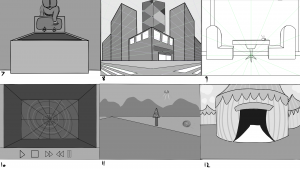
After we were split into our teams, we got to work making 100 ideas. Our team had a group meeting on Monday to narrow down our ideas to a top 5, and then come up with 13 thumbnail sketches based on our ideas. I did 6 ideas all based on our groups final idea, but I decided to do 7 other thumbnails with different ideas so that I could practice some other perspectives. I found the task quite difficult as I’m not the most confident at drawing perspectives but I used the recommended tool of ‘caraspace’ which helped me in creating a good base to work on. 
In thumbnail 1 I liked how I worked with the low angle perspective to show the convenience store. I like the gradient of the flames in the window but I don’t think the tiles on the floor are the most accurate in terms of perspective. Also, I feel like more depth in the tones of the tiled floor would be a good way to add depth and form into my perspective drawings.
For thumbnail two I wanted to create something which looked like a hallway to a sketchy backroom. I wanted to try an angle which would look like a set of stairs descending downwards but I couldn’t get the perspective right so I changed the idea to show a low angle shot of a corridor, focusing on the sets of flames getting smaller to show the perspective of the thumbnail. I should have added gradient into the image, or perhaps made more use of the flames and how they could work with shadows on the floor and walls.
I liked how thumbnail 4 worked out, as I think it was one of the most successful ones in terms of perspective. I tried to work with incorporating the bright fluorescent tones of a typical convenience store inside the store and contrasting it with the darker values outside. I think this worked well but it could have been taken further.
For thumbnail 5 I think that because the image is quite simple I should really have worked on adding more tonal values into the image. The tonal values would provide more depth and form to the objects in the image. I kept it quite simple for because I’m still getting used to drawing perspectives but I think I still should have worked at bringing in more tonal values to improve the over all thumbnail.
For thumbnail 6, I again kept it quite simple in order to get a better grasp on perspective. I tried to capture a scene which was supposed to look like a backdoor auction house but I couldn’t get the angle of the room right so in the end I simplified it in order to make the perspective work better. I think I should have added some gradient in here in order to make the atmospheric perspective look better because at the minute the image falls a little flat. I do however, like the the composition of the large cage in the foreground and the smaller podium stand in the background.

For the next 7 thumbnails I experimented with some of the other ideas which we had discussed in our group and that I was thinking about. I thought that this would allow me to explore perspective a little bit more by working with other angles and shots which wouldn’t fit into the main idea. For thumbnail 7 I tried an extreme high angle shot, of a person reaching towards a mirror. I thought this would be a cool angle to try and work with perspective. When I saw showing my work, it was suggested that whilst it was an interesting angle, adding more tonal values in would be helpful in making the over all image look more interesting.

The feedback I got on my images was that whilst the perspectives were interesting and there was nice clean lines, there was not enough depth in the images. It was suggested that more variety in tone would help create more form and depth in the sketches. I think this is right and it is an area which I will work hard on improving in the future. Another more specific piece of advice I got was that the lines of perspective in shot 3 were not quite right. Sarah said not to change it though, but instead to take the comment and work on it in the future which I will do.