IXD103
IXD103 – Exploring identity – Week 5
Should it be more abstract? Would this make it more interesting?
When we were critiquing the logos, mine sort of got lost, so it is not there quite yet. It isn’t unique enough?
The weight will show confidence and boldness – this is key
My line thickness needs to be thicker
Mine is very abstract, what perception am I going for? How effective is it?
Does it work in small scale? — YES

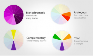
Colour
It can bring across personality and can influence the customers perception.
Take what you understand as the perception of colour and change it to become part of your identity, take ownership of it.
Colour systems
- CMYK (Cyan Magenta Yellow Black) – print. It is a 4 colour printing process, 4 plates used in printing press, the colours when mixed make up black/dark colours; it is a subtractive colour system.
- RGB – on-screen and electronic display. Colours are formed using 3 light beams of various intensity to compose colour, the mixed colours make up white.
- Pantone – ensures consistency (useful for brand colour reproduction), it is used in printing, it can be specified as a brand colour. It is a standardised system; it manages the colour from design to production.
- RAL – used mainly for powder coating, painting and plastic colouring (physical products that need to be coated) thing products and interiors.
- Hexadecimal – Used in displaying web pages (coding) the colours may be specified as an RGB triplet or in a hexadecimal format. Displayed in 6 digits with # preceding it.
Colour resources
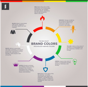
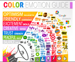

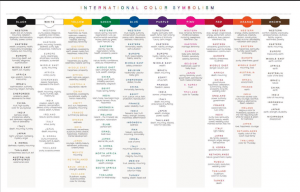
The colour has to be associated with the words used in the bio/the intentions you want to put forward. Take into consideration colours and how they are seen or thought of depending on different cultures.


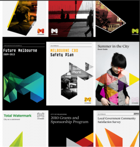
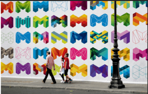
Useful case studies to look at
- City of Melbourne
- Channel 4

- Spotify – diversity angle
- Financial Times – they tried to represent their logo colour into RGB to match their identity.
1 Week project
Do a brand in a week. Design a brand for a pizzeria as a way of recap and to develop your skills. You can choose an existing one or come up with your own. YOU give it the personality and its focus. Is it fun, professional, high-end quality?
Start with words, research and competition
Establish tone of voice, word bank, etc…
Design a symbol in the shape of a symbol or monogram
ONLY produce 3 pgs —> PDF
A3 landscape format
IDEA : chocolate pizzeria? Fun, quirky, experience.
Visual identity and drawing – week 4
In 3 weeks (week 7) we will have a group critique ***
Recap
Bio, word associated with our values and tone of voice. We created unique marks based on our initials and investigated appropriate typefaces that encompass our character and personality. What am I doing and why am I doing it? To get an understanding of the foundations of branding so that we can create authentic branding for ourselves and for potential/future clients, to solidify our ideas and develop our skills. To be unique and stand out in industry. We are trying to make ourselves look desirable/employable.
In my course alone there are 22 people, they are competition in the industry, that is why standing out is so important. I will be in competition with many people, I NEED to stand out. Who I want to work with will find me through my brand. MY brand will also dictate how people will perceive me.
Kinds of identification: uniqueness, value, holding power, description, association, tone of voice, graphic excellence (quality) reputation, discretion, repetition (& recognition). Which ones will my brand be focused on?
The power of identification and recognition – think of McDonald, Apple, Nike, Twitter, PlayStation, even if you don’t see the full logo in its original colour it is still easily identifiable.
Design program
When a trademark is used to identify an organisation it works together with other graphic elements in a design programme, each part of the plan for a visual identity. Through this a company can inform how it is (its values) how it wants to be seen (it’s image). A large part of it is informing people/the customer.
Includes basic elements like:
- Name mark: company’s name written in a special way (typography)
- Symbol: A picture mark or decorative abbreviation.
- Colours: Selected colour(s)
- Type: Selected typeface(s)
- Fifth element: An extra, decorative element. ( example 1 monogram used to create an icon set; this gives an expansive tone of voice)
Note —> you would never use a name mark and a symbol, it is one or another not both.
Pictorial & abstract
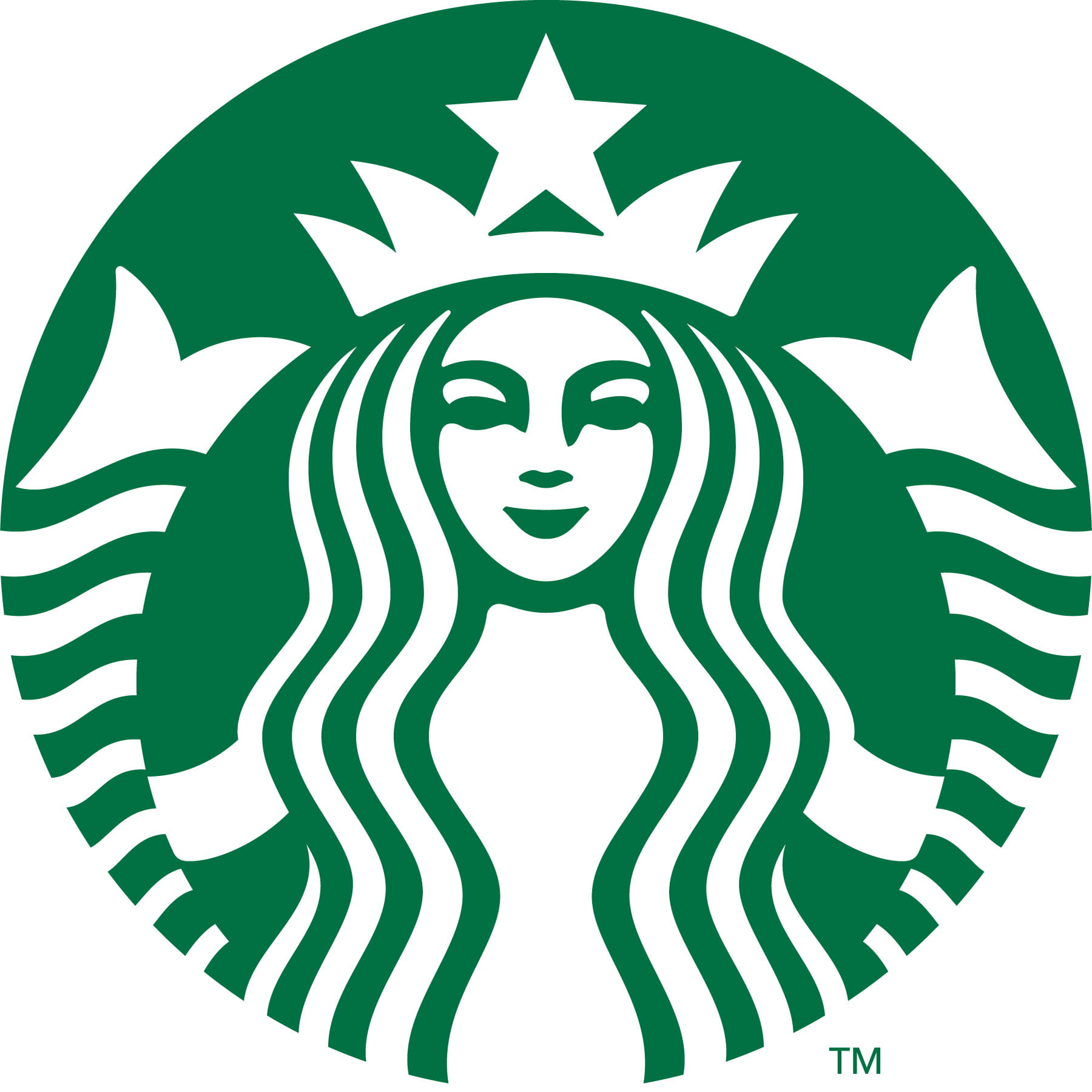
Pictorial marks are non-abstract and iconic in nature. They depict a stylised version of something – anything’really: a fruit ( like the Apple logo), a mythical beoing ( like the Starbucks logo), an animal
This kind of logo may be preferable when your brand is a bit abstract or open to interpretation. Pictorial marlks can also be really efective is your brand lends itself to a specific image: Apple and Jaguar are good examples
Abstract marks arre abstract, they usualky consist of very simple geomatric shapes
They lend themselves to brands thata are more descriptive because their logog just needs to be recognisable by repetition
Combination marks
A wordmark combines with either a letter mark or a symbol. They are versatile and can use the symbol or the wordmark in isolation as well.

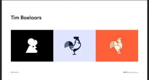
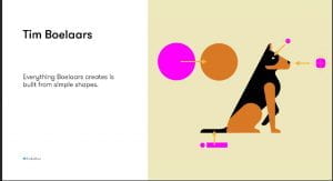
- Tim Boelaars – forms and shapes are key for his designs
- Jeroen van Eerden
- Fabio Basile
- Vic Bell
- Ivan Bobrov
- Airside
- Jason Santa Maria
Process
Thinking by drawing – drawing loads and loads of ideas. Thinking it through as you draw. How can I represent it pictorially. You should put EVERYTHING down, it is an important part of the design process; put down your mistakes, realistically your idea stage should be 95% mistakes.
Pictorial Superiority effect
Humans process visual info 60,000 x faster than words
Sketch noting
The 5 basic elements: circle, square
Always keep a sketchbook with you; a good sketchbook will have a mixture of words and drawings.
Containers, Shadow & highlights, line and dividers, shapes, compound shapes, objects and icons, type styles, layout and structure (3points x 3 bullets).
Mind Maps: Helps put it all together.
Think outside the box
—-
Task
- Doodling talk by Sunni Brown – watch and analyse
- Book – Ed Emberley ( Make a world)
- Penguin drawing task on slides
- Make a mind map with words about yourself and use that as a guide for your word mark. Select the ones that are important. Find the important word and sketch out what you think it is.
- Sketch the following objects using the techniques talked about today _ iPad, Laptop, Camera, Sketchbook, Pencil, Browser, USB stick, Paper, Tv and Radio. ON PAPER.
- Pick 5 key words from your week 1 word association mind maps/bio (these could be your values) and explore a range of ways to represent them visually.
- Research visual marques – design a symbolic
- Look up brand new blog
Next week – Brand guidelines and colour.
Tutorial:
look up venezuelan type foundries
quirky – duality of 2 words organisation but whimsical nature. visually have loads of variety. ditot thick and thin lines.
type foundries that have quirky aspects. Fonts myths look up
variable fonts – more technical, google pioneered them.
IXD103 – Type & Wordmarks – Week 3
Great reads
- FontShop Meet your Type – They use romantic tone of voice to allude to falling in love with type (Book).
- FontShop (Website).
- Graphic design solutions (Book).
- Thinking with type (Book).
- Packaging design: Successful product branding from concept to shelf (Book).
- Fonts in use blog.
Why is type important?
Letterforms were developed as an alternative to the spoken word. It evolved from pictograms/ icons on cave walls to letterforms. Think of carved typography – eg in Egypt messages were carved into stone. These give a gravity to the message as they were literally carved in stone.
“Typography is the craft of endowing human language with a durable visual form.” – Robert Bringhurst.
It enables information to be passed down from generation to generation. It communicates a message where the originator isn’t able to present it. It allows us to share information and knowledge worldwide.
It differs from culture to culture, eg think religion. Think of hand drawn bibles and how much time and effort it took to complete. This was important to them and it brought notice.
“Typographical design should preform optically what the speaker creates through voice and gesture so his thoughts” – El Lizzitsky.
For example we can not understand sarcasm through type as it relies heavily on tone and facial expressions.
Tone of voice
How do you visually represent it?
What are the elements of typography?
- Fonts: a particular set of typeface. It’s what we use to make a typeface happen. (Spiekermann, 2010)
- Typeface: Alphabet of letters, numbers, punctuation and diacritical marks that share stylistic elements. A typeface is what you see. It’s the design of a single set of characters unified by consistent visual properties; the properties then create the essential character of a typeface (Landa, R., 2018).
- Weights: they can come in a range of different weights which facilitates their use in different areas, eg bios.
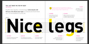
- Cap height: it is the distance between the baseline and the top of a capital letter.
- Baseline: Its an imaginary line where all letterforms sit.
- Counter: The enclosed negative space within a letter. (Glossary, 2021).
- X height: The height of a lower case x or the height of lower case letters.
- Ascender: The part of a lower case letter that rises above the X height.
- Set width: Its the width of a character in relation to the height.
- Descender: Its the section of a letter that hangs below the baseline.
- Terminal: Its the end point of the letterform.

Tasks
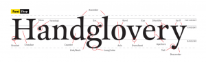
- The anatomy of type —-> read FontShop Meet your Type pages 9, 10, 13, 14
- Anatomy of type —> Select a typeface and write your name. Use this to identify elements of type and label them. Lay this up on an A4 page/digitally. My outcome is shown bellow.

- Complete the menti exercise for the typefaces: Didot, Helvetica, Times New Roman and Cooper Black.
Didot 
Helvetica 
Times New Roman 
Cooper Black
My thoughts
I thought these tasks were a very great way to see what each type made the viewer feel, it conveyed a message just by its looks and not the information, I think it shows how perceptive humans area and how our jobs as designers is important as subconsciously we are analysing and in a way critiquing everything we see, hear and do. Typography is a vital component of user interface design – when done correctly they can help us establish a great graphic balance to the website and other graphic products, eg pamphlets, ads, etc…
Typography (when done correctly) can establish a very strong visual hierarchy and tone of voice for the brand. It also serves as a reflection of the brand as people will identify the typography chosen with the business. Some great examples of this would be Disney, Fanta, Lego, McDonalds, Pepsi, Vogue, Netflix, etc..
I need to research typography further before choosing which one will be used for my brand as I have learned what an important role they play in branding.
“Typefaces are to the written word what different dialects are to different languages” – Steven Heller
Appropriate type face selection
- Determine who your audience is and articulate your language for them. Knowing what your audience wants can help you choose a typeface that will draw them and engage them. Also consider the application
- Pairing typefaces together can be an option. eg one for headlines and one for text. These would have to be clearly stated in the brand guidelines.
Great resources
Type Foundries
- Atipo Foundry
- Lineto
- Klim Type Foundry
- Grilli Type
- Colophon Foundry
- AinsiFont Digital
- Fontsmith
- Dalton Maag
- Fonts by Hoefler&Co.
- The Designers Foundry
- P22 Type Foundry
- Displaay
Free fonts and fontshops
- Hype For Type
- Font Fabric
- Lost Type
- Ultra Types
- The Northern Block
- Type different
- Dafont
- Google Fonts
- T26
- Font Squirrel
- Font Blog
- My Fonts
- Font Shop
Kerning
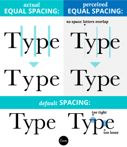
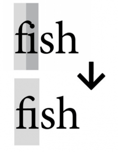
It’s the space between the letters – it is especially important in Lettermarks. In typography, kerning is the process of adjusting the spacing between characters in a proportional font, usually to achieve a visually pleasing result. It makes certain combinations of letters, for example, WA, MW, TA and VA fit together better.
In the image bellow you can see that without the kerning the k looks uncomfortable but once it is added it is much more visually pleasing.


In the image shown above the spacing between the ‘T’ and the ‘r’ is too big and the spacing between the ‘r’ and the ‘y’ is too small. To fix this, the spacing was fixed as shown above.
Examples
Here are some bad kerning examples I found – they really helped me understand the impact that kerning can have on branding. The key is to use your eye, its about more than just assessing the distance between letters, but also if it ‘feels’ right. I need to apply this key skills when completing my wordmark. Kerning once done correctly will allow me to present myself not only to clients, designers but also employers in a more professional and competent manner. I also found that generally speaking larger type needs a tighter kerning to be applied.


I visited the website Welcome to Method of Action and completed the kerning game to improve my skills, here is how I did:

Ligatures
It means “connection”. When referring to the appearance of type, a ligature is made from two or more letters, which appear connected. In handwriting these connections are created all the time. It’s the union of two or more characters (Cullen, 2012). They create a single character out of two (Spiekermann, 2010).
Ligatures can be:
- Stylistic: They are used to resolve unwanted character collisions that happen when some letterforms combine. They give aesthetic refinement. Bellow is a great example of Stylistic ligatures (Cullen, 2012).
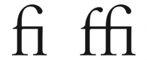
- Lexical: They represent composite vowels like aesc and ethel (Cullen, 2012).

- Discretionary: Many typefaces contain these. They add stylistic grace with ornate/historical nuance (Cullen, 2012).
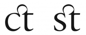
- Ampersand: It symbolises the Latin word et – means “and” (Cullen, 2012).

Hierarchy
Its the rank or order of importance.
This is a key tool for designers and when done correctly it makes the viewer look where and when you want them to look. When this is not present is can cause the viewer confusion and frustration. One can emphasise by using size, weight, colour, style and placement. (Spiekermann, 2010)
Leading
This refers to the amount of horizontal space between two lines of text. It’s measured from baseline to baseline. When the distance between the leading and the point size is applied correctly, it makes the text look great.
Letterspacing/Tracking
This refers to the overall spacing between letters in a block of text. The larger the type, the less letterspacing is required.
Type distortion
It’s important to avoid widening, outlining or shortening the type selected; the designers who created them have created them with the ideal proportions, it it doesn’t fit, its better to change type than to try and force it (Spiekermann, 2010).


Special characters
These can add a little bit of character and quirkiness to your work when done correctly.
- Ligatures
- Numbers
- Smart quotes
- Swash characters
Wordmarks
These can come in many forms:
- Script/Calligraphic
![]()
- Typographic
- Personal brands


- Custom type: This is a great option when an accompanying symbol doesn’t fit the style; the wordmark logo must then be made distinctive by applying appropriate design distinctions. Like for example: Colour, size, serif, san serif, lower case, upper caser, weight, etc…
To make the wordmark logo more readable using lower and upper case is useful as the human eye distinguishes the letterforms more easily.
- A twist: Giving your wordmark a distinctive look using a simple tweak to customize the mark is a great way to have a more recognisable brand. It could be done by adding a ligature, a notch, a colour difference, playing with positive/negative space, kerning, letterspacing or really any twist that makes it unique and different from the standard typeface.


“Words have meaning. Type has spirit. The combination is spectacular” – Paula Scher.
I tried doing this using Procreate to strengthen my typography skills, here is how I got on:

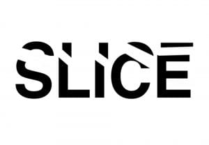


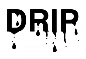

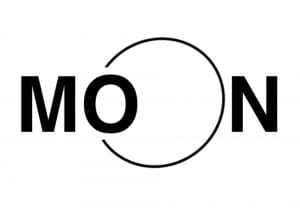


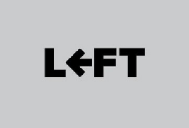
I had loads of fun making these; I did four different versions of the word ‘slice’ as I kept trying to improve it and push myself. My favourite ones are the word play on ‘charge’, ‘umbrella’, ‘Moon’ and ‘Drip’.
References
- Brown, T., 2015. Caring about open type features. [online] Practice.typekit.com. Available at: <https://practice.typekit.com/lesson/caring-about-opentype-features/> [Accessed 9 February 2021].
- Cullen, K., 2012. Design elements, typography fundamentals: A graphic style manual for understanding how typography affects design. Rockport Pub.
- FontShop. 2021. Glossary. [online] Available at: <https://www.fontshop.com/glossary> [Accessed 8 February 2021].
- Klimchuk, M.R. and Krasovec, S.A., 2013. Packaging design: Successful product branding from concept to shelf. John Wiley & Sons.
- Landa, R., 2018. Graphic design solutions. Cengage Learning.
- Lupton, E., 2014. Thinking with type: A critical guide for designers, writers, editors, & students. Chronicle Books.
- Spiekermann, E., 2010. Meet Your Type. 1st ed. [ebook] SI FONTSHOP INTERNATIONAL, pp.7 – 11. Available at: <http://104.236.43.209/pdf/fsfinalbook_single.pdf> [Accessed 8 February 2021].
Monogram progress
Why do I need a wordmark or word monogram
It makes you recognisable, It forms the basis of a lot of our communication. It can form the basis of everything.
Initial monogram designs

I created these initial ideas using Figma; I was really interested in the layering of the letter as it produced quite an interesting design. These are my favourite designs; they consists of my initials.


Tutor feedback
It does not have to be a monogram, it could be a watermark.
I should maybe try to use sharp shapes or points – make it different. Shapes can form part of the visual language later on.
I need to start on paper first, it will give me more freedom to experiment and broaden my ideas.
The typeface I used for my initial design ideas is too thin, it makes it look not fully formed. The typography used is doing me no favours, It’s like I am fighting it. It is restricting my creativity. Bold lines can come across as more confident and sophisticated.
Daniel likes the rectangular one in the middle ( 3rd row) It is one of the ones I liked the most also.
Avoid trying to do a name instead of your own as you may not like it in later years. Stick to your own name.
Pinterest moodboard:
After taking the feedback on board, I started sketching out some of my ideas.


![]()
Here is a link to my Figma logo draft.
Here is what my final monogram design looks like:

I created this monogram by joining my 2 initials (E and U). I liked its abstract nature as it kind of looks whimsically inventive . I would love to create an animation out of this monogram, I think it would be a great way to apply my logo to as many aspects of my brand as possible.
I could also use the logo design as an illustration design.
I decided to create an icon illustration, I started off by sketching out some ideas. I decided to focus on creating a simple line illustration of myself focusing on my defining qualities.

I then tried to explore my idea further using Procreate


Although I like the idea I am not sure I will be using it as part of my brand. I feel like the monogram has enough character and that adding this illustration would only take away from that.
Having said this, it was a fun learning experience.
Typography moodboard
We were tasked with gathering inspiration, identifying all different types of typography.
Create 2 mood boards:
- Magazines and Ephemera
- Digital (photos, online) go for a walk and look for type in your environment, finding letter forms in different applications.
- Typography based shapes – a ladder, a desk, a window, etc… and identify what makes that shape recognisable? Bold and curved? simplified?
Moodboards are a good way to convey information and inspire. They allude to a tone of voice and briefing. Pinterest is great for this.
Click here to see my Pinterest moodboard.
Magazines

I really enjoy the playfulness created by overlaying squiggle like letters on top of bold, attention catching typography. It made me smile when I saw it. It effectively conveys an aura of playfulness and child-like innocence that I found very visually appealing. One typography contradicts the other – The white is structures, bold and organised whilst the quirky letters on the top are whimsically weird.
I would love to integrate some of this into my own designs, make it more abstract and interesting to look at. I tried out the style with my own name in my sketchbook (shown below). I think it’s a really friendly approach to typography that I would like to integrate latter on if it fits the theme.

Bellow are some other magazines that I really enjoyed researching, they used playful and at times abstract typography.


Typography based shapes


Feedback:
Work within the constrains of the shape you decide to work with – he likes this idea. Look up Paula Sher and the monogram she did for The New School – a modular, elongated letterform approach. Matched up letters. Stretched letterforms.
The overall theme that stands out in my moodboard was stretched letterforms and playfulness. I should explore this further.
Quirky and eye catching.
IXD103 – Monograms – Week 2
Personal branding
The logo of a brand can be thought of as the starting point for describing it. Your bios are open to change and that is ok – they are not set in stone. A brand is an evolving process – even established brands evolve – a good brand is fluid, it will evolve and adapt. Weaker brands will need to be re-branded. Monograms are open to change as we develop as designers and fine tune our skills. Reviewing your work continually and adapting it if necessary is a key aspect of design.
Simplicity. A simple concept for the mark makes it easier to understand and ensures durability. This is something I will strive for in my own personal brand.
Personal branding is a way to not only communicate with consumers but also with the world. What is my work about? What kind of designer/person am I? What is unique/special/drives me? something that can evolve over time.
Workmarks and Monograms
They both use letterforms to make unique, identifiable marks. The choices made for these will visually demonstrate the tone of voice established in the writing stage of the branding process.
Task 1
Write your first name using letterforms made out of circles, squares and triangles only. We were given 1 hour to complete this task.
Things I will be considering:
- What is necessary to make the letters recognizable?
- What can be left out?
- How do you differentiate the letters but maintain a consistency?
- Should I do it digitally or on paper?
Click here to see the completed task.
Resources and references to research:
Books
- Symbol by Angus Hyland – In library 741.6/HYL
- Marks of excellence by Per Mollerup – library
- Logo by Michael Evamy
- Logo modernism by Jens Muller
- Logo design love by David Airey
Artists
- Wim Crouwel – Dutch Typography
- Armin Hofmann – Swiss Designer
Websites
- Moving brands
- Pentagram
- Made Thought
- Interbrand
- Anagrama
- Multiadaptor
- 4creative (network-rebrand)
Monograms and Lettermarks
It’s a motif made by overlapping or combining 2 or more letters to form a symbol; they are often made by combining the initials of an individual or a company, used as a recognisable symbol or logo.
Daniel’s Pinterest monogram board link.
Examples
Asymmetrical words, vertical, horizontal – you can play around with it, place a line over them, etc. We can abstract letters – reductive language for visual communication.
- HP – they have removed aspects of the logo and are hoping to remove more to the point of it being an angled line. Complete simplicity. It provides also the tone of voice – simplicity and efficiency.

- London Luton Airport – their use of multiple colours works perfectly as the logo is made of squares.

- MIT media lab – they are a great example of versatility and consistency. When compiled all those monograms create an appealing visual experience. It is very Memorable and it was all created from a basic colour pallet.
- Canadian National.
- Jessica Hische – Daily Drop Cap project.
- Hope Meng’s monogram project.
- Early Greek and Roman coins that bear the monograms of rulers or towns.

- Albercht Durer’s monogram from 1502 is one of the best known monograms from the world of art history.


- Paul Rand’s IBM logo. Rand successfully created an iconic logo for IBM that ties the letters together using nothing more than equally weighted bands.

- CNN logo – a logo that has truly stood the test of time.

Case study
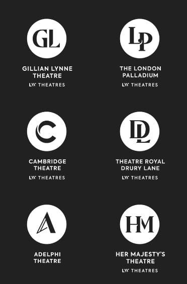
- LW theatres – Andrew Lloyd Webber’s LW Theatres ( previously Really Useful Theatres) owns and manages 6 West End theatres. The new logo is meant to represent the stage and the spotlight but its a stretch of a connection to make for anyone that see the logo without the explanation. It is elegant though. They kept the negative space consistently with their 6 other brands. This establishes the consistent language, whilst maintaining the individual originality of each theatre. It provides a high-end, simplistic and consistent design.

- Gatwick express – they removed the previously cluttered logo and replaced it for a more simplistic logo which resulted in a clearer, calmer and more luxurious looking design which for the customer translates to the products. They made it recognisable. Their previous logo was outdated and it caused customers to feel that their high price point was not justified. They lost the clutter and made the new logo all about clarity. The mix of cusps and curves conveyed a sense of calm to the brand that the previous logo was not providing. The ‘G’ and the ‘X’ now looked seamlessly connected and simplistic in its approach. It brought a sense of clarity to all the brand communications – including tone of voice and photography.

Task 2
Gather inspiration, identifying all different types of typography.
Create 2 mood boards:
- Magazines and Ephemera
- Digital (photos, online) go for a walk and look for type in your environment, finding letter forms in different applications.
- Typography based shapes – a ladder, a desk, a window, etc… and identify what makes that shape recognisable? Bold and curved? simplified?
Present at 3:30pm!
NOTE: mood boards are good to convey information and inspire. They allude to a tone of voice and briefing. Pinterest is great for this.
Blog post for this task link.
Monogram design brief
Practical requirements -Book- Mollerup presents 24 ‘practical requirements’ linked to graphic marks. [Mollerup, P., 1998, Marks of Excellence. London: Phaidon. pp. 90-91].
A good monogram will have all of these:
- Simplicity – is the mark simple and easy to understand?
- Attention value/holding power – does it draw you in and hold you attention? ( compare yours to the Pinterest ones and see if it stands out/holds its own )
- Application (including scale) – does it work when very, very small? will it work on a small business card? is it just going to be screen based or both?
- Competition – Does it distinguish itself from other marks? it is clearly mine?
- Tone of voice – is the feel of the mark keeping with my brand?
- Fashionability/Timelessness – will it evolve beyond fashion, be more than a trend? is it likely to lose relevance over time? Is it contemporary? Will it evolve as fashion changes and transcend time? Fashion and culture changes, we move quickly, it will have to last longer than 10 years.
- Focus on form (no colour) – Work within the constraints of black and white as this forces you to explore form. Colour will be added later on. Even when working with black and white the constraints are removed. Consider whether some parts of the letter need removed or does the negative space hint at it better? Paper first!!! Digital once you have fully explored it. Start with fast sketches then move unto more refined ones. Do plenty then narrow it down to your favourite, develop them further on paper then digitalize. Animate it if you can.
- Animation – consider how it could be animated or come to life.
- Research – To start with look at —> Wim Crouwel ( Dutch typographer ) Armin Hofmann ( Swiss Designer )
- Attention to detail – it is vital, use a grid, avoid a dreadful execution.
- Think uppercase, lowercase, adding middle name or a middle initial?
- It HAS to work in black and white, single colours, multi colour, etc., as you never know who will use it and reproduce it so if it is simple and easy to use it will be successful.
- Typeface into the monogram? or just a simple monograms?
- Visually represent your tone of voice presented in your bio.
——————< Brief on blackboard explaining it further >——————
Geometric typography
Task
1 hour – write your first name using letterforms made only out of circle, square and triangle.
Consider
- What is necessary to make the letters recognizable?
- What can be left out?
- How do you differentiate the letters but maintain a consistency?
Can be done digitally or on paper.
I decided to create mine using Figma, I originally wanted to create my name using all the shape options given and these were my results:
This is my initial idea, I used only circles, I wanted to play with negative space and stick to my favourite colour – pink.
It kind of reminds me of lights shinning in the dark or lightbulbs forming your name.
This was my second attempt, I wanted to allude to the letters whilst still using negative space and the circular shape, I like it but it is not quite there. I darkened the pink to give it a more mature look.

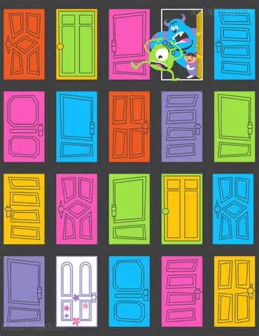
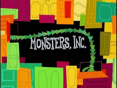
For my 3rd attempt I took inspiration from one of my favourite Disney movies – Monsters inc.
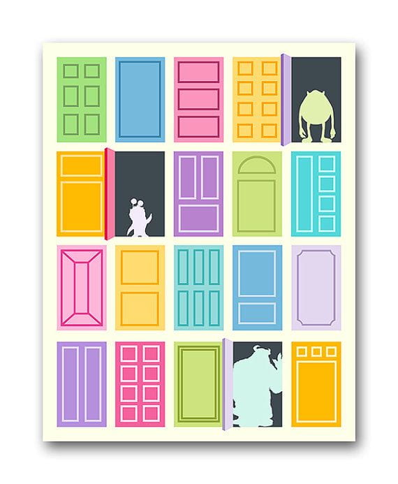
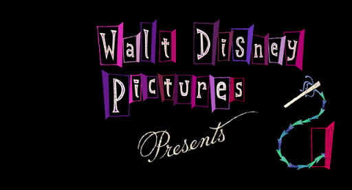
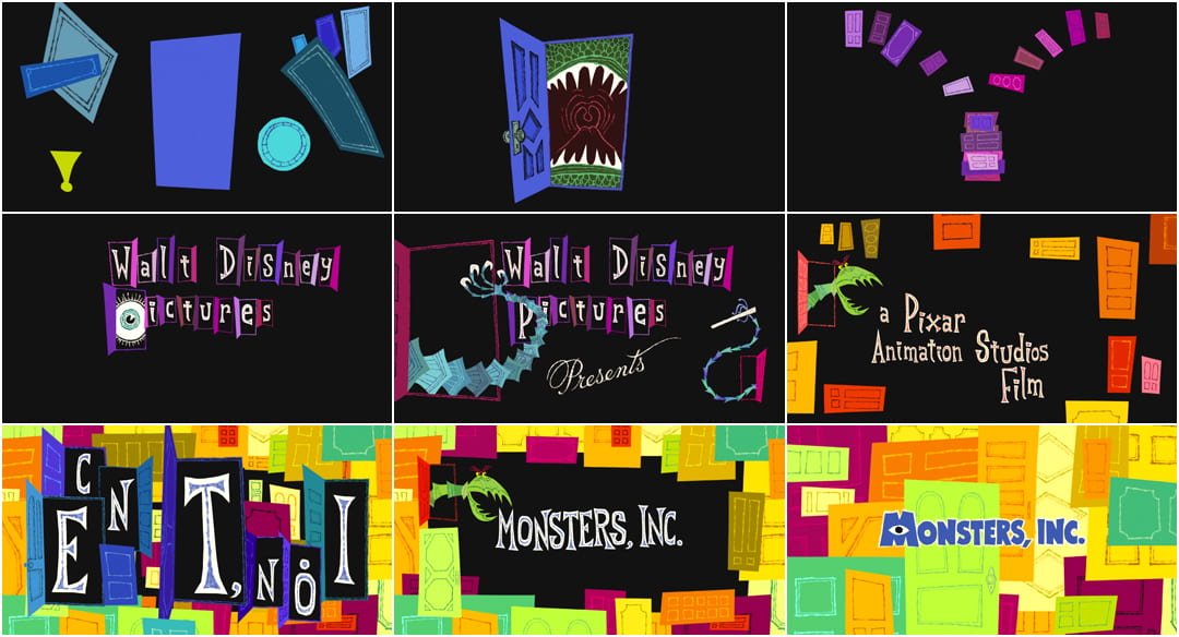
Bellow is shown my final outcome.
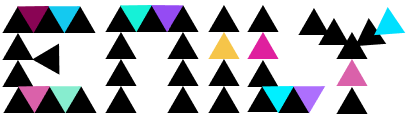
I am quite pleased with the final outcome as I think it is quite quirky, unique and energetic – which for anyone that knows me – describes me perfectly.
What really appealed to me about the monsters inc aesthetic was the starting colours against a black background – This is something I simply had to incorporate into my design.
About me page
Long Bio
Hello, my name is Emily Ussher. I am a first year Interaction design student at Ulster university Belfast. I am originally from Venezuela; I found my love of art when I moved to Northern Ireland at 13 as it gave me a communication tool that I did not have at the time. I love to travel and create art. My multi-cultural upbringing has offered me a different perspective and point of view – something that is always evident in my designs.
Short Bio
“Just another Venezuelan/Irish self-appointed explorer, studying Interaction Design and doing what she loves”
My mission statement:
“To create and showcase unique, high quality designs in a professional manner to help other people achieve their goals and promote my skills”
Business card
Pinterest moodboard link.

I really liked the idea of putting a cute illustration in the front – I should maybe create an illustration of myself to use as part of my brand?

I like the idea of using different colours for the same design of business card – it gives a fun and quirky feel while remaining professional.


Here are some of my initial sketchbook ideas:


Figma link. This is the link to my business card digital designs.

I then changed my colour scheme and general layout.

This is my business card design, I created two options for my information section, a minimal one and a colour one, I think I could use both depending on who the client/employer is and what they prefer.
CV
Pinterest moodbard link.
Here is my current (boring) cv —-> Emily Ussher cv.
Bellow are some of the CVs I found that inspired me the most – I really like the illustrative style of each one of these, I would love to incorporate this style into my own CV.


Figma cv project progress link.
Content Audit Exercises
Creating a word bank
The brand I choose to base this exercise on was Starbucks as I like their products and their overall aesthetic.
 Rewards
- Sweet
- Treats
- beautifully crafted
- Roast
- High quality
How they speak to their customers
- Friendly
- Helpful
- Respectful
- Kind
- Professional
Writing for the website
- Professional
- Simple – clear to understand
- Short
- Catchy
- Engaging
Creating content for brochures and catalogues
- Consistency
- Logo
- Use of company colours
- uncluttered
- Simply but efficient
Brand dictionary
Calls to action in the marketing and advertisement
- Starbucks rewards
- Starbucks app
- Starbucks deliveries
- Starbucks stories
Contact us language
- About us
- Customer service
- How can we help you
- To get in touch with our Customer Care team, please send an email to UKInfo@support.starbucks.com,
Brand self description
- Mission statement ” To inspire and nurture the human spirit – one person, one cup and one neighborhood at a time.”
- High-end
- Great taste
- customer loyalty
Terminology for product ranges, processes and procedures
- Blend
- Roast
- Warmth
- Sips of delight
Tone of voice guide
3 words that describe the brands essence
- Quality
- Connection
- High-end
A short strapline summarizing its raison d’etre
Starbucks aims to create quality blends of coffee, to be a different kind of company and to enrich the human spirit.