Great reads
- FontShop Meet your Type – They use romantic tone of voice to allude to falling in love with type (Book).
- FontShop (Website).
- Graphic design solutions (Book).
- Thinking with type (Book).
- Packaging design: Successful product branding from concept to shelf (Book).
- Fonts in use blog.
Why is type important?
Letterforms were developed as an alternative to the spoken word. It evolved from pictograms/ icons on cave walls to letterforms. Think of carved typography – eg in Egypt messages were carved into stone. These give a gravity to the message as they were literally carved in stone.
“Typography is the craft of endowing human language with a durable visual form.” – Robert Bringhurst.
It enables information to be passed down from generation to generation. It communicates a message where the originator isn’t able to present it. It allows us to share information and knowledge worldwide.
It differs from culture to culture, eg think religion. Think of hand drawn bibles and how much time and effort it took to complete. This was important to them and it brought notice.
“Typographical design should preform optically what the speaker creates through voice and gesture so his thoughts” – El Lizzitsky.
For example we can not understand sarcasm through type as it relies heavily on tone and facial expressions.
Tone of voice
How do you visually represent it?
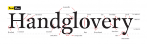
What are the elements of typography?
- Fonts: a particular set of typeface. It’s what we use to make a typeface happen. (Spiekermann, 2010)
- Typeface: Alphabet of letters, numbers, punctuation and diacritical marks that share stylistic elements. A typeface is what you see. It’s the design of a single set of characters unified by consistent visual properties; the properties then create the essential character of a typeface (Landa, R., 2018).
- Weights: they can come in a range of different weights which facilitates their use in different areas, eg bios.
- Cap height: it is the distance between the baseline and the top of a capital letter.
- Baseline: Its an imaginary line where all letterforms sit.
- Counter: The enclosed negative space within a letter. (Glossary, 2021).
- X height: The height of a lower case x or the height of lower case letters.
- Ascender: The part of a lower case letter that rises above the X height.
- Set width: Its the width of a character in relation to the height.
- Descender: Its the section of a letter that hangs below the baseline.
- Terminal: Its the end point of the letterform.

Tasks
- The anatomy of type —-> read FontShop Meet your Type pages 9, 10, 13, 14
- Anatomy of type —> Select a typeface and write your name. Use this to identify elements of type and label them. Lay this up on an A4 page/digitally. My outcome is shown bellow.

- Complete the menti exercise for the typefaces: Didot, Helvetica, Times New Roman and Cooper Black.
Didot 
Helvetica 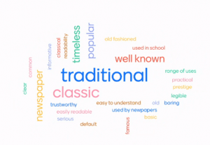
Times New Roman 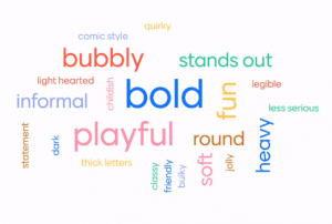
Cooper Black
My thoughts
I thought these tasks were a very great way to see what each type made the viewer feel, it conveyed a message just by its looks and not the information, I think it shows how perceptive humans area and how our jobs as designers is important as subconsciously we are analysing and in a way critiquing everything we see, hear and do. Typography is a vital component of user interface design – when done correctly they can help us establish a great graphic balance to the website and other graphic products, eg pamphlets, ads, etc…
Typography (when done correctly) can establish a very strong visual hierarchy and tone of voice for the brand. It also serves as a reflection of the brand as people will identify the typography chosen with the business. Some great examples of this would be Disney, Fanta, Lego, McDonalds, Pepsi, Vogue, Netflix, etc..
I need to research typography further before choosing which one will be used for my brand as I have learned what an important role they play in branding.
“Typefaces are to the written word what different dialects are to different languages” – Steven Heller
Appropriate type face selection
- Determine who your audience is and articulate your language for them. Knowing what your audience wants can help you choose a typeface that will draw them and engage them. Also consider the application
- Pairing typefaces together can be an option. eg one for headlines and one for text. These would have to be clearly stated in the brand guidelines.
Great resources
Type Foundries
- Atipo Foundry
- Lineto
- Klim Type Foundry
- Grilli Type
- Colophon Foundry
- AinsiFont Digital
- Fontsmith
- Dalton Maag
- Fonts by Hoefler&Co.
- The Designers Foundry
- P22 Type Foundry
- Displaay
Free fonts and fontshops
- Hype For Type
- Font Fabric
- Lost Type
- Ultra Types
- The Northern Block
- Type different
- Dafont
- Google Fonts
- T26
- Font Squirrel
- Font Blog
- My Fonts
- Font Shop
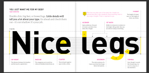
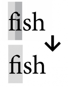
Kerning
It’s the space between the letters – it is especially important in Lettermarks. In typography, kerning is the process of adjusting the spacing between characters in a proportional font, usually to achieve a visually pleasing result. It makes certain combinations of letters, for example, WA, MW, TA and VA fit together better.
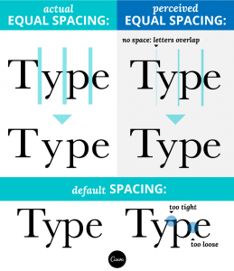
In the image bellow you can see that without the kerning the k looks uncomfortable but once it is added it is much more visually pleasing.


In the image shown above the spacing between the ‘T’ and the ‘r’ is too big and the spacing between the ‘r’ and the ‘y’ is too small. To fix this, the spacing was fixed as shown above.
Examples
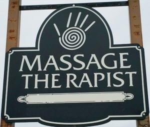
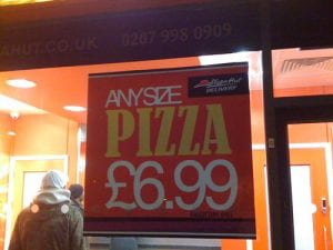
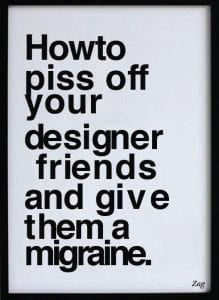
Here are some bad kerning examples I found – they really helped me understand the impact that kerning can have on branding. The key is to use your eye, its about more than just assessing the distance between letters, but also if it ‘feels’ right. I need to apply this key skills when completing my wordmark. Kerning once done correctly will allow me to present myself not only to clients, designers but also employers in a more professional and competent manner. I also found that generally speaking larger type needs a tighter kerning to be applied.


I visited the website Welcome to Method of Action and completed the kerning game to improve my skills, here is how I did:

Ligatures
It means “connection”. When referring to the appearance of type, a ligature is made from two or more letters, which appear connected. In handwriting these connections are created all the time. It’s the union of two or more characters (Cullen, 2012). They create a single character out of two (Spiekermann, 2010).
Ligatures can be:
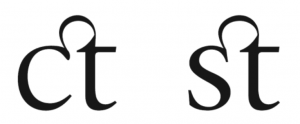
- Stylistic: They are used to resolve unwanted character collisions that happen when some letterforms combine. They give aesthetic refinement. Bellow is a great example of Stylistic ligatures (Cullen, 2012).
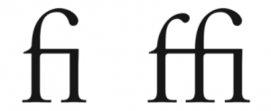
- Lexical: They represent composite vowels like aesc and ethel (Cullen, 2012).

- Discretionary: Many typefaces contain these. They add stylistic grace with ornate/historical nuance (Cullen, 2012).
- Ampersand: It symbolises the Latin word et – means “and” (Cullen, 2012).

Hierarchy
Its the rank or order of importance.
This is a key tool for designers and when done correctly it makes the viewer look where and when you want them to look. When this is not present is can cause the viewer confusion and frustration. One can emphasise by using size, weight, colour, style and placement. (Spiekermann, 2010)
Leading
This refers to the amount of horizontal space between two lines of text. It’s measured from baseline to baseline. When the distance between the leading and the point size is applied correctly, it makes the text look great.
Letterspacing/Tracking
This refers to the overall spacing between letters in a block of text. The larger the type, the less letterspacing is required.
Type distortion
It’s important to avoid widening, outlining or shortening the type selected; the designers who created them have created them with the ideal proportions, it it doesn’t fit, its better to change type than to try and force it (Spiekermann, 2010).


Special characters
These can add a little bit of character and quirkiness to your work when done correctly.
- Ligatures
- Numbers
- Smart quotes
- Swash characters
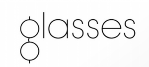
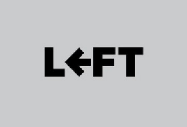
Wordmarks
These can come in many forms:
- Script/Calligraphic
![]()
- Typographic
- Personal brands


- Custom type: This is a great option when an accompanying symbol doesn’t fit the style; the wordmark logo must then be made distinctive by applying appropriate design distinctions. Like for example: Colour, size, serif, san serif, lower case, upper caser, weight, etc…
To make the wordmark logo more readable using lower and upper case is useful as the human eye distinguishes the letterforms more easily.
- A twist: Giving your wordmark a distinctive look using a simple tweak to customize the mark is a great way to have a more recognisable brand. It could be done by adding a ligature, a notch, a colour difference, playing with positive/negative space, kerning, letterspacing or really any twist that makes it unique and different from the standard typeface.


“Words have meaning. Type has spirit. The combination is spectacular” – Paula Scher.
I tried doing this using Procreate to strengthen my typography skills, here is how I got on:

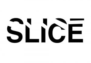


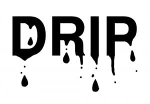

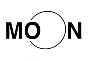


I had loads of fun making these; I did four different versions of the word ‘slice’ as I kept trying to improve it and push myself. My favourite ones are the word play on ‘charge’, ‘umbrella’, ‘Moon’ and ‘Drip’.
References
- Brown, T., 2015. Caring about open type features. [online] Practice.typekit.com. Available at: <https://practice.typekit.com/lesson/caring-about-opentype-features/> [Accessed 9 February 2021].
- Cullen, K., 2012. Design elements, typography fundamentals: A graphic style manual for understanding how typography affects design. Rockport Pub.
- FontShop. 2021. Glossary. [online] Available at: <https://www.fontshop.com/glossary> [Accessed 8 February 2021].
- Klimchuk, M.R. and Krasovec, S.A., 2013. Packaging design: Successful product branding from concept to shelf. John Wiley & Sons.
- Landa, R., 2018. Graphic design solutions. Cengage Learning.
- Lupton, E., 2014. Thinking with type: A critical guide for designers, writers, editors, & students. Chronicle Books.
- Spiekermann, E., 2010. Meet Your Type. 1st ed. [ebook] SI FONTSHOP INTERNATIONAL, pp.7 – 11. Available at: <http://104.236.43.209/pdf/fsfinalbook_single.pdf> [Accessed 8 February 2021].