Companies that produce great designs

As part of our IXD302 module we were tasked with the following:

  1. Find 3 examples of local companies, UK and Ireland that you admire and that represent great design/wok and that you would like to work for
  2. Also three examples of international design firms that you believe are world leading and produce exceptional work – ones you would aspire to work for.
  3. Write a short paragraph on each and show some work examples to back up your thoughts

Things I would like to have in a workplace

Before starting my search I decided to narrow down my search by identifying the key attributes I would like to have in my future workplace.

  • Innovation
  • Flexibility
  • Creativity
  • Growth opportunities
  • Feedback
  • Mentorship
  • Travel opportunities
  • Driven
  • Exciting
  • Learning opportunities
  • Friendly
  • High quality content created
  • Collaborative
  • Great pay
  • Focus on work/life balance
  • Learning Opportunities
  • Good fitting environment – it is important to be mindful of the environment and that you are a good fit for it.

Local companies I will be investigating:

To find local companies I read an article posted by Tech Behemoths

International companies I will be investigating

  • BigDrop
  • Amazon
  • Disney
  • Pentagram
  • Clay
  • Neuron
  • Firefly
  • Raw Studio
  • Milkmonkey
  • EA Mobile
  • Wandr
  • Neuron

Creative entrepreneurship

As a designer I must work on my communication skills.

I should aim:

  • To be introduced to professional practices within the creative industry, career options and skills to improve employability.
  • To demonstrate a clear understanding of idea generation and research tools for digital product design.
  • To demonstrate skills in written and verbal communication within a professional context.
  • Working on paper and supporting research and independent study. Reflecting and evaluating your work in a professional context.

I will need to

  • Develop professional practices skills and employability.
  • Make a good CV, cover letter.
  • Learn how to give a pitch and confidently present ideas.
  • Create products that will solve problems.
  • Record my idea generation process and the research that leads me to my final design outcomes.
  • Produce work and research and take on feedback within the allowed time.
  • Aim for personal development and career development.
Feedback should be ongoing and it will come in 2 different forms:
  • Formative feedback: this is the kind of feedback that helps the work progress and its development.
  • Summative feedback: this is the feedback one receives after the work has been handed in.

Idea: It might be beneficial to leave my work in the studio; like a printout and ask for feedback, it will be a great help as showing my work will get me better feedback and therefore better results.

Preparing for Placement

  • Always ask, mentors that simply refuse to help are useless to me as a young designer as they don’t help me increase and hone my skills. Do no waste your time, it is not worth it.
  • It is ideal to recognize a bad situation when you are in one, if your studio environment is not helping you grow, then you should leave it. You are not only there to work but most importantly also to learn and improve.
  • As part of building up yourself as a young designer attending events such as the Belfast Design Week would be greatly beneficial.
  • Be aware of the challenges of your industry and how it is continually changing. AIGA (the professional association for design) has an amazing website which would make for a great resource.
  • The UX design collective trends has a great resource – 100 lessons for 2021
  • The article ‘are you a good fit for UX?‘ talks about skills you need to succeed in the industry; this would be a great learning resource.
  • Employability; it is essential that I identify my strengths and weaknesses.
  • What kind of studio environment am I interested in. It’s up to me to find the direction I want to go in.
  • Challenge yourself, this will help you grow as a designer, learn new skills and develop my design process.
  • When creating my portfolio to show to employers a mix of physical and digital work is a MUST.
    You can get ideas down on paper faster than on screen, these sketches are essential when applying for placement.
  • Don’t let an employer pay you less because they know you are willing to do the job simply for the love of it. Get you that money sis.
  • You need to know what you are looking for before you start looking for it. Separate the jobs that are of interest to you and set aside the ones that are not of interest.

Possible job roles

  • UX designer
  • UX researcher
  • UI designer
  • UX engineer
  • Visual designer
  • Content designer
  • Front-end developer
  • Graphic Design
  • Product designer

Here is a link to a separate blog post where I carried out further research into the different career directions I can take.

Companies that have previously offered placement

  • Rapid7
  • Puppet
  • Fathom UX
  • Output Digital
  • David Henderson Design
  • White Space
  • Sugar Rush
  • Little Thunder
  • Cirdan
  • PSNI
  • Secure Broadcast
  • Core Systems
  • Global Payments
  • Qarik
  • Aurion Learning

Things I would like to have in a workplace

  • Innovation
  • Flexibility
  • Creativity
  • Growth opportunities
  • Feedback
  • Mentorship
  • Travel opportunities
  • Driven
  • Exciting
  • Learning opportunities
  • Friendly
  • High quality content created
  • Collaborative
  • Great pay
  • Focus on work/life balance
  • Learning Opportunities
  • Good fitting environment – it is important to be mindful of the environment and that you are a good fit for it.

Career ideas

What can I do with my degree?

Here is a link to a great prospects website that aided me in my research

Its also useful to remember that employers sometimes accept applications from graduates with any degree subject, don’t restrict your thinking.

  1.  UX designer

As a UX designer, I could work across all sectors of industry including private companies, public bodies like central and local government, non-profit organisations and charities. These can range from large multinational companies to small and medium-sized enterprises (SMEs).

You could work in-house for a company in a range of sectors, including:

  • education
  • banking and financial services
  • health
  • manufacturing
  • public
  • publishing, media and broadcasting
  • retail and sales
  • telecommunications.

I will continue to research bit by bit per week.

Portfolio research and Inspiration

As a way to improve my portfolio website and my career prospects I decided to conduct some research but first I decided to make a list of the things I would like my portfolio to be:

  • Portfolio site and content strategy. My Instagram, LinkedIn, Slack must be active, functional, consistent and professional; they should all match, think brand recognition.
  • My portfolio should be simple and functional.
  • I will aim to tell the viewer a story when writing my case studies.
  • Skills I would like to include: Wireframing, prototype testing, web development, illustration, branding, Iconography.
  • Design experience I should include: feedback Stephen (client) gave for the work I did on the ice cream shop logo as a quote for my portfolio page on the logo design.

Learning from others

I started off by looking for inspiration in Pinterest and then created a Pinterest board – I will be updating this board as I work on my portfolio throughout the semester. Here is a link to my board.

So I decided to take a look at some of the portfolio websites some previous IXD students completed while at the same stage that I am currently at to better understand what the expectations are and to learn from them.

Calum Dixons

Dixons website attracted me due to its simplicity. In his main/home page he uses a main title and a secondary title (information architecture) as a warm and short introduction. It makes me as the user feel welcomed and drawn in, this is something I would like to do in my own website.

He also added a little cute thing in his title home page where he added gifs over the underlined words. This adds a level of quirkiness and familiarity that made visiting his website all the better.

I noticed that he doesn’t have a full CV, just a sort summary of one. Nice and brief. I would however have added a call to action button to download his full cv, personally I think it would have polished his ‘About’ section and allowed possible employers to get his full experience. I do however like how he gave a short summary of his experience. It made it easy and simple to digest. I really liked the aesthetic he created by being consistent with his black and white theme. This also made it easier to digest the information.

These design principles – especially his idea of a summarized CV is something I would love to include in my own portfolio website.

I liked his use of relaxed and informal language in his contacts section of his website; I appreciate the fact that he didn’t use an email box and instead he put his email address with a link to send the user straight to their email to contact him. He used playful language for his social media handles which was funny and cute- a very nice idea I would like to incorporate into my own website as it fits my brands tone of voice.

Take notice of how he added a bit of playfulness to the image introducing one of his case studies by adding a little motion for his case studies when you hoover over it – its awesome. I also like how he very briefly introduces his work in his home page.

He shows his research first, then his rough drafts, then his thoughts, then final products and reflections (they are super important).


Matthew McLaughlin 

When you first enter the site, you are met with big text introducing his skill sets and ability to produce clean and simple design – his ‘home’ page is easy to read and follow. I like that he gave a quick, short bio about his skill sets, values and where he can be found on social media.

I like how he uses colour without making it overwhelming or overpowering and how his consideration for colour, type and information architecture ensures that the content is accessible.

Overall I think that this page is simple and aesthetically pleasing which easily engages users.

His layout never chances for his case studies, it gives a nice flow and continuity for the site. The length of his case study is ideal – not too long but with enough information to interest prospective employees or clients.

I also liked his use of a sticky navigation bar as it made it easier to find your way back and navigate the site.

I really enjoyed his tone of voice throughout the site – relaxed, friendly yet professional as it made you feel like you were actually talking to him and it also reflected on him making me think he might be a friendly person in real life.


Alex McCormick 

*** Her website is no longer available so I can not show any pictures of it ***

Alex works in whitespace now (small company, they only ever take one student on). She shows more than the app design, she also shows the different elements and illustration she created for it. I really liked how she also showcased her other interests that are still relevant to her thought process or how she tackles a design problem.

When the time comes I would like to also have a section for my illustrative work.


Gemma Ferguson

What stood out to me the most in Gemma’s website was her layout for her case studies as it was clean, simple and easy to follow – it felt like I was being guided through the information.

I also liked how she used a banner at the top of her case studies as a way of a preview – I also really appreciated the fact that she toned down the colours of the banner so it would not take away from the information and allow the writing to be seen clearly.

Gemma utilizes white space very successfully and consistently in her case study area making it easy to read and understand. I also like how she showcased her sketches as a way of explaining her design thought process.

Reflection: I would like to apply a similar style in banner as a quick introduction or preview into the work explained in the page. I also want to step out of my comfort zone and maybe use my white space more successfully.


I then decided to look at some more experienced designers


Illustrated by Mabel

This was a happy accidental find. I like how she used a collage styled way of showcasing her illustrative work while still keeping the artwork organized in a grid layout.

I am not in love with her menu bar – I think it gets confusing and that she added too many options making it easy to get confused, I think that for example the ‘How can I help you’ section of the menu bar is not needed and that the ‘contact me’ section can just as easily cover this need.

I like that she kept a white background so her work would not be obstructed or upstaged.

I really liked how when you hover over one of the items on the menu bar they are highlighted in pink and underlined, it is a small touch but it really helps to draw in your attention and it fits her website style perfectly. I do however think that the pink is too light and a slightly darker colour would help resolve the contrast issue.


Owltastic

This is an incredibly beautiful website and it was an honest joy to scroll through it and view it. It left a very positive and lasting impression (Something which I would ideally be able to do with my website).

It was different, memorable and kind of quirky – the message she shares as part of her intro is also perfectly complemented by the artwork behind it. It is simple and uncomplicated and while it is a drastic change in style compared  to the previous websites I have looked at; it proves that colour when used correctly can be incredibly successful.

The text stands out and the call to action button comes in at a perfect time to encourage interest.

Something I found quite interesting is that while she does provide a brief preview of her work, her case studies are explained in medium so essentially her portfolio is an organized guide or way to show her work a posted on Medium and Dribble which is a very interesting way to utilize a single page website.

Brief and to the point – you can see everything is very carefully considerate and refined and after reading her blog post on re-designing her website I can see why as she has been working under the name ‘owltastic’ since 2008 meaning that she has been able to refine the design and use her many years of experience to make the successful website I see now. Practice really makes prefect.


Vandana Pai:

Her use of typography is awesome. It takes a real skill to reduce a site down in the way she has done it.

Her logo is also incredible – I am kind of in love with it tbh.

The way the case studies have been displayed is simple gorgeous. A quick and simple description is given. The only part of the text that overlaps with the coloured boxes are the titles for each project.

Simple, collected and easy to use.

I like how she continued with the same box as she puts in a small box as part of the preview of her case study in the main page. I would argue that the content is lengthy – especially for my purposes but display wise her design is very easy and simple to understand – very successful.


Here are other great examples I also looked at but did not decide to talk about in great detail

  • Dawson Andrews is a great local NI company.
  • Jordan Moore
  • Jack Mcdade has a great and unique website with funny little intros of himself. It was enjoyable and entertaining but it did feel crowded. I must give it to him though, it was not boring.
  • John hicks designhas a great layout example for the case studies.
  • Xavious Cusso – now this is a cool website although it was at times complicated and kind of confusing. Very cool and engaging though
  • Tiffanie Mazellier– Incredible, simply incredible. It is definitely worth a look. She was featured as Site of the Day for May 23, 2020 in Typewolf

I like how when you hoover over an option in the menu bar, it is highlighted by a cool little doodle looking circle.

I kind of lost my mind when I saw the cursor change to be a circle with the phrase “See case study” – breathtaking.

When you hoover over the line drawing a real-life picture of the designer comes up which as you move the cursor over the image becomes distorted – again very interesting and engaging.


Reflection

The best design is the design where there is nothing else to be taken away


Content planning for my portfolio


Considering my UX workflow/Design thinking

Discovery/Research

  • Research for Inspo: A very useful tool for this is Dribble, it’s like Pinterest for designers – some of the UI in there does NOT work though so take the designs there with a pinch of salt if you will. Just researching on dribble is not discovery though. Discovery is finding designers and finding out how they structure their website and how they work, what their process is like.
  • Understanding my user: Conducting discovery is simply searching for data, and discovering what my audience needs and understands. What words do people type when they search the web? What kind of language do they understand? Google trends is a great tool for understanding your audiences vocabulary. Researching buzz words around the industry and seeing what the best fit is can be greatly beneficial like for example how in the UK the word ‘placement’ would be not be recognized in the US as they would instead use the word ‘Internship’.
  • Getting started on paper: sketches, mind-mapping and general idea generation. NEVER EVER jump straight into software, first paper and pen

Things I need to consider?

  • Be specific:  Specify that you are looking for a year long placement/internship in your portfolio. Narrow it down.
  • Skills: What can I do? Can I do it? How can they contact me? As a designer the portfolio is a must, it is way more important than a CV, it acts as a meet and greet. Show what you are really good at, what IXD activities you like to do? What makes you different from other designers?, On which projects did you bring the most values? What interesting stories can you tell about the work you did? Show that you can do the hard work that comes before the pretty pictures – SHOW YOUR WORKING OUT, think Math GCSE.
  • Case studies: they will get you a job.
  • Call to actions: Every homepage should have a call to action. Introduce yourself first though, then add a call-to-action button. Treat it like a real conversation. It should ideally take the user to your portfolio.
  • Text design: what typeface best suits my portfolio
  • Sketches: Show your thought process and how you start on paper.
  • Visual design
  • Prototype/build: This is the part where you build it. Use Figma for this also to show the usability, make it there so the user flow is not only shown but also functional so you can see what stage you are in and how it presents.
  • Test: surveys, user tests, etc…
  • Discuss your work: This is when you show it to other people. Show it to more than your friends as others give more truthful opinions. Get advice from peers when at all possible. If needed go back to the sketch stage and fix the issues.
  • Deliver but keep refining

In my portfolio what is the most important thing to show?

  • Work
  • Contact name
  • Name
  • What am I?/What kind of designer am I? Does my portfolio reflect that?

What to include into the case studies?

  • The problem
  • Who you worked with?
  • What tools you used?
  • Discovery phrases (how you go about solving the problem?)
  • The process you used to overcome the problem: the lo-hi wireframes, prototypes, sketches, personas, user journeys and research.
  • Challenges you faced and overcame – understand the problem and outline the solution, even if you don’t have time to overcome it.
  • The final outcome

Initial ideas and sketches

As a rule I like to get started on paper, I noted down some quick ideas of how I want my content to be laid out and also some quick points of what information I should add.

I did a quick wireframe of what I would like my website to look like, I want to create a website that will flow easily and will be easily read.


Writing and planning my content


Home page

Here I will add a short introduction at the start of my website – it needs to be simple and concise. It needs to draw in the viewer and also quickly inform them of the key information I need them to know such as my name, what I can do for them and possibly where I am based.

  • My name: Emily Ussher
  • Short description: I am just another Irish/Venezuelan Product/UX/UI designer and self-appointed explorer designing her way through life with a user centered state of mind.
    I am currently looking for placement, get in touch if you would like to hire me.
  • Call to action button: Go on, take a nosy

Reasoning: I included my name at the top, some relevant information about myself and what I do/the services I can offer. I might add a call to action button that playfully encourages the viewer to keep on looking – “Go on, take a nosy” seems like a cute and fun way to encourage the viewer to peruse further my website, that and it matches my friendly brand vibe.

I will also need a short introduction to some of my work – Maybe I could talk about some of the skills I used when working on the project. I will need to give a short overview and an eye-catching image to draw the viewer in.


Contact/Get in touch

I will put this information at the bottom of my website as a footer – I think this should remain consistent throughout my website, this way it will be easy to use and navigate making it easier for viewers to find my work and my socials so we can network.

  • Title: Get in touch
  • Call to action statement: Do feel free to stalk me online or even better contact me and maybe hire me?
  • Socials to include: Email, LinkedIn, Instagram and my blog


About

Title: Emily Ussher

Blurb: Hello! I am just another Irish/Venezuelan Product/UX/UI designer and self-appointed explorer designing her way through life with a user centered state of mind.
I am originally from Venezuela; I found my love of art when I moved to Northern Ireland at 13 as it gave me a communication tool that I did not have at the time. My multi-cultural upbringing has offered me a different perspective and point of view – something that is always evident in my designs.
My mission is to create and showcase unique, high quality designs in an accessible manner to make users interactions with content simple and easy.
I am currently looking for placement, so get in touch if you would like to hire me.
‍Call to action button: Want to see more? here is my CV


Case studies

App design – Bible app

  • Page title: Bible travel app
  • Brief: As part of our second module in first year we were tasked with creating a travel app. I decided to take a more abstract approach to it as I wanted to design an app that would stand out from the ones my peers would create.
  • Software: Figma, Miro, Procreate
  • Skills: Web design, Prototyping, Wireframing, User research, UX and UI design, App design.
  • Call to action button: Go on, take a nosy …
  • Discovery: I started off by considering all the different areas I could technically consider as ‘travel’. I considered taking a more ‘normal’ approach but eventually decided to make the project a bit more personal to myself. I realized that there was a big gap for young Christians when it came to interactive apps that would not only teach but also guide them through the years as their knowledge and understanding grows – Three Sixteen was my solution to this problem.
  • Getting started on paper: A very important part of my design process is putting pen to paper. This is something I struggled with at the beginning as I was used to jumping straight into the computer. Having to slow down and actually have to think things through was a big help though. This is something I slowly became better at through the duration of my first year at university.
  • The problem: I decided to create a bible app as I noticed there was a very large gap in the market for truly interactive bible based learning platforms. I was largely inspired by some of my childhood books I had growing up that were truly interactive in the way of textures, colours and imagery. I started thinking of how as I got older and my knowledge grew I started moving on from simple books to harder more in depths evaluations of the different books in the bible and how this process enabled me to further my knowledge. The problem is that this is paper based learning method that spreads out over many (very heavy) books; my aim was to digitalize this journey to create a platform were the user could learn and be guided as their knowledge grows. Three sixteen was my solution.
  • Designing: After sketching out my ideas I decided to focus mainly on the younger demographic or users that would be using this learning platform. I decided to use a lot of fun, eye catching colours to appeal to that age group. I designed my illustrations in Procreate. At this time I did not have much experience with this tool so this was a very good learning opportunity for me. I created a little character to take you through the app. I gave her a map to give the idea of taking a journey through the different biblical events.
  • Reflection: I was too quick to jump into procreate and I had not come to grips with wireframing at this stage – at least not correctly – I now understanding their importance and should I have a chance to work on this project again, this is one of the changes I would make to my process to improve my project
  • Peer feedback: This is something I found incredibly hard to do at the beginning – giving feedback. I found that people were not quick to give feedback due to fear of offending but I found the critical feedback given to be the most useful for me as this is what helped me improve the most. Click here to see my blog post detailing how I took the feedback onboard.

Branding


  • Page title: Branding
  • Brief: As part of our third module in first year we were tasked with designing our own brand and to develop our identity as designers
  • Software: Figma, Miro, Procreate, Photoshop, Illustrator
  • Skills: Web design, Prototyping, Wireframing, User research, UX and UI design, Branding and Illustration
  • Call to action button: Go on take a nosy …
  • Research and discovery: A big part of my design process is based on research and experimentation. I like to record this not only on paper but also on my research blog. I do not like designing in a vacuum so a big part of my process is also looking at other more experienced designers work and creating a moodboard; I normally do this on Pinterest. I wanted to create a modern yet timeless logo and wordmark – something that I would (hopefully) not cringe at in 10 years time. I have a great love for architecture and fine art so I wanted to incorporate some of those clean, modern and at times abstract elements that I feel best describe me as a designer as I like to apply my knowledge of other artistic disciplines to my work; in fact I often am inspired by visual artists like Alex Gross, Mr. Doodle and even some past IXD students like Inga Hampton.
  • Getting started on paper: Another big part of my design process is putting pen to paper. I started off by experimenting with the letters of my name to start forming my logo design. I took some wild turns along the way but I eventually designed my current logo by merging the ‘e’ in my name and the ‘u’ from my surname.
  • Going digital: I created my logo and illustrations using Figma and Procreate. I decided to go with an abstract and flowy design as I felt that this would best represent me. For my visual marque I started off with a simple line drawing but then decided to showcase my illustrative skills further by making an illustration of myself that looked more realistic. The profile illustration I use in my ‘home’ page was my final outcome. Here is the Figma file for my logo design.‍
  • Colour: I was careful in considering the colour scheme for my brand and website as I wanted to create an accessible colour scheme . I used Adobe Color to ensure my selected colours would be inclusive for all users. I decided to go for a soft, calming, fun and feminine aesthetic as I felt that it not only best described me and my personality but that it fitted my brand well also. I started by creating a gradient from my profile image for all my socials and went from there. Even before designing the new layout for my website I wanted to have a simplistic and minimal color palette as I wanted the focus to be on the work and not on the surroundings.
  • Website: Research. That is how it started for me, I found that visiting other designers websites and even some design agencies was a big help in informing me what good website architecture looked like, how to prioritize content and how layout has to be carefully considerated. I explain this in more depth in my research blog. I was encouraged to wireframe my designs to better understand how my website would work – this is a skill that I have improved upon since 1st year – slowly but surely and that I am still striving to improve upon. I created the design for my website at the start through trial and error (and many wireframes). I was trying to learn HTML5 and CSS so I could write my own website from scratch however due to time constrains I changed my approach. My old website (which I constructed is still posted on GitHub though). I also go into more detail on this process on my research blog.
  • Results: While there are still things I would like to change and improve upon, I have managed to create solutions that meet my current needs.

Designing with Content


“Well-structured content is the backbone and starting point of all successful web designs and user interactions.” – Karen McGrane content strategist.


What is content?

Content is not restricted to words. It can be understood as a way of showing what users need. Content helps to highlight what the users needs compared to what they want.

“As someone who writes for the web I want to learn what content design is, and how to start doing it so that I can communicate in the most user-centric and efficient way for my audience” – Sarah Richards

The content designed and created should be focused on the understanding of the user. As Sarah Richards (now Winters) explained it in her book; content design is simply data and evidence that the audience needs, at the time they need it, in a way they need it.

Richards then explains the content design process; Richards breaks it down into 7 points:

  1. Research: this is were it all begins. It can be desk research, usability research, expert research but there has to be data and evidence of what the audience wants and needs.
  2. User needs: User and job stories are key as they allow us to define what the audience wants from us. Do users have a problem? what is it? Can I solve it? As Sarah Winters put it in this article “When we write content based on well researched user needs it’s automatically answering specific tasks the user has at that point in their journey. This kind of content helps them move on to the next stage and, ultimately, reach their goal.” By conducting the research we can then understand the user’s journey (the offline and online steps the user must take to complete their task). What are the motivations of the user when they reach your content? How much effort did it take for the user to reach the information they needed and how much of it did they get?
  3. Channel and journey mapping: Consider which channels are the right ones to offer the information to the user throughout their journey. These channels could be a website, social media, advertising or even events; that’s why it is important to have all these things in mind when designing content as it offers us (the designer) the language, priorities and flow to work with. Understanding when and how to offer the information to the user can mean the difference between successful or failed content design.
  4. Language and emotion: The way people communicate, especially per section or even country can vary due to colloquialism  – An example that comes to my head from personal experience is how in my home country – Venezuela – some words that we would use with friends like ‘chama’ in Spain it would not be considered appropriate. Differences in terms, need to be considered when designing content. The language used for a product MUST reflect the intended audiences vocabulary, otherwise it will make the user-content interaction extremely difficult and rocky. Whilst language is a very important part of content design, considering emotion can be just as important; Am I connecting with the audience? What is my tone? Richards follows the following set of steps: What will the audience see (and where are they seeing it)? What are they hearing and who from? Which channel? ,How they are feeling, What will our audience be doing? What decisions do they feel they have to make?
  5. Creation: This process should ideally be very collaborative in order to find the best solution for the user.
  6. Sharing: This is an essential part of any designers creative process. Peer reviews whilst scary can offer valuable insight.
  7. Iteration: Learn – Apply – Move on

In Sarah Richards’s book (content design) she highlights the importance of certain content design components such as:

  • Push content: Look at this! Buy it ! This can be described as the content the designer wants to impose unto their audience. It’s content the user did not necessarily or directly asked for but still receives, like a notification.

  • Pull content: It is the description of a product or an eye catching fact, eg good price. This is the time of content that is specifically tailored to the viewer.

  • Ease of use:  fastest way to a happy audience is an easy to understand and interact with website. Knowing your audience can inform you what you need and how you need to execute it. Users will pay more if the interaction is easier; a great example of this was illustrated during Dr Boyd’s lecture where he remarked how users would knowingly pay more for the UK driving test by using other providers over the official government website as it was a very difficult website to navigate. They will especially remember a bad experience.
  • Trust: A trustworthy website will not only promote consumer trust but also loyalty. How does the website present itself? does it look like it could be a scam? Is it littered with spelling errors? if so this will most certainly not instill a sense of ease with the user. Ideally the website should be consistent throughout with its tone of voice, branding and identity.

Here is a marketing article I found written by Céillie Clark-Keane (Head of Marketing for Building Ventures) which I found very helpful. In this article the author highlights the importance of the next 7 marketing strategies:

  1. Building content communities: Building communities specifically around content sharing and creation allows marketing teams to continue to expand their reach, even with fewer resources.The image above illustrates how Slack communities have grown 2.5 times since 2016 and have over a million members. This highlights how communities like these offer benefits beyond networking. Tools like Slack, Twitter, LinkedIn allow you to tap into massive audiences by utilising a modern version of digital ‘word-of-mouth’ marketing, along with increasing brand awareness. As stated by  Masooma Memon (a SaaS content marketer) “Whether it’s content for social, your blog, or a webinar, it’s going to continue focusing on making your audience feel like a community,” she says. “Folks love this sense of community belonging. It makes them feel valued, so this trend should continue picking up pace.” which in turn will positively affect audience engagement.
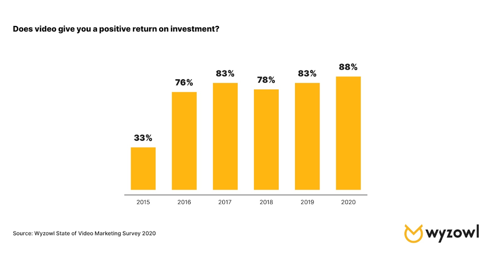
  2. Going live with video and webinars: Covid-19 has resulted in video and webinar content becoming vital, something that will not soon go away. “My guess is video marketing including the boom in live video will continue to grow in 2021,” Masooma predicts. But it’s not only because of in-person restrictions; there’s a reason why live video was trending well before the pandemic. “The reason? Video is a quick and effective medium to communicate your message and educate your audience. Consumers want to quickly get information and video marketing is the most effective way of doing this.”
  3. Improving content experience: sometimes how you’re interacting with content is just as important as what content you’re interacting with.  Content marketing trends are now focused on content experience, be it, interactive content or better UX.
  4. Focusing on products and services
  5. Repurposing content

(I did not go into detail in the last two as they are self explanatory).


What is content wireframing?

  • A content inventory (audit) is a great way of looking at the content or even the layout of other more skilled designers and see if you can apply or take as inspiration to produce your own ideas. Bellow is the example Kyle gave us.

I found a great article showcasing how to conduct a great content audit – The Step-by-Step Guide to Conducting a Content Audit in 2021.

  • Site-mapping your site is a great way to create a layout for your website on paper before actually bringing it to life.

Here is the example Kyle gave us:

And here is my version – It is still very rough, I will need to continue revising this and improving it.

  • Content wireframing can be considered as the skeleton of the website. Think of the outline of a building and how everything is placed around (the blueprints). Once this is established then you can start making a more detailed wireframe. Design small first then big but only in reference to designing for mobile and then onto desktop view. This should not be as detailed as an actual digital wireframe. These are to be done in great quantities and quickly; they are just a way of quickly noting down your thoughts and ideas.

Think (scale wise) mobile then Tablet then Desktop and then Desktop HD. This is the best way to accurately figure out where the content should go.


Learning from others

Bellow are some great designers with great portfolios I would like to further research.

  • Jack Mcdade
  • John hicks design
  • Xavious Cusso
  • Vandana Pai: Her use of typography is awesome. It takes a real skill to reduce a site down.

Reflection

This week was very informative, in all honesty I had no idea how much work I had yet to do. It however encouraged me to start my research and to develop not only my website, portfolio and CV but also my personal brand.

I also discovered the importance of content designing and how the users should always be the centre of my focus when designing. The user is key and I should aim to design with them in mind.


Tasks for 30/09/21

  • Write the content for your portfolio – in plain text or in html. Focus on the content. Using your inventory and content wireframes
  • Research and discovery – google trends/job specs/look at language. Look at some portfolios, really study it at a granular level
  • Content audit
  • Sitemap your site
  • Write site content – 3 case studies, home page, about page, contact page
  • Sign up for Webflow.

Icon recreation

We were encouraged to take a master–apprentice approach to our studies and development as artist; searching for artists and in some cases reproducing their work to learn new skills and improve.

We were tasked with breaking things down, analyzing and reproducing them.

I will now reproduce an Icon set given my my professor; that I could use for my Project 01 (travel app) or simply just as a learning experience. I will be using figma to complete this task.


I began by attempting 3 of the blue icons, bellow are my outcomes.


OK, so I made them supper small ( Clearly I didn’t think it through) and so when I made them bigger they became pixelated – It was really annoying as I had done quite a few in this way which meant they were no good. In a more positive note, I learnt an important lesson.


I wanted to really challenge myself so I attempted to do the map from the second set of icons; this one was more complex than I thought as there were curves involved in the design. Overall I am quite pleased with my final outcome. I need to practice more as they took me an embarrassing amount of time to finish.


IXD104 – Image and data visualisation – Week 1

Image and data visualisation

We have heard before ” a picture is worth a thousand words ” but by exploring non-verbal forms of communication we can introduce illustrative and diagrammatic approaches to communication.

We can even go as far back as the stone age where images were used for communicating; by paintings in caves.

One can’t read a picture but pictures can have a narrative when combined – they can even tell a story. Juxtaposition (making the ordinary look extraordinary, it represents one of the essential techniques in the Surrealism art movement.) can also be used on images to make new stories or narratives possible.

The aim is to not only create images but to also brief others through the creation of illustrative assets – conveying information effectively through imagery.

All images communicate.

Look up

Module breakdown

20 credits –> 200 hours –> 38hrs a week

  • Illustrative (30%) —> Icons and app – week 1-6
  • Diagrammatic (30%) —> Infographic – week 7 to 12
  • Blog (40%) —> research, discovery and backup work. Reflect on what you have covered in class, write and evaluate, research relevant designers/illustrators.

Book recommendations:

  • Data driven graphic design
  • Dear data

Remember to:

  • Break things apart and analyze them.
  • Break illustrations/drawings/images to their most simplest form to analyze them and learn.

Task:

  1. master –> apprentice approach, finding artists, reproduce and learn from their work.
  2. Breaking things down, analyzing and reproducing.
  3. Icon set –> create 5 icons that you can use in your travel app ( does not have to be travel in earth ) week 1 and 2. Eg space travel – retro feel? Travelling into the depths of the ocean. Think of travel in its broader term. Travel around town to encourage home tourism? DO YOUR RESEARCH!!! state your desired audience and design and plan it towards it.
  4. Redesign the icons given from the 2 sets and recreate them in simple shapes first.
  5. Research travel apps and what kind of place you would like to base your app on – be as imaginative as possible.
  6. Identify some travel app designs, highlight what it does.
  7. Mind map and development of ideas must be shown

Travel app

  • needs 3 screens (home/launch screen, a city/country/planet, details on the place
  • Working prototype

There will then be a group critique.


Semester 1 quick feedback:

  • Need more research – it was lacking in some areas – Needs to  be updated more constantly.
  • Alternative for WordPress – Tumblr ( but not covered by university ) or Notion –> if you do switch over then put a link to it from your campus press.

About me page

Long Bio

Hello, my name is Emily Ussher. I am a first year Interaction design student at Ulster university Belfast. I am originally from Venezuela; I found my love of art when I moved to Northern Ireland at 13 as it gave me a communication tool that I did not have at the time. I love to travel and create art. My multi-cultural upbringing has offered me a different perspective and point of view – something that is always evident in my designs.

Short Bio

“Just another Venezuelan/Irish self-appointed explorer, studying Interaction Design and doing what she loves”

My mission statement:

“To create and showcase unique, high quality designs in a professional manner to help other people achieve their goals and promote my skills” 


Business card

Pinterest moodboard link.

I really liked the idea of putting a cute illustration in the front – I should maybe create an illustration of myself to use as part of my brand?

I like the idea of using different colours for the same design of business card – it gives a fun and quirky feel while remaining professional.

Here are some of my initial sketchbook ideas:

Figma link. This is the link to my business card digital designs.

I then changed my colour scheme and general layout.

This is my business card design, I created two options for my information section, a minimal one and a colour one, I think I could use both depending on who the client/employer is and what they prefer.


CV

Pinterest moodbard link.

Here is my current (boring) cv —-> Emily Ussher cv.

Bellow are some of the CVs I found that inspired me the most – I really like the illustrative style of each one of these, I would love to incorporate this style into my own CV.

Figma cv project progress link.

Content Audit Exercises

Creating a word bank

The brand I choose to base this exercise on was Starbucks as I like  their products and their overall aesthetic.

  • Rewards
  • Sweet
  • Treats
  • beautifully crafted
  • Roast
  • High quality

How they speak to their customers

  • Friendly
  • Helpful
  • Respectful
  • Kind
  • Professional

Writing for the website

  • Professional
  • Simple – clear to understand
  • Short
  • Catchy
  • Engaging

Creating content for brochures and catalogues

  • Consistency
  • Logo
  • Use of company colours
  • uncluttered
  • Simply but efficient

Brand dictionary

Calls to action in the marketing and advertisement

  • Starbucks rewards
  • Starbucks app
  • Starbucks deliveries
  • Starbucks stories

Contact us language

  • About us
  • Customer service
  • How can we help you
  • To get in touch with our Customer Care team, please send an email to UKInfo@support.starbucks.com,

Brand self description

  • Mission statement ” To inspire and nurture the human spirit – one person, one cup and one neighborhood at a time.”
  • High-end
  • Great taste
  • customer loyalty

Terminology for product ranges, processes and procedures

  • Blend
  • Roast
  • Warmth
  •  Sips of delight

Tone of voice guide

3 words that describe the brands essence

  1. Quality
  2. Connection
  3. High-end

A short strapline summarizing its raison d’etre

Starbucks aims to create quality blends of coffee, to be a different kind of company and to enrich the human spirit.