IXD103 – Portfolio sites – Week 9

Assessment criteria

Demonstrate an understanding of personal brand identity as applied to a portfolio website; it should include a consideration to brand identity through voice and tone, considered content and visual cohesiveness.

Considered content: what needs to be included
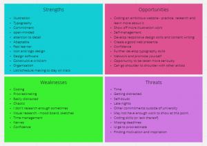

S.W.O.T Analysis

Strengths, weaknesses, opportunities and threats. It’s worth doing this when considering undertaking any project yourself. List these things in squares. For opportunities think in regards to the website and for threats think what is in the way of you completing what you want to complete. My main weakness is coding so I could maybe try to code something more ambitious to try to learn, however a threat to that might be that I might not have enough time.

SWOT excise
Miro board link of my S.W.O.T analysis here.

What should I put in the portfolio site?

  • Things you put down as strengths – eg logo, illustrations, icon design

Tips for procrastinators

  • Get someone to check in on you to show them your work – helps hold you accountable
  • Set mini deadlines for yourself
  • The more weaknesses you overcomes the more strengths you will have
  • The more threats you solve the more opportunities you will have

Mission statement

What is the purpose of the project? What problem am I trying to solve? What is my portfolio site for/what will it accomplish?

Create a mission statement before starting to design a website, it will provide a clearer picture. The primary function must be showing my work.

Miro board link

  • Experience building and designing a website
  • To showcase finished and ongoing work – Display my work/strengths
  • To network, present myself in a professional and friendly manner and to give the viewer/client a sense of who I am
  • To create a portfolio for my work
  • To show my work to prospective clients and increase the amount of freelance work I get to do – create a name for myself
  • Networking
  • To create a web presence
  • To show employers who I am and what I can do
  • Gain more exposure
  • Online profile to promote work
  • Generate a level of professionalism
  • Demonstrate skills level in website building
  • Help me get a freelance work/work placement
  • Present my process
  • Develop an online presence
  • Present myself as a brand and promote my brand
  • Contact me more easily
  • Demonstrate my personality through a clear tone of voice
  • Become more recognised
  • Show my creativity
  • Learn how to employ new things with HTML5 and CSS to make a great portfolio
  • Present my process (research or writing – case studies)
  • Make it unique and memorable

My mission statement:

“To create and showcase unique, high quality designs in a professional manner to help other people achieve their goals and promote my skills”


Priorities for my website

Primary:

  • Online profile promotes work
  • Allows clients to contact more easily
  • Displays my work well

Secondary

  • To build a reputation for my brand
  • Gain more exposure
  • Present my process (research or writing – case studies)
  • To showcase finished and ongoing work

Tertiary

  • Unique & memorable (has to do its primarily function well before it can be unique and memorable)
  • Generate a level of professionalism
  • Demonstrate my personality through a clear tone of voice

To build a good hierarchy/lists of priorities you have to find what needs to be done for other things to eventually be developed.

The work should be the MOST important thing – the brand is almost secondary to the work.
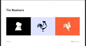
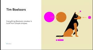
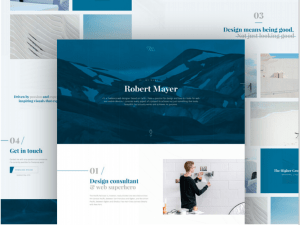

Inspiration

Look up and research them – evaluate and blog this.

For design – NOT a tone of voice guide

  1. Lucian Slatineanu
  2. Vladimir
  3. Sean Halpin
  4. Rachel Schmitz
  5. Taylor Ward
  6. Steven Mengin
  7. Edward Lim
  8. Kathleen Warner

IMPORTANT —> Don’t start with “hello there” or something similar; its been overdone and we have explored better writing practice at the start of the semester so revisit that. Tone of voice provides an opportunity to be more unique.

For Case studies

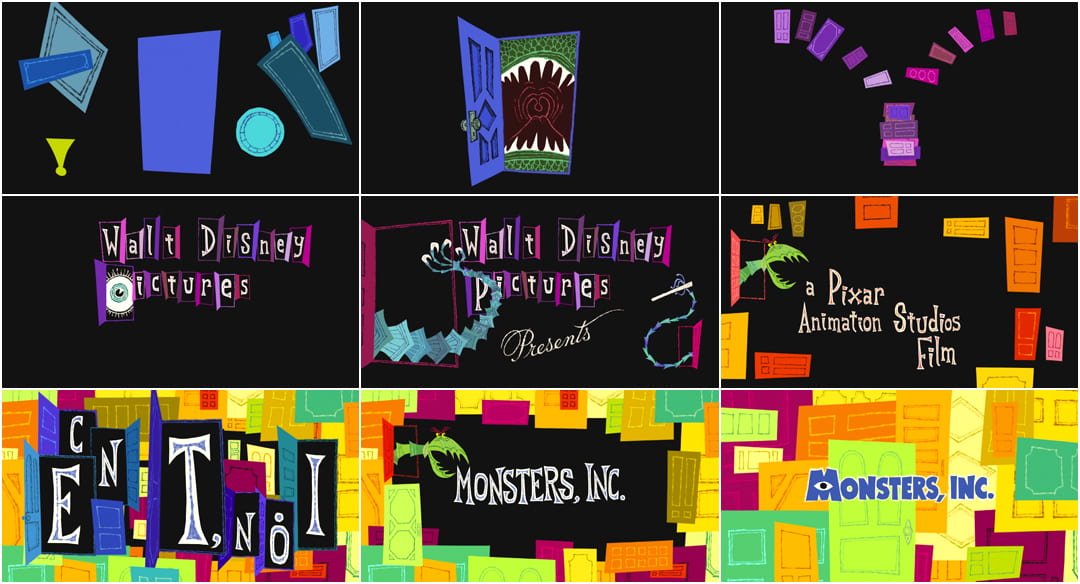
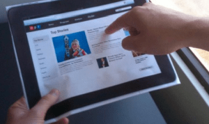
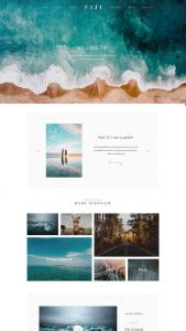
  1. SFCD —> They describe the function of their work through animation in detail . They use a large header followed by a short summary – awesome key introduction. Using animation and motion can be difficult – especially for beginners – so use it sparingly. They have also used a multipage site. It is a superb website!
  2. One page love —> try to tackle your own content for your website first, reviewing too many websites can sometimes trip you up. It becomes an overload of information.
  3. Site Inspire —> full of good examples. Immersing yourself in good design work is just as important.

Web standards

  1. Media Queries —> good for reference and insight in to how responsive sites interact.
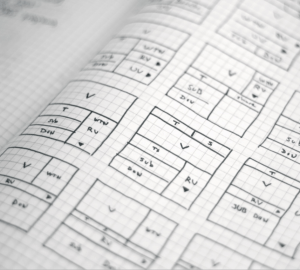
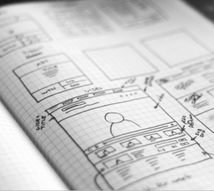
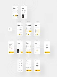
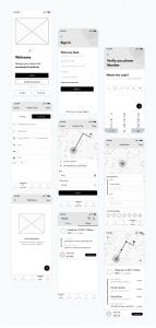
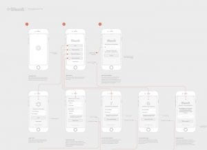
Wireframing

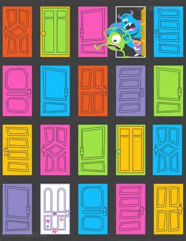
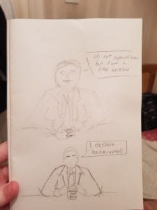
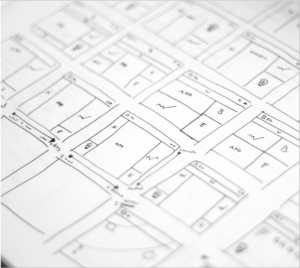
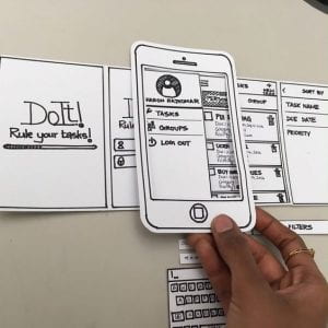
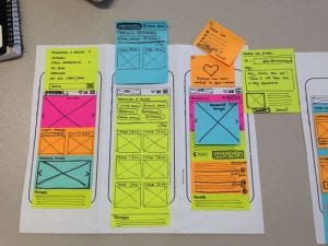
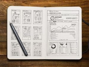
It doesn’t need to look pretty – it is simply a plan for a web page to work from. Start on paper – its quicker and easier. (Examples bellow)

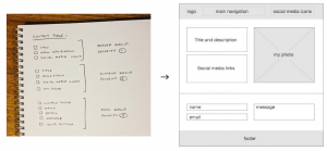
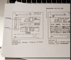
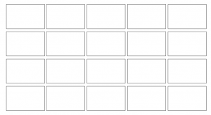
Start with loads of ideas – start small and fill the boxes, this can help get your flowing. (Examples bellows)

You can even create a key for your interactive elements, that way you can plan in boxes instead of having to spend time drawing.

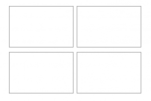
Then pause and pick the best ones; then repeat the process, drawing the promising ideas out again in higher fidelity and in larger boxes (I could try making them bigger – maybe 4 boxes per A4 page) – an idea should emerge from that.

You can then try making a:

Paper prototype (at actual size)
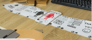
Digital wireframes

Digital prototype

Tips

  • Simplify it for yourself
  • Don’t stick to  your first idea and force it to work – EXPLORE the other options!
  • Make connections through iterations and analysing what’s working/doesn’t work
  • Reject what doesn’t work and go a different direction
  • You won’t know what is your best idea if you haven’t explored all of them
  • Language shapes text. Use real text when putting in placeholder text and not ‘Lorem Ipsum’
  • Start with your current websites from IXD101 – how can these be modified? How does the brand map to it?
  • Idea generation Osborn checklist. Substitute –> Combine –> Adapt –> Modify –> Put to another use –> Eliminate –> Rearrange

Substitute — Different ingredient? Other material/processes/place? Other approach? Other tone of voice? Someone else?

Combine — Combine units, purposes, appeals or ideas? A blend, alloy, or an ensemble?

Adapt — Is there anything else that works like this? What does this tell you? Is the past comparable?

Modify — Give it a new angle? Alter the colour, sound, odour, meaning, motion and shape?

Put to another use — As it is? If modified?

Eliminate and/0r add — Can anything be added? time, frequency, height, length, strength? Can it be duplicated, multiplied or exaggerated? Opposites? Backwards? Reverse roles? Change shoes? Turn tables? Turn other cheek? Transpose ‘+/-‘? Can anything be taken away? Made smaller? Lowered? Shortened? Lightened? Omitted? Broken up?

Rearrange — Swap components? Alter the pattern, sequence or layout? Change pace or schedule? Transpose cause & effect?

Here is a link to a Miro board template

“It is easier to tone down a wild idea than to think up a new one” – Alex Osborn

  • Be ambitious
  • Explore options and opportunities
  • Consider web standards

To do

  1. Read and blog the article by Adham Dannaway.
  2. Read and blog article by Dustin Senos
  3. Content planning – element collage from last week will help for interactive/design elements. Consider the formatting and placement of elements. What projects should I include? In what order? Text to include? Informative/for tone/bio? Contact details? Any additional details/links? What content/Imagery?  —–> what do I need to say and how am I going to say it? Is information better as text or diagram? Will it be text/hero/image lead? What is my first impression going to be? Will it be a single page or multiple page website?

DEDLINE 07/05/21 at 11am

checklist

  1. Bio & Brand Dictionary
  2. Monogram
  3. Wordmark
  4. Visual Marque
  5. Brand Guidelines
  6. Website Design
  7. Website Build
  8. Research blogs

Here is the link to my Gantt Chart – I created this to try and help keep myself organised and on track.

Visual identity and drawing – week 4

In 3 weeks (week 7) we will have a group critique ***

Recap

Bio, word associated with our values and tone of voice. We created unique marks based on our initials and investigated appropriate typefaces that encompass our character and personality. What am I doing and why am I doing it? To get an understanding of the foundations of branding so that we can create authentic branding for ourselves and for potential/future clients, to solidify our ideas and develop our skills. To be unique and stand out in industry. We are trying to make ourselves look desirable/employable. 

In my course alone there are 22 people, they are competition in the industry, that is why standing out is so important. I will be in competition with many people, I NEED to stand out. Who I want to work with will find me through my brand. MY brand will also dictate how people will perceive me.

Kinds of identification: uniqueness, value, holding power, description, association, tone of voice, graphic excellence (quality) reputation, discretion, repetition (& recognition). Which ones will my brand be focused on?

The power of identification and recognition – think of McDonald, Apple, Nike, Twitter, PlayStation, even if you don’t see the full logo in its original colour it is still easily identifiable.

Design program

When a trademark is used to identify an organisation it works together with other graphic elements in a design programme, each part of the plan for a visual identity. Through this a company can inform how it is (its values) how it wants to be seen (it’s image). A large part of it is informing people/the customer.

Includes basic elements like:

  • Name mark: company’s name written in a special way (typography)
  • Symbol: A picture mark or decorative abbreviation.
  • Colours: Selected colour(s)
  • Type: Selected typeface(s)
  • Fifth element: An extra, decorative element. ( example 1 monogram used to create an icon set; this gives an expansive tone of voice)

Note —> you would never use a name mark and a symbol, it is one or another not both.

Pictorial & abstract

Pictorial marks are non-abstract and iconic in nature. They depict a stylised version of something – anything’really: a fruit ( like the Apple logo), a mythical beoing ( like the Starbucks logo), an animal


This kind of logo may be preferable when your brand is a bit abstract or open to interpretation. Pictorial marlks can also be really efective is your brand lends itself to a specific image: Apple and Jaguar are good examples


Abstract marks arre abstract, they usualky consist of very simple geomatric shapes


They lend themselves to brands thata are more descriptive because their logog just needs to be  recognisable by repetition


Combination marks

A wordmark combines with either a letter mark or a symbol. They are versatile and can use the symbol or the wordmark in isolation as well.


  • Tim Boelaars – forms and shapes are key for his designs
  • Jeroen van Eerden
  • Fabio Basile
  • Vic Bell
  • Ivan Bobrov
  • Airside
  • Jason Santa Maria

Process

Thinking by drawing – drawing loads and loads of ideas. Thinking it through as you draw. How can I represent it pictorially. You should put EVERYTHING down, it is an important part of the design process; put down your mistakes, realistically your idea stage should be 95% mistakes.

Pictorial Superiority effect

Humans process visual info 60,000 x faster than words


Sketch noting

The 5 basic elements: circle, square

Always keep a sketchbook with you; a good sketchbook will have a mixture of words and drawings.

Containers, Shadow & highlights, line and dividers, shapes, compound shapes, objects and icons, type styles, layout and structure (3points x 3 bullets).

Mind Maps: Helps put it all together.

Think outside the box

—-

Task

  1. Doodling talk by Sunni Brown – watch and analyse
  2. Book – Ed Emberley ( Make a world)
  3. Penguin drawing task on slides
  4. Make a mind map with words about yourself and use that as a guide for your word mark. Select the ones that are important. Find the important word and sketch out what you think it is.
  5. Sketch the following objects using the techniques talked about today _ iPad, Laptop, Camera, Sketchbook, Pencil, Browser, USB stick, Paper, Tv and Radio. ON PAPER.
  6. Pick 5 key words from your week 1 word association mind maps/bio (these could be your values) and explore a range of ways to represent them visually.
  7. Research visual marques – design a symbolic
  8. Look up brand new blog

Next week – Brand guidelines and colour.


Tutorial:

look up venezuelan type foundries

quirky – duality of 2 words organisation but whimsical nature. visually have loads of variety. ditot thick and thin lines.

type foundries that have quirky aspects. Fonts myths look up

variable fonts – more technical, google pioneered them.


Typography moodboard

We were tasked with gathering inspiration, identifying all different types of typography.

Create 2 mood boards:

  • Magazines and Ephemera
  • Digital (photos, online) go for a walk and look for type in your environment, finding letter forms in different applications.
  • Typography based shapes – a ladder, a desk, a window, etc… and identify what makes that shape recognisable? Bold and curved? simplified?

Moodboards are a good way to convey information and inspire. They allude to a tone of voice and briefing. Pinterest is great for this.


Click here to see my Pinterest moodboard.


Magazines

I really enjoy the playfulness created by overlaying squiggle like letters on top of bold, attention catching typography. It made me smile when I saw it. It effectively conveys an aura of playfulness and child-like innocence that I found very visually appealing. One typography contradicts the other – The white is structures, bold and organised whilst the quirky letters on the top are whimsically weird.

I would love to integrate some of this into my own designs, make it more abstract and interesting to look at. I tried out the style with my own name in my sketchbook (shown below). I think it’s a really friendly approach to typography that I would like to integrate latter on if it fits the theme.

Bellow are some other magazines that I really enjoyed researching, they used playful and at times abstract typography.

Typography based shapes

Feedback:

Work within the constrains of the shape you decide to work with – he likes this idea. Look up Paula Sher and the monogram she did for The New School – a modular, elongated letterform approach. Matched up letters. Stretched letterforms.

The overall theme that stands out in my moodboard was stretched letterforms and playfulness. I should explore this further.

Quirky and eye catching.

Geometric typography

Task

1 hour – write your first name using letterforms made only out of circle, square and triangle.

Consider

  • What is necessary to make the letters recognizable?
  • What can be left out?
  • How do you differentiate the letters but maintain a consistency?

Can be done digitally or on paper.

I decided to create mine using Figma, I originally wanted to create my name using all the shape options given and these were my results:

This is my initial idea, I used only circles, I wanted to play with negative space and stick to my favourite colour – pink.

It kind of reminds me of lights shinning in the dark or lightbulbs forming your name.

This was my second attempt, I wanted to allude to the letters whilst still using negative space and the circular shape, I like it but it is not quite there. I darkened the pink to give it a more mature look.

For my 3rd attempt I took inspiration from one of my favourite Disney movies – Monsters inc.

Bellow is shown my final outcome.

I am quite pleased with the final outcome as I think it is quite quirky, unique and energetic – which for anyone that knows me – describes me perfectly.

What really appealed to me about the monsters inc aesthetic was the starting colours against a black background – This is something I simply had to incorporate into my design.

About me page

Long Bio

Hello, my name is Emily Ussher. I am a first year Interaction design student at Ulster university Belfast. I am originally from Venezuela; I found my love of art when I moved to Northern Ireland at 13 as it gave me a communication tool that I did not have at the time. I love to travel and create art. My multi-cultural upbringing has offered me a different perspective and point of view – something that is always evident in my designs.

Short Bio

“Just another Venezuelan/Irish self-appointed explorer, studying Interaction Design and doing what she loves”

My mission statement:

“To create and showcase unique, high quality designs in a professional manner to help other people achieve their goals and promote my skills” 


Business card

Pinterest moodboard link.

I really liked the idea of putting a cute illustration in the front – I should maybe create an illustration of myself to use as part of my brand?

I like the idea of using different colours for the same design of business card – it gives a fun and quirky feel while remaining professional.

Here are some of my initial sketchbook ideas:

Figma link. This is the link to my business card digital designs.

I then changed my colour scheme and general layout.

This is my business card design, I created two options for my information section, a minimal one and a colour one, I think I could use both depending on who the client/employer is and what they prefer.


CV

Pinterest moodbard link.

Here is my current (boring) cv —-> Emily Ussher cv.

Bellow are some of the CVs I found that inspired me the most – I really like the illustrative style of each one of these, I would love to incorporate this style into my own CV.

Figma cv project progress link.

Content Audit Exercises

Creating a word bank

The brand I choose to base this exercise on was Starbucks as I like  their products and their overall aesthetic.

  • Rewards
  • Sweet
  • Treats
  • beautifully crafted
  • Roast
  • High quality

How they speak to their customers

  • Friendly
  • Helpful
  • Respectful
  • Kind
  • Professional

Writing for the website

  • Professional
  • Simple – clear to understand
  • Short
  • Catchy
  • Engaging

Creating content for brochures and catalogues

  • Consistency
  • Logo
  • Use of company colours
  • uncluttered
  • Simply but efficient

Brand dictionary

Calls to action in the marketing and advertisement

  • Starbucks rewards
  • Starbucks app
  • Starbucks deliveries
  • Starbucks stories

Contact us language

  • About us
  • Customer service
  • How can we help you
  • To get in touch with our Customer Care team, please send an email to UKInfo@support.starbucks.com,

Brand self description

  • Mission statement ” To inspire and nurture the human spirit – one person, one cup and one neighborhood at a time.”
  • High-end
  • Great taste
  • customer loyalty

Terminology for product ranges, processes and procedures

  • Blend
  • Roast
  • Warmth
  •  Sips of delight

Tone of voice guide

3 words that describe the brands essence

  1. Quality
  2. Connection
  3. High-end

A short strapline summarizing its raison d’etre

Starbucks aims to create quality blends of coffee, to be a different kind of company and to enrich the human spirit.

IXD103 – Language – Week 1

Exploring identity

What I do, what I am about as a designer – that is my (brand) identity.

Learning outcomes:

  1. Developing an understanding of the principles and importance of identity and its role within communication design
  2. Analyse through exploration, identity in the broader sense to find and use processes appropriate to the visualization of ideas in both paper-based and on-screen
  3. Use of industry standard software in the development of personal brand
  4. Self-directed study, timekeeping and organization skills and contribute to group discussions and peer learning.

Deliverables:

  1. Monogram –> Daniels Pinterest board ( create your own Pinterest board as research )
  2. Wordmark –> The written name of the company, eg SONY, Dior, PRADA, Forbes…
  3. Logomark –> think fashion based designers as they go for perception. Also consider more recognizable brands, eg Nike, Starbucks, Apple, Shell, etc.
  4. Brand Guidelines –> example (Interactive webpage with loads of info) think brands like NASA
  5. Portfolio website –>  Site Inspire, John Kappa, Pentagram, Moving brands, MultiAdaptor studio, Barnbrook studio, Adham Dannaway, Minimal monkey, Paddy Donnelly, Mike Kus, M. Henderson, Alice Lee, Laura Kalbag, Kyle Tezak, CSS Wizardry
  6. Supporting blog –> think of it as a digital scrapbook, gather content and complete tasks. Remember to tag posts with IXD103. Reminds me of an art research journal.

The personal brand and portfolio website deliverables are worth 60%

  • The brand (30%)  MUST include a monogram, wordmark, visual mark and brand guidelines – the design and implementation for this must be innovative and outstanding with great consideration for the monogram, wordmark, visual mark and brand guidelines. To get top marks the brand must be outstanding with both digital and moving image assets present. Excellent attention to detail is essential.
  • The portfolio website (30%) designed using industry technology which adheres to web standards and reflects the brand that has been created
  • The research, discovery and supporting sketches (40%) this needs to be functional and not necessarily pretty, as long as it clarifies your thinking.

Reading List

Required

Sites to keep an eye on:

Jobs that intrigued me:

  • Web designer
  • App designer
  • UX designer
  • UI designer
  • Interaction designer
  • Digital product designer
  • Front end designer
  • Visual designer
  • Illustrator
  • UX researcher
  • Content strategist
  • Mobile game designer
  • Multimedia artist and animator
  • Information architect (IA)
  • Mobile designer
  • designer/developer (front-end or back-end)
  • Creative director
  • Lead designer
  • Creative technologist
  • Design strategists
  • Exhibition designer
  • Service designer
  • Producer
  • Social media expert

Design process:

Analyse and brief –> Identify key requirements –> Research –> Idea generation –> Idea development –> Production –> Testing –> Implementation –> Evaluation –> Redesign.


Description tasks:

  1. Create more pages on your blog for portfolio sections eg “about”, “projects”, etc… think of it as a practice portfolio website.
  2. Pick an inanimate object and put yourself in their shoes and describe who you are and what you do from their perspective. Click here to see it.
  3. Think of a book/music album that you would recommend to someone and without saying what it is recommend it to someone in no more than 120 words. Once you have completed this, summarize it in 4 words and draw something that would represent your recommendation. Click here to see it.

Brand ideals and Tone of voice

Stories sell brands, people like something relatable and personal, eg – I ‘love’ this book, I recommend it.

Describe something in a way that makes the customer want it and then reveal it; make people be part of it and choose it over something or someone else. What makes it special? How we describe things can make it unique –> creating a unique selling point/brand.

Your brand should answer the following

  • Who are you? –> Logo
  • Who needs to know? –> Target audience
  • How will they find out? –> Networking
  • Why should they care?

IF it doesn’t then people will simply dismiss it.

Ideals

  • Meaning
  • Vision
  • Authenticity –> trust worthy
  • Differentiation –> what makes you different from any other designer
  • Coherence
  • Flexibility
  • Durability –> which longevity does it have? eg Coca-Cola has not changed
  • Commitment
  • Values –> brand values, what is it trying to do and what is important to it?

Brand evaluation tasks:

  1. Go to Menti.com and enter the code 7451359 (Coca-Cola)
  2. 2138021 (Calvin Klein)
  3. 8573049 (Amazon)
  4. 5710854 (Apple)


Words shape experiences

“95% of the information on the web is written language. It is only logical to say that a web designer should get good training in the main discipline of shaping written information, in other words: Typography.” – Oliver Reichenstein.

  • Macrocopy : establishes the tone and sets personality
  • Microcopy: Reinforces the tone and satisfies a function.
  • Tone of voice: personal or corporate? or somewhere in between? think of who you are talking to and who you are, this along with what everyone else in your field is doing should affect your decision. It represents brand personalities and values, this has to include the words you choose and the order in which you put them, it has to apply to all the content you deliver ( website, social media, emails, etc..). Tapping into what is important, practicing it and it fitting with who you are/ who the company is. Consistency is important. Practice what you teach.

Linguistic Register:

the way a speaker uses language differently in different circumstances. This can aid thinking about the appropriate tone of voice for a situation.

  • frozen: static register – historic language or communication that is intended to remain unchanged, like a constitution or prayer.
  • Formal: used in professional, academic, legal settings where communication is expected to be respectful, uninterrupted and restricted. Slang is never use and contractions are restrictive.
  • Consultative: Used in conversation when speaking with someone who has specialized knowledge or who is offering advice. Tone is often respectful (use of courtesy title) but can be more casual if the relationship is longstanding. Slang is used sometimes.
  • Casual: Used with friends, family, co-workers, acquaintances. Use of slang, contractions and vernacular grammar is common, expletive and off-colour language is used also in some settings.
  • Intimate: Non-public; intonation more important than wording or grammar; private vocabulary. Also includes non-verbal messages. Most commonly used among family members and close friends.

Not a linear process but about understanding the components and your identity so it can be built into it, that is why the register, tone and vocabulary is very important.

Bellow is an example of  and ad using different registers – since soap is an intimate product the designer  used a mix of registers including an intimate register.

Brand dictionary

You have to be objective and the words used need to match the brand ideals.

Eg Mercedes = precision, luxury, stylish, engineered, efficient.

Be objective, even if you do not like the brand, think ‘Why would someone that likes it go for it?’


 My brand

  • I Need to define my 5 words
  • People already have an opinion on my personal brand – it is based on what people say about me when I am not present and what they see me do. Its  your personal reputation, the value I add and the messages I convey – literal and subliminal. It is delivered also in how I introduce myself, my appearance and how I behave. What I put out in person and online ( is my Instagram appropriate? should I keep it private and have a separate one)

Personal brand strategy

  1. Understanding your current brand: What do people come to me for? What skills can I offer?  What is my work reputation? How do other people describe my work/what I do?
  2. Identify your strengths: what is different about me to the person next to me, Identify them and take ownership of them. Could do a spot analysis.  What am I strong/weak at?, what do I want to be? what may get in my way? PERSEVRRANCE is important. This is a way of managing yourself.
  3. Clarify your values: What is important to me about my career?
  4. Define your vision: Where do I want to be in 5/10 years? what does my brand need to be to get me there? who do I need to be to get there? How do I need to learn/grow to get there? What are my aspirations?
  5. Understanding the gap: craft your brand strapline – words that describe me, my why and the value I bring. How I present myself, the value I bring, how I communicate, my relationships. How well am I representing my brand? Building a great portfolio NOW. How can I improve how  my works looks and is presented? Who am I now and where do I want to go?

Outlining your vision

  • Describes your goals
  • Defines measures of success (milestones)
  • Determines your pathway
  • Keeps me focused
  • Helps bring others on the journey ( engages )
  • Establishes long-term goals

Elevator pitch task

Elevator pitch task: in breakout groups of pairs, 2 minutes each describe yourselves then swap. Then tell us about the person you spoke to. Start by taking down 5 words/sentences.

I completed the task in a in separate post –> Click here


Creating a Bio

Examples:

  • “Drawing and rapping” @mr_bingo
  • “Designer. Arrived at the intersection of design and technology. Couldn’t find a parking space. Went home” @brendandawes
  • Making things, mainly sandwiches. Senior illustrator @gitlab and making fun stuff for @BearNotesApp – @vic_bell
  • “Freelance illustrator. Creator of kids app at weetaps.com Wishes Pluto was a planet”
  • “New York Times Bestselling Author, Lettering Artist, Over Sharer, Parent of Small People. New book: Tomorrow I’ll be Kind (Jan 2020)” @jessicahische
  • “32. 5’ 6’’. Doesn’t know what he’s talking about. Currently making up.” @armstrong
  • “Designer, researcher, writer, occasional speaker with a love of electronica, comics & architecture. UX @puppetize. Organizer @uxbelfast.” @monro

A 3 pronged strategy:

  1. Social: Instagram, Twitter, GitHub, Codepen –> Starting conversations and engaging with your audience. You NEED a consistent avatar, Hero image (profile image) and Copywriting. Can show work in progress. You do not need them all though. Even your bio should be consistent – do not put the whole long version on Instagram but a summarized version – It however MUST be consistent! Use the same tone of voice throughout – only allow slight variations.
  2. gathering (content audits): blogs, Pinterest –> First is the macro view, identifying exemplars – Who inspires me? This will give you a sense of where you see yourself fitting in the landscape. It is like looking at it from a birds-eye perspective. The second micro view is a more detailed analysis of the diff exemplars. How are their sites structured? How is content organized? How often do they post? These questions help make a more structure strategy. Bellow is an overview given in class.                                                                  
  3. Story: Web site/web presence –> You would need to buy your own domain name to seem professional, DO NOT use Hotmail or Gmail. Come up with a list of domain names that will be appropriate and search and as soon as you find it – buy it!! It must be short.

My aim through this module will be to become a good branding designer and appreciate language because if your language works your brand will last.

Meaningful vs Superficial –> make sure there is language that is relatable. It will last longer and provide a solid foundation.

Think outside the box – avoid patterns that you have seen everywhere, eg cursive over solid lettering.


My to-Do list

  1. Social Bio —> Write a bio with words of only 1 syllable – It’s helps to say it out loud and see how it sounds, think simple, don’t over complicate it. Simplicity is appreciated. Good writing is straight forward. It should be short and efficient. Click here to see my bio.
  2. Follow Something —> Find blogs and follow them, this is a good way to learn and obtain inspiration. Repost a few entries  underconsideration.com/brandnew (to start you off).
  3. About page —> Create an “about me” page on your blog with a longer bio, the tone of voice MUST be consistent with the short bio and any other info or imagery you post. Customize your theme for your blog and choose an appropriate look and feel ( you can change it as you progress). Click here to see my bio.
  4. Content Audit Exercises –> Complete the exercises in the images bellow and blog it. There are more exercises from this book are on BBL for more reading / challenges to improve your copywriting skills in multiple areas. Click here to see my completed Content Audit task.

Elevator pitch task

In breakout groups of pairs, 2 minutes each describe yourselves then swap. Then tell us about the person you spoke to. Start by taking down 5 words/sentences

Sean Downey

  1. 22 years old, seems a bit shy but still very friendly
  2. Lives in Newry Co. Down
  3. Has a dog and a cat
  4. Likes watching films in the genre of Murder, Comedy
  5. Enjoys hiking, cycling – I think he might be sporty
  6. Likes chilling, spend time with friends, clubbing

Enjoys the outdoors and spending time with friends

Outgoing and friendly

Recommending a book/music album/tv show

Describing my favourite tv show

The first season is rough, but it gets better I promise…

It has a lot of humour that may offend but its delivery makes it forgivable; its about everyday life at work with a boss who doesn’t act like a boss, he acts more like a class clown.

Its a mockumentary sitcom television series – its delivery reminds of Parks and Recreation.

It is a feel good, binge-worthy show. The characters are relatable and quirky.

It is full of gossip, pranks, romance and general foolishness and silliness at Dunder-Mifflin Paper Co. in Scranton, Pennsylvania.

You can expect little gems like:

“I’m not superstitious, but I am a little stitious.” – Michael Scott, Season 4, “Fun Run”

What’s not to love?


I would describe it in 4 words as

relatable, paper, bears, beets.


A quick descriptive sketch