Rubric review
You need to post your research to gain the marks, even if it is evaluations of failed attempts, this is also important. Your choice of imagery MUST fit your theme and overall feel, eg if you are travelling through the Amazon yet your illustrations are rigid and architectural instead of flowy.
Pay attention to the research guidelines as ignoring or underestimating them will bring you down a few mark brackets.
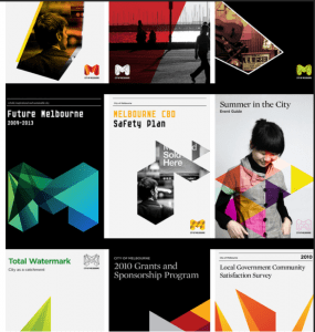
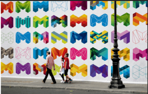
Research —> Go find your own, don’t use the same as everyone else.
Tying things together
——————— Critique next week via Miro (week 6 – 05/03/21) ———————
Need to have done
- Three screens
- Consider action buttons, icons, illustrations/sections that can function through
- Icon set ( master apprentice and your own )
- Cityscape (master apprentice and your own)
- UI design idea on paper and digital
—–> You can try to animate the graphics if you have time <—-
Can talk about the flow or animation as part of your design ideals
Principles of UI
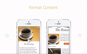
Formatting content – the flow of the content needs to fit the device the information will be viewed on
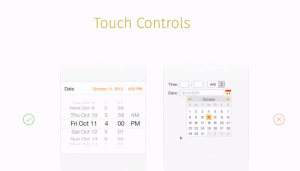
Touch controls – these can make the interaction with your app feel easy and natural, user friendly .
- Jacobs law: Users spend most of their time on other sites; meaning that users prefer your site to work the same way as all the other sites they already know.
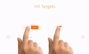
Hit targets –
- fitt’s law: the time to acquire
- Law of Pragnanz: people will persieve and interpret ambiguious
Text size –
Contrast –
Distortion –
Organisation _
- Hick’s law
Alignment –
Touch screen sizes – The smaller the target, the harder it is to hit/select. Look at icons of apps you use all the time and notice the size of their icons. The sizes will vary depending on devices eg Apple 44px, Microsoft 34px and Nokia 26px.
Using the finger pad comes natural but it covers the entire target area; using the finger pad shows more. Index finger and thumb overlap on to neighbouring targets when they are grouped, resulting in users accidentally triggering different actions.
The average pixel width of human finger is 57 pixel touch target – wider than most guidelines. A small target slows users down as they have to pay more attention.
The average pixel width of a human thumb is 72 pixel touch target – the thumb will fit snuggly into the target area, target edge gives visual feedback.
Placement of information is also important.
Using the correct finger size can be ideal but not always functional.
Colour – helps users see and interpret the information and understand actions within the app. Target audience MUST be considered for this.
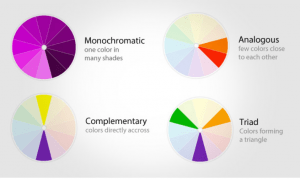
Colour scheme standards
- Monochromatic: can have a sophisticated look
- Analogous colours: This can be useful for a weather app for example or to give priority eg red most important – yellow least
- Complimentary: Can help make elements stand out, eg messenger (green) using red to show notifications. When the human eye sees a bit of red on green the eye will be drawn to it.
Useful programs:
- Adobe colour – it can even tell you if people with different degrees of colour blindness will be able to fully operate the programs without being hindered by the colour.
- webaim.org – contrast checker
Impact of colour contrast:
12
Contarst and redability:
13
Contrast ration: 1:1 – 21:1
14
small text 4.5:1
large text
Contrast and user attention – Used very effectively for marketing
Von Restorff Effect: when multiple similar objects are present
15
Tasks:
- Tying it all together
- Finishing up UI design in illustrator/sketch/Figma —> NO Photoshop! ( look up UI kit in figma) Unsplash is also good for images of people holding phones or just look for smartphones mockups.
- Think of presentation – use flat screens for the presentations and use the mockups for your portfolio
- Have 6 finished screens
- Research blog — it’s worth 40% of your grade!!!!!