In all honesty I was a bit sad about the lack of comments but Daniel was very helpful, he suggested I change the profile image from a rectangle to possibly a circle as it would help keep the flow of the website constant and uninterrupted. He suggested I change the business card – which I will do. It was helpful to see my peers websites and personal brands as it helped me gauge where I am and where I need to be.
I made an animation using Procreate to use as my loading symbol
After the group critique I decided to make a few changes to not only my colour scheme but I also decided to make a new illustration to represent myself.
I used Adobe color to create my colour scheme.
I developed my illustration using procreate, here is my progress:
This is my final illustration for my brand.
I am quite pleased with the outcome and I feel as though it will add a fun and friendly aesthetic.
Present my process (research or writing – case studies)
To showcase finished and ongoing work
Tertiary
Unique & memorable (has to do its primarily function well before it can be unique and memorable)
Generate a level of professionalism
Demonstrate my personality through a clear tone of voice
To build a good hierarchy/lists of priorities you have to find what needs to be done for other things to eventually be developed.
The work should be the MOST important thing – the brand is almost secondary to the work.
Websites that helped me code my portfolio
Researching how to scale my website. Link to the article I read here. This article helped me learn how to ovoid visitors of my website being able to zoom. I wanted my website to have a set border, I am not the best with coding and so researching code and trying to learn new techniques was key for me.
Preload attributes – w3schools was a HUGE help when it came to learning how to properly code and troubleshoot my website.
Researching how to style the body of my website. Link to helpful website here. This was helpful when I ran into trouble setting a margin box for my website.
I used the courses offered by GitHub quite a lot to help me expand my knowledge of code. Link here.
How to create a website using GitHub here. I was struggling with how to upload my website to GitHub (this was actually my biggest issue last semester). How to host your website on GitHub. This link also helped me learn how to host my website.
Webpage design. This was a great article that helped me consider the layout and design of my website.
How to make my navigation bar fixed/sticky. This was my biggest challenge by far! I’m still not completely clear on ow to do this so I would like to continue expanding my knowledge in coding over the summer.
I’m a visual learner and finding resources like the ones above was a huge help to me as it helped me understand what I needed to code and where I needed to code it.
This was one of my favourite websites, she has a very cool animated type intro when you first go into her website. Ideally if I had the skills to do that I would have liked to incorporate something like that into my website.
Even though the three links above where just templates I learned a lot with them by going into their source code and inspecting it. I did this with every website I went into that inspired me and this was a great learning tool.
Colour
Color codes. This was a useful tool when trying to find out the codes for the colours I was considering.
I wanted to make a change to my colour scheme for my website once I had started as I felt that the colour scheme I had previously chosen no longer accurately described me and therefore my personal brand. I had previously leaned toward more neutral colours and avoided ‘girly’ colours if you will. I finally decided to integrate these colours as they not only represent my personality quite accurately but also my style – something that people always comment on – so I decided to lean into it.
I really liked the above colour, it is a nice, solid and simple shade of pink that is kind to the eyes – not too bright and not too dark.
I really liked the coral colour theme above but I worried about its visibility and distinguishability from each other for people with color blindness for example.
I had the idea to create a colour pallet and gradient using my profile image, I really like this colour palette and I checked it against colour blindness and it works. I am very pleased with the new colour palette I created and feel like it suits my brand much more than my previous choice.
This was my initial draft of my colour gradient (I wanted to use it as the background colour for my website) I then moved the colours around to give it a smoother transition into the dark colours and this was my final result.
I will be using this gradient as the background colour for my website. I like the flexibility it represents by going from a very light colour to seamlessly transitioning to a very dark colour. Not only that but I feel as though it will add depth to my website and make it more interesting.
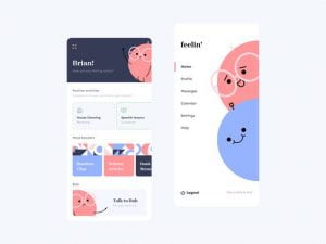
This is what my ideal website would look like if I had the coding skills required to code it. I made this using figma. I want to add a section that would incorporate some of my side projects such as client work, illustration work, etc…
Now that I look at the home page I think I would change the profile picture and change it with an illustration as it will be a fun way to introduce myself and showcase my illustration skills.
This is my initial draft for my profile illustration
I really liked the hair detail hanging outside of the circular confine.
I was not able to figure out how to add it in a size appropriate manor to my website so I was not able to include it. I will continue to work on this in my spare time.
I attempted to make a harder website but I could not figure out how to fix the code – It was a mess
I really liked the title area of the website, I would have liked to keep this but I could not do this in the time allowed.
My biggest hurdles were time and my lack of coding skills because of this I had to change tactics and try to simplify my website, this is how that went.
My initial sketches
I decided to keep brainstorming my website, here are some of my preliminary sketches .
I wanted to give my website a soft and delicate look so I tried out all the colours to figure out which I liked the best.
I would prefer if my website had multiple pages linked to it, like for example when you click on one of my projects it takes you to a separate page to explain in detail the process and show my sketches.
Personal brand, Portfolio website and research blog – These deliverables should demonstrate your understanding of the subject matter covered each week.
Recap
This should all be reflected in my work!!!!!!
Week 1: Language – values, tone of voice, bios, stories and strategies. This should always be the starting point when creating a brand.
Week 2: Monograms – Examples, case studies, requirements, Axes ( how to balance the letters) and sketching.
Week 3: Typography – Choosing and using type, Kerning, Anatomy.
Needs to be updated more often, loads of content missing. Put the time in! Maintain it. if you don’t it will slip. Take an hour a day and post !!!!
Lecture summaries – Class notes.
Independent research (literature reviews, blogs and articles) be critical of your sources. Make sure articles are from a reputable website. Lean more towards book – they are credible.
Backup and development work – paper sketching, you need to draw as much as you digitalise!!! Include all developmental work.
Self-reflection – weekly summaries of what you have learned.
Assigned tasks – progress and final outcome and reflection.
Read
Designing brand identity by Alina Wheeler
The future beyond brands lovemarks by Kevin Roberts
“The word ‘brand’ is overused, sterile and unimaginative” – Michael Eisner, Disney
To me this maybe suggests that branding needs a bit of a shake up, we are over saturated in them. We are bombarded with branding – it’s everywhere, even in our homes. Has it just become a way to compete instead of creating a meaningful interaction? Does brand now equal boring?
Values
Brands are all about values. You need to believe in something and you need to explain why you believe in it ( they might get on board because of this, if you don’t believe in it, why should the audience?) This enables you to form an emotional connection with your audience.
What are the functional benefits? without this you have nothing. Emotional benefits – what makes it better than the competitors?. Is it self expressive? If done correctly the customer will not only believe in the brand but they will feel like the brand expresses them as well. It allows the audience a way to be self expressive with the brands products.
“Consumers who make decisions based purely on facts represent a very small minority, yet, even for these people, there is always some product or service they buy based on impulse or emotion.” – Maurice Levy, Publicis.
We tend to make decisions based on emotions not facts, a good designer plays on this. They will create a brand that inspires loyalty beyond reason.
You need to make your brand desirable. How do you make your bio captivating? statement or story? A captivating tale. Frame your thinking process as see in the image bellow.
I need to become an idea person as this is what will make me valuable to customers and employers. Designers are here to sell ideas. Professional and passionately creative. Passionately creative makes you think that the person thinks, eats and breathes creativity; they cant help but be creative.
A brand that not only creates a great emotional connection and sense of respect will create real, impactful value and that in turn will cause the customer to pay you back with loyalty and love. Don’t just dress the brand up nicely, make it something that will last. If you make an emotional connection with your client, they will not only keep coming back but they will also refer you.
What I stand for matters and this should be reflected in not only my brand but my work.
The Nespresso not only feels stylish but it also states good – its a lifestyle choice in a way. Kenco taskes good but its appearance doe not convey any sort of enthuthiasium
BxP Value proposition map
This is another way of looking at it – values are at the core.
The brand: This is the number one indicator of value for a customer. Users develop emotional connections to brands that far supersede any …
The experience: The experience of the users is key to reinforcing brand perception as it connects your products before it did. It might solve a problem that has not been solved yet or it might address an untapped need in the market. Just be better than everyone else basically. For me this will be the look and functionality of my website.
The product: Ironically this is the last thing a customer will interact with.
Examples:
Patagonia: It is respected but also loved. It is a lifestyle kind of brand, eco friendly, recycled and natural materials.
Nike: It offers products of great reliable/good quality.
Lush: They offer and great and somewhat unique bath bomb Experience. It is a cruelty free & environmentally friendly company.
Disney: It offers a sentimental connection to your childhood and offers you a way to keep memorabilia of it in a way. It exudes happiness, family and fun times. It is a respected and loved brand.
Amazon: you can buy pretty much anything you want and get it in a day. Convenient, reliable, cheap.
Sharpies: The Reliable marker, it will last longer than others. Fun and recognisable branding.
HP: Technology. It makes daily life better for everyone.
Brands and reputation take time to build
Focus on:
Consistency – quality/ tone of voice. Be it in adds, social media, website. Consistent messaging. Customers expect the quality to be good so keep a consistent quality portfolio, branding, business card, etc…
Attention to detail – Consider everything. People care so much that they make unboxing videos.
Emotion – Tell a good story, people will pay attention to a good brand story.
Experience – Ways in which people ‘feel’ your brand. This could be the lighting used in a store, the logo of a brand used as décor, etc..
Reward loyalty – Gestures and tokens
“A brand is the set of expectations, memories, stories and relationships that, taken together, account for a consumer’s decision to choose one product…..”
“If you don’t give the market the story to talk about, they’ll define your brand’s story for you.” – David Brier.
Is my bio captivating? or is there room for improvement? Is there a way to make it more exiting? Have my values evolved?
Task
Post examples of 3 businesses you respect and study how they form an emotional relationship with their customers. Instantly I want to use Disney
One step beyond (for 3pm) Design one additional touchpoint for your personal brand. This can be anything at all and the purpose is to promote an emotional response to your brand. Design something that will attract attention. Don’t just slap your logo on a t-shirt.
Ideas
Animated loge, Animated gif show reel of work for website/social media. A wearable item but make it desirable. Branded merchandise (Look up Merchandise.com and awesomemerch.com). Supporting app idea or micro interaction. Desktop/phone/table/Wetransfer background.
IT must be relevant to the brand/service with customers and people in mind.
Look at
Twitter and Brand New (blog) for example. Selling a tweet (NFTs)
My outcome
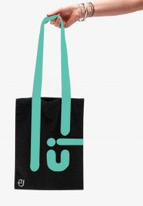
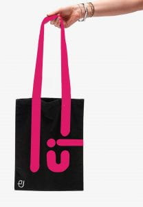
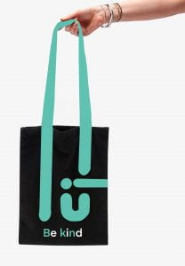
I started by mind mapping some ideas and exploring my options – I really liked the idea of a tote bag as it will not only help the environment but also give advertisement to my personal brand whilst also not being too in your face.
I think this could be a very cute idea as its very useful, I can never refuse a free bag for life so I think this would be a great marketing scheme for my personal brand. I would do many different colours, it doesn’t have to be the same background colour or even consistent line colour.
I would also like to make a few more with the phrase ”be kind” I think it is a strong and recognisable phrase with a lot of weight to it.
I really liked this, it’s something I would be happy to use..
I want them to be as unisex as possible – something for everyone to be able to enjoy.
I wanted to have something simple and useful; I love shopping and for me a bag for life or a tote bag is a must. I personally can not resist when one is being offered, so I decided to play on this. I used the handle to extent and also represent part of my logo to create a pattern that is interesting and a bit abstract. Ideally they would all be lovely, happy and varied colours. I added the phrase “Be kind” to my last one as it is a message that resonates with me and many other people.
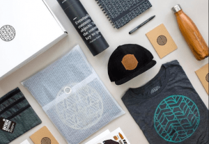
I would like to experiment with notebooks, pens/pencils, Hair clips, “Thank you” cards for customers, water bottles (safe the turtles and stay hydrated), Antibacterial (To avoid Rona)
Feedback:
Great, simple idea, the logo in the bottom is not needed, take it out – other than that, its great.
QR code that takes you to my portfolio website/app?
******** Try to animate your logo so the lines and dots fall and become the logo.
Animation
I decided to attempt to animate my name as a way of practicing – I used procreate to animate my name; I could not figure out how to put the animations onto my blog so I put them in a separate Miro board.
Demonstrate an understanding of personal brand identity as applied to a portfolio website; it should include a consideration to brand identity through voice and tone, considered content and visual cohesiveness.
Considered content: what needs to be included
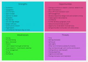
S.W.O.T Analysis
Strengths, weaknesses, opportunities and threats. It’s worth doing this when considering undertaking any project yourself. List these things in squares. For opportunities think in regards to the website and for threats think what is in the way of you completing what you want to complete. My main weakness is coding so I could maybe try to code something more ambitious to try to learn, however a threat to that might be that I might not have enough time.
IMPORTANT —> Don’t start with “hello there” or something similar; its been overdone and we have explored better writing practice at the start of the semester so revisit that. Tone of voice provides an opportunity to be more unique.
For Case studies
SFCD —> They describe the function of their work through animation in detail . They use a large header followed by a short summary – awesome key introduction. Using animation and motion can be difficult – especially for beginners – so use it sparingly. They have also used a multipage site. It is a superb website!
One page love —> try to tackle your own content for your website first, reviewing too many websites can sometimes trip you up. It becomes an overload of information.
Site Inspire —> full of good examples. Immersing yourself in good design work is just as important.
Web standards
Media Queries —> good for reference and insight in to how responsive sites interact.
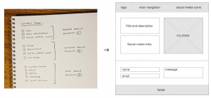
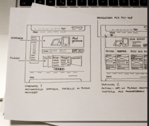
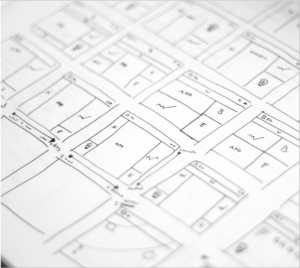
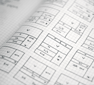
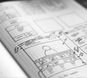
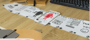
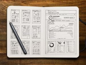
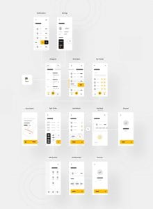
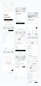
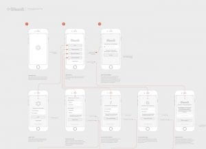
Wireframing
It doesn’t need to look pretty – it is simply a plan for a web page to work from. Start on paper – its quicker and easier. (Examples bellow)
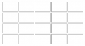
Start with loads of ideas – start small and fill the boxes, this can help get your flowing. (Examples bellows)
You can even create a key for your interactive elements, that way you can plan in boxes instead of having to spend time drawing.
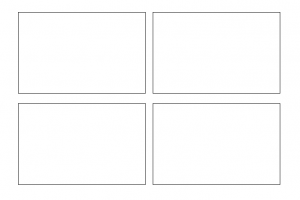
Then pause and pick the best ones; then repeat the process, drawing the promising ideas out again in higher fidelity and in larger boxes (I could try making them bigger – maybe 4 boxes per A4 page) – an idea should emerge from that.
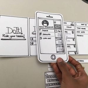
You can then try making a:
Paper prototype (at actual size)
Digital wireframes
Digital prototype
Tips
Simplify it for yourself
Don’t stick to your first idea and force it to work – EXPLORE the other options!
Make connections through iterations and analysing what’s working/doesn’t work
Reject what doesn’t work and go a different direction
You won’t know what is your best idea if you haven’t explored all of them
Language shapes text. Use real text when putting in placeholder text and not ‘Lorem Ipsum’
Start with your current websites from IXD101 – how can these be modified? How does the brand map to it?
Idea generation Osborn checklist. Substitute –> Combine –> Adapt –> Modify –> Put to another use –> Eliminate –> Rearrange
Substitute — Different ingredient? Other material/processes/place? Other approach? Other tone of voice? Someone else?
Combine — Combine units, purposes, appeals or ideas? A blend, alloy, or an ensemble?
Adapt — Is there anything else that works like this? What does this tell you? Is the past comparable?
Modify — Give it a new angle? Alter the colour, sound, odour, meaning, motion and shape?
Put to another use — As it is? If modified?
Eliminate and/0r add — Can anything be added? time, frequency, height, length, strength? Can it be duplicated, multiplied or exaggerated? Opposites? Backwards? Reverse roles? Change shoes? Turn tables? Turn other cheek? Transpose ‘+/-‘? Can anything be taken away? Made smaller? Lowered? Shortened? Lightened? Omitted? Broken up?
Rearrange — Swap components? Alter the pattern, sequence or layout? Change pace or schedule? Transpose cause & effect?
Content planning – element collage from last week will help for interactive/design elements. Consider the formatting and placement of elements. What projects should I include? In what order? Text to include? Informative/for tone/bio? Contact details? Any additional details/links? What content/Imagery? —–> what do I need to say and how am I going to say it? Is information better as text or diagram? Will it be text/hero/image lead? What is my first impression going to be? Will it be a single page or multiple page website?
DEDLINE 07/05/21 at 11am
checklist
Bio & Brand Dictionary
Monogram
Wordmark
Visual Marque
Brand Guidelines
Website Design
Website Build
Research blogs
Here is the link to my Gantt Chart – I created this to try and help keep myself organised and on track.
Now the style guides have to be more extensive as they have to not only cover print but also digital products/aesthetics.
Style guide
Physical or digital document that represents the styles, patterns, practices, and principles of a design system and teaches how to use it. They encompass a company’s branding guidelines, including logo usage, designated colour palette, typography, etc. You should update your brand guidelines to include digital outputs. Pattern libraries are a detailed subset of the overall style guide.
Article by Harry Roberts with good advice and information
Things to consider
Establish a table of contents
Break info in to manageable chunks
Use plain English and explain things clearly
Modern Tools that help
Style Tiles are a design deliverable consisting of fonts, colours and interface elements that communicate the essence of a visual brand for the web. It offers a template to work and design around.
Element Collage, an alternative tool by Dan Mall. Mall uses it as triggers for client conversations; it starts a free form conversation to gauge a better direction to go in for the client. It can help clear up the brand direction. The only problem with a vertical element collage is that it can look like a webpage you’ve built, so horizontal is a better format for us.
Interface inventory; taking stock and categorizing the components making up a website. The fewer buttons you have in a website the better the design as it ensures better consistency for the interface.
Managing code
HTML, CSS and JS, building a guide we can use to ensure everything’s consistent. Some elements within your style guides will have definable CSS properties such as colours, type and layout, etc.
Pattern library
An organised set of related, reusable components, often containing code examples, design guidelines and use cases. It ensures a consistent user interface. Big sites are developed by different people over a prolonged period and revised regularly. That almost always leads to a fragmented user interface unless there is something in place to ensure consistency. Essentially it’s a collection of design components that appear multiple times on a site, such as: navigation, slideshows, social media features, news listings, related links, carousels and more. It documents all these ‘patterns’ (also known as components) and defines how they behave, what they look like and how they are coded.
Good examples
BBC design framework for consistent user experiences.
A self-contained and reusable pattern that represents a specific piece of interface or functionality.
Task
01 Interface inventory
Choose a website and complete an interface inventory, documenting all the interactive elements used throughout. This could be the website for the brand you completed a set of guidelines for last week, but it is not essential. The important thing is to observe the sorts of buttons and elements of the UI included. For more information follow this link.
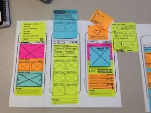
02 Element Collage
Create an element collage for your personal brand in anticipation of designing or styling your portfolio website. For more information follow this link.
03 Update your research blogs
Make sure your research blogs are up to date and organised. Daniel will be reviewing these and providing feedback prior to the Easter break.
What should be included
Weekly summaries
Lecture content
What you’ve learned
Reflection on tasks
Analysis of books and sources you’ve looked at
Research
Writing and values
Monograms
Typography
Wordmarks
Colour
Visual Marques
Brand guidelines
Practical Work
All weekly tasks
Pizzeria brand
Business cards
Example brand guidelines
Interface inventory
Element Collage
All development work, sketches and iterations
04 Portfolio site
Portfolio site design and mapping your style guides on to a site. You MUST at least have a skeleton of a site to work on next week.
Hello, my name is Emily Ussher. I am a first year Interaction design student at Ulster university Belfast. I am originally from Venezuela; I found my love of art when I moved to Northern Ireland at 13 as it gave me a communication tool that I did not have at the time. I love to travel and create art. My multi-cultural upbringing has offered me a different perspective and point of view – something that is always evident in my designs.
Short Bio
Just another Venezuelan/Irish self-appointed explorer, studying Interaction Design and doing what she loves
Tone of voice
Friendly
Professional
Creative
Comprehensive
Caring
Word bank
Dedicated
Diverse
Bilingual
Friendly
Professional
Original
Innovative
Unique
Well designed
Multicultural
Happy
Creative
Quirky
Diferrent
Brand values
My brand values will be to create high quality, well designed products centred around the customers need. To provide a unique, welcoming and fun experience to the customer and produce products of the highest quality.
Logo design
I decided to keep it simple and uncomplicated, the font I used for my name is FS Alvar in bold.
As part of my professional yet quirky brand I decided that it would fit best if I added colour to only the dot and maintained the rest black.
When turned upside down the logo reminds me of an elephant, I will try to play around with this concept and maybe turn it into a mascot or even create a series of illustrations in the same style.
Your brand is gateway to your true work, it will attract people who want the promise of your brand – which you deliver
-David Buck
What can I apply to my brand?
Think outside the box
What do I need, how would I introduce myself?
Social media/ online presence – CONSITENCY
Business cards – ESSENTIAL – they leave a lasting impression and are a must have for networking
Advertisement banners
Ads in newspapers
Website
Email signature
Packaging
Portfolio
Studio – could be interior décor. Office design ( eg monogram into a desk?
Corporate gifts
Apparel ( take it with you were you go eg phone case, tote bag, shirt. Become a walking ambassador for your brand)
Video Idents (signing off prototypes, videos and motion graphics)
Merchandise (stickers, phone case, laptop cover)
Literature (leaflets, pamphlets, etc)
Prototypes/presentations
Sponsorships
Blimps LOL
Headed paper (eg for letter or invoices)
Envelopes/Mailers (a good way to make an impact when sending CVs to employees)
Postcards (again good CV idea)
Stationary (they draw attention, provide more points of recognition)
Funding opportunities (using your brand to show professionalism and confidence when applying for funding for your digital products or start-ups) The more real you make something feel, the more willing/confident they will feel to invest. Solid mock-ups and prototypes are important.
ANYTHING
Task
Design your own business card, use your wordmark, typeface choice and monogram or symbol to design a business card. It must be 85x55mm. Consider both sides of the card.
Can use different paper types or colours and use a stamp to put in your details? paper finish


 Click here to see them in action.