UI Design Principles
Before jumping into some of the specifics of UI design and formatting I felt I needed to run through some of the broader principles of the area to gain a stronger foundation to build upon. UI is so important as if it’s done poorly it can affect the use of a product therefore a number of design principles have been created and are used by designers to guide software design. I found a great adobe article to help me with this on Adobe XD by Nick Babich outlining the 4 golden rules of UI Design. These are:
- Placing the user in control of the interface
- Make it comfortable to interact with a product
- Reduce cognitive load
- Make user interfaces consistent
The full article can be found here: https://xd.adobe.com/ideas/process/ui-design/4-golden-rules-ui-design/
Placing the user in control of the interface
There are a variety of ways to help users to feel in control of the Graphic User Interface (GUI). These include making actions reversible, creating an easy to navigate interface, providing informative feedback, showing the visibility of the system status and accommodating users with different skill levels.
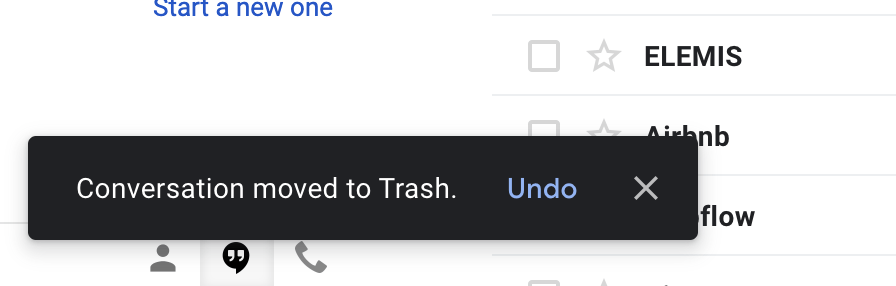
Making actions reversible can be as simple and as adding ‘undo/redo’ buttons to the GUI yet it is so important as it encourages the user to explore unfamiliar options without fear of making a mistake and not being able to unto the action. See Gmail example below.
Creating an easy to navigate interface means making the navigation clear and self-evident so that users can enjoy exploring the interface without fear of hitting the wrong button. This can be done by providing context i.e. showing the user where they are, where they’ve been and where they can go next. Providing visual cues such as page titles and navigation options can provide the context and prevent the user from becoming lost in where they are in the user interface. Predictability is also a really helpful tool and is gained by adding cues that help users to predict the outcome of their actions.
Providing informative feedback comes into play at points of action. Regular points of action should provide more modest form of feedback such as a button changing colour when it’s clicked while infrequent and significant actions should provide more substantial feedback such as a load bar, check sign, and additional text confirming the action and colour changes. This prevents users from returning to the action to check it has been performed.
Showing the visibility of a system status is an important one as users don’t like to be left staring at a blank screen while they are waiting for something to load, progress indicators are a great way to provide comfort to the user and make the experience more enjoyable.
Finally accommodating user with different skill levels generally means making sure that you are not just designing for expert users but always keeping novices in mind. This can be done by the addition of tutorials and explanations, skips should also be added to these features to allow confident users to skip through. Providing shortcuts beside actions should also be considered as they can help speed up commonly used actions and will be very useful for experienced users.
Make it comfortable to interact with a product
It is important that users feel comfortable interacting with interfaces. This can be achieved by simplifying interfaces and illuminating elements that are not helpful to the user. A great analogy of this is the sellotaped remote control only revealing the necessary buttons helping the elderly to use the TV.

Likewise eliminating unnecessary elements that don’t support the task at hand can help users to feel more comfortable with the process they are going through. Other important factors are avoiding asking users for data they’ve already entered and avoiding jargon or system-oriented terms.
Applying Fits law to interactive elements which state that the time to acquire a target is the function of the distance to and the size of the target. My understanding of this is important functions require larger targets e.g. bigger buttons. It is also important to consider the people using the products themselves when creating user interfaces so that everyone can use the website or software including those with low vision, blindness, hearing impairments, cognitive impairments and motor impairments. One of the important elements that should be considered here is the colour theme as colour blindness impacts around 10% of men 1 % of women in the population and therefore designers should avoid using colour to convey information.
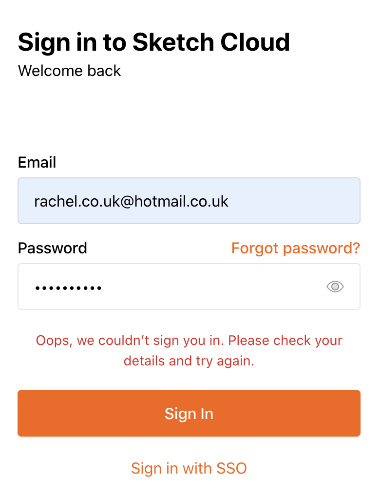
Other important elements to consider are the use of real-world metaphors such as the recycling bin used in macs to show the user where deleted items will go before they are deleted permanently and error messages. Error messages are important to consider as endless errors messages can become very frustrating for the user and may cause them to abandon the app or process. However, coupling error messages with problem-solving advice can generate a conversation around the problem easing tension. See sketch example below, here the user has advised the check their details and try again and a clear ‘Forgot password?’ is displayed in vivid orange.
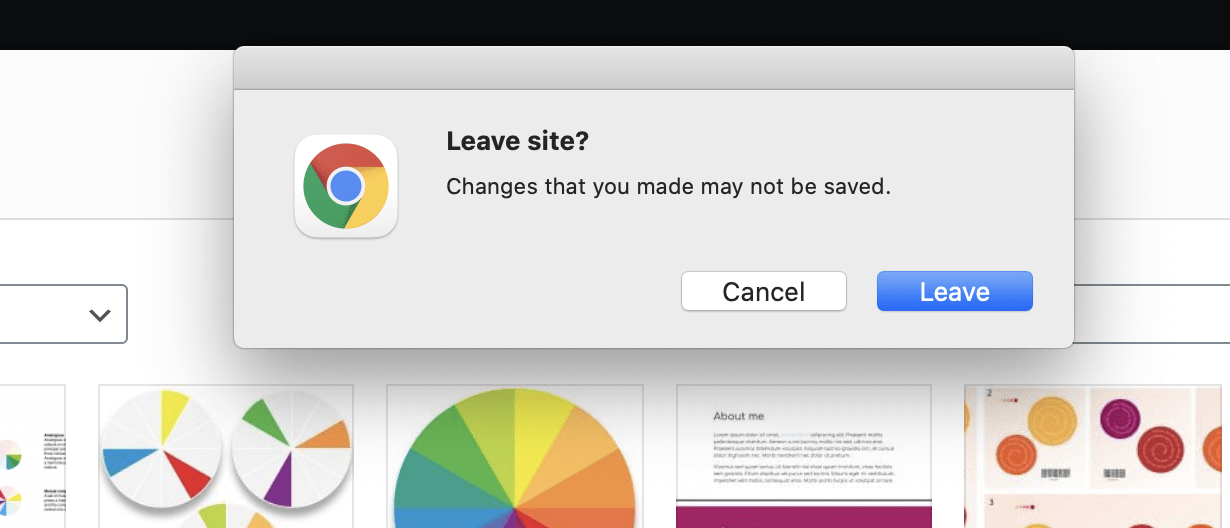
Another important action that can be considered here is when action will result in an uncompleted process or loss of work to prevent users from loosing work and not completing processes. A great example of this can be seen in the leave site? response that appears when exiting the editing page of WordPress by hitting the back button, see below:
Reduce cognitive load
By reducing the cognitive load (the mental processing power required to use a product) you can avoid making the user think/work too hard. This can be achieved by chucking sequences of information or actions, reducing the number of actions required to complete a task (e.g. the three click rule) , recognition over recall and promotion of visual clarity.
Make user interfaces consistent
Consistency is an essential component of effective UI as leads to intuitive design that contributes to learnability and usability using transferable knowledge e.g. transferring knowledge about use in one area of the website or app to another. This can be achieved through visual consistency e.g. use the same fonts, colours and icons, functional consistency e.g. the principle of least surprise: If a necessary feature has a high astonishment factor, it may be necessary to redesign the feature and finally keeping design consistent with user expectations which is done by following platform conventions and not reinventing patterns.
A great resource of UI Design patterns can be found here: http://ui-patterns.com/
Material Design
Material design is Google’s design systems that provide the design foundation for high-quality digital experiences on Android, iSO, Flutter and Web. The resource provides an introduction to the digital systems created by Google and highlights a number of apps that use them.
A number of foundational elements are also included here these are: environment, layout, navigation, colour, typography, sound, iconography, shape, motion, interaction, communication and machine learning.
Environment deals with design based on real-world physics and therefore a lot of the section deals with depth, the various layers on the applications and how these layers cast shadows presenting layers as elevated above others see example below taken from the surfaces section.
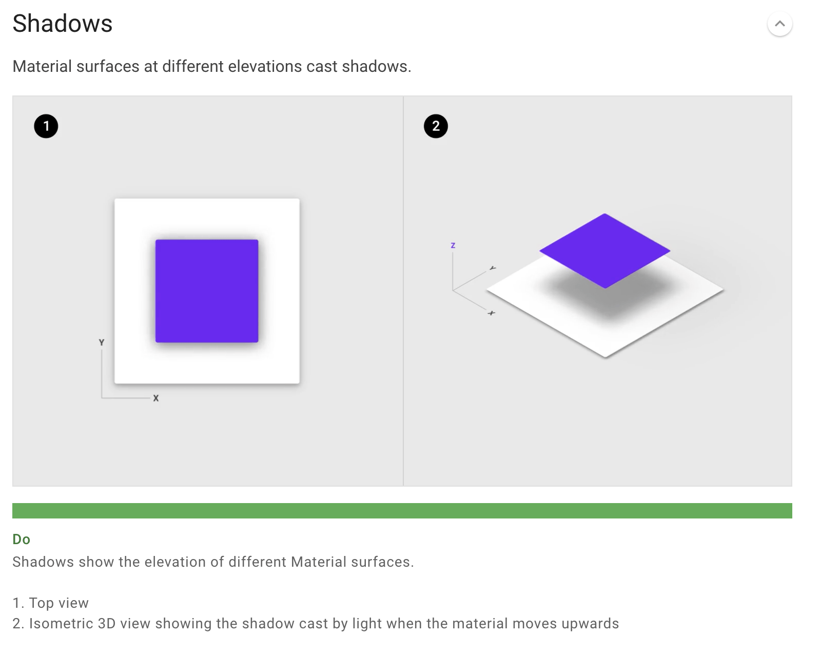
This is really good to know and understand when designing great UI’s as it mimics the real world which appears to me as making the users experience feel more natural and authentic and I hope to spend more time on this in future to get a fuller understanding of how best to present menu’s that slide in and how this will impact on shadows along with the other various do’s don’ts throughout this section.
The layout section presents a guide to using layouts, pixel density on android, responsive grids and designing for various screen uses e.g building adaptation in your design that will allow it to work on desktop, tablet and mobile.
The navigation portion displays how to create sliding menus and bottom bar menu’s. These are particularly important as they need to be familiar to the user so that they will intuitively be able to use them and therefore I feel this portion of material design is particularly useful and will definitely be a resource I return to when designing interfaces.
Colour deals with colour palette’s and themes. Material design has a plug in theme editor which is a great resource for Sketch when designing for android.
Material design also provides its own type system and a variety of sounds and explanation of their appropriate as well as and detailed outline for icon design and a number of system icons available as well as portion dedicated to app design.
There section dedicated to shapes explaining how to work shapes as cut-outs and how shape can be used to indicate selections- curved edges.
It also runs through motion it is also good to understand what developers can and cannot do when working within a particular operating system such as android and iSO.
The site also covers interaction e.g. pinch and zoom, gestures, avoiding delays, hides and so on.
Components is a great area that demonstrates how to build all the different components of a UI including lists, menus and tables to name only a few. This is an amazing resource as not only does it provide you with so much guidance and clear usable interfaces but it also shows you what is possible so when handing off to developers as a designer you know that what you have designed is transferable and the developed will be able to use it produce an actual app or web page.
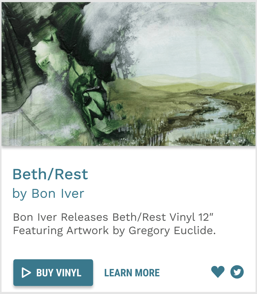
Designing a Card
As part of a workshop as a class, we used Material Design to create a card displaying information to about a vinyl record and the option to buy or learn more.
I began by using the information from the card component are to create the basic structure of my design, using the measurements and spacing.
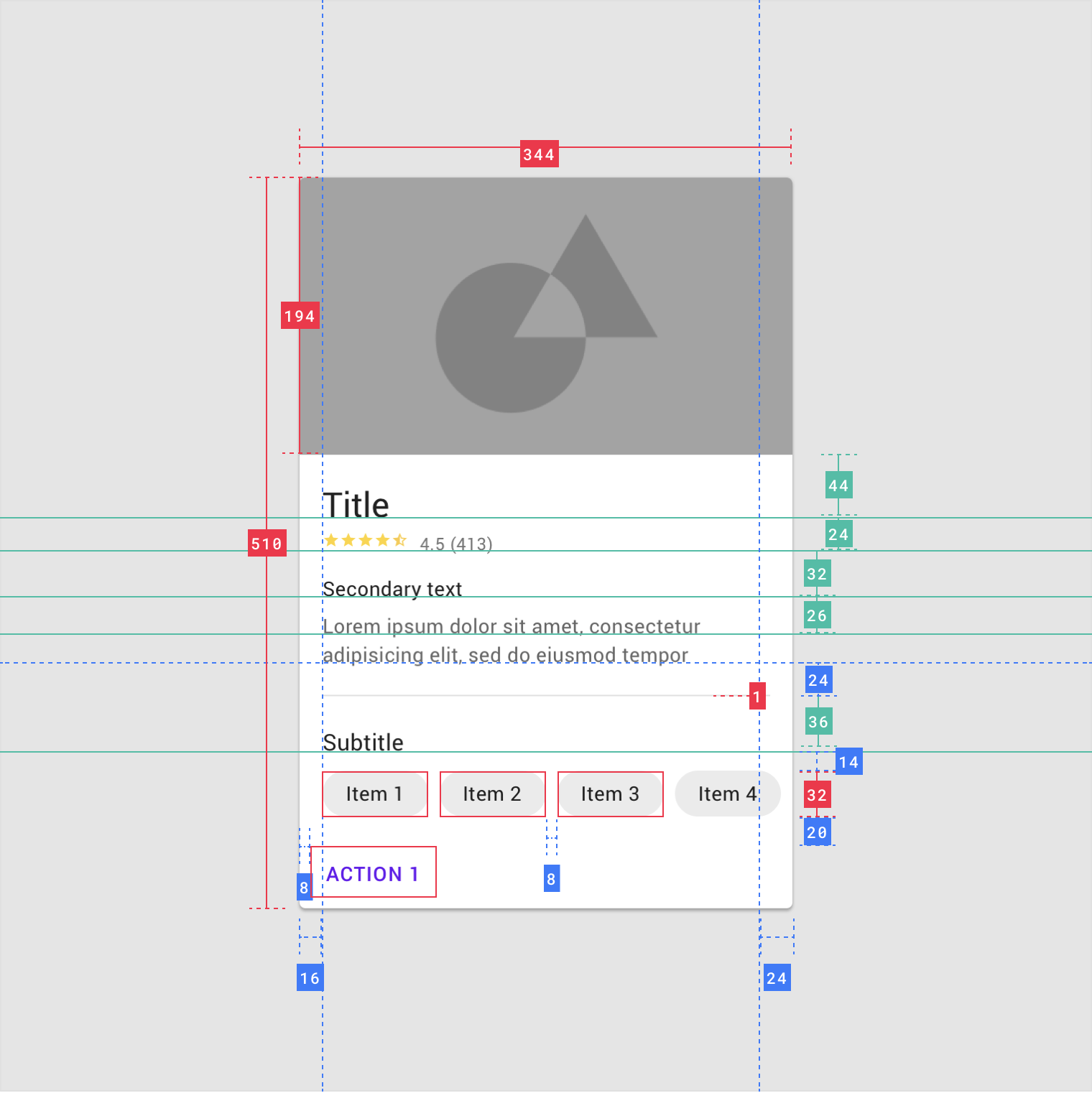
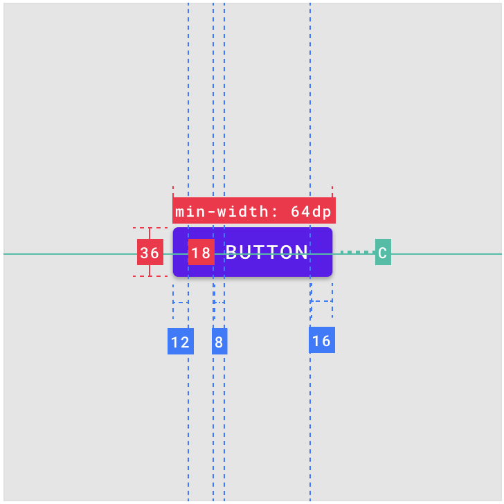
I then used the information provided about buttons to create my two action buttons see below. Again here I mimicked the measurements, spacing and type size.
Finally, I used Material Design’s Type system to select the appropriate type scales on the rest of the body text selecting the typeface Work Sans for my body text and Roboto Condensed for my button font. Producing the below outcome
This was a really useful exercise and something I am sure I will revisit in the future and will hopefully become adept at using.
Another great resource I found was a Material Design UI and Theming kit provided for Figma that actually provides with the pre-made components which can literally be dragged and dropped into your own design.
What have I learnt?
- Good UI design is about making websites and systems easy to use and easy to learn to use therefore it’s really important to incorporate the researched methods and components that will achieve this and incorporate it into UI design.
- It is important to make websites and systems easy to navigate.
- Users should be able to reach a desired destination in more than 3 clicks.
- Actions should be easily reversible were possible or display warnings
- When problems occur don’t just tell the users there’s a problem tell them how they can fix it.
- Creating a familiar environment is really important and this can be achieved by drawing from resources such as Googles Material design.
How can I apply this to my work in future?
- When working on websites and systems it is important that I make the UI functional and well as aesthetically pleasing, I can do this by working my way through the 4 principles of good UI design and applying these principles as closely as possible to my own work.
- There are loads of brilliant resources and well-researched pattern library that I can draw from an incorporate into my own work that will help me to produce optimal design outcomes for UI.
- Material Design has lots of resources attached to it that I can use to help me to create well-considered and researched design outcomes and that can help me to increase my understanding of some of the do’s and don’t’s in UI design.