Type scale, lettering and colour are all incredibly important components of design. Therefore I believe that by building a strong understanding of these areas I will be developing a strong foundation and understanding of typography in design that will allow me to produce considered and effective design outcomes that communicate effectively with the viewer. As such I have looked at lettering, readability and colour in some detail.
Lettering

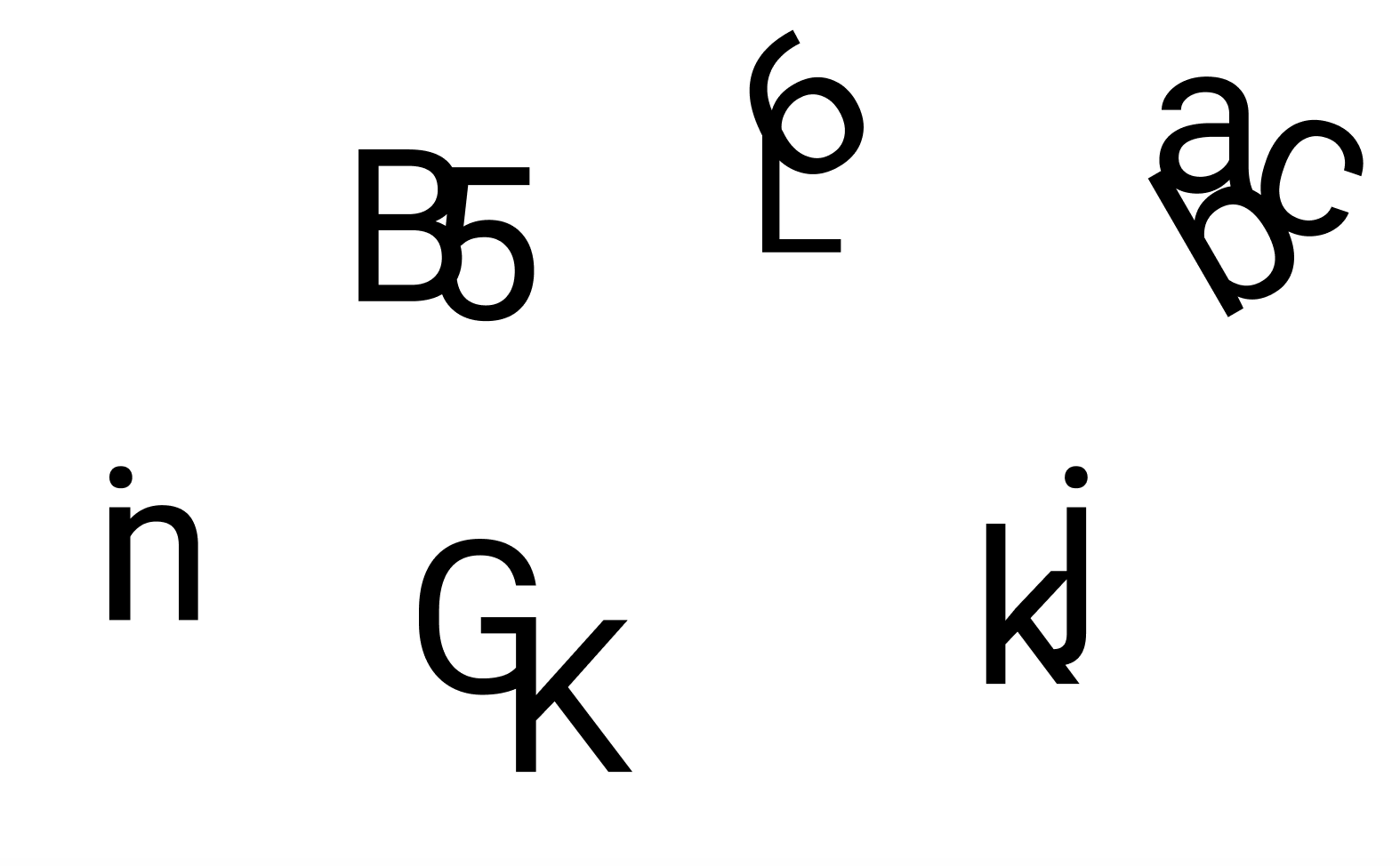
I then used Figma to play about with lettering to see what shapes I could form using the typeface Roboto. It’s really interesting to see how letters and numbers can combine to produce different shapes and outcome. I find experimenting with lettering to be a great way to produce simple and effective logo designs as with my design outcome for Networkit a software company that provides a system featuring training resources and campaign tools for network marketers and network marketing companies, shown below.
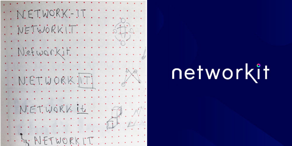
I began by very roughly sketching my initial ideas and digitised most of them before narrowing down my selection and finally having the third from the top (image top left) selected by the client- this was great as it was my favourite which never happens! I ended up with the final outcome shown to the right. I made a couple of changes to the lettering including removing the top portion of the ‘n’ stem that rises above the curved stroke to produce a seamless curve at the top of the letter, extending the leg of the ‘k’ and replacing a dot with an icon I had produced to mimic a loading wheel. I was really pleased with the outcome as I generally prefer wordmark/ logotype logos and I feel that I was able to achieve a tech feel and subtly separate the words ‘network’ and ‘it’ with the extension of the ‘k’ leg.
Type scale in print layout
Below I have experimented with type scale in printed layout quickly mocking up the below left-hand outcome after having been given some unformatted text.
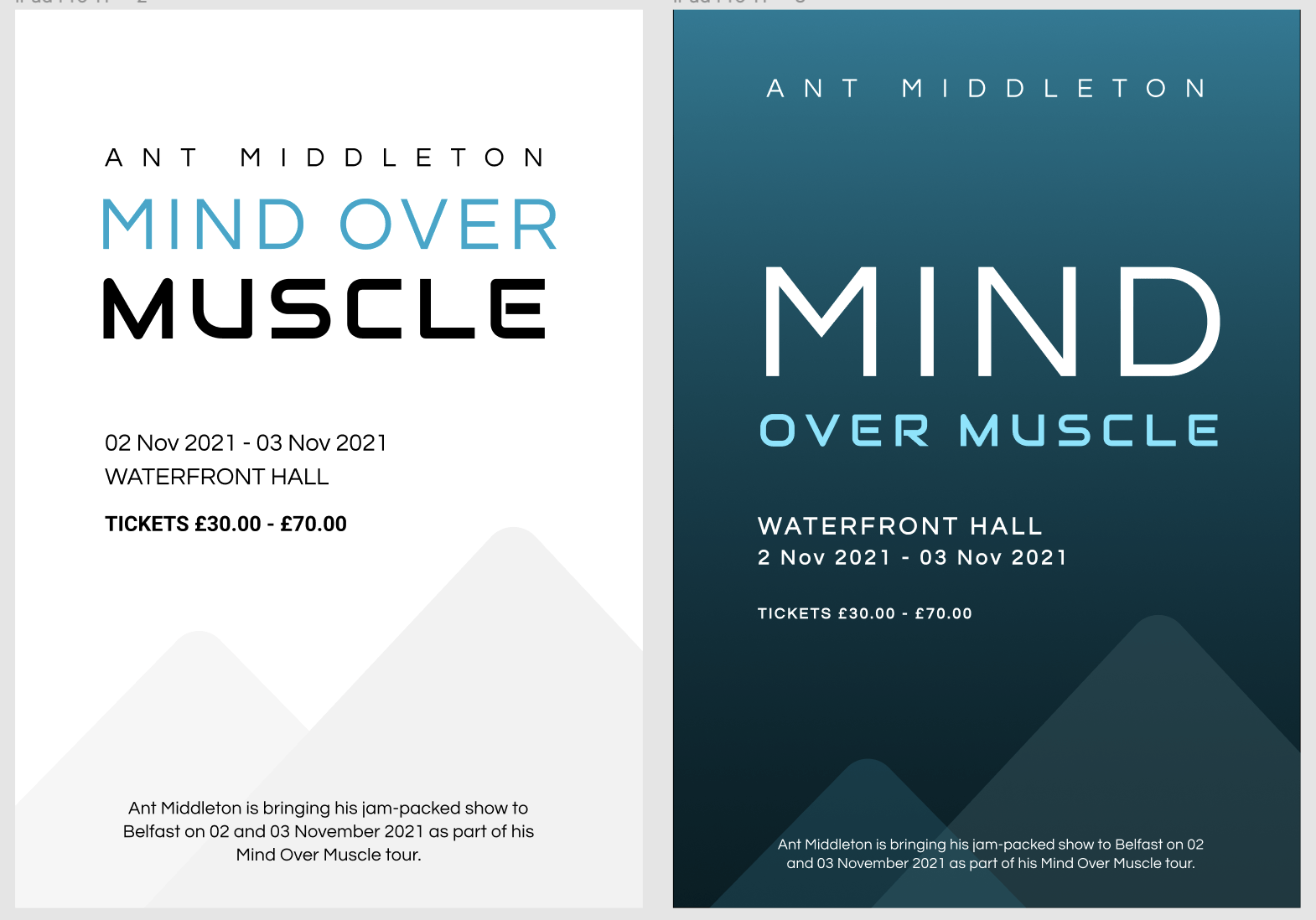
I was quite pleased with this outcome and how I was able to make the title of the event stand out through scale and colour as well as Ant Middleton’s name and with pretty effective use of white space. However, after having reflected on the outcome there were a number of issues that I felt I could improve upon so I made the second outcome shown above to the right. My primary concern was the inclusion of the work over being placed onto of the word muscle meaning that the word ‘mind’ was losing focus and had to be scaled smaller than the word ‘muscle’. Therefore I took out the word ‘over’ and place it beside the word ‘muscle’ creating a clear hierarchy of text in the title drawing the readers attention to the word mind and literally having unplaced onto of the ‘over muscle’. I also increased the white space around the title and lowered the weight and size of the price so that the reader had to spend a little more time looking for it as it may be a deterring factor. I then reduced the size of the description at the bottom of the layout as I felt it looked neater in two-line (in this instance I didn’t mind having the description as a footer as it essentially just repeated the information already stated. To finish it off I added a dark background with a slight gradient and swapped the blue to the ‘over muscle’ to ensure the word ‘muscle’ wasn’t overlooked and mistaken for ‘matter’. While on the whole while the layout has only been adjusted slightly I feel I have managed to produce a much stronger layout in terms of type scale and information hierarchy.
Type scale in web layouts
I also experimented with type scale in web layout using https://type-scale.com to select the size of my type in order to create a clear hierarchy of information which I presented to be used for the hero section for Networkit (see logo development above).
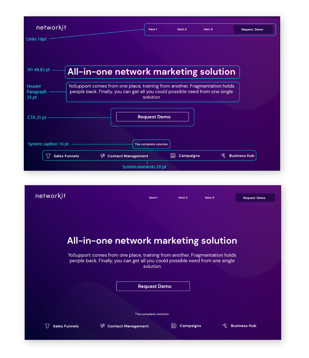
The above outcome with outlined sections in blue highlighting the type sizes I have chosen based on the sizes found on type-scale.com. I was particularly interested in highlighting the main page title and short paragraph of information below along with the CTA. I feel that the scale I have chosen throughout this layout has achieved this focus while keeping additional elements such as the system elements still lower in the hierarchy of information. I was really pleased with this outcome and particularly impressed with how well considered a layout can be when only/primarily using text.
Legibility and Readability
I had always thought that legibility and readability were the same thing but after having read how we read by Jason Santa Maria I now understand the concepts are very different. While legibility refers to our ability to interpret text readability refers to the amount of effort required to read the text, and therefore the likelihood that people will bother reading it all. Therefore by setting a standard of high legibility I am still setting the bar quite low in comparison to setting a standard of high readability.
I feel this is a really important concept to grasp as design is a form of visual communication which means my ability to design effectively is directly related to my ability to make that design communicate the message I am trying to present. This will not be helped if I fall into some of the more common pitfalls such as “TL;DR (too long; didn’t read).”
Maria looks at this in more detail by evaluating more than just the design and typography of a page or layout but also by taking into consideration the readers environment, intention and even the mechanics of how we read.
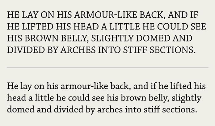
One of the points I found most interesting was how we don’t read in a liniar way instead our eyes actually jump back and forth in saccades stoping for short intervals (fixations) to decode the information. This process is helped by identifying features in words which are more common in the top half of words than the bottom half making the top half much easier to read when shown in isolation as below.

This also makes it more difficult to read words when presented in all caps.
Other areas to consider are the differences between reading from a page or a device, colours and contrast, screen brightness and so much more. There really is so much to consider when producing typography!
Letter Anatomy
I also looked at the break down of letter anatomy in order to gain a better understanding of the components that make up letters and their names. I found the below infographic to be really helpful in highlighting a number of the key typographic terms.

Other important features within typography include:
Leading— The vertical space between each line. For readable body text, the leading should generally be between 1.25 and 1.5 times greater than the body font size.
Tracking and Kerning— Tracking is the adjustment of spacing between all letters of a word evenly while kerning is the adjustment of spacing between specific letters generally used to create harmonious pairings.
Measure— The line length of a block of text. It is important to consider line length when presenting text as if it is too long the reader can get lost while if it is too short it can break up the reading experience unnecessarily with the general rule that line length should be between approximately 52 and 78 characters in length.
Hierarchy and Scale— Hierarchy can be established in text in a variety of ways including size, weight, colour and spacing. Size is one of the more common ways to present a clear hierarchy to guide readers through the text e.g. the main title is largest followed by headers the sub-headings and finally body text.
All of these features will be important for me to reflect upon when generating design outcomes that include typography.
Colour Theory
I found designing for the web to be a great online resource by Mark Boulton. In the chapters on colour theory, Boulton breaks the topic into three primary areas scientific, artistic and psychological. What I found really interesting was Boulton’s remarks on choices regarding colour schemes often being made by designers subjectively making it difficult to explain these choices to clients. However, eve just by looking at the artistic and some of the psychological applications of colour I can learn how to make decisions around colour more subjectively
Colour Wheel
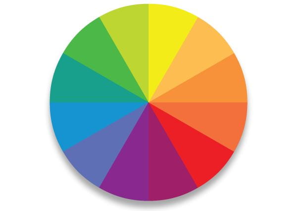
The colour wheel can be helpful in presenting the relationship between colours. It can be broken down into primary, secondary and tertiary colours, i.e. primary colours= yellow/red/blue, secondary colours= orange/ purple/ green and tertiary colours= everything in between. See diagram below.
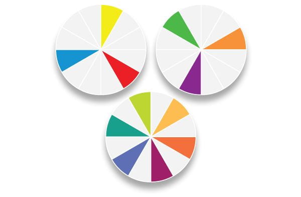
This can form the basis for creating colour palettes (ant alternative to going on instinct). Other important sections include:
Monochrome one colour
Complementary colours that face each other on the wheel
Triads colours that are equidistant, two examples of triads can be seen in the demonstration of primary and secondary colours above
Analogous colours that sit beside one another
However, the application of these colour combinations must be applied in a considered way as just because colours are complimentary on the colour wheel does not mean that they are always visually effective however if used effectively they can produce strong vibrant colour palettes and can work well as highlighter colours as they are opposing colours. Triads are colours of equal strength which means they equally contrast each other and can add tension in a colour palette and therefore must also be well considered and so on.
More examples of selections can be seen in the diagram below:

Another important combination of colour includes subtractive and additive colours. Subtractive primary colours are obtained through the subtraction of light and are generally used for printing, cyan, magenta, yellow and black (CMYK). Additive primary colours are obtained through the addition of light and used as the basis for on-screen colours, red, green, blue (RGB), see diagram below. This is important to know when creating designs for digital and print outcomes and also to understand colour codes.

This knowledge forms a firm foundation for understanding colour in more detail and it terminology such as:
Hue a specific tone of colour
Saturation the intensity of the hue from grey
Brightness how much white or black is contained within the colour
It also allows us to understand why some colour choices are more appropriate than others and how to select appropriate colours for base, primary and accent colours. And how different colour combinations can create completed different moods, e.g. neutral, muted, active and so on.
What have I learnt?
- There are many ways to change and combine lettering.
- Type scales can be used to guide the reader through a layout and is useful in demonstrating what information is most important and what to look at first, this is known as generating a hierarchy of information,
- Readability and legibility are not the same thing and it is important to consider both when formatting text.
- Colour themes are important as they create an atmosphere/ tone that should reflect the content that is being presented it is therefore important to consider colour combinations carefully in order to set the correct atmosphere and to have a reason for your selection.
How can I apply this to my work in future?
- I can use type scale in branding and promotional material as well as hero sections on websites to emphasise specific words and sentences in order to create a clear hierarchy of information.
- I can use lettering outcomes to create interesting design feature in layouts and logos.
- I must consider readability and the context of what is being presented and who it is being presented to in order to generate strong formats that fit the content and audience.
- I should attempt to use reasoning when selecting colour themes and consider the mood I am setting and not choose colours instinctively and without reason.