Research
Below I have presented a number of example websites that influenced the design of my own portfolio website most strongly. As well as websites that incorporated cool features that I would not yet be able to animate or code but just wanted to highlight as aspirational goals.
Hoang Nguyen-hoang.com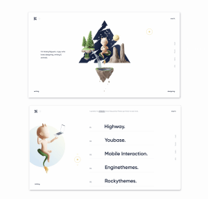
I love the animated movements included in Hoang Nguyen’s website and the 3D illustrations. Each element of the central illustration moves up and down independently as if it were floating creating a very calming feel to the website which is enhanced by the optional audio. The entire outcome is very unique and interesting. When hovering over the illustration there a dots that are linked to the text on the left-hand side and changes it to another fact about Hoang Nguyen- a couple of which linked to astrology which is reflected in the theme of the illustration. Social media links are displayed vertically on the right-hand side of the page and navigational options are presented in each corner of the page.
The transitions between pages are equally elegant and cause the central illustration to rotate to a side view, the backdrop to fall away and as displayed in the image above each list item to drop in order. Other nice features included additional text appearing when hovering over a nav item e.g. when you hover over designing, see my design appears, the mouse display as a dot inside a circle and changes from yellow to blue with an arrow when hovering over a nav item and on the designing page when you hover over a project the yellow dot turns to a yellow eye and the illustration shown to the left turns to an illustration/image associated with the project.
While the overview and feel of this website is quite different from what I am trying to achieve in my own website I really love the entire feel of this piece and how smooth all of the movements and animations are and would love to find a way to incorporate something like this in my own outcome. It was fun to explore this site and see what additional elements would appear as you hover the mouse across the page. A big highlight for me with this website is that it is so unique, yet very usable and easy to navigate. I also love the calming tone that Nguyen has produced making the whole user experience very refreshing and fun rather than confusing and irritating.
Writing across the site is very minimal, simple and direct in keeping with the minimalist theme. However, the blog included in the writing section of the website is written in Vietnamese making it difficult to get a full understanding of Nguyen’s writing style and tone of voice.
When viewing the website on mobile a lot of the additional features are lost as there is no hover option or space for the moving illustrations that are included in the transition between pages on desktop. On the mobile loading page, the user is recommended to view the website on desktop with the following text included- to tell you a better story. I prefer you visit my site on desktop. It is a little disappointing that all of the features are not transferable to mobile meaning that the majority of the viewers will miss out as generally mobile view is preferred. However, I still think that it’s nice to use the additional capabilities and options available on desktop to create a view that uses these to their full potential.
Calum Dixon-calumdixon.com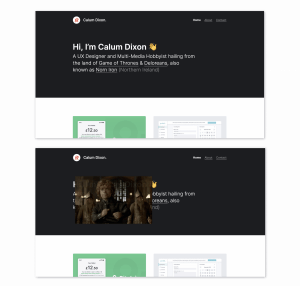

Calum Dixon is currently a final year Interaction Design student and has created the above portfolio website. I love what Dixon has done with this piece. He has added some fun additional elements such as when you hover over some of the defining contributions of Northern Ireland mentioned in Dixon’s hero section a gif pops up (it also moves slightly as you move the mouse) relating to the item, see a game of thrones example shown above. What I loved about this was that it was so unexpected. I am also familiar with the content in each of the gifs which probably adds to my experience of viewing them. I thought this was a great way for Dixon to display his personality and creativity. Again I feel that this is really unique and not something I have come across on a portfolio website before.
Overall I love the minimalist feel of this site and the black (nearly black) and white colour scheme as I feel it helps the work to really pop. There are also some nice hover motions with a tilt added to the project images and text when you hover over them (I imagine this requires JavaScript). It is also interesting that while the gif feature is not accessible on mobile the hover feature has been included when the item is selected it runs the hover response before taking you to the page.
Dixon’s tone of voice is informal, playful and at times humorous. However, the writing style in the case study section is more formal. An appropriate decision in my opinion and definitely an approach I intend to take in my own work.
Lucian Slatineanu- emblematiq.com

Lucian Slatineanu is an interactive designer with a focus on digital products. In Slatineanu Why Me? the section he begins with:
“Expertise. Clarity. Character. Call me a wide-eyed dreamer, but I still believe in the power of a handshake.”
I feel this sentiment is reflected in the design and tone of his website which I feel reminiscent of print work in its use of typography and layout. There are also nice hover element with text being highlighted in light red boxes and content popping up as you scroll down the page. It is also interesting that the home page does not include a scroll option and placed the focus strongly on imagery, typography and page layout.
Slatineanu’s writing style is more formal than some of the other portfolio sites I have looked at and focuses strongly on previous achievements and well-known products Slatineanu has worked on. I feel that Slatineanu’s tone of voice is about reflecting his expertise in the field of product design and this is achieved in combination with client testimonial and a very impressive resume.
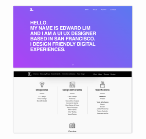
Edward Lim- eduxdesigns.com
Edward Lim is a UI and UX designer. I really like the simplicity of Lim’s website and the moving colour gradient used in the websites hero section. I also like the emphasis placed on typography in the hero section however I think I personally would prefer a more expressive choice of typeface. Though, I do feel that it is effective in not distracting from the project sections that follow.
I really like the ease in effect used for various elements appearing as the site loads and while navigating through it. I also like the icons used throughout the site. I felt the case studies on this website were particularly strong specifying each stage of the process in great detail from the beginning with an outline in Design roles, Design Deliverables and Specification. This is followed by an Overview, Discovery Phase, Brand and Identity, Information Architecture and Visual Design which are included in the top nav on every case study page.
A Problem and Solution are included in the overview section and highlighted by Princess Peaches (problem) and Mario (solution) icons- a reference I appreciated. In the Discovery Phase section User Surveys, User Personas and Competitive Analysis are all discussed and accompanied by images and icons. The Branding and Identity section is broken into Concept and Branding and Logo Design. Information Architecture is broken into User Stories, Paper Prototype, User Flow Using Sketch, Paper and High fidelity Wireframes and User Testing– which is followed by a Designing the Product Detail Page section. Finally an overall visual is provided in the Visual Design section. This provides a really in-depth overview of the entire project and exactly how each element of the project was tackled.
I would love to include case studies/ project pages in this level of detail highlighting my process for each project in a structured way as seen here.
Vic Bell- vicbell.co.uk

The overall feel I get from Vic Bells portfolio site is fun and playful with a clear demonstration of the illustrative focus of her work. I love the bright colour scheme and the inclusions of a featured project section. The typography fits with the playfulness of the overall outcome however the curved bubbly heading text is not something I’m particularly fond of.
I do, however, love how Bell splits up her text with a mix of titles above and to the side of the text and her inclusion line rules. I also like how Bell highlights and links text throughout her body text, bringing you to the websites of the projects she is referring to.
Vic Bell displays her process really well and includes her explorations showing how her work has developed and even concepts that didn’t work. I think this is a great inclusion as you don’t generally get to view the designer’s process in this level of detail. Bell also splits up her process into sections which vary from project to project however all begin with an overview, as a section I would like to include in my own project pages.
I would describe Bells tone of voice as informal, friendly and at times consultative. I think Bell strikes a really nice balance here and would love to achieve a similar tone of voice in my own work.
Rachel Schmitz- rachel-schmitz.com
Rachel Schmitz portfolio home page is very minimal drawing the viewers attention to only her name current job however mostly her projects. I love this approach and would like to experiment with something similar in my own portfolio homepage.
Out of Schmitz’s project pages, Google Attribution is definitely my favourite. The page is sectioned up really nicely with white nearly black and 2 shades of purple. It also features some really nice animated features with each section popping up as you scroll through the page. This works really nicely in both mobile and desktop view. Schmitz details her process very clearly and in really good detail. There’s also a nice inclusion of numbers, icons and vertical lines guiding the viewer down the page.
I would describe Schmitz tone of voice as slightly more formal and professional. I feel this approach works with her focus on product design and particularly as the majority of written content is included on project pages.
SFCD- sfcd.com
SFCD is a digital project agency. Their homepage hero section consists of a black and white videography reel combined with and coloured animation along with animated text. This followed by projects, their area of focus, their approach and finally a want to work with us section. Each of these sections is beautifully animated and include bold colours, product gifs, testimonials, awards, icons and smooth colour transitions. Out of all of the sites I have looked at I think being able to create a website like this someday is really an aspirational goal for me.
Rather than moving straight from the homepage to the project case studies, SFCD provides a work and contact page with a nice grid structure that allows the views to scroll through a grid of projects/ case studies on the left while providing contact details on the right.
SFCD case study pages are very in-depth and include a nice blend of 1, 2 and 3 column grid sections. Each section is split with a line rule and again I love the heading left, body text right text alignment used here and seen also on Vic Bell’s website. What jumped out to me on SFCD’s website was their use of a serif typeface for body type. This is very distinctive in a website context as I think so few people elect to use a serif typeface on their portfolio websites and therefore adds the level of professionalism on the site in my opinion. It also contrasts nicely with the Neue Haas Grotesk Display typeface that has been used for heading text throughout the project page.
SFCD’s tone of voice is quite informal and even playful in areas e.g. “Opening an account with Yota is a breeze.” As quite surprised by this as the overall site felt so considered and professional I was expecting a more formal tone of voice. However, I think this slightly more informal approach works far better in my opinion as would love to achieve a similar tone of voice in my own website.
What have I learnt?
- Animation can really impact the overall feel of the website and brings with it a level of professionalism as well as, in instances, boosting engagement with the UI.
- Audio is an additional feature that can be included if it adds to the overall theme though this should be considered with caution and I feel that the option to enable audio should always be included rather than automatically playing it.
- I should consider breaking sections up with colour and line rules.
How can I apply this to my work in future?
- When creating my wireframes I should consider the grid structures I want to build with as well as image and text placement.
- While I have already chosen my typography for this project it might be nice to experiment more with sans serif typefaces in future.
- I want to invest more time into learning how to animate in programmes such as After Effects and how to include animations in CSS and using JavaScript. These areas I would like to develop further so that I can add more animated elements into my portfolio website next year.