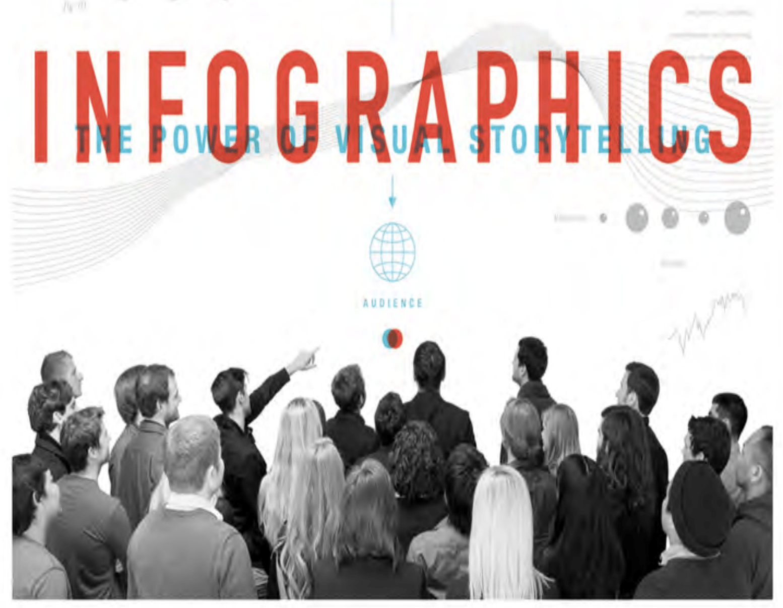
In this book, an in-depth look is taken into infographic discussing their purpose, how they are created, narrative and exploratory outcomes, efficacy, formatting, content distribution and various other related topics
I wanted to look at a chapter that particularly jumped out to me, What makes an infographic good?
The answer to this is likened to a quote from Horace’s thought on the role of a poet:
“[it] leaves you feeling informed or delighted”
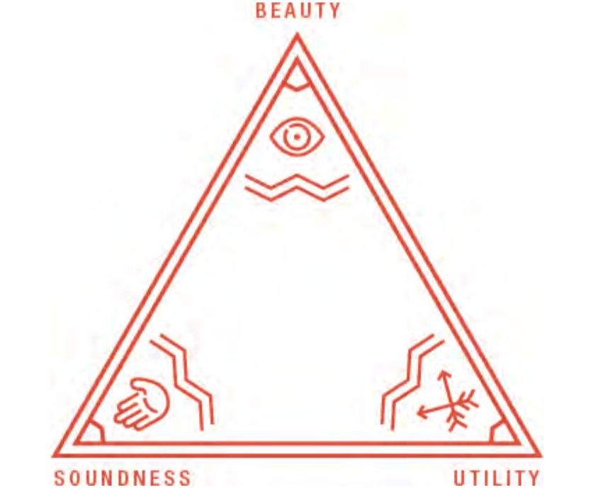
Another response relates to Vitruvius’ principles of design. Marcus Vitruvius Pollio was a Roman engineer, architect and artist. He states three fundamental principles of what great architecture (applied to great infographics in this instance) should accomplish:
Firmatis: It should stand up robustly and remain in good condition — be durable. (soundness)
Utilitas: It should be useful and function well for the people using it — be functional. (untility)
Venustatis: It should delight people and raise their spirits — be beautiful. (breauty)
This is aptly displayed in the below diagram included in the book.
Utility
Utility in an infographic can relate to a number of things however an overarching approach to utility can be taken by measuring how the infographic enables a brand [or subject] to reach its objectives. To do this you first must consider whether the infographic is narrative or explorative. A narrative infographic will tell a predetermined story while an exploratory infographic will present information and allow the viewer to come up with their one rationale. A narrative approach should be taken when the viewer needs to be left with a specific message, this form of infographic should focus on audience appeal and information retention. Exploratory infographics are generally the best approach in the scientific and academic presentation of information when clarity and insights are a priority. In this regard, I believe my infographic is best suited for a narrative approach as I want to leave people with an awareness of mental health disorders and links to substance disorder as well as the need to get access to mental health services back on track following the COVID-19 pandemic.
Soundness
Cliff Kuang is a UX designer and an award-winning journalist. In Kuang’s column which can be found at Fast Company, Kuang posts an infographic of day, he received hundreds of pitches from those wanting their infographics to be included but what he found was that the most common mistake made was that the information wasn’t interesting. Not only is it important that the information presented in an infographic be clear and accurate it is also important that the infographic communicates something meaningful and of value. Kuang states
“Infographic producers (from brands to designers) tend to confuse the amount of time and researching, copywriting, and designing an infographic with the level of willingness that an audience has to read the content.”
This is a really important factor as yes the audience may be drawn in by a beautiful design however if on further inspection the topic doesn’t grab their attention they’re likely to move quickly on. This has really got me thinking about my topic choice. While mental health is something I am passionate about as I love the idea of helping others and working together to improve our mental states, is the message I’m presenting achieving this. Furthermore, is the message being presented engaging? Another concern for me is that the level of awareness around Mental Health is pretty high in western countries and therefore my content may seem like more of the “same old thing”.
While I will not be changing my topic at this stage I did stumble across a book that I felt had a massive impact on me and how I view the world. It was called Ten Global Trends Every Smart Person Should Know. This book is filled with amazing and uplifting facts about the world that I had no idea about and I imagine others won’t either, such as global absolute poverty has fallen from 42% in 1981 to 8.6% in 2020. This I believe would make a great topic for an infographic and is something I would love to take stab at in the future.
Beauty
When considering the beauty (design) of an infographic there are two things to consider: design quality and format. Decisions around design and formating should be made on the basis of the data being presented and should ensure that the design does not misrepresent or skew the data. The book describes the design as
“the application of a visual solution to the problem; it is representative to the approach as a whole, rather than individual elements (e.g. an illustration or icon)”
This means not only reflecting on the data but also the target audience to ensure “form follows functions”. It is important, therefore, not to let personal biases and preferences slip in and rather present the data, e.g. using an illustrative or a minimilst approach that best fits the data and the target audience, not the designer’s personal taste.
Again I think this is a tricky one as perhaps we as designers are likely to assume that our target audience will automatically like what we like when this is not necessarily the case. However, I do believe that it can be achieved by adequate research into the data e.g. an infographic aimed at the stem sciences will have to use an explorative approach and also take into consideration that this field of interest is dominated by men and try to factor these considerations into colour, formating, typography and design choices.
What have I learnt?
- For an infographic to be good it is important to ensure that the infographic you are creating makes an impact on your target audience.
- Narrative infographics tell a predetermined story while exploratory infographics present information and allow the viewer to come up with their own rationale.
- It is important not to confuse the amount of time that I spend researching, copywriting, and designing an infographic with the interest it will generate in a target audience.
- When choosing and creating an aesthetic for an infographic it is important to consider the data and target audience.
How can I apply this to my work in future?
- While I always want there to be a story behind my work and that to be considered in the outcome that doesn’t necessarily mean I will always be presenting a narrative outcome. If the outcome requires viewers to determine their own response to the data an exploratory outcome will be more appropriate.
- I need to consider the level of interest I will be generating in my target audience and I think this is best assessed by considering whether I am presenting something that is either new information or drawing new connections and/or of some value to the target audience.
- I need to consider the data and target audience when designing and formating an infographic.