Typography Research
Fonts in Use
I found fonts in use to be a great resource and one of my favourites when researching fonts for my wordmark. What particularly good about this resource is that it places the typeface in context. There were several typefaces that jumped out at me when trying to select a style for my wordmark however I have chosen my favourites below.

Everett jumped out to me right away. I love the sharpness of the typefaces edges and its cut out feel. My only concern would be that the typeface is too fine and might become lost as a wordmark when scaled to a small size.

Similarly, Kreuz has a sharp-edged digital. I particularly love the ‘o’ in this typeface as it resembles a bolt which is quite a nice parallel if you consider the building elements within design.
Fonts by Hoefler & Co
Fonts by Hoefler & Co (typography.com) was another great resource. It was particularly helpful as it allowed you to view a full font family side by side in every width, condensed and screen smart version possible.
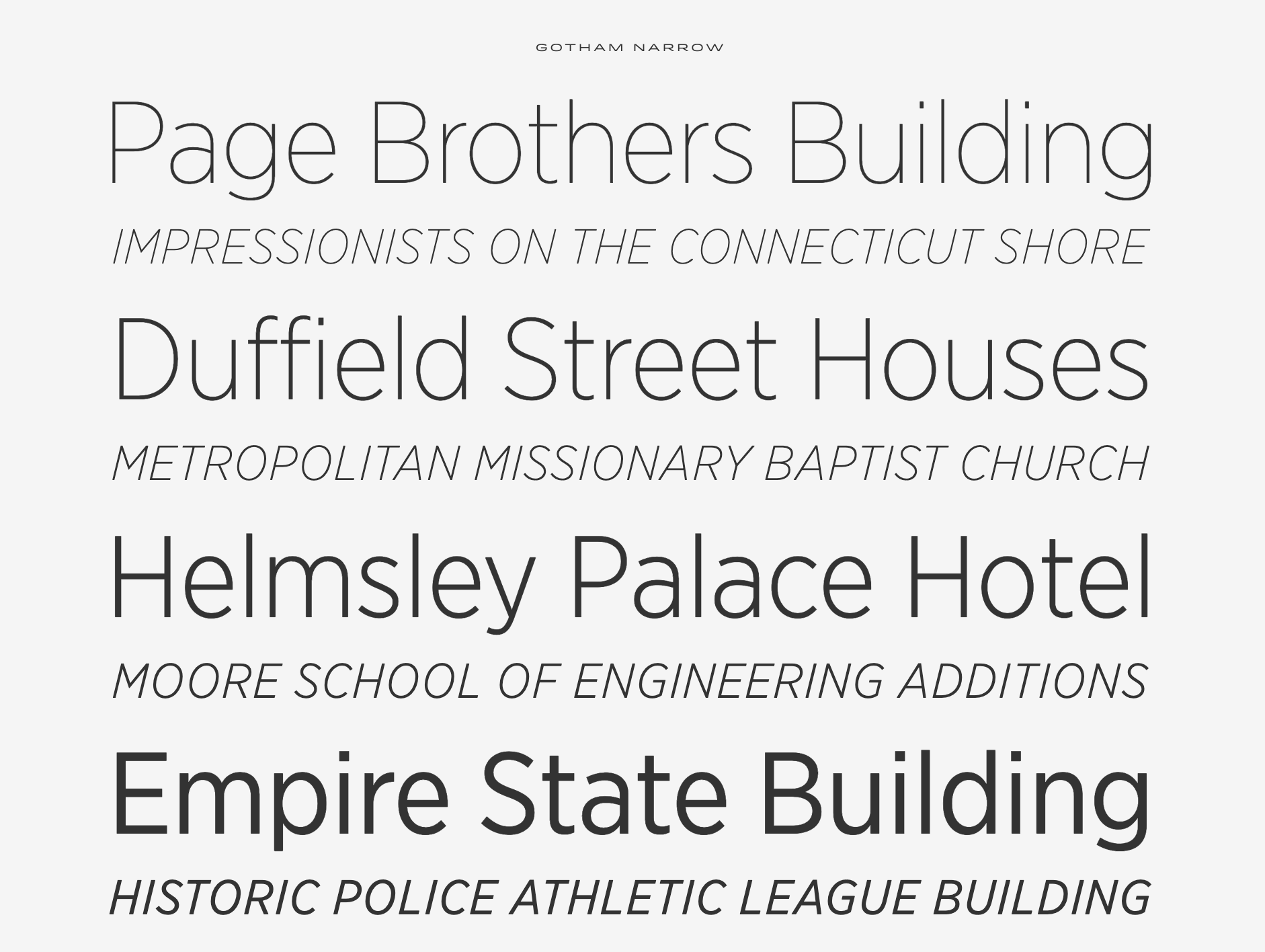
Above is an image of all the different version of Gotham Narrow placed together.
Typeface options for Rachel Donaldson wordmark

As I’m not fully sold on running with Rachel’s Design Lab as my portfolio name just yet I thought I would experiment with various typefaces for Rachel Donaldson as my wordmark. I was also concerned that I was narrowing my selection too soon towards a sharp-edged digital style typeface and decided to look at a broad range of typeface before I made a decision. I began with Playfair Display Black as it’s a typeface I really love with its playful variation of thick and thin strokes and the use of circles throughout. I then looked at a couple of sans serif typefaces- Century Gothic and DM Sans. I like the roundness Century Gothic however I feel it lacks character which draws me more strongly to DM Sans with two-story a and neck and loop on the g. I also experimented with a couple of script fonts a typewriter face and a modern roman typeface.
Typeface options for Rachel’s Design Lab wordmark

For Rachel’s Design Lab I wanted to stay away from the script typefaces as the idea of a lab for me requires a more clinical or futuristic style typeface. I began again with Playfair Display Black however in this context I didn’t feel the style was appropriate. The closest to a script typeface that I tried was Amatic SC (4th from the top) as I felt this might be more appropriate as it could reflect a handwritten note style. I also tried more futuristic-looking typeface such as Orbitron however I feel the outcome is a little too sci-fi looking. I experimented with Silom to see what a more pixel style outcome would look like.
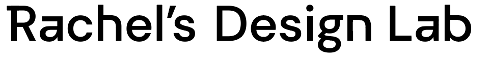
I decided to run with Rachel’s Design Lab in DM Sans as I think a sans serif typeface is more appropriate in this instance and I like the added details of the two-story a and neck and loop on the g. as mentioned. I also feel this gives me a nice canvas to work with in order for me to create my additional changes to add some personality to the outcome.

I began with a really quick sketch of where I wanted to introduce straight lines into my letters. My original focus was nearly entirely on making the top of the ‘a’ straight as this was something I was looking for in a typeface but couldn’t find. I then moved on to roughly consider how this could be incorporated in the ‘n’, ‘h’ and ‘b’.
Above is my final outcome and I’m really pleased with how it turned out. I’ve added additional straight lines throughout the most distinctive unsurprisingly is the horizontal line and right angle junction added to the a. Slightly more subtle amendments are the straight lines added to the h, g, n and b. See before and after below with area’s changed circled. Finally, I added an additional Stroke to the R to give a more distinctive feel. I drew inspiration for these primarily when researching Wim Crouwel as presented in my monogram research blog and hoped to achieve a more digital style outcome as seen in his experimental project New Alphabet.
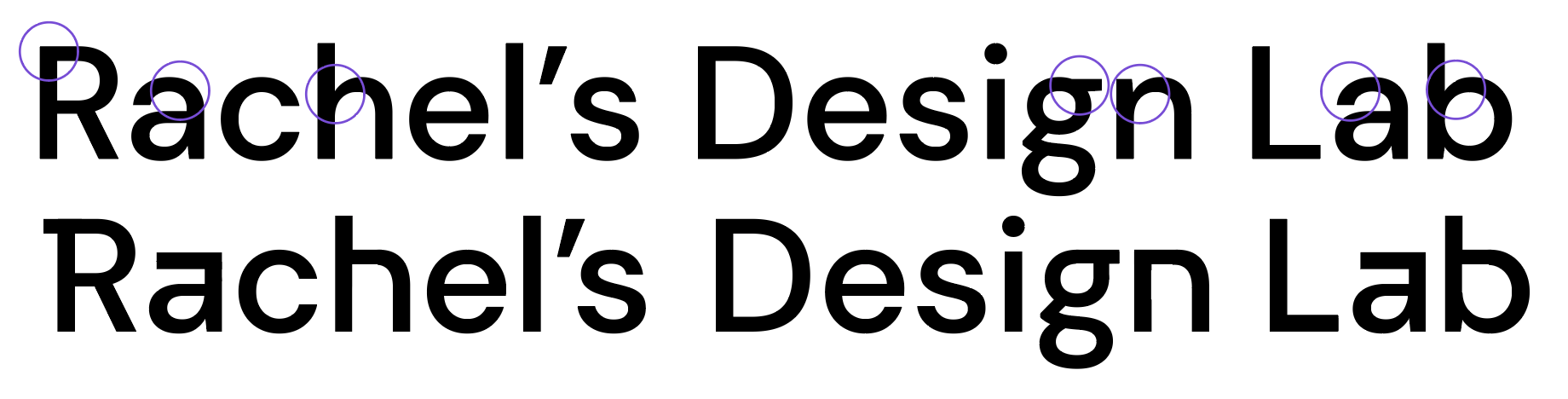
I really want to reflect a stylised professional outcome and keep my type in line with lab work and research. I also want the outcome to be memorable and interesting and feel that the changes made add a more original and distinctive feel to the outcome. However, on reviewing this with my lecturer and in gaining feedback, I realised further changes were required to ensure that all of the letters fit together and that not only sporadic changes were being made. I, therefore, made further amendments resulting in the following outcome.

Above I have added ends to the top and bottom of the ‘D’ flattened the bottom of the ‘e’ and added serifs to the ends on the ‘a’s and ‘b’. I am really pleased with this outcome and feel that it achieves the sleek and stylised digital feel I was attempting to creating. I really love this outcome and as I continue to develop my brand I hope to produce a completely stylised typeface that I can include as a header typeface throughout my website and all branded materials.
Typography Selection
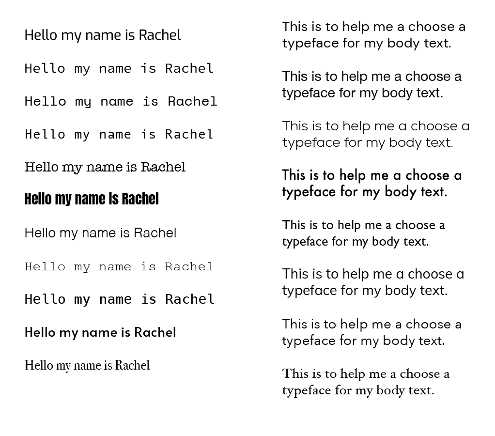
For my heading text, I created a selection of typefaces shown above to the left and for my body text, I created a selection of typefaces shown to the right. I generally knew I wanted to find a typeface that has a digital/ pixel feel to it in line with my wordmark and the design lab theme. I felt that a digital typeface might be found on old lab equipment. However, I did experiment with a number of typefaces before making my final decision including a bold condensed typeface (Anton Regular), a more formal serif typeface (Bondi 72) however I did not feel they fit with my overall brand at all allowing me quickly narrow my selection to either a sans serif typeface or a mono typeface. I decided to go with my original hunch and selected a Space Mono as my heading typeface as I felt this captured the digital/ pixel feel I was after. For my body text, I wanted to use a sans serif typeface however I did experiment with one serif typeface (Hoefler Text). I quickly decided to use DM Sans as this was the typeface I used to create my wordmark and I felt it would compliment my customer typeface very well. I would like to turn the customisation I have made my wordmark and turn it into a customer typeface for my headings at some in the future.
What have I learnt?
- It’s really important to consider the tone of voice when selecting a typeface for a wordmark
- Generating a list of different typefaces together is a great way to quickly decide what works as what doesn’t
- It’s important to consider scale when adjusting a typeface e.g. when I zoomed out on my final outcome I found the top of the ‘a’ appeared far too narrow even though it was the same thickness as the stem of the ‘a’ and had to make it thicker.
How can I apply this to my work in future?
- When selecting typefaces or even when attempting to customise my own fonts in use a great resource that I will turn to in future for inspiration
- When customising a typeface I found it to be helpful to focus on the changes I wanted to make to 1 letter and then continued to work individually across the rest rather than looking changes to the typeface as a whole, for me this was a great way to approach the task and definitely an approach I will use again if customising fonts in future