Victor Mosquera
Victor Mosquera is a digital/conceptual artist and has also produced multiple drawing and paintings. Mosquera works at Ubisoft Toronto a game developer company.
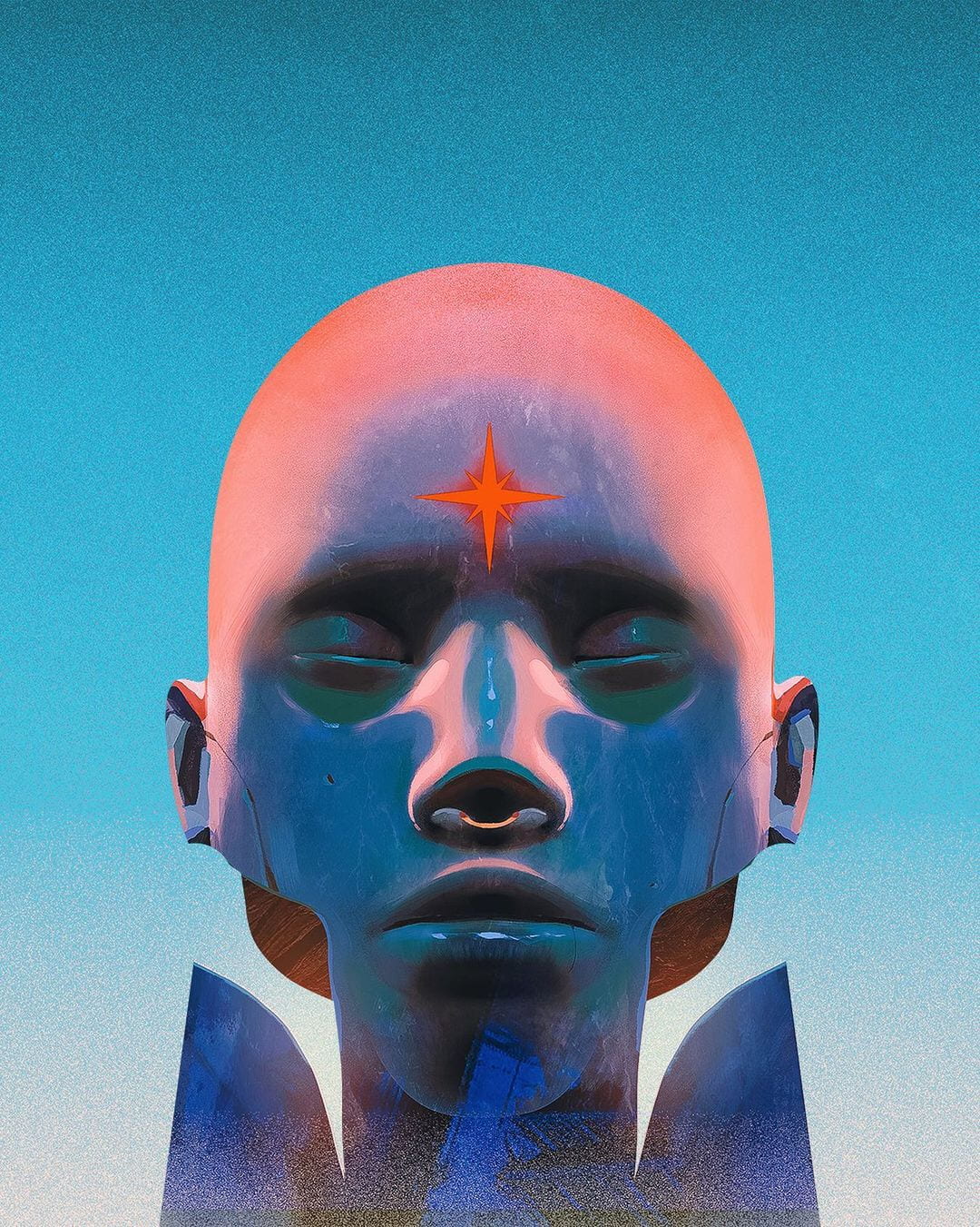
I love the uniqueness of Mosquera’s work and its otherworldly feel. I was particularly drawn to the above outcome due to the variety of textures created. The head appears as though it were made from marble with a strong shine effect incorporated in the nose and lips. The emphasis place on light and the beautiful oranges and blues that are used to create this peace result in an incredible hyper-realistic statue style outcome.
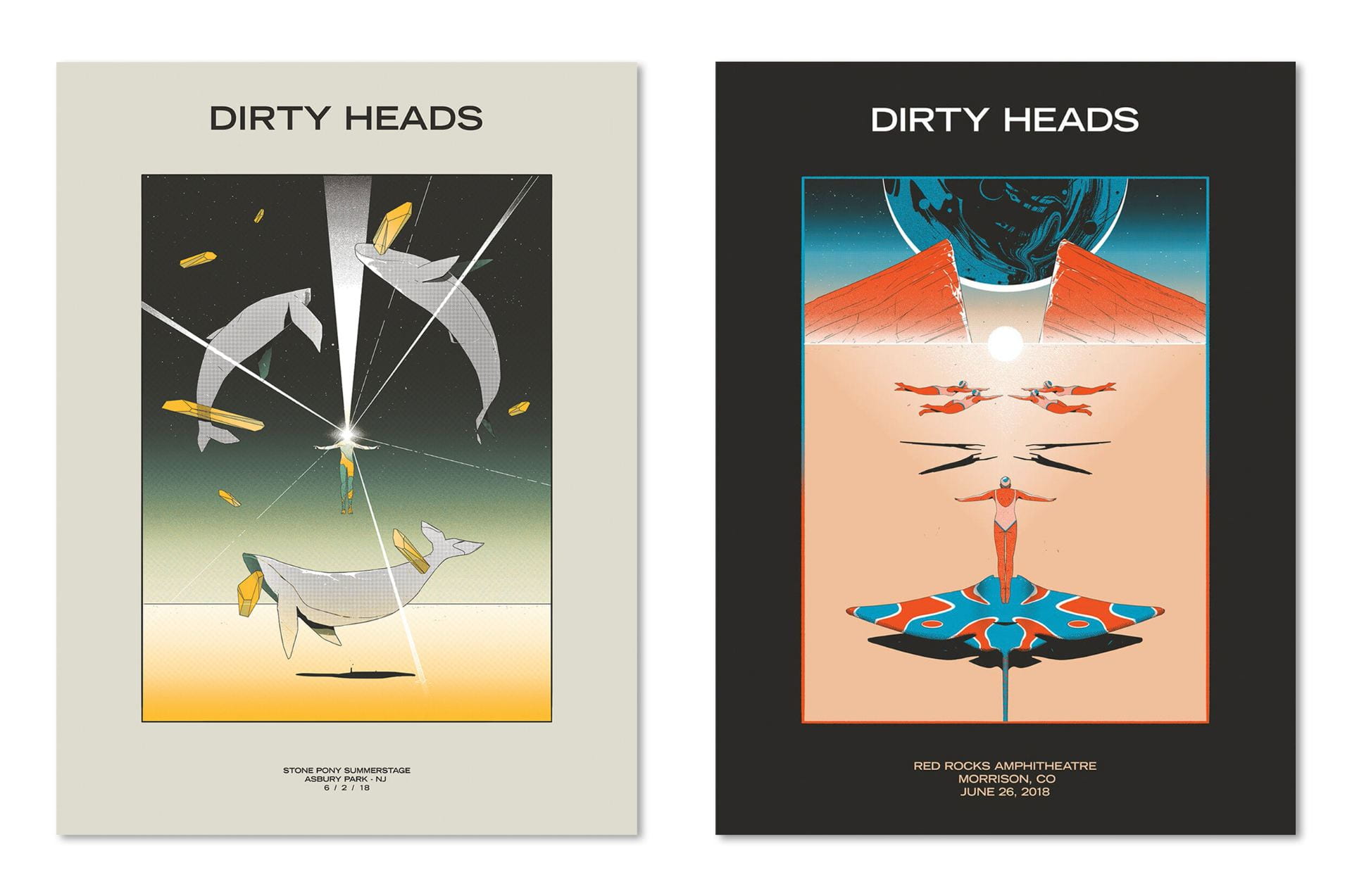
The Dirty Heads posters presented above stick to a more graphic feel. However, I love the use of colour combination and gradients as well as the focus on the light at the centre of both. The compositions are both incredibly strong as well as creating balance. This is particularly true of the post on the right which appears to be almost completely symmetrical.
I also get a slightly retro feel from the outcomes which I think would be really fun to reproduce in my own Star Wars-themed travel app. While I do not feel I would be able to recreate the accuracy and detail of this illustrative style I would love to draw from the colours used and would like to experiment with the style as I continue to develop my own illustrative style.
Olly Moss
While I have already covered Moss’ work and attempted to complete a master-apprentice exercise using one of his Firewatch posters I feel it was important to include Moss’s work in my Travel App research also.
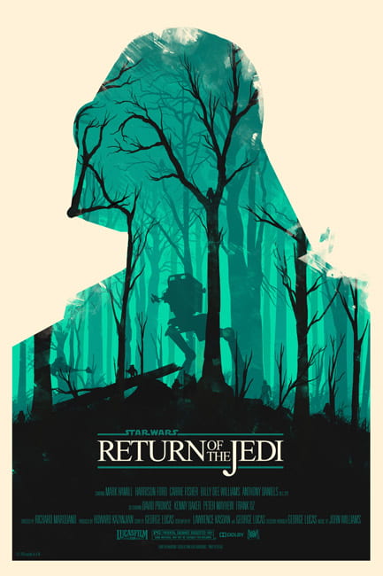
What I really want to capture in my own illustration for my travel app is the atmosphere created by Moss through his use of colour and presentation of light. I also love how the bottom of the image fades into black and creates a really nice setting of the text as displayed in the above Return of the Jedi poster created by Moss. This is something I would also like to experiment with in my own work.
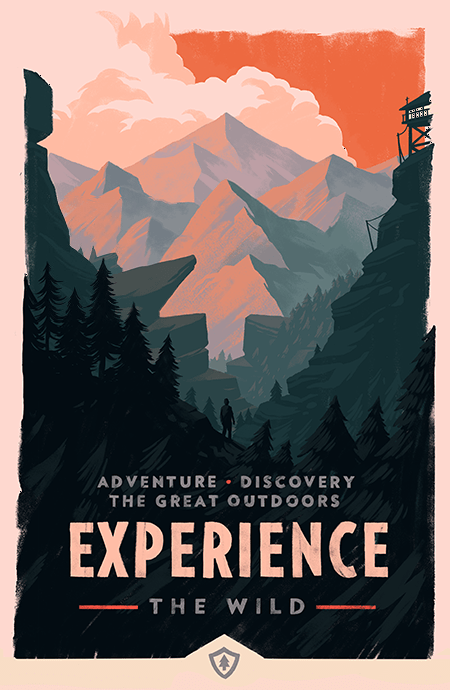
Again, I wanted to look at another of Moss’ Firewatch posters as he depicts mountain scenes so well and there are mountains included in the image of Jabba’s palace that I want to make an illustrative version of. The use of shading on Moss’s mountains is incredible and something I would love to recreate in my work. Using layers to present light scale and distance in his illustration is another defining element of Moss’ work in both his Star Wars and Firewatch posters and again I would love to be able to recreate something similar in my own work.
Chesley Bonestell
Chesley Bonestell (1888-1986) was an American painter and is described as a pioneer of space art. Bonestell’s paintings inspire the American space programme as his work helped popularise space travel.
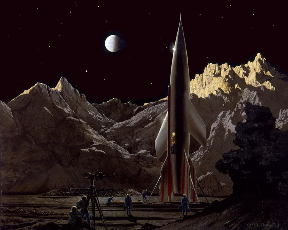
As Bonestells work has had such an impact on how we imagine space I wanted to include his work particularly when considering the galaxy illustration I want to include in my own app in a hyper-real style. Above is Bonestell’s Ship Ready For Return Trip, 1948. I think it’s incredible that Bonestell created this painting over 70 years ago and yet it still appears to accurately represent space to the point that I could be easily talked into believing that the above painting was a photograph. I love the inclusion of shading on the moon and the sporadic placement of stars.

In the above painting Saturn as seen from Mimas, 1948 I was particularly drawn to the detail used to create Saturn. I would love to be to incorporate this level of detail in my own planets however I’m not sure how I will go about this as I will most likely have to use photoshop to produce the 3D outcome I’m after.
Robert Hodgin
I was recommended to look at Robert Hodgins Planetary app as I was partway through the development of my illustrations however I have still been able to draw inspiration from this resource.
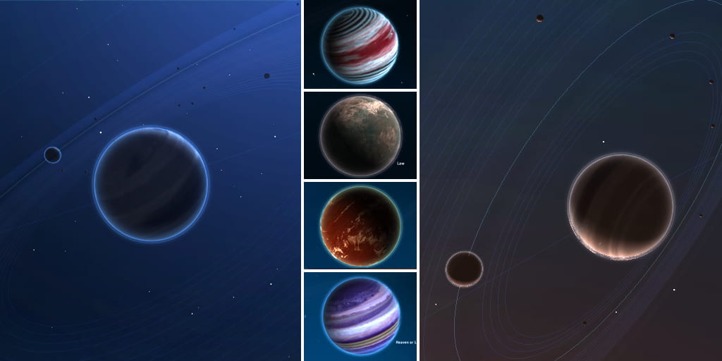
Planetary was an iPad app created to link with music playlists and present them as a galaxy of stars, planets, and moons. Above are a number of planets that were created from the app and what has immediately jumped out to me and I now intend to include in my own planet illustrations are the glows that surround each planet. I really love this effect as I feel it helps the planet to really stand out from its backdrop.
I also liked how Hodgins has included labels. I have currently added white boxes to house my text in my Galaxy view however on completion I feel all the white boxes were a little overpowering. I think using white text against the dark background as presented above should provide enough clarity for the text.
What have I learnt?
- Colour is really important for demonstrating light and creating an atmosphere in illustrative outcomes.
- It is important to consider composition in illustrative work and the level of symmetry I want to include in my outcomes.
- By changing the colours of certain sections of my illustrations I can create a sense of light.
- When creating my galaxy scene I need to consider the direction of the light and shade my planets accordingly.
How can I apply this to my work in future?
- I should try to consider textures in my illustrations for my Star Wars travel app however this is something I want to develop in my illustrative work as a whole.
- I want to experiment with colour and gradients to create a sense of light in my travel app illustrations.
- It is never too late to find a new resource that could improve your work and therefore I intend to try to keep an open mind when working on projects in future and readily review my work in relation to new research.