Paula Scher
I really enjoyed the abstract series and particularly the episode focusing on Paula Scher: Graphic Design. I was particularly struck by her work for The Public Theatre and how iconic the brand has become using simple weighting to produce a really interesting, bold and eye-catching.

Scher breaks this down further by likening the variety of weight to New York and the variety of people that live there. The topic of how type can be used to display character in the way it’s presented and how weight, height and even moving the middle bar of a capital E in a variety of ways can completely change the appearance of the letter so that before you read the type you can already elude to the ‘Spirit’ of what’s written. This is a really interesting concept and reinforce the importance of use case and is incredibly helpful to remember when producing a logo, promotional materials and websites.
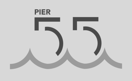
What also jumped out to me throughout the episode was the level of meaning that Scher attached to her design work i.e. there is always a reason as seen in her design for Pier 55 in which Scher actually pulls shapes from the plans for the pier to create the 55 and then emulates its position on the water in the final outcome.

What also grabbed my attention was the Scher’s discussion with a new theatre client in which she describes how she wanted to develop a visual language that would mean a person wouldn’t need to see the logo to know that they were looking at the theatres material as she had done with the public theatre. This notion of creating a clear identity throughout promotional materials really struck me particularly in a theatre where each play would have its own identity meaning it was important to not only promote the play but also the theatre at the same time. Blending the two together will produce a cohesive visual that can run across all plays and workshops connecting them to the theatres overarching brand. This strategy makes perfect sense to the point that it almost feels like ‘common sense’ however I feel that it is a tool that is often overlooked in advertising that could be better employed and may be useful if I choose to move forward in a career working within marketing/advertising.
Ian Spalter
The abstract episode on Ian Spalter takes a really interesting view of not only digital product design but also how Spalter developed as a designer and essentially grew with the industry. Ian Spalter is head of design at Instagram and the episode looks at his progression from items such as the fuel band, a tracking system similar to a fit bit produced by Nike. This was the first product that allowed ordinary people that were not professional athletes to improve their health habits through a tracking system.
Considering how popular fit-bits are now and innovative this project would have been at the time I imagine this to have been a really cool project to work on as it is a system that actively benefits people with limited negative outcomes.
From there the documentary moves on to look at Spalter’s redesign of the Instagram app and logo and how he spent a month redesigning icon having the designers within his team complete tasks such as taking 10 seconds to draw the original icon in their weekly meeting finally drawing up every variation possible and adding colour using one of the simpler outcomes to reveal as much colour as possible (the wanted to keep the rainbow and therefore incorporated in a colour gradient)
Unfortunately for Spalter, the response to this change was bad with the general view that it was too simple. However, the app interface was kept largely the same with the primary change being removing the colour and simplifying the UI which didn’t seem to bother people too much. I do wonder on the basis of this, how important app icon designs are particularly to established systems such as Instagram that are already so popular as the app didn’t seem to be negatively affected by the change in terms of its number of users. I would suggest that maybe the design change was just too severe and it took people a while to adjust as I personally feel that the incorporation of a gradient in this work has brought back popularity in the use of gradients.
Making large changes to massive platforms such as Instagram are described by Spalter as uncomfortable. He describes trying to find the boundaries in order to see how far they can go and speaks about finding the problems that they as designers have the permission to solve. I take this to mean understanding what features can be added to the app that will improve the user’s experience and how they can be added in a simple and effective change that allows the user to smoothly transfer to updated version of the app.
It’s also really interesting to even get a better understanding of the product design and why that term is used over UX or UI design. In relation to this Spalter talks about the product experience, and how the design has to deal with the product as a whole, not just a moment or an interface but how that product features as a system and things move and flow as part fo that system. I think this is really important when designing anything and if you can achieve that birds-eye view almost as a designer you have the potential to create something pretty amazing.
