After having looked at how art movements that developed throughout the 1900s as a response to the movement from rural to urban bases I thought I would look at Japonism the Art’s and Crafts Movement and Art Nouveau in a little more detail. I particularly want to see how I can draw influence from these movements to create interesting outcomes incorporating them in current design challenges e.g. logo design, product design and branding.
Japonism
The introduction of Japanese art and design in Europe revolutionised the contemporary standards of composition, colour and perspective. This influences on European art has become known as Japonism incorporating iconography, bold colours, flattened perspectives and the graphic quality of Japanese woodblock Ukiyo-e prints. This style lends itself perfectly to simple illustrations and icon design. I think it could be really interesting to draw inspiration from some of the works in this movement and incorporate it into logo design.
Below is Katsushika Hokusai, Under the Wave of Kanagawa also known as The Great Wave, from the series Thirty-Six Views of Mount Fuji. 1830-32. I really love this piece, the drama of the curling wave and how it reveals Mount Fuji in the distance. Therefore I thought it would be interesting to see how I could emulate this masterpiece to create a simple logo design.

I began by recreating the wave on illustrator. I wanted to capture some of the waves most distinctive features such as the curled edges at the top of the wave, the blue and navy striped coloured effect and the inclusions of circles to show water droplets, see outcomes below.
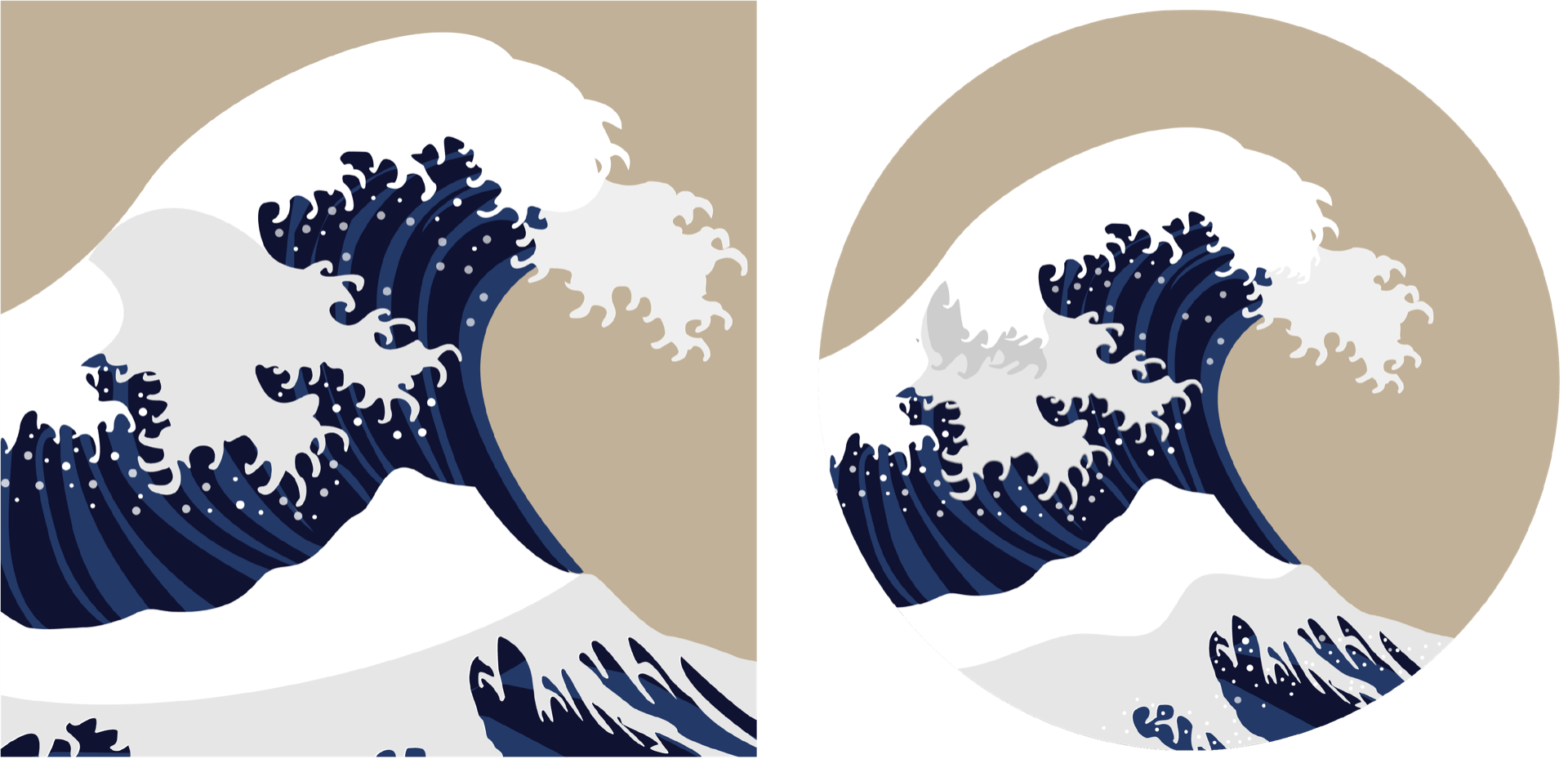
I then decided to use this illustration as the basis for a surfing competition logo. I found the colour palette to be not bright enough for this outcome so I began by making the background a bright blue several shades lighter than the wave and added in the name of my surfing competition The Great Wave Pro. I felt this was still a little bland so I drew in yellow and red to give it more of an ‘Olympic Games’ feel by adding a border and stripes along the bottom of the outcome.
![]()
This was a fun exercise and I am very pleased with how effective the outcome is. While I probably left in a little too much of the detail of the wave to be used in a real logo I feel with some further simplification and perhaps more playing about with text placement this could result in a really strong Japonism influenced logo. I have found this exercise really useful in showing me how influences can be taken from everywhere particularly movements in art history and how it’s important not to confine myself to current trends when producing any design outcome.
Arts and Crafts Movement
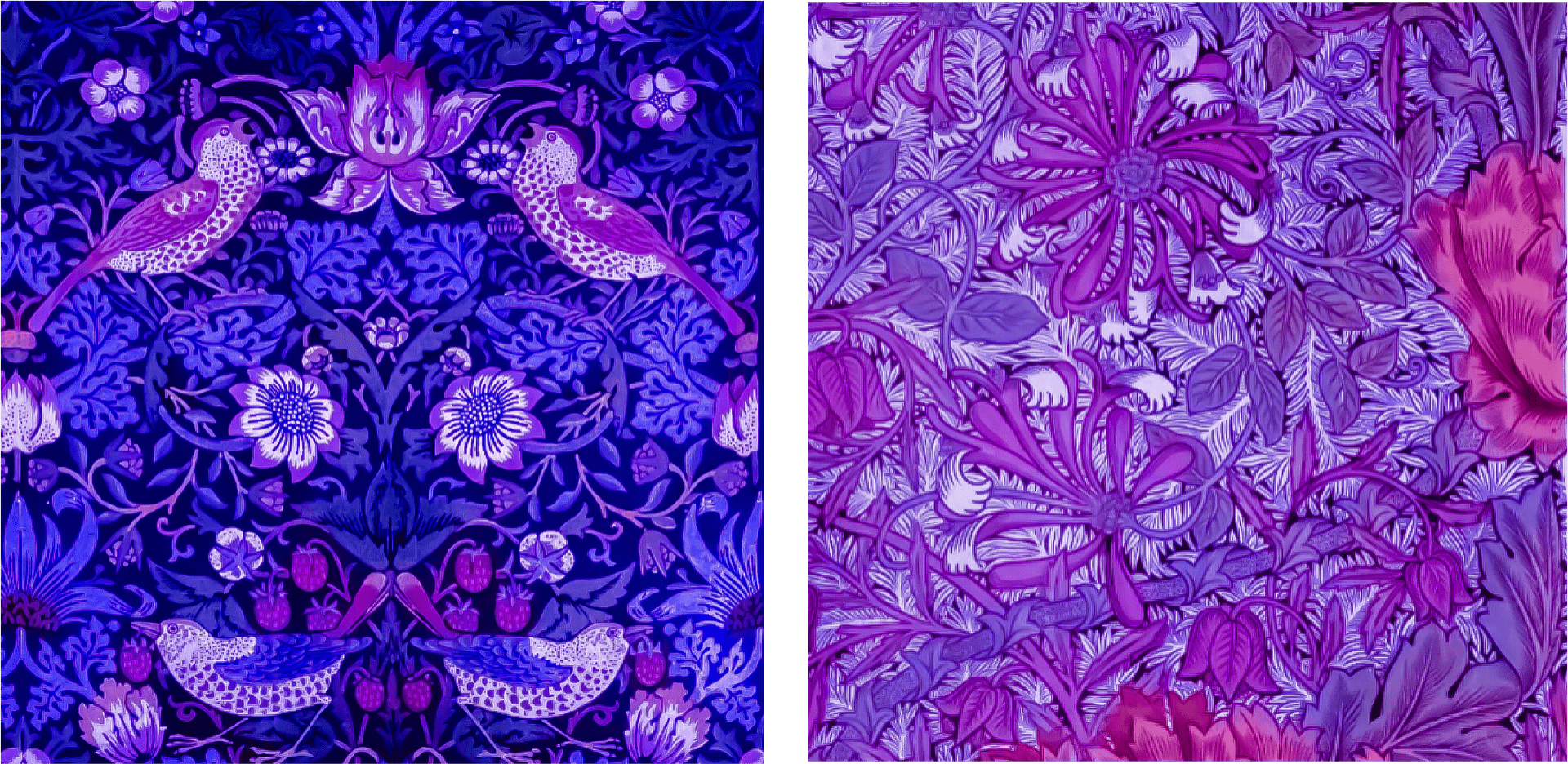
The Arts and Crafts movement was very much a response to the industrial movement drawing inspiration from nature. One of the leading figures in the movement was William Morris. Morris has been described as a revolutionary force in Victorian Britain due to his work as an artist, craftsman, designer, writer and socialist. Some of his most memorable work today includes his wallpapers and textiles. Below are 2 examples of Morris’ work; Strawberry Thief and Honeysuckle.
.
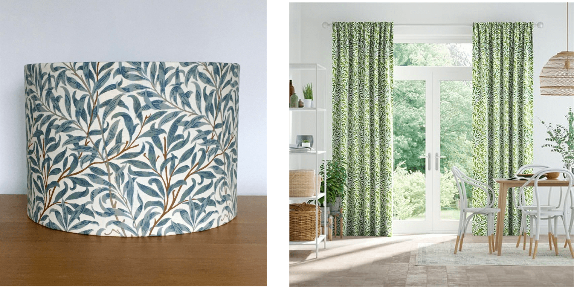
Personally, I always kept my distance from the Arts and Crafts movement. When it came to design I found the work dated with too much detail and I struggled to see how incorporating any sort of inspiration from the movement into my own work could be of benefit. However on further research and seeing how Morris’ Willow Bough pattern had been incorporated in textiles today including lampshades and curtains, see images below, I realised that it wasn’t the design work itself that I was struggling to engage with, it was its context.
In seeing the textiles placed in beautiful, clean, minimalist surroundings all of a sudden I could see the value in the arts and crafts movement as an engaging point of interest. Another stumbling block for me was the general colour palettes used. I, therefore, decided to experiment with Morris’ Strawberry Thief and Honeysuckle by changing the colour pallet on photoshop to see what sort of interesting outcomes I could produce. I was particularly pleased with the blue/ purple outcomes shown below.
I now began to envision what these patterns would like if included in album art and could start to imagine some really cool outcomes so I jumped on illustrator to try a few out and ended up producing the below.
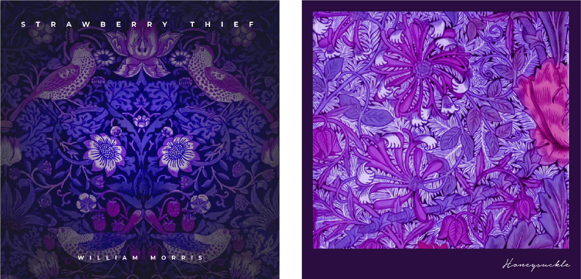
I really love these outcomes and can hardly believe that they are produces using actual outcomes from the arts and crafts movement. I now feel that the outcomes that have to potential to be produced by drawing inspiration from the arts and crafts movement are endless. I am very keen to experiment with this further in the future as I feel that while I love minimalist style outcomes I often run into the problem that work can become bland and indistinguishable against so many other similar outcomes. By incorporating points of interest through the use of nature-inspired patterns as seen in the Arts and Crafts movement I will be able to add points of interest in my work.
Art Nouveau
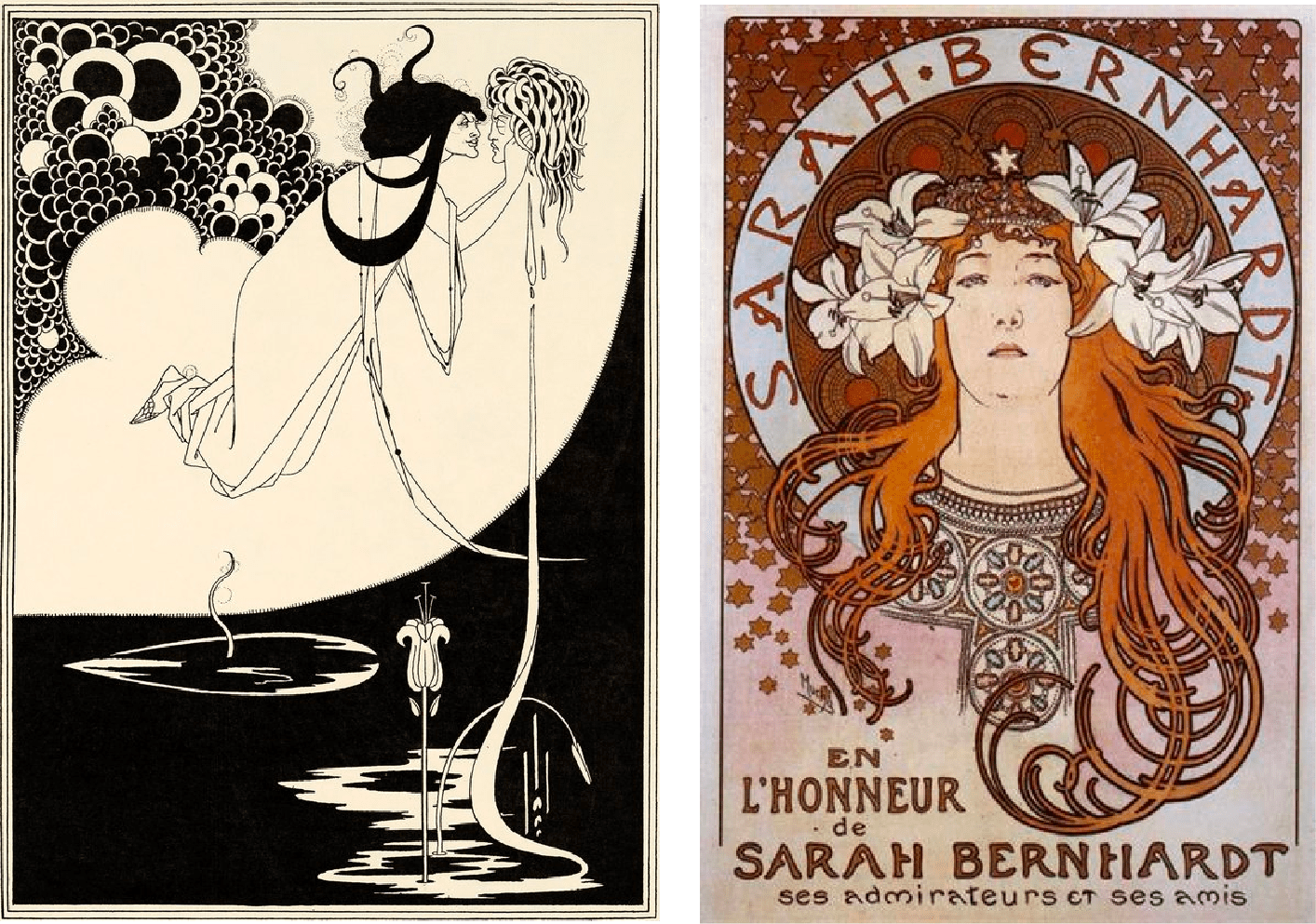
Art Nouveau is another movement that takes inspiration from nature as well as natural forms and can be seen in architecture, ceramics, jewellery design and paintings. Artists such as Aubrey Beardsley and Alphonse Mucha have become well known for their contributions to the movement with Beardsley’s Japanese woodcuts which demonstrate decadent and even grotesque outcomes, see below to the left. Mucha’s work somewhat contrasts the work of Beardsley and is far from grotesque in his decorative and beautiful depictions of stars such as Sarah Bernhardt in his theatrical posters, see below to the right.
The movements influences in art and illustrations are very evident in the years since but what had struck me as particularly impressive it the movements influence on branding with some even detecting traces of Art Nouveau in the Starbucks branding. As I have already experimented with using Japonism to experiment with logo design I thought it would be interesting to see how I could incorporate the Art Nouveau style into product design. I thought I would attempt to produce packaging for Argon Oil- an oil generally applied to the face and hair. I used an intricate pattern for my backdrop and made it a slightly darker green to the backdrop and downloaded the typeface Amarante from google fonts along with a leaf png form pngtree.com to produce the below outcome and then dropped it on a dropper bottle mockup and packaging using photoshop.

I can definitely see how using Art Nouveau can be a great influence to produce interesting and effective product particularly for high-end products. While I am pleased with the above outcome I think If I were producing this for an actual client I would probably run with a sans serif typeface and make the pattern on the packaging textured for a really impressive outcome.