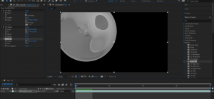
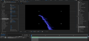
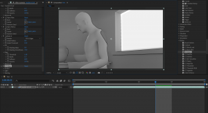
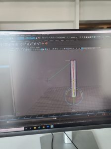
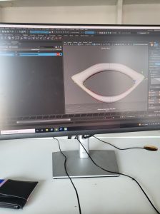
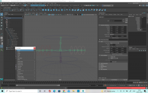
Rendering was a little bit difficult at first as the computer I was using did not export properly. I wasn’t sure what was causing this as I was following the video. However, once I changed machines I was able to export the test export of my lighting scene. This gave me a chance to explore adobe after effects as I had never done used that program before. There was some very cool features which could be used, but I didn’t get a chance to explore with all of them. A few which I really liked was the glow, as well as the cartoon. These effects were really interesting and I think there is certain projects which could really be enhanced by this. When I was done with the editing, I send it to the adobe media encoder. These two programs work side by side and so it is important to know how to use both.
Category Archives: Animated Narratives
Week 9- Animation Practice
This week we were introduced to a new type of rig, the Inverse Kinetic, or IK rig as well as how to use the grease pencil tool.
The grease pencil tool allows you to draw out the movement you want your 3D animation to follow. This helps with the block out of your animation. For this exercise I used the ultimate walker rig which had already been provided. The grease pencil tool was really helpful here as I was able to mark out what position I wanted the rig to be in for the jump. Once happy with the placement of the grease pencil markings, I created a single sphere to the side of the rig which I could use to help get more of a 3D sense of placement. I made keyframes of what position I wanted the body of the character to be in at each keyframe.
After this I moved onto the blocking pass. This involved looking closely at the jumping references and making keyframes of the big movements first. One thing which I struggled with at first was trying to get a natural pose for the character when it was bent down, getting ready to jump. I originally had the body bent back too far and so if it happened in real life, the character would fall over backwards. After some work and a couple of tries, I managed to find the correct center of gravity for the model. I tried to capture some leaning into the pose to make it look more natural. For the initial blockout of the rig I used the sphere which I had already keyframed to help me with getting the timing right. Getting some of the details such as the points of the feet when the character jumps came next as these details really bring the animation to life and you want them to be accurate. After I was happy with this, I went back to do the in betweens. This really helped to fill in the gaps which made the animation look strange. When I was happy with this I went to add a few more details, such as having the feet lift to different heights and at slightly different times. I had a bit of difficulty with this as when I tried to do the keyframes for the feet they moved in a strange way. It took me quite a while to figure out where the issue was, but eventually I was able to fix the keyframes and get it to a natural movement. I also initially had some issues with the knees, possibly as I was not yet used to working with inverse kinetic leg rigs. After trying the exercise a few times and using different positions I was able to get it fixed and to move the way I wanted it to.
Once I was happy with how the rig and animation looked at this point, I moved onto the 2nd pass. This pass really helped me to improve the movements of the character and make the jump feel more natural. I was able to fix the details such as the position and points of the feet both in the air and when it landed back on the ground. This really helped ,e to bring the animation to life and incorporate more of the principles of animation. I added some more anticipation into the character to build the jump up a bit more. I also added in a little bit more time at the top of the jump to give the movement a bit more influence.
The polish pass was done to ensure that I was happy with the final animation, as well as the timing of everything. This was my first introduction to the dope sheet and how you can use it to edit your keyframes and in the beginning I found it very difficult. I couldn’t quite work out how to move the frames to the correct place. I was able to get the hang of it better after requesting some extra help from the lecturers. I was happy with how the rig ended up looking, but I do think it could be improved further with practice.
Week 5- Animation and 3D Previs
This week we were introduced to 3D previs and how it works. I had never heard of the concept of 3D previs before so it was really interesting to learn about how all animated movies have a previs to help with planning. There are also some high budget movies which have previs made for them, as it helps directors and film makers to plan out shots ahead of time.
We were given the chance to do a 3D previs for Jurassic Park as practice. This was a great practice and it was my first time to learn the skills. I struggled a lot at first as the key frames would not set no mater where I set them. I couldn’t figure out how to fix this so I decided that copying the meshes into a new scene might help. Surprisingly this did mean I was able to set the keyframes and I could get to work on making the previs.
It was difficult to get the frames quite right but I was able to get a draft of the Previs done with some good timing and not too bad animation. Obviously it will be improved with practice and as I get more used to 3D previs.
Week 7 and Week 8 – Rigging
WEEK 7: AN INTRO TO RIGGING
Rigging is a crucial part of 3D animation so we had two classes on it to learn. We started with the basics, learning about the different elements which make up Rigging, such as hierarchies, kinematics and joint skinning. It is important not to move the mesh when animating, but instead use the controls which means that anything in your scene which moves, will have to have a very simple rig to make it work for your animation.
We started with the very basics of hierarchy structures, such as parenting one object to another to allow them to move together in an FK chain. These rigs behave much like your own joints would, e.g. you upper arm controls you elbow, your elbow controls you forearm and your forearm controls your wrist. This makes it a very useful rig for animation so it is important to understand it well.
We did a practice exercise to try and get familiar with FK rigs, using a very simple arm. We used a simple cylinder, with some cuts around the middle to allow it to bend. Then, we applied the joints using the rigging tab of maya. It is important to parent the joints in the correct order otherwise it will not behave how you wish. The arrows between the joints are a crucial way of seeing which way the joints are parented but they are not actually part of the joint.
After you are happy with your joints, you have to bind the skin. You do this by opening the rigging menu, selecting the bones and then the mesh, and clicking ‘bind skin’ from the skin menu. This connects the bones to the mesh, and allows them both to move together.
There are times when you want to clean up the way your mesh moves with the joint, such as if you are getting a pinching motion when you try to bend it. This can be adjusted using the skin weights tool. This allows you to adjust the influence of the bones on the mesh. It is important in order to keep your mesh looking natural and moving in a realistic fashion.
The second exercise we looked at was how to use joints, constraints, points and orients. This exercise was a lot of fun as we got into some more of the principles of animation, such as follow through. There are cases when objects want to follow a different orientation from their parent. This makes things a little more complicated but it does provide a much smoother animation. A constraint allows us to do this. So in this case, instead of using a parent constraint, we looked at using an orient constraint. This will then connect the object you want to move with the constraint you have created. However, this will result in the object being set to the coordinates as the constraint so if you wish to avoid this, then you can simply open the orient menu and unclick the maintain offset button. This means now when we turn our example wheel it will simulate gravity better.
Again, we do not want to be animating the mesh so we have to create a control for the wheel to follow so as to not interfere with the mesh. Following this, we will create a point constraint so that we can have everything connected to one point and move the control and constraint from the one point. This is helpful for moving your model about your scene.
You can then create your animation by setting the key frames. This allowed me to add in some extra animation, such as having some wind in the scene blow the water buckets a little unevenly.
The next exercise we looked at was a control rig for a tentacle model. Control rigs are very important for animation, particularly as you often share files with and you want to have a nice clean rig which teammates will be able to maneuver. We started with creating the bones for the tentacle to follow, and made sure the parenting was correct. Next is binding the joints and mesh. This will allow us to move the tentacle, but it would be easier to attach a controller which will allow for more interesting animation. It will also make the animation better.
To create our controls, we use a nurbs curve which can be scaled up to surround the object. Then we need to freeze the scale of the nurbs so that we don’t get any deform on the objects. We can then change the colours so that they are easier to see against the mesh. Once that is done, and we have created enough nurbs curves for each joint we can use the match transformations to make sure that the controls are placed at the same level as the joints which will be better for the animation. The next step is to do the constraints. We can use a parent or an orient but in this case we want to use an orient constraint. The contraints will allow the joints to move when we use our controls, instead of having to use the joints or mesh for movement.
I did an exercise in parent constraints which involved having an arm pick up a cup and lift it up to take a drink. We started with making a simple IK arm, which will be used to pick up the cup. The cup was created with a base control and a second control which will allow us to move the cup also. This is helpful as it will allow us to add animation into the cup even after we have locked the hand with the base control. If we do the animation of the arm and hand moving up before we move the cup it will be easier to find the key frame where we wish to have the cup go with it. We first select the controlling object, and then shift select the cup and add a parent constraint. In this case we want the maintain offset button to be ticked. We have to keyframe the object we want to move with the parent (which in this case is the cup) in order to stop it from moving along with the arm when we don’t want it to. This will create a blend parent node in the channel box which we will need to set to ‘1’ when we want the motion to start. Then on the keyframe before, set the blend parent to ‘0’ which will allow the cup to only move whenever we want it to. Next, repeat this with the keyframe where the cup is put back down on the table and the arm lets go. It is the extra control above the main control which allows us to add more animation into the scene.
WEEK 8: BLENDSHAPES
Blend shapes is a very interesting part of animation, as it allows you to create a number of different expressions. It was interesting to learn about the different relationships objects have and the use of the shape editor. It is important to set a target for your object, otherwise your blend shapes will not work properly. You can use different areas together to create a variety of expressions which makes blend shapes very useful for character animation.
I started by making myself a mouth shape which I would use to create the expressions. Using the soft selection when selecting your vertex points helps to create a more subtle change and helps make the expressions look better. When I wanted to make the mouth open I selected the areas I wished to change and moved them up and down to create the shocked expression I was after. You can also duplicate the target if you wish to mirror a smile for example on the other side of the mouth.
You can use more than one slider at once, so you can experiment with the variety of different expressions you can make by using different blend shapes together. I made different expressions by only tweaking one side of the mouth compared to the other to experiment with a smirk or a full smile. It was also interesting to add on the opening and closing of the mouth with the smile.
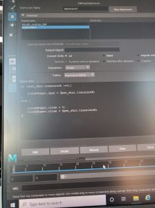
Next I looked at connections and expressions for UI. It is very handy to be able to connect attributes such as scale between objects. You have to use the connection editor of this. I started with a cube, and a circle. This allowed me to simply see how the sphere could be affected by the cube. You can also use the expression editor to do the same thing as the connection editor. With the expressions editor you have to create expressions which gets a little bit more into the coding and programming side of animation which is not my strong suit. I struggled at first with this as I was not able to get the expressions to change but I was able to make it work on the second attempt.
This is an area which I still need to work on as I feel there is a lot more to learn and explore but it was good to start to explore getting a grasp on the basics.
Week 4- 3D Animation
This was the first real start into 3D animation so we started with the simple bouncy ball, much like when we started covering 2D animation. We kept it quite simple initially, with having a bouncy ball jump into the frame and hit a wall before bouncing back. This exercise was not too difficult to follow and I managed to get the initial movement of the ball hitting against the wall. Unfortunately, this is where I ran into a problem. Maya suddenly stopped working and would not open properly. I was working from home at this time, as there was a strike and so it was hard for me to get my laptop back up and running for using Maya for about a week. This was quite stressful so I began to panic a little about the animation, however after attempting the exercise’s using the school computers (and the 2020 version of Maya once I was able to get it installed on my laptop) I was able to start learning properly about the processes of 3D animation.
Week 3
This week we watched our presentations in class. We got some good feedback on our groups work, including the layout and there being some good analysis. One thing which I believe was a shame, was that there was some good analysis which we ended up having to cut due to time constraints. In order to show this work, I separately compiled a video showing everyone’s parts together as they originally were. The section I was covering was 2.22 to 3.55 so there was a lot to cover.
For the afternoon session, we got into our groups and started to brainstorm what we wanted our final project to be. We made some good notes, but some advice we got was that some of the stories were perhaps a little too long and complicated so they would need to be cut down to 30 seconds. We have agreed to pick our top three ideas and discus on Monday to see which is the groups favourite.
We also did some work on 3D animation. It was very difficult and at the start I really struggled to get the creature to move properly.
The first draft was very jumpy and I couldn’t get a smooth animation. I also couldn’t get the sound to import correctly so it was not a good job.
The second attempt was a tiny bit better. I was able to get the sound imported into the file which was something, but I was still not happy with the animation. I will need to practice a lot more in order to get my animation improved.
Week 1
This week was primarily an introduction to the module we will be covering this semester. We also got assigned our project groups for the short film presentation we will have to do on week three. We got a chance to look through all of the films in the morning and then in the afternoon we did an exercise to help us identify the armature and the steps of the hero’s journey and how important they are to story telling. For this exercise, we rolled dice in our groups and then we have to come up with a short story relating to the images which we rolled. We rolled a set of pirate dice, and so we came up with a story of an old man who guarded some treasure on a deserted island. A noble man comes to steal it, with her men and they try to make the old man walk the plank. When they do this, a curse is revealed and the Kraken is released from the depths of the ocean, killing the nobleman and his crew. The old man however, is able to survive and escapes back to his island. This exercise was useful as it enabled us to be able to understand how to create a story from the bottom and all the important points which need to be covered in order for the audience to understand it. I have included photographs of my notes from this exercise as I took the role of the note taker.
Week 2: Analysis
This week we were given a lecture on the technical aspects of filmmaking, particularly in animation. One of the tasks we were given was to watch the short film ‘ Best Friend’ by Gobelin studios. I made some notes on it based on the lecture we had just seen. I have included photos of the notes I took. My group was not in this day so I ended up doing the analysis by myself which was a bit of a shame as it would have been nice to hear other ideas from the group. 
Smash and Grab Analysis
We have been given the short film ‘Smash and Grab’ to write about for our group presentation. I started by watching the short and making a note of where I thought the breakdowns of scenes could be done to divide the work as evenly as possible. I found a scene which I thought would be really interesting so I asked the group if I could cover this part. They all agreed this was fine so I got to work analyzing it.
I found that I wrote too much for my part of the scene, given that we only have two minutes to speak each and we want the presentation to be delivered at a good speed which is clear to the audience. I decided I would cut down my basic notes but I have included them here on my blog:
In text form:
- Narrative structure & relation to the Hero’s Journey
- Mise-en-scène
- Cinematography
- Sound
- Editing
- ‘Discovering intent’ – How it evokes a reaction from the audience
Narrative Structure and relation to the Hero’s Journey:
This part of the film shows the call to action. Though it is not a physical calling, there is a longing in the larger robot’s mind, and it is clearly established what he wishes to accomplish- which is the intent. On top of this, we can see what the plan he forms and therefore believes he is ready to ‘cross the threshold’ in the next scene. The armature is also established in this scene, when we get to see how the other robots live in comparison to the two main characters of this story. The armature here is that everyone should have an equal chance and one is not above another, just because of the circumstances they are created into.
Mise-en-Scene:
Put into scene- The Mise- en- Scene of this scene is very important because we are introduced to characters other than the two main robots. The design of these new robots is very sleek and rounded. Which contrasts with our main characters. These new, outside robots have a shiny surface which reflects a lot of light and gives them a very new, well- kept appearance. The main robots on the other hand, have a much duller finish, and you can see the inner mechanics and pipes as they are not properly covered. On top of this, we also see close-up the scars and marks on the main characters body, unlike the robots who live freely outside. They are untarnished. The shot from 3:03 to 3: 07 compares the two different types of robots directly. The props of the scene are also important. The set of the walls, the train and the outside world as very developed, with a lot of detail but the actual use of props is kept to a minimum. Inside the train, the only real prop that we see if the pieces of coal that is being thrown into the furnace. Outside the train, the only prop is the power balls which are used to give the robots energy. Keeping these props to a minimum lets the viewer focus more on the story, without being distracted by objects which will not be used again. There is also the pay off to earlier in the scene which set up the principle of ‘Checkovs gun’. This principle Is designed with the intent of never introducing a prop or subject without including a way to bring relevance to it. Alexander Chekhov explained it as “One must never place a loaded riffle on the stage if it isn’t going to go off. It’s wrong to make promises you don’t mean to keep.” (https://jerichowriters.com/what-is-chekhovs-gun/) This is demonstrated in this short film as in an earlier scene we see the main robot using the drill on his hand to cut the rocks. This is then brought back into focus during this scene when he decides to cut his own power supply with this same tool, thus bringing it back and completing it’s use. This example isn’t as extreme of an example as in other short films, as the drill did serve a purpose in its original scene but it was still a clever way to foreshadow very early what was to come later on in the short.
Cinematography: When looking at the cinematography of this scene I think the lighting and colouring is one area which really stands out. The colouring when the robots are stuck in the train is very cool, with various tones of blue. In western cultures, we link this palette with sadness, depression and loneliness. In comparison, when the robot looks outside, he sees that it is much brighter out there, with much more well-rounded light. This shot shown on the board is a very good shot for showing this. (2.35) It has the small blue square, which is very darkly lit, directly in the middle of the train, which has a warm, yellow tone- which we would associate to be happier and brighter. Even though the lighting of the train and the outside is not immensely bright, given that it is taking place in space, where there is no light from the sun, there is still enough of a contrast with the dark blue square to illustrate the point. There colours work very well with helping to tell the story- Where the robots live now, they are trapped, feeling lonely and frustrated. However, the outside world is warmer and brighter, where they would be free to live on their own terms. The use of spotlights also works to further this point. There is only a small glimmer of light which comes down into the room, showing the robot only a glance of what is outside. This small area of light shrouds everything else in darkness, showing that this place they are stuck in is gloomy. There is also the choice to have the character working in the train, under the windows as the sun is then coming down on top of the character. This then build the sense that they are looked down on by society, by showing them physically underneath the other robots. The use of camera angles and movements also really stand out. There is a lot of camera angles which place us as the viewer into the scene directly, giving us a perspective, which will make us relate more to the main character. When he looks out, into the bigger world, the camera covers over as if to show a blink which really puts the audience into the robots’ shoes. As well as this, when they are looking around, the camera tracks along so that the audience is really seeing what they see. All of this makes it more immersive for the viewer, thus helping us to relate more and extracting more empathy for the characters. Another clever way in which the camera is used to immerse the viewer in the world is during shots at 2:45 and 3:54. In the case of the first one, the camera shudders and jolts at the same time the trains collide on the screen. This puts us into the film, as if we are watching the two train carriages join up. The second shot is cleverly down at the camera has ben placed on the side of the trap door, and this when they have animated the door falling, the camera falls too so that we see the action of screen as if we are really in the room. Again, this helps to place us into the scene and develop more empathy for the characters. The camera work also includes a wide variety of shot types, which helps to keep us interested in watching, and the zoom shots is used effectively. The fact zooms such as at the 3:20 mark help to convey a sense of shock and realisation as the robot hatches it’s plan. The slower zoom shots are used for bringing that sense of deep longing, as the shot is very drawn out and really captures the emotion on the robots face, despite it only showing one eye.
Sound:
Background noise is sound effects, noise of movement but there is no music when they are below ground/ trapped. The noise that starts to play when he is looking through the crack is very gentle and sentimental. As the scene progresses the music gets a little more curious, with a sense of building tension. The music grows louder, beginning to swell and the base beating louder, mirroring a heartbeat as the robot decides what to do. As he cuts his power supply rope, the music comes to a climax. Following this there is a change in pace in the rhythm. It becomes more like a chase and less like a heartbeat, with a very quick thumping rhythm. There is no dialogue in the film, so the sound is very important for conveying the characters speech. The sound effects of the robot’s noise work hand in hand with their gestures to show their thoughts. From 3.50 we as the audience can tell from the use of sound partnered with the animation of the eyes that the larger robot is reassuring the younger, despite it not being in a language we can understand. There is also an echo sound when the robots are moving about in the room they are trapped in, showing that it is a cold, empty space where there is not much for them.
Editing:
The pace of the editing quickens slightly as the larger robot creates his plan and cuts off his rope. This increase in pace in the editing causes the audience to feel as if the scene is moving quicker, hence heightening the tension. You can particularly notice this when you compare it to the first few scenes where the shots are longer and more drawn out. In short film, editing can be extremely important as you need to tell the story in much less time. This short does a great job of showing continuity editing, and every scene builds upon the last to develop the story.
Discovering intent:
The combined use of all these different elements creates strong emotions, such as bravery, longing and sadness. As this section falls under ‘the call to action’ in the hero’s journey, it is useful in establishing what is to come in the story by establishing the goal of it’s characters. It also brings empathy to the characters and sets up the audience to root for them and make us want to watch them succeed. This is important at this stage, as we have a whole journey to complete with them, and if we didn’t relate to them or what to see them succeed, the story would not be as successful in evoking a reaction from the viewer.
Reference:
https://jerichowriters.com/what-is-chekhovs-gun/
https://www.youtube.com/watch?v=A4-G7YpSFb4
Bibliography:
https://www.britannica.com/topic/cinematography
https://en.wikipedia.org/wiki/Mise-en-sc%C3%A8ne
https://www.studiobinder.com/blog/mise-en-scene/
https://www.youtube.com/watch?v=A4-G7YpSFb4
I have also included my in class notes. We had a lecture from Sarah about the technical aspects you must think about when it comes to creating an animation. An exercise she got us to do at the end of each section was to think about how our own short film used these practices so I made some notes on Smash and Grab about these individual aspects.
3D Cactus
We were given the task of creating a 3D moving cactus as a way of getting us used to the processes involved in 3d modelling. This was a whole new area for me as I have no experience in 3D but I found the process quite exciting. We followed a tutorial which helped me to understand each step of the process and why we were doing it.
It was tough at first to get my head around how to extrude the faces to make the plant pot so I had to start over again at first. This was helpful to me though in the long run as the second model was more successful and it meant I didn’t end up getting into the habit of bad practices. The above screenshot shows my second attempt at the model, after I had finished adding the spikes. For this I used the scatter brush tool. It allowed me to add the spikes in a randomized fashion around the body and arms. I did however, have a slight problem with the model not being big enough and there for the spikes did not fit. To fix this I simply used the r button and then made the model bigger. This solved most of the problem, but there was still a few spikes which were pointed in different directions so I individually had to go through and fix these few points. I didn’t notice at this point, but one of the spikes was pointed at an angle, into the pot at the bottom. This was fine at this stage, but it caused me problems later on when I got to the animating. To fix this then, I had to go back and select the individual spike so that I could delete it. This ended up fixing the problem.
The adding the colour was a little tricky when it came to the gradient because I was new to UV mapping but in the end I managed to fix it and I was happy with the result.
Once I was happy with the model scale, colour and spikes I decided to add a small touch of personalization to my cactus. I decided to add a tiny mouth to make it look a little bit cuter. When I was happy with it, I arranged the eyes and mouth until I was aesthetically happy with the cactus’ face.
When I was going to start adding skeleton joints and rigging I changed the perspective and realised that I had been making the cactus from the side and not the front. To correct this, I selected everything and rotated along the x axis by 90 degrees.
When it came to the rigging and joints I had a few problems. I didn’t parent the joints properly and the skeleton joints were not in the right places. This caused me problems when I tried to make the character move, as the arm was connected to the base of the spine joint, which in turn made the cactus pot move. I asked for help from my lecturer which was very helpful as he explained the areas I went wrong and I was able to work through my mistakes and correct the issues. This problem helped me to be aware of what had gone wrong and therefore it will help me in the future when I am animating the models.
This was my final product for the cactus. It was very challenging as I had never done anything like this before but I was very happy with the outcome. Being able to create the cactus following a tutorial was quite inspiring as it made me see that if you break down the steps of 3D work it is not as complicated and scary as it may seem at the beginning. I’m looking forward to learning and improving in 3D digital literacy.


