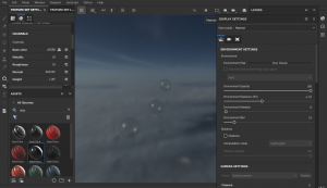
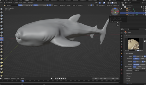
Once I was happy with the topology, placement and position of all the models in my scene, I was able to move on to the texturing. One major problem which I faced at this stage was that my original high poly model did not have a low enough voxel count and therefore the edges were not as smooth as I would have liked, particularly around the gills and the pinched lines of detail along the back. To fix this I brought the model back into blender and by using ‘Shift + R’ combined with the smooth tool I was able to get it much smoother and looking better. After I was happy with this, I had to reexport it as the high poly mesh before taking it back into maya.
Once it was back in Maya it was time to create a UV map. To start, I selected the whole model and created an automatic unwrap, which I then sewed back together. Then, using the workspace area I was able to select the edges where I wanted to cuts to be. I had a problem with other thinking the UV maps at this stage, and so instead of making simple cuts the first time I made too many pieces when they could have been connected and work fine. 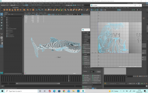
I decided to redo it and only make cuts where needed, such as around the mouth and some of the fins. This made the UV map a lot cleaner and better to work with. It also allowed the checkerboard to show up as a much better fit, meaning the texture wouldn’t be stretched on the model. After this, I made the high poly surface live and conformed the low poly mesh to it. Then I exported both the meshes out using FBX.
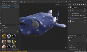
Next I took the model to substance painter, where I loaded up the low poly mesh and went to texture set settings. Here, I clicked the ‘Bake Mesh Maps’ button but instead of using the use low poly as high poly mesh button we have been using previously, I imported my high poly FBX file into the high definition meshes tab. This will then bake the high poly mesh details into the low poly mesh meaning you can keep your detail without having an extremely high poly count slowing down your model or preventing you from uploading.
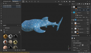
For my model I tried a few different types of materials but I thought leather was roughly the texture I wanted for his skin as I thought it would match a whale shark well. I also looked at different colorings, from lighter blues to darker blues but in the end I decided on quite a light colour as I thought it would make the character appear brighter and cuter. I used a spotted texture over the top, arranging it until I could the pattern and size of the spots to a size I wanted. This worked well but there was a couple of locations where the pattern was meeting the cuts of the UV map and looking a bit strange so to fix it I was able to hand-paint on the half circles which were missing from these areas.
I also thought that there was not quite enough spots on him as whale sharks quite a condensed group of spots along their back so I added a few more on. I originally tried a variety of colours, such as purples, dark blues and yellows to try and create an almost water colour painting effect however I thought that this was starting to take the design away from looking like a whale shark so I did not keep these changes. Finally for his body, I painted his tummy and chin white to look more like a whaleshark.
For his mouth, I decided to hand paint it pink, and then since I had modelled and UV unwrapped his tongue separately I was able to apply a human skin material to give his mouth a nice natural texture. I think this worked really well and it helped the model overall. For his eyes I tried two different versions. The first was a plain black, shiny plastic material which would reflect the light and for the second I painted the white marks on which would look like the reflection. In the end I decided to go with the first version as I thought it would be better to keep the reflection natural for this character.
After I had cut and unwrapped his UV’s, I moved onto the texture for the Ray.
In the case of the Ray I did not have to bake the high poly mesh into the low poly one so I simply used the ‘Use Low Poly as High Poly’ button when baking the texture maps. Again, I wanted him to have the nice leathery material so that he would have some nice rough texture to him. I went with a darker blue than the Whaleshark as this was more accurate to my references and also I wanted to have some contrast with the other character. For his tongue I went for a light pink so that there would be a nice contrast against the darker pink of his mouth.
When I was happy with the mouth eyes and skin I used a paint layer to hand paint on his cream coloured belly. This was a little difficult at places as I wanted to get the percentage of white/ blue the same on both sides of the model but in the end I was happy with the result.
After the Ray, I textured the chest. I had a few different versions of the chest. For the first one, when I exported as an FBX there was a lot of different layers so the details were split up onto different layers. I fixed this by making sure there was only one lambert applied to each mesh in Maya and then using the polygon fill brush and masks on substance painter.
The first one was a dark coloured wood walnut material for the wooden panels, with pure gold for the trimmings of the treasure chest. I wanted it give it a bit more detail and texture so I tried the ‘Grunge Dirt Muddy’ texture map. I really liked how this looked on the pure gold. I also tried ‘Grunge Map 008’ but I thought the effect did not suit the style I wanted.
The second attempt was the same base as above however I wanted to try adding rust onto the chest as it was lying at the bottom of the ocean and water affects metal. I also added some more texture into the wood to make it a bit more realistic. I decided that whilst this one looked the most realistic, it didn’t give as much of a wonderous treasure vibe that I wanted to capture when the animals found the chest.
The third one is the one I ended up using. It was closer to the design of the first one but the damage which I had added helped to bring character. I also chose to use the smart material ‘Gold Damaged’ as I thought it looked better than the pure gold.
The coins were a lot of fun to texture. I knew I wanted them to be shiny and be reflective to light so that they could look shiny and impressive in the chest so I used the pure gold material for them. However, I thought that they were missing something so I added roughness map ‘BnW Spots 1’ so that they would look a little weathered. This texture was perfect for the look I wanted.
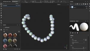
For the pearls I did something a little different. There was no pearl or texture in substance that I liked so I found a picture which had a slightly shiny, pearly look to it and imported it into the project. Then I used this texture to hand paint the pearl look onto the necklace. I was able to capture the nice shiny, pearlescent look I wanted.
For the starfish I wanted it to be a nice bright colour, as there was a lot of blue in the scene and I wanted to bring a new colour. I chose a nice bright orange, as a lot of the references I looked at had this colour and I thought it would work well with the blue. I started with a rough leather material as a base but I thought this was too plain on it’s own so I added the material ‘Plastic Grid Bumpy’ to give a bit more texture. This one worked really well with the little raises I had made on the original mesh. Overall, the starfish looked exactly how I wanted.
I kept the seaweed quite simple, but I chose to use a material called ‘human head bald skin’ which sounds strange for a seaweed texture but I liked how it added a little texture without being too overpowering.
For the sand texture I applied the same process as the pearls. I tried a few of the preexisting materials that substance offered but I could not find any which matched the look I wanted so I found my own image and imported it to create the sand texture on the plane. I thought this one worked really well as it was able to capture the little rivets of sand which settle on the ocean floor.
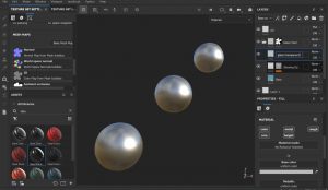
Finally, I did the textures for the bubbles. These were the most challenging, as I’ve never tried to do a see through texture on substance painter however it was a very fun challenge. I found this video extremely helpful (https://www.youtube.com/watch?v=5igvXjMM4Nc&t=1s) in creating the correct texture I wanted, although this was for glass so I had to edit a few elements, such as removing the dirt texture. I also played with the colour and changing the opacity until I achieved the look I wanted. There was quite a lot of steps to creating it. I started with the smart material ‘Glass Visor’ and then a fill layer for the AO. I selected just the colour channel and added the ambient occlusion to the base colour. I changed the normal setting to multiply and then opened the layers folder for the glass visor layer. There, I was able to change and edit the base colour. I added a fill layer just above the ‘glowing edges’ tab which was for the glass transparent. I was able to add the new channel of opacity in the texture set settings. This allowed me to select only this new channel and adjust the shader settings. Here I was able to change the ‘pbr-metal-rough’ to ‘pbr-metal-rough-with-alpha-blending’ so that the textures would be able to export properly. From here, I was able to adjust the opacity in the properties tab. I set my opacity value to 0.1429 as I liked that it was almost see through but still want completely clear, like a bubble.


