CV
We looked at how to write a CV in early module classes, which helped give us a start on producing our own CVs. I already had a CV from hospitality/retail jobs I have worked in, so luckily I could use this as a base. However, it was not perfectly suited to an artist’s CV, so I had to make several tweaks. I looked at the examples of past pupils’ CVs for an original design but decided to look online as well to get a wider sample.


(Cover Letters of previous Students^)

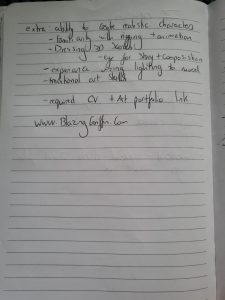
(Examples of artist CVs found online^)


Looking at my old CV compared to the other art-focused ones, I was able to see what needed improvement. Visually, it was boring compared to the layout of the artist portfolios so I knew I had to change the design. It also did not show off my most important skills the way it should for applying for a job in the creative field.
Artist CV examples, tips & templates | myPerfectCV
This website was helpful when considering what I needed to add to my CV to make it more creative and engaging. One recommendation was to include keywords from the job description, which I thought would help tailor the CV to specific roles. I also decided to add a section to my CV with the software I am familiar with to draw this to the attention of potential employers.
Artist CV Example (Template & Guide with 20+ Tips) (zety.com)
This website was mainly for providing a template to work off, but I found the tips very useful. They recommended keeping a CV between one and two pages which I followed with my work. It also highlighted what we had covered in class on the importance of colour, fonts, and good formatting. You want your CV to be readable so that the person you are submitting it to is not searching for information.
Animator CV Example Company Name – Repentigny, Quebec (livecareer.co.uk)
I had a few drafts of my CV as I updated it each time I found some new advice. With my second draft, I made the content more specific and added a list of my proficiencies in various software.

My lecturer provided feedback on this draft that the content was good, but the structure could be more consistent. I agreed and made the change but was still not entirely happy with the layout as it didn’t resemble the examples I had sourced of artist CVs. So I decided to make some major formatting changes to give the document a more striking design.


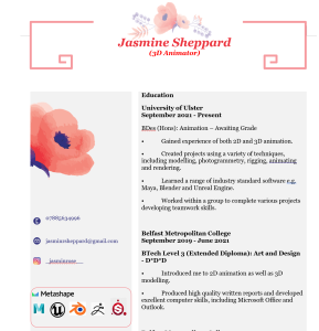
Draft 2 ^


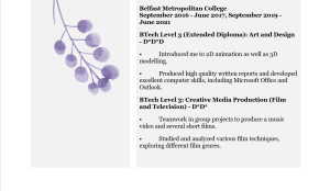
Draft 3 ^
I submitted this draft for final feedback in my one-to-one meeting and my lecturer suggested I list the software I am proficient in as well as use pictures. This was because a hiring manager might not be familiar with logos and could be looking to see the keywords written down. I did this and also moved my soft skills onto the second page so that the document was less crowded. In addition, I decided to revert to using bullet points instead of full sentences, as this made the document easier to read. Finally, I changed the overall formatting to make sure everything matched, which helped improve the appearance of the CV.
One of the seminars we had involved speakers coming to talk about their experiences in the industry. This chat was helpful as it gave an interesting insight into what it is like to work in the field of animation. There were representatives for a range of careers, including a Director & Creative Director ((24) Denis Bouyer | LinkedIn), Animators ((24) Matthew Hamill | LinkedIn)((24) Rachel Dixon | LinkedIn), and a recent graduate just starting as a 3D artist ((24) Rheanna Devlin | LinkedIn). Having representatives from different career paths and levels got me thinking about what career I want to do. During the talk, I asked if there were any tips the panel had for interviews, and I got some helpful feedback. They suggested that by the time you’ve gotten an interview, the company already knows your skills, so now they are trying to find out if you are a good fit for the company in terms of personality.


We were also asked to research a job role to find out what skills companies are looking for, and to look into artists in the starting stages of their careers.


Gerard Lavery (@GerardLavery) / Twitter
I also looked at a few other artists from a game studio that I really liked, called studio Chibig.
(24) Alberto Reboreda Rivera | LinkedIn
(24) Paloma Pipeleers | LinkedIn
Stone angel – 3D model by Paloma Catharina Pipeleers Torres (@ktorres) [799fd0e] (sketchfab.com)
Cover Email
Next, we looked at how to write a cover letter. I have never written a cover letter for an art-related job, so I was eager to learn what makes a good one and how to relate your CV to your cover letter. As hiring managers read plenty of cover letters and CVs, it is important to ensure yours stands out. At the same time, these can’t be too long as you don’t want to overwhelm them with information that may lead to them losing interest. Another key thing I learned from the lecture was to personalise your cover letter to the position you are applying for. If you have a very general CV, it will come across that you don’t know anything about the company and their work, so they won’t want to hire you.
There is a good layout to follow when writing a cover letter: Firstly, you should mention the studio and why you want to work there, including what you have learned from the job listing. Flattery is good, as it proves that you know about the studio and are invested in them. The second paragraph should introduce yourself and why you think you would be a good fit for the role. At this point, you should link back to your CV, especially to any relevant work experience. The third paragraph should be the final one, thanking the employer for reading your cover letter and considering you for the position. You want to keep it polite, as an overconfident or rude tone could damage your pitch. From comparing various examples, I’ve found that a simple design works best as an overly complicated layout can take away from the content.

(An example I thought was a good cover letter ^)


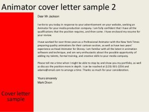
(Two examples of cover letters that I did not think were very good^)
Animator Cover Letter / Job Application Letter (lettersandtemplates.com)
Showreel Design
The showreel design task was the most difficult for me as I have no experience making one or presenting my work for display. Luckily, I have made short films and animations, so I am familiar with premier pro and other editing software. Finding the right content is crucial because you want to show your best work. We covered this in our Ulster University lectures and my extra module at Berkely Community College. One of our assignments for this class was to make a final showreel, which helped me practice for this task.
Animation Assignments -> Final Reel (syncsketch.com)
During the Berkley module, I had the opportunity to see examples of showreels from the lecturer, Chris Carter, and others who worked at the Pixar internship. They explained how they improved their showreels over the years. I asked Chris where you should put your favourite; the start, middle, or end. He suggested it would be ideal at the beginning, but if you are only using your best pieces, it shouldn’t matter too much.
Chris Carter I Pixar Animation Internship Reel 2019 I 3D Animation Internships – Bing video
Jamie Ryan | Pixar Animation Internship Reel 2018 | 3D Animation Internships – Bing video
In UU, we had a lecture highlighting the importance of tailoring your showreel to the job role you are applying for. I picked a job as an animator and applied this knowledge by including more of my animations than 3D models. I watched videos on what makes a good showreel and seeing the diversity of examples inspired me to add extra effects, such as setting videos to a beat and professional transitions between projects.
What should I animate?? (Exercise List) – part 1 – YouTube
What should I animate?? (Demo Reel List) – part 2 – YouTube
25 Tips to Create an Animation Demo Reel – YouTube
Edit To The Beat Adobe Premiere Pro CC | How-to Guide – YouTube
How to Add Title in Premiere Pro – YouTube
4 Super Easy TITLE ANIMATIONS in Premiere Pro (Tutorial) – YouTube

I asked for feedback from my classmates on this draft, and they advised me to keep the colour scheme simple. Alec also suggested I include simple renders of my animations instead of playblasts as the quality would be higher, so I did. For my final draft, I rearranged the position of clips in the timeline to give them a better flow.
Self Reflection
I enjoyed this module as it helped me to prepare for the future. I learned the most when working on my showreel, as it was the area I was weakest in. I have gained valuable insight into highlighting my best work as effectively and professionally as possible. The piece of work I was happiest with was my cover letter because it was strong, professional, and demonstrated my abilities well. There are aspects that I will need to continue to work on, such as updating my showreel regularly with improved content, but as a result of this module, I will be more confident when presenting myself to future employers.

