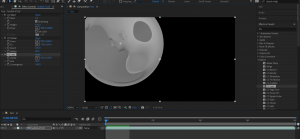
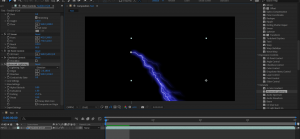
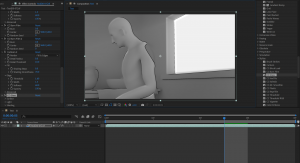
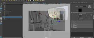
Rendering was a little bit difficult at first as the computer I was using did not export properly. I wasn’t sure what was causing this as I was following the video. However, once I changed machines I was able to export the test export of my lighting scene. This gave me a chance to explore adobe after effects as I had never done used that program before. There was some very cool features which could be used, but I didn’t get a chance to explore with all of them. A few which I really liked was the glow, as well as the cartoon. These effects were really interesting and I think there is certain projects which could really be enhanced by this. When I was done with the editing, I send it to the adobe media encoder. These two programs work side by side and so it is important to know how to use both.
Monthly Archives: April 2022
Week 10: Lighting
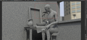
Lighting is a concept which I have struggled with, even when I was studying film making. It was good to be able to practice it in a 3D setting and get more familiar about where lights should or should not go. I used the already premade lighting exercise which was provided. I started by adding the skydome light as I was already familiar with it from the cactus practice. Next I tried directional lights in the scene. The area lights were tricky as I could not get the intensity to be quite right to the point where the subject would be lit properly. With some practice and editing the intensity and placement of the area lights I was able to improve the scene.
Extra Elements to Build The Scene
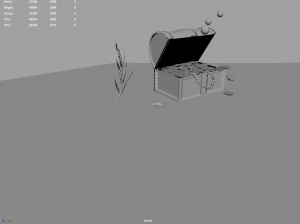
I wanted to make my scene feel more complete so I decided to add in some extra elements. I wanted to give the feeling that the characters had discovered a abandoned treasure under the sea, so I started with making the treasure chest.
Initially I had a simpler lid for the lid of the box. There was no gold trimming on it though and I thought the design looked a little to simple so I deiced to remake it by adding a little more detail and fixing the shape of it a little to make it more appealing to look at. After I was happy with lid of the box I decided I wanted to adjust the shape of the base of the chest to look better . I used the extrude tool to get the correct shape I wanted. I was much happier with this.
Next, I worked on the coins. These were pretty simple as it was only a case of using a cylinder and hardening the edge to make a bevel around it. Then, I duplicated it lots of times to fill in the space with a lot of coins to give the impression it was full up.
The pearls were also quite simple as it was just spheres manipulated to form the shape of a necklace. The challenging part of these extra elements was capturing the motion as I wanted them to feel like they were being manipulated by the water. I had the pearls arranged in a way where they pointed upwards a little, as if caught on a current. For the coins I stacked a few teetering on the edge of the chest and then added in some which looked like the were floating down to the bottom as a coin would sink.
Next I decided to model some seaweed in blender for the environment and to help place the characters in an underwater scene. The shapes were not too difficult as it was just a case of pulling them to get the shape of seaweed which looked like it was moving in the sea. I also did a starfish as I thought this would also strengthen the location of the scene. I kept the shape quite curvy as I looked at some cartoonish references of starfish and I liked them more than the perfectly even legs and shape of the real life images I looked at, though I did start by making the shape even and then adjusting the curves to how I wanted it after as I thought this would give a better model.
After I had imported these elements into the scene and retopologized the ones made in blender I thought the scene still looked a little bit unfinished. I decided it would benefit from adding some bubbles to look like the treasure chest has just opened. This was very simple as I just used three sphere meshes and moved them to the size and position I wanted. These looked simple but I knew I wanted to apply textures in Substance to bring them to life.
Research for Extra Elements
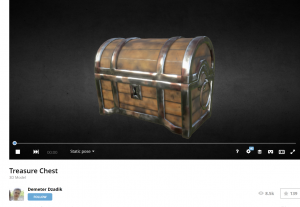
I wanted to get some more references, specifically for the extra elements I wanted to make. I found Pinterest had a few good ideas I wanted to incorporate but for the chest in particular I found sketchfab to be a lot more helpful. Here I was not only able to find inspiration, but I was also able to look at the topology of the meshes which helped me when it came to sculpting my own chest on maya.
https://www.pinterest.co.uk/jazzy_121/3d-digital-literacy-extra-references/
Retopology
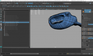
This was my first introduction to the process of retopology and how you use it. Since I was not familiar with the process I wanted to practice it before I started on my own model. I used the practice elephant head model to try and get comfortable with retopology.
I did find it quite challenging at first, particularly at getting everything into neat loops. One problem I had in particular with this model was getting the ears to join in the middle. I struggled with this, as can be seen in the image below. However, once it was suggested to me that it is easier to work outwards from the center to get a circle I found the process to be a little easier.
I had the most success with the trunk area and the space around the mouth as I was able to get nice clean lines and to get the low poly mesh to fit well along the high poly mesh. It wasn’t perfect but once I was happy with how the low poly mesh looked on this project I moved onto retopologising my Whale Shark.
When I first started with the retopology of my whale shark, I struggled quite a bit. The mesh was very large and so started to over think the retopology. Some parts of the model I managed to get to a point where I was happy with it, such as the mouth. I was able to make a successful loop in the mouth area and around the chin which worked well. However, I found that the lines were much too condensed, especially around the back and along the fins. This was inconsistent and I felt like it wasn’t going to be very good for the poly count.
I used the relax tool to loosen up all of the areas which were too clumped together and it helped a lot. I was also able to turn off quad draw, go into edge mode and delete any edges which were unnessicary or that were causing Ngons (though thankfully there were only 2 which needed removed). I was much happier with the retopology of the model following this.
When I was happy with the Whale shark retopology, I looked at the secondary ray character. As it is a much simpler character, I decided to use the auto retopologize in Maya for this originally. Later on however, I had some time so I decided to go back and make an attempt at retopologising the ray character myself.
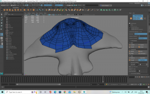
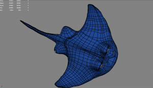
Despite the ray being a much smaller character I found it a lot trickier than the whale shark, possibly because of it’s shape. the basic shapes of the ray come down to triangles and so I found it quite hard to keep the loops consistent across the body. Some of the areas were alright but some of them where not fitting properly against the high poly mesh, particularly around the chin so i decided to delete it and start again.
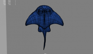
The second attempt was a lot better as I was able to cover the mesh properly around the whole body. The loops around the eyes, fins and tail were also a lot better so I was pleased with this. I was able to find a wireframe of the ray from ‘Finding Nemo’ which was very helpful to me when it came to trying to retopologize my own character.


