Week 5- Sketchfab

This week we got a reintroduction to UV mapping which was a big help for me and I am still finding it difficult to master in my head. We also got to learn about sketchfab and how to real time render.

I liked this a lot as it meant a little more practice at substance painter as well as finding out about different file types and how they can be used. We already knew about the FBX file type in Maya, and how to bring it into substance but it was good to learn the new settings needed for bringing your substance textures into Sketchfab.

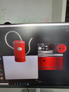
In order to practice this, we used a model of a watering can which we textured in substance painter. I chose to go with a painted red body of the watering can, with metal extra parts. After I was happy with the base, and the roughness, I decided to add some rust to really bring it to life and to make it stand out more.

Once I was happy with the model and I had baked my mesh maps, I exported my textures as a sketchfab file. This then allowed me to upload my FBX file (which I had exported from maya) onto sketchfab where I could apply the different maps such as Albedo, roughness, normal and AO. Once I was happy with the final model, I was able to play about with the different settings sketchfab offers, such as depth of field and shadow, midtones and highlights until I was happy with my piece.

https://sketchfab.com/Jasmine_Sheppard

Week 4- Substance Painter

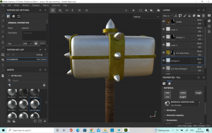
This week we were learning about Substance painter and how useful is can be for adding texture to your models. We were able to learn about how Masks can be used to add texture to only certain parts of you model and not others as well as how fill layers and paint layers can be used. We started off using a model which Mike had already unwrapped for us which was helpful for me as I was able to focus on picking up the substance painter techniques as I am still unused to modelling.

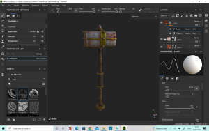
We were making a war hammer and so I knew that I wanted to have some areas of the hammer be metal and some be wood. This is where the masks came in very handy. I played about with how the metal should look, trying out a variety of different roughness levels. Finally I decided on one which was a little bit rough but not too completely bent. I wanted it to look like the hammer was used but not too destroyed.

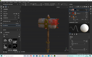
Once I was happy with the colours and textures on the main body of the hammer I decided to add a some blood, to give it a bit more of a used feeling. I think this choice really enhanced the item and made it seem much more believable.

Week 3- Independent practise

I was trying to challenge myself to add UV maps to some of the work I had already created in order to give it more of a finished appearance. I applied textures to my Vase, snake and cart.

I started with the Snake as it was the project I most enjoyed completing and I wanted to see it fully completed. It was suggested that by adding some eyes to the snake it would look more realistic so I decided to do the UV wrap for the skin and eyes together on the same map to make it look more complete. Firstly, I started by creating a groove in the snakes head for the eyes to sit in. I thought this would make it look a bit more realistic as opposed to them being just placed on top. Once I was happy with this, I worked on unwrapping the model and finding a good skin which I could use to texture. I used a yellow snake skin for the body and a picture of a snakes eye for my own. I was happy with how the uv map turned out overall and it definitely made it look more like a real snake.

Next, I practiced on the Vase as I thought it would be better to practice on a model with only one piece before jumping into the cart. I wrapped the model fairly easily in this case as I had a little bit of practice and it was only one piece. I first pattern I used did not work so well on the vase as it was too stretched and the pattern did not line up properly.

I decided to change it for one which I liked better and I was much happier with the final result.

Finally I worked on the cart. It was more of a challenge to unwrap each piece of the cart as it was comprised of a lot of different primitives’ but I was able to eventually. I used a shiny red for the body of the cart as I wanted it to have a nice surface texture which would stand out. For the metal parts I used a shiny silver skin so that it also would look a little bit more impressive than if I had used a dull finish. I think that by adding the skins to the cart I was able to make it look a lot more finished and completed which was good and it will definitely help with my 3D work going forward.

Week 3- UV mapping

Learning about UV mapping was a process which I found quite difficult in the beginning and I struggled to work out for to unwrap the models. My first attempt at the dice took a lot longer than I would have liked, as it was quite an easy starting point.

Once I had worked out how to unwrap the model it became a bit clearer however, I still struggled initially with the sizing of the dice faces, as the face with just 1 dot was much larger than it should have been. I did manage to make the other faces a better size, and successfully transfer the file from photoshop into Maya.

Next, I moved onto the coke can. I still had a little trouble with this as I was still quite new to the process, however eventually I was able to unwrap the model myself and use photoshop correctly to make the new UV wrap. I was happy with how the coke can turned out as the wrap worked well.

The hammer was quite difficult to unwrap as there was more pieces of the model which needed to be unwrapped. I did manage eventually to get the pieces unwrapped and then placed onto the UV map fittingly. I was happy with the texture I managed to get onto the hammer and I think these exercises were very useful in getting used to 3D.

Week 3

This week we watched our presentations in class. We got some good feedback on our groups work, including the layout and there being some good analysis. One thing which I believe was a shame, was that there was some good analysis which we ended up having to cut due to time constraints. In order to show this work, I separately compiled a video showing everyone’s parts together as they originally were. The section I was covering was 2.22 to 3.55 so there was a lot to cover.

https://youtu.be/ZOuUNVDkvU0

For the afternoon session, we got into our groups and started to brainstorm what we wanted our final project to be. We made some good notes, but some advice we got was that some of the stories were perhaps a little too long and complicated so they would need to be cut down to 30 seconds. We have agreed to pick our top three ideas and discus on Monday to see which is the groups favourite.

We also did some work on 3D animation. It was very difficult and at the start I really struggled to get the creature to move properly.

The first draft was very jumpy and I couldn’t get a smooth animation. I also couldn’t get the sound to import correctly so it was not a good job.

The second attempt was a tiny bit better. I was able to get the sound imported into the file which was something, but I was still not happy with the animation. I will need to practice a lot more in order to get my animation improved.

Week 2 Independent Practice

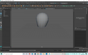
The first independent practice I tried this week was to create a snake on a branch. I started with the snake first of all, using the EP curve tool. I manipulated the points as much as I could but there was still a few points which did not have the smooth curve look. Next, I created the branch. To do this I used the same tool, followed by the sweep mesh to create the branch. I edited the size down until I was happy with the thickness. Once I had done this, the snake was nowhere near the branch so I tried to move the whole snake over using the ‘W’ button. However, I learned that this does not work and to move the snake you must manipulate the points on the sweep. I ended up deleting the first snake as I was not happy with it in the first place and I thought I could create a better one. I gave this one more points using the EP curve tool which meant it was easier to manipulate and get the smooth shape the snake. When it came to editing this snake I was more adventurous with the shape, giving it a long hanging down portion, as well as making sure it wrapped around the branch. I was much happier with this and I was able to get the curves a lot smoother and natural. Finally, I tapered the snakes tail so that it closed into a point and added a primitive of a sphere which I edited to look like a snakes head.

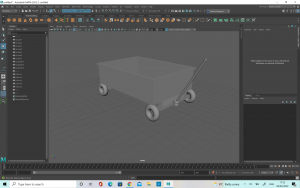
Next I tried to make a childrens pull cart as I thought that it would be a good way to practice extruding and also since it was the beginner level I thought it wouldn’t be too complex for me to complete. I started with a basic cube which I flattened and then extruded the sides upwards to form the walls. Next, I extruded the faces out to create a lip on the side of the cart, like in my reference photograph. Once I was happy with this, I started to break down the shapes which came together to form the mechanism under the cart. I noticed there was quite a few different sized rectangles on the front portion so I did my best to recreate these by deforming cube primitives’. For the back of wagon, I noticed there was two thin rectangles, connected by a long, thin sphere so I made these out of a cube primitive and a sphere primitive.

The wheels were the most interesting part to work on but there was also a bit of a challenge in getting everything to line up correctly. I started with a cube primitive which I smoothed and changed the dimensions to 2. Then, I duplicated it four times and tried to match one up at each point of the cart. To make the wheel shape, I used a torus primitive, which I resized and then maneuvered to cover the spheres I had placed. Once I had done this, and I checked the reference I realised that the wheels were not perfect torus’s and there was a second part which was visible inside the wheel. I decided to make my original torus shapes into this inside part and create a new torus for the outer wheel. To do this, I started with the original Torus primitive but I select the face at intervals along the face of the object and used the w button to pull them up. This created the exact texture and appearance I was looking for in the wheel. Once I was happy with the size, I duplicated them four times and placed one on each wheel. After doing this I realised that the wheel placements were not quite right so I had to go back and resize the under parts of the cart so that the wheels would be sitting out from underneath the body, but still be attached where needed. Once, I was happy with their placement I started on the handle.

The handle was the most difficult for me because I found it difficult to get the shape right. I started with a sphere primitive which I stretched out long and thin. Next, I put the object in vertex mode and used the multi-cut tool to add more dimensions along it so that it would bend easier. Once I was happy I selected only the top half of the objects vertex points and used the e button to bend it. Once I was happy with the angle, I had to use w to make the object line up again. When I was happy with this, I repeated the process lower down to create a second bend. After I was happy with this shape, I took the object and duplicated it, before turning it 180 degrees to make the other side of the handle. I matched the two up and created a thin, flat rectangle to join the two and create the final part of the handle.

One way in which I think the cart could be improved would be to maybe have a thicker handle, which might fit better with the other elements of the cart but overall I was happy with the cart design.

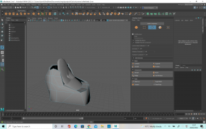
The rollerblade was definitely the most challenging model so far. I really struggled with it at first, because I couldn’t work out how to get the square object to have soft edges and so this was causing a lot of problems. I tried to use the ep curve to do the shoe laces but ultimately this did not work. I believe I did not have enough joins in it in order to make it flexible enough and so I could not bend it the way I wanted. After asking for some advice I have been shown how to do this a lot better and so when I try again I believe it will be better.

Finally, I tried to make the Vase, following the tutorial posted. This vase was a lot more successful than my first attempt as I am getting to be a lot more familiar with the software.


Week 1

This week was primarily an introduction to the module we will be covering this semester. We also got assigned our project groups for the short film presentation we will have to do on week three. We got a chance to look through all of the films in the morning and then in the afternoon we did an exercise to help us identify the armature and the steps of the hero’s journey and how important they are to story telling. For this exercise, we rolled dice in our groups and then we have to come up with a short story relating to the images which we rolled. We rolled a set of pirate dice, and so we came up with a story of an old man who guarded some treasure on a deserted island. A noble man comes to steal it, with her men and they try to make the old man walk the plank. When they do this, a curse is revealed and the Kraken is released from the depths of the ocean, killing the nobleman and his crew. The old man however, is able to survive and escapes back to his island. This exercise was useful as it enabled us to be able to understand how to create a story from the bottom and all the important points which need to be covered in order for the audience to understand it. I have included photographs of my notes from this exercise as I took the role of the note taker.

Week 2: Analysis

This week we were given a lecture on the technical aspects of filmmaking, particularly in animation. One of the tasks we were given was to watch the short film ‘ Best Friend’ by Gobelin studios. I made some notes on it based on the lecture we had just seen. I have included photos of the notes I took. My group was not in this day so I ended up doing the analysis by myself which was a bit of a shame as it would have been nice to hear other ideas from the group.

Smash and Grab Analysis

We have been given the short film ‘Smash and Grab’ to write about for our group presentation. I started by watching the short and making a note of where I thought the breakdowns of scenes could be done to divide the work as evenly as possible. I found a scene which I thought would be really interesting so I asked the group if I could cover this part. They all agreed this was fine so I got to work analyzing it.

I found that I wrote too much for my part of the scene, given that we only have two minutes to speak each and we want the presentation to be delivered at a good speed which is clear to the audience. I decided I would cut down my basic notes but I have included them here on my blog:

In text form:


  • Narrative structure & relation to the Hero’s Journey
  • Mise-en-scène
  • Cinematography
  • Sound
  • Editing
  • ‘Discovering intent’ – How it evokes a reaction from the audience


Narrative Structure and relation to the Hero’s Journey: 

This part of the film shows the call to action. Though it is not a physical calling, there is a longing in the larger robot’s mind, and it is clearly established what he wishes to accomplish- which is the intent. On top of this, we can see what the plan he forms and therefore believes he is ready to ‘cross the threshold’ in the next scene. The armature is also established in this scene, when we get to see how the other robots live in comparison to the two main characters of this story. The armature here is that everyone should have an equal chance and one is not above another, just because of the circumstances they are created into.  

Mise-en-Scene: 

Put into scene- The Mise- en- Scene of this scene is very important because we are introduced to characters other than the two main robots. The design of these new robots is very sleek and rounded. Which contrasts with our main characters. These new, outside robots have a shiny surface which reflects a lot of light and gives them a very new, well- kept appearance. The main robots on the other hand, have a much duller finish, and you can see the inner mechanics and pipes as they are not properly covered. On top of this, we also see close-up the scars and marks on the main characters body, unlike the robots who live freely outside. They are untarnished. The shot from 3:03 to 3: 07 compares the two different types of robots directly. The props of the scene are also important. The set of the walls, the train and the outside world as very developed, with a lot of detail but the actual use of props is kept to a minimum. Inside the train, the only real prop that we see if the pieces of coal that is being thrown into the furnace. Outside the train, the only prop is the power balls which are used to give the robots energy. Keeping these props to a minimum lets the viewer focus more on the story, without being distracted by objects which will not be used again. There is also the pay off to earlier in the scene which set up the principle of ‘Checkovs gun’. This principle Is designed with the intent of never introducing a prop or subject without including a way to bring relevance to it. Alexander Chekhov explained it as “One must never place a loaded riffle on the stage if it isn’t going to go off. It’s wrong to make promises you don’t mean to keep.” (https://jerichowriters.com/what-is-chekhovs-gun/) This is demonstrated in this short film as in an earlier scene we see the main robot using the drill on his hand to cut the rocks. This is then brought back into focus during this scene when he decides to cut his own power supply with this same tool, thus bringing it back and completing it’s use. This example isn’t as extreme of an example as in other short films, as the drill did serve a purpose in its original scene but it was still a clever way to foreshadow very early what was to come later on in the short.  

Cinematography: When looking at the cinematography of this scene I think the lighting and colouring is one area which really stands out. The colouring when the robots are stuck in the train is very cool, with various tones of blue. In western cultures, we link this palette with sadness, depression and loneliness.  In comparison, when the robot looks outside, he sees that it is much brighter out there, with much more well-rounded light. This shot shown on the board is a very good shot for showing this. (2.35) It has the small blue square, which is very darkly lit, directly in the middle of the train, which has a warm, yellow tone- which we would associate to be happier and brighter. Even though the lighting of the train and the outside is not immensely bright, given that it is taking place in space, where there is no light from the sun, there is still enough of a contrast with the dark blue square to illustrate the point. There colours work very well with helping to tell the story- Where the robots live now, they are trapped, feeling lonely and frustrated. However, the outside world is warmer and brighter, where they would be free to live on their own terms. The use of spotlights also works to further this point. There is only a small glimmer of light which comes down into the room, showing the robot only a glance of what is outside. This small area of light shrouds everything else in darkness, showing that this place they are stuck in is gloomy. There is also the choice to have the character working in the train, under the windows as the sun is then coming down on top of the character. This then build the sense that they are looked down on by society, by showing them physically underneath the other robots. The use of camera angles and movements also really stand out. There is a lot of camera angles which place us as the viewer into the scene directly, giving us a perspective, which will make us relate more to the main character. When he looks out, into the bigger world, the camera covers over as if to show a blink which really puts the audience into the robots’ shoes. As well as this, when they are looking around, the camera tracks along so that the audience is really seeing what they see. All of this makes it more immersive for the viewer, thus helping us to relate more and extracting more empathy for the characters. Another clever way in which the camera is used to immerse the viewer in the world is during shots at 2:45 and 3:54. In the case of the first one, the camera shudders and jolts at the same time the trains collide on the screen. This puts us into the film, as if we are watching the two train carriages join up. The second shot is cleverly down at the camera has ben placed on the side of the trap door, and this when they have animated the door falling, the camera falls too so that we see the action of screen as if we are really in the room. Again, this helps to place us into the scene and develop more empathy for the characters. The camera work also includes a wide variety of shot types, which helps to keep us interested in watching, and the zoom shots is used effectively. The fact zooms such as at the 3:20 mark help to convey a sense of shock and realisation as the robot hatches it’s plan. The slower zoom shots are used for bringing that sense of deep longing, as the shot is very drawn out and really captures the emotion on the robots face, despite it only showing one eye.  


Sound:  

Background noise is sound effects, noise of movement but there is no music when they are below ground/ trapped. The noise that starts to play when he is looking through the crack is very gentle and sentimental. As the scene progresses the music gets a little more curious, with a sense of building tension. The music grows louder, beginning to swell and the base beating louder, mirroring a heartbeat as the robot decides what to do. As he cuts his power supply rope, the music comes to a climax. Following this there is a change in pace in the rhythm. It becomes more like a chase and less like a heartbeat, with a very quick thumping rhythm. There is no dialogue in the film, so the sound is very important for conveying the characters speech. The sound effects of the robot’s noise work hand in hand with their gestures to show their thoughts. From 3.50 we as the audience can tell from the use of sound partnered with the animation of the eyes that the larger robot is reassuring the younger, despite it not being in a language we can understand. There is also an echo sound when the robots are moving about in the room they are trapped in, showing that it is a cold, empty space where there is not much for them.  

Editing:  

The pace of the editing quickens slightly as the larger robot creates his plan and cuts off his rope. This increase in pace in the editing causes the audience to feel as if the scene is moving quicker, hence heightening the tension. You can particularly notice this when you compare it to the first few scenes where the shots are longer and more drawn out. In short film, editing can be extremely important as you need to tell the story in much less time. This short does a great job of showing continuity editing, and every scene builds upon the last to develop the story.  

Discovering intent:  

The combined use of all these different elements creates strong emotions, such as bravery, longing and sadness. As this section falls under ‘the call to action’ in the hero’s journey, it is useful in establishing what is to come in the story by establishing the goal of it’s characters. It also brings empathy to the characters and sets up the audience to root for them and make us want to watch them succeed. This is important at this stage, as we have a whole journey to complete with them, and if we didn’t relate to them or what to see them succeed, the story would not be as successful in evoking a reaction from the viewer.  


Reference: 

https://jerichowriters.com/what-is-chekhovs-gun/ 

https://www.youtube.com/watch?v=A4-G7YpSFb4 


Bibliography: 

https://www.britannica.com/topic/cinematography 

https://en.wikipedia.org/wiki/Mise-en-sc%C3%A8ne 

https://www.studiobinder.com/blog/mise-en-scene/ 

https://www.youtube.com/watch?v=A4-G7YpSFb4 


I have also included my in class notes. We had a lecture from Sarah about the technical aspects you must think about when it comes to creating an animation. An exercise she got us to do at the end of each section was to think about how our own short film used these practices so I made some notes on Smash and Grab about these individual aspects.

Week 2

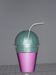
For our work in class for Week 2 we made a milkshake cup with a straw. This was a little bit of a challenge but I was still much more confident than I had been the week before which showed my improvement to myself. I do wish I had taken more photographs documenting my journey but I do at least have the final image.

I was following a lecture tutorial but I tried to make my own little adjustments to the piece to give it a little originality. I changed the colour or the milkshake and the opacity of the glass, as well as creating more dimensions on the lid of the cup to give more texture.

Originally I struggled with getting the shape correct, and then extruding the faces. Once I retried the steps I was able to complete it correctly which was good. The straw was also a little bit difficult as I have never used the tools before, including the sweep mesh. It was a little difficult to grasp at first, but eventually I was happy with the outcome. Finally, I used the multi-cut tool to create more divisions in the straw, which I extruded to make the ruffles on the straw.

Overall, I was very happy with the outcome of the milkshake glass. It took me a little longer than I would have liked but this will improve over time, the more practice I have.