Character Design world 6

This was a sketch I came up with after I had done a few doodles on paper. I’m more confident in digital art so I really wanted to create a digitalized version of the character. For this character I love the idea of having a cat headmaster running the school because cats are such smart creatures and they have such a strong tie to witchcraft. I wanted to draw a few different poses of the cat to try to get some movement into the character and create the feeling that all three cats are the same character as this is something I have struggled with in the past. I think however, in this sketch I was able to capture the characteristics and body shape to show that it is the same character.

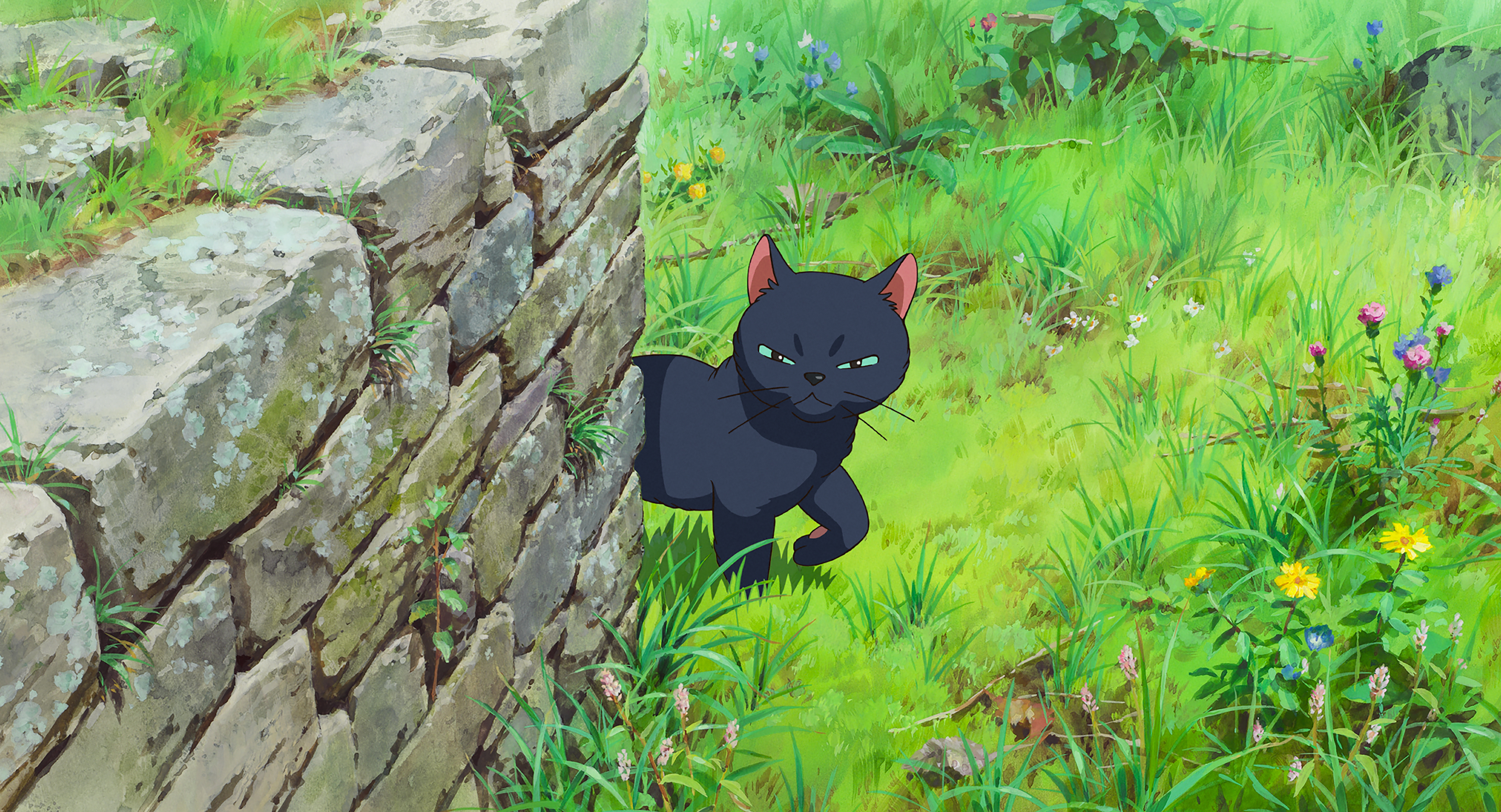
I was inspired by a few different cats from animated films but particularly ‘Mary and the Witches Flower’ (Studio Ponoc) and ‘ Whisper of the heart’ (Studio Ghibli).

I’ve included the paper sketches I started for the cats as well as I think they were a good starting point for me to develop from.

Week 4- Colour exercise #2

For this exercise we were given a pre-drawn image and asked to add colour to see what effect different colours would have on the atmosphere and feeling of the images. I decided to try a couple of different ones, to try to create different feelings and see within my own work how to experiment with different colours.

For this first image I originally planned on doing a triadic colour scheme, with very bold colours but I naturally found myself using these colours so I decided to just work with it and see what I could create. I chose to use quite bold colours, not very much shading because I wanted to keep this one quite simple. I did add a little shadow to the rocks and water just to give the image a little more depth. I think that the response this one provokes is quite a sunny, upbeat feeling. It reminds me of the kind of bright, colorful backgrounds you might find in kids tv shows, such as on cartoon network.

For this image I wanted to focus more on a mysterious, magical feeling which would match more with the world I am currently in. It is a world surrounding magical academia so I thought the mysterious purples and royal blues would work well. I also included the green and pink shades in order to add to the sense of mystery I was creating in the image. I think that this colour scheme could work well in my current world so I think having this colour palette as a reference will be helpful for world building further.


For this experiment I wanted to capture something which has quite soft, romantic lighting. I made sure to use quite muted tones, with nothing too vibrant and eye catching so that all of the colours will work together with nothing being too over powering. I think this one turned out well, with all the colours used working together to create a calming atmosphere.

I was pleased that I was able to come up with three very different feelings in the exercise, to really experiment with how colours affect the mood of an image. I think I was quite successful with this experiment and I look forward to applying it to my own drawings of the worlds I experiment with.

Week 4- Colour exercise #1

For my redraw of a thumbnail in colour I decided to go with the monochromatic scheme. The thumbnail was based off the idea of a Hell landscape so I thought that the red colour often associated with Hell would be a good choice. I also wanted to practice this monochromatic scheme as I am not used to only working with different hues to create an image so I thought it would be good practice.

I think the colour redraw has really helped to add emotion into the piece, giving it quite an ominous feeling. It almost creates a post-apocalyptical feeling, with the red hues in the sky and the darkest tones of the leaves. I think this works well given the world I was trying to create and portray in this thumbnail.

In the colour image I think the sky captures a better gradient which in turn helps to add to the atmospheric perspective so I am happy to see my work improving in this way. I also think that the gradients and different hues of reds works well in the areas of land in the image, particularly more towards the back of the image.

One area which I think could do with some improvement in comparison to the first image is that the light streaks which fall on the rocks. I think the lines appear softer is the first image, so I could try using a blur tool or a softer airbrush tool to make the blend softer and more like a light.

Perspective Practice in Photography

Since we started learning about Perspective, I have been noticing a lot of images in the real world and starting to think about what is one or what is two point perspective. I’ve found it very interesting, as it’s not something I would have nessicarily thought about before. Some of these photographs I took for the exercise task Alec set on week 2 to take some photographs around the city center but I found myself continuing to notice perspectives when I was just out walking so I thought it would be good practice to photograph this as well and include them.

  *

For some of the images I found it hard to work out exactly where the points would lie but in most of them it was quite easy to see the lines of perspective and the horizon lines. I did also start to find myself noticing how the colours looked in the images as well, and how to light faded more as you get closer to the horizon line (Which I think is particularly visible in the image in the line above which I have *ed).

In order to grasp the lines and perspective a little bit more I decided to try and do a draw over on a few of the images, just to get myself a bit more used to the lines. This practice helped me out and I think it will help me in the future with drawing perspectives.

I tried to pick colours which could stand out on top of the photographs but I think that it would maybe be a good idea to make the images black and white first so that I can focus on the lines and perspective without getting lost in the colour.

Week 3- Cross hatching as shading practise


I was trying to practice shading using cross hatching as a technique. I found this quite difficult, because whilst there was some tone created in the areas of shadow, it was quite hard to get it to look tidy, and well polished. I was trying to also look at interesting perspectives and I think this also made it difficult to focus on both things. I think there should have been maybe more texture and shading on the ground in the top right image, but I couldn’t think how to shade the ground and also keep the shadow from the door standing out.

After I had trouble with cross hatch shading in the perspective drawings, I thought it would be easier to take things back a little simpler. I started by drawing the 3D shapes of a cube, cuboid and a cone. I looked at different light sources and how that would affect where you put the shading of the form. I think making the shapes simple helped me to work out with the crosshatching and really be able to think about how the light falls.

Week 3- 6 Thumbnails and one further developed image

For this weeks tasks I really tried to keep take the feedback I got last week and use it to improve my work this time. I still had a little bit of difficulty but I was definitely able to improve the atmospheric perspective and tone in the thumbnails. I really worked on the advice given in Alec’s lecture, specifically about how the colours change as you get the horizon line and get lighter. I also noticed how he mentioned that the colours and horizon line tend to blend when you get to the line. I really wanted to try capturing this in my work.

I think these thumbnails were better in both their perspective and the tonal values which I added in. When I was getting some feedback, Sarah said that there is definitely an improvement from last week so I’m glad you can see the improvement in my work. She also pointed out that although the perspective of the road is not quite right in the first thumbnail image, you can still see the work on the gradient and tonal values. I really liked thumbnail 4 and 6 in particular. In 4 there is a lot of nice work on the lighting on the rocks and along the river, and the perspective works well. I also liked how the gradient and tonal values out in this image, and you can see how the light hits it. There is also a nice gradient in the sky, leading down to the horizon line. I decided that this would be an interesting image to develop more so I decided to choose it as my HQ image.

The larger thumbnail took me quite a long time to draw, because I wanted to capture quite a lot of detail. I think that I could maybe have taken the perspective a little further and made it a little bit more interesting but I think that it is good that there a difference in sizes between the large castle in the foreground and the city in the background, beside the horizon line. I think that there was some very nice tonal work in the castle and I’ve been able to add depth to the image. I also worked at adding quite a lot of gradient and tonal work into the sky, making the top darkest and getting lighter the further to the horizon line it gets. However, I found that once I exported the image, the colour gradient was not so prominent and it sort of lost a bit of the perspective. I think this was a shame, as it did sort of detract from the perspective work. Sarah gave the feedback that a few stars sprinkled across the sky would help with the perspective as they would only be visible at the top of the image due to the glow of the city lights. Overall, I think that there was a clear improvement in this image compared to the smaller thumbnail of the same design, as well as the images from last week. I still think that I could improve it further by practicing more so I will continue to work on it and develop my atmospheric perspective work.

I also read the book ‘Dream Worlds’ by Hans Bacher, after hearing Alec recommend it during the lecture. I found the book very interesting and it was very helpful in coming up with ideas about how to create a world. I also found it quite helpful in terms of thinking about perspective and looking at how composition works alongside perspective.