Website update part 2

After learning so much about accessibility and how to design with a user centered approach I decided to make some changes not only to the layout of my website but also to the colour scheme I use not only for my branding but also for my website. Adobe colors was a great resource for researching typography contrast and colour combinations.

The colours while lovely did not have a high enough contrast so I made a few adjustments to ensure everyone who would use my website could use it to its fullest.

I then started considering these colour changes and took a look at my previous designs; it previous looked like this after working on it for a few days:

Now I realize that the pink not only clashes with my illustrations skin colour but as a way of highlighting text, it does not fully work as it is not dark enough. The contrast ratio is too low.

To make this section easier to view I removed the colour for the background; I think this made a big difference in the presentation of my illustrations, making my illustrations stand out more.

I also tried to add the social icons to link my socials but I could still not figure out how to align them to the center – so I asked Kyle.


Here are some snapshots of the changes I implemented to my website to improve it:

I removed the block colours to separate the sections and instead stuck to white – I think that overall this looks and works better.

I tried removing the background colour for my intro section of my home page and I believe that it really improved its ease for viewing.


After Kyle helped me understand my issues with my navigation bar (It was no longer sticky) I was able to fix it. I really needed the navigation bar to be sticky as I had shown my website to some older family members both here and in Venezuela to see if the general layout of my site was easy enough for them to understand and navigate. I also sent the link out to other friends on Instagram (some who only speak Spanish) to see how accessible my site was – I sent it to my Spanish speaking friends to see if even with a language barrier the set up was straight forward enough to lead them through my website.

One of the things I learnt by doing this is that less is more and that consistency is my friend. The colour changes were also preferred as it made it easier for all who viewed it (They were all of varies ages, abilities and backgrounds) yet aside from aesthetic preferences, there was a general agreement that the higher contrast was the preferred version of the website.


As part of my IXD302 class Ronan McKinless came in to give us some information on applying to placements and how to make the most out of our time in placement. I reached out and sent him a link to my portfolio and he was kind enough to offer me some feedback.

I will be taking this on board and hopefully making the changes as soon as possible.

What I learnt the most through this process is that feedback is vital. Be it by peers, friends and even better yet more experienced designers. I also learnt to consider the user throughout the process.

Portfolio

It is easy to get lost in the infinite sea of information so I decided to make this a little easier to view by listing all my research blog post links and other relevant links here to keep things nice and tidy. I will also be organizing it by week.

Here is to hoping it works out!


Project 01 brief – Portfolio

Portfolio site and content strategy. Your Instagram, LinkedIn, Slack must be active and functional and professional ASAP – they should all match, think brand recognition.

This year I will need to create a new portfolio site. The portfolio should be simple and functional. A bit part of developing my website will be focused on research and learning from other more experienced designers.


emilyussher.com


Portfolio part 1

Week 01 – research conducted between 23/09/21  to  30/09/21

Portfolio part 2

Week 02 – research conducted between 30/09/21  to  07/10/21

Portfolio part 3

Week 03 – research conducted between 07/10/21 to 14/10/21

Portfolio part 4

Week 04 – research conducted between 14/10/21 to 21/10/21

Portfolio part 5

Week 05 – research conducted between 21/10/21 to 28/10/21


Something that really stuck out to me during this process is that feedback is gold, accessibility is a must, starting on paper is necessary and that a website is never fully finished and perfect and while my current website serves my current needs (showcasing my work for employers offering placement) it will have to grow with me as I grow as a designer. I have made small but good changes since having blogged my process. My website is changing along with me.

Making my website

I decided to use Webflow instead of coding it myself due to time constraints so I also kept notes of links so I would be able to organize my site correctly.

I had tried to make a mock-up of my website in Figma but truthfully I was inpatient and instead jumped right into Webflow – looking back I regret this as I would have been able to avoid some silly design decisions and saved myself time and effort if I had put in the work and made the mockups.

I realized early on that Webflow was a lot easier than having to do it yourself. It look a bit of learning and for that Webflow University and some YouTube videos were a great help in informing my process and teaching me how to more efficiently use the software.

During my 1st year I had purchased my domain name; this is something I am very glad I did as it fit in so much better into my CV than some random Webflow URL – it did however take me a very long time to figure out how to connect my website to my URL; cue in customer support for Webflow and Ionos (my domain provider).

I kept the home page simple and clean. I was however struggling with the layout options and alignments. It took a lot of tweaking but eventually I got it there. I made the navigation bar sticky as I thought it would make it easier to navigate the page. I also decided to add a ‘Hire me’ button to the menu bar that when clicked opens up my CV – I figured this would make me stand out?

I also added the illustration of myself as part of my introduction section of my home page as I thought it would bring across my playful and artistic personality as well as showcasing my skills.

I am having trouble fixing the blending of the button outline and the footer background colour. I do think that while the footer works it might be too simple and not informative enough.

I quickly realized that trial and error was my friend here as that is when I learnt the most.

I think it is really down to refining my ideas at this point and continuing to process.

Narrative design

I started off by thinking of how different brands market their products, even if they are owned by the same company, eg how BMW put out a high end, expensive idea but MINI put out a cute and fun one, even though they are owned by the same people.

Webpages can be simple one page websites where you move down, or you can have a multi-screen one where you move from screen to screen.

Considering my websites story

  • Start – Home page
  • Middle – Case studies
  • End – Contact

Inspiration for narrative outside of design

Films: Think of the narrative in films and how they flow. The pace – when is it quick? Are there pause? If so then why? Sometimes when its quick they will excite you and capture the audiences attention.

In the home page – that’s where I NEED to capture the audiences attention – I need to consider it the fast paced and exciting section (if this was a film that is what it would be). Then in the Middle (Case studies) it slows down to allow consideration and perusal.

The hierarchy sound be:

  • Critical info
  • Background and context
  • Nice to have


Here are some websites that showcased these principles extremely well:


Sketching out some ideas

Now I promise there is a method to my madness, so stay with me.

So I started by jotting down some of the characteristics I wanted my website to have – like a static navigation bar to make it easier to navigate the site at all times and reduce confusion. I also wanted to make its background clear so it would not clash with the main websites colour.

I also wanted to have some of my main titles overlaying the ends of the edge of the background colour box – I thought it would give it a nice and playful look. This is something that was inspired by my previous research.

I started playing around with colour to try and figure out how to best incorporate my colour scheme. I also wanted to use some aspects of my logo to try and have it create a pattern of sorts; I thought it might be kind of interesting. I decided to stick to the colour scheme I landed upon last year after creating my brand (Shown below).

I experimented with watercolours (It’s what I had handy) to see how the gradient idea would work out for my background before comitting to it. I also made some quick sketches of what the logo being deconstructed to create the pattern for the background could look like. I thought it was cool so I decided to try it at a larger scale.

I wanted to get a quick preview so I made a simple sketch on a sticky note. I thought it worked so I decided to further develop it but in paper.

While the picture bellow shows a very crude idea of what the background could look like it was an incredible insight – normally I jump straight into the computer but having to take a step back and draw it and fix it and change it forced me to explore different avenues – starting on paper works!

I then created a quick mock-up of the background using a mixture of Figma and Procreate – I did eventually place it in my sketchbook also but here is the digital version:

I then decided to go into Figma to create some quick mock ups for the peer feedback session to be had in the next IXD301 class.

I started off by creating my components – I decided to create soft, friendly and inviting buttons:

Here is my Figma file

Where does content and visual grammar come from?

This week what I need to focus on is the design of my portfolio as next week we will have a critique for our portfolio – we must have 3 pages done (especially the home page and case studies).

I need to create a high resolution mock-up; which is an image/prototype of how my website will look. It should look like the real thing whilst only being an image. I will most likely use Figma for this as it is the software I am most comfortable with.

Where does content come from?

  • Client:  A client can sometimes give the designers in any form; however, it may not always be in the right format, so it is up to us then to fix or suggest changes.
  • Self-generated: eg our portfolio. Blogs, design, branding,
  • Third party sites: eg Wikipedia,
  • User Generated content: eg YouTube, it creates the content for the user. Things that people make and then share. Social media in general. We are all basically content creator now. Instagram – we don’t realize it but within one post the amount of content offered is massive! Not only does it have the initial content but also ways to interact with it eg comment, like, tag …

Content has (or should have) a purpose

What is the acceptance criteria? Eg can people find my content or in my case can people find my portfolio in my website?

The acceptance criteria/ condition for satisfaction defines the criteria that must be met to suit the requirements of the user.

The 3 C’c: Card – conversation – confirmation.

Content curation

This is the process of sorting through the vast amounts of content on the web and presenting it in a meaningful and organized way around a specific thing.

Doing this is a must as we are living in an era of oversaturation of content and having someone that can sort through that is vital. Think fake news and how negatively impactful they can be when they are not called out.

Good content should be appropriate, useful, user centered, clear, consistent, concise and supported.

It is important to get good sources of information to better inform your design decisions.

Here are some great sources of content

This is a great resource for good UX content. I have actually read a few of the articles and learnt some tricks from them.

I really struggled with coding last year so this is a good resource, although there is so much information out there on coding that I was not short of information – it was kind of overwhelming actually. So the way the website was layout made it easy to find content. Now that is good content curation!

The great thing about this magazine is that it is centered towards UX designers so the content there is very relevant information here for me – this could be something I could bring up in interviews.

This is a great example for self-generated content.

Apart from being extremely beautiful and effective it is incredibly engaging – something I must strive for my portfolio website to be.


Idea

This is something as a designer that I could do, send a newsletter each month, it doesn’t have to be ground breaking work, it can be useful content, an update on your work – this can help grow your audience. This would actually be a great idea for when I am doing placement?


User and job stories

User story is a way of pinning down what you need to do. It helps you identify the users needs to better design around their wants and needs.

An example of how this would work, would go as follows:

As a [person in a particular role]

I want to [perform an action or find something]

After conducting some more research on user stories and job stories I found that Sarah Winters explanation was the most helpful.

According to Winters user stories and job stories are ways of capturing what a user wants to do. They are often written on little cards and stuck up on the wall so that the whole team can understand the user’s perspective.

User stories can look at follows:

As a [person in a particular role] I want to [perform an action or find something out] So that [I can achieve my goal of…]

User stories are great if you have a number of different audiences who might all want to consume your content. But there’s an alternative to user stories that might be better if you only have one audience, and that’s job stories.

User stories are a great way of figuring out what the different user categories are. These should NOT be specific as they restrict creativity.

After some more research I found a very interesting article by Alan Klement on ‘Replacing The User Story With The Job Story’ – his idea is that we design problem in a Job, focusing on the triggering event or situation, the motivation and goal, and the intended outcome: When _____ , I want to _____ , so I can _____ .

Job stories always start with:

When [there’s a particular situation] I want to [perform an action or find something out] So I can [achieve my goal of…]

Here is an example:

How would you design a fracking website? Maybe talk to home-owners, community groups, geologist people that work in this industry. It could have a scientific area with raw data as it would interest a geologist

Job stories are all about context and causality.

Here is an example he provided on his website that really helped me understand how to best use these  design tools.

1 – User Story:

As a moderator, I want to create a new game by entering a name and an optional description, so that I can start inviting estimators.

2- Job Story:

When I’m ready to have estimators bid on my game, I want to create a game in a format estimators can understand, so that the estimators can find my game and know what they are about to bid on.


Task 01:

Create 2 user job stories

Remember it is not about the designer but about the user.

Eg When [ ] I want to [ ] So I can [ ]

Results:

As an employer I want to assess a student’s potential

As an organization I would like to easily find the contact details so I can show my interest in hiring them.

When I want to find out more about interaction design

Portfolio research and Inspiration

As a way to improve my portfolio website and my career prospects I decided to conduct some research but first I decided to make a list of the things I would like my portfolio to be:

  • Portfolio site and content strategy. My Instagram, LinkedIn, Slack must be active, functional, consistent and professional; they should all match, think brand recognition.
  • My portfolio should be simple and functional.
  • I will aim to tell the viewer a story when writing my case studies.
  • Skills I would like to include: Wireframing, prototype testing, web development, illustration, branding, Iconography.
  • Design experience I should include: feedback Stephen (client) gave for the work I did on the ice cream shop logo as a quote for my portfolio page on the logo design.

Learning from others

I started off by looking for inspiration in Pinterest and then created a Pinterest board – I will be updating this board as I work on my portfolio throughout the semester. Here is a link to my board.

So I decided to take a look at some of the portfolio websites some previous IXD students completed while at the same stage that I am currently at to better understand what the expectations are and to learn from them.

Calum Dixons

Dixons website attracted me due to its simplicity. In his main/home page he uses a main title and a secondary title (information architecture) as a warm and short introduction. It makes me as the user feel welcomed and drawn in, this is something I would like to do in my own website.

He also added a little cute thing in his title home page where he added gifs over the underlined words. This adds a level of quirkiness and familiarity that made visiting his website all the better.

I noticed that he doesn’t have a full CV, just a sort summary of one. Nice and brief. I would however have added a call to action button to download his full cv, personally I think it would have polished his ‘About’ section and allowed possible employers to get his full experience. I do however like how he gave a short summary of his experience. It made it easy and simple to digest. I really liked the aesthetic he created by being consistent with his black and white theme. This also made it easier to digest the information.

These design principles – especially his idea of a summarized CV is something I would love to include in my own portfolio website.

I liked his use of relaxed and informal language in his contacts section of his website; I appreciate the fact that he didn’t use an email box and instead he put his email address with a link to send the user straight to their email to contact him. He used playful language for his social media handles which was funny and cute- a very nice idea I would like to incorporate into my own website as it fits my brands tone of voice.

Take notice of how he added a bit of playfulness to the image introducing one of his case studies by adding a little motion for his case studies when you hoover over it – its awesome. I also like how he very briefly introduces his work in his home page.

He shows his research first, then his rough drafts, then his thoughts, then final products and reflections (they are super important).


Matthew McLaughlin 

When you first enter the site, you are met with big text introducing his skill sets and ability to produce clean and simple design – his ‘home’ page is easy to read and follow. I like that he gave a quick, short bio about his skill sets, values and where he can be found on social media.

I like how he uses colour without making it overwhelming or overpowering and how his consideration for colour, type and information architecture ensures that the content is accessible.

Overall I think that this page is simple and aesthetically pleasing which easily engages users.

His layout never chances for his case studies, it gives a nice flow and continuity for the site. The length of his case study is ideal – not too long but with enough information to interest prospective employees or clients.

I also liked his use of a sticky navigation bar as it made it easier to find your way back and navigate the site.

I really enjoyed his tone of voice throughout the site – relaxed, friendly yet professional as it made you feel like you were actually talking to him and it also reflected on him making me think he might be a friendly person in real life.


Alex McCormick 

*** Her website is no longer available so I can not show any pictures of it ***

Alex works in whitespace now (small company, they only ever take one student on). She shows more than the app design, she also shows the different elements and illustration she created for it. I really liked how she also showcased her other interests that are still relevant to her thought process or how she tackles a design problem.

When the time comes I would like to also have a section for my illustrative work.


Gemma Ferguson

What stood out to me the most in Gemma’s website was her layout for her case studies as it was clean, simple and easy to follow – it felt like I was being guided through the information.

I also liked how she used a banner at the top of her case studies as a way of a preview – I also really appreciated the fact that she toned down the colours of the banner so it would not take away from the information and allow the writing to be seen clearly.

Gemma utilizes white space very successfully and consistently in her case study area making it easy to read and understand. I also like how she showcased her sketches as a way of explaining her design thought process.

Reflection: I would like to apply a similar style in banner as a quick introduction or preview into the work explained in the page. I also want to step out of my comfort zone and maybe use my white space more successfully.


I then decided to look at some more experienced designers


Illustrated by Mabel

This was a happy accidental find. I like how she used a collage styled way of showcasing her illustrative work while still keeping the artwork organized in a grid layout.

I am not in love with her menu bar – I think it gets confusing and that she added too many options making it easy to get confused, I think that for example the ‘How can I help you’ section of the menu bar is not needed and that the ‘contact me’ section can just as easily cover this need.

I like that she kept a white background so her work would not be obstructed or upstaged.

I really liked how when you hover over one of the items on the menu bar they are highlighted in pink and underlined, it is a small touch but it really helps to draw in your attention and it fits her website style perfectly. I do however think that the pink is too light and a slightly darker colour would help resolve the contrast issue.


Owltastic

This is an incredibly beautiful website and it was an honest joy to scroll through it and view it. It left a very positive and lasting impression (Something which I would ideally be able to do with my website).

It was different, memorable and kind of quirky – the message she shares as part of her intro is also perfectly complemented by the artwork behind it. It is simple and uncomplicated and while it is a drastic change in style compared  to the previous websites I have looked at; it proves that colour when used correctly can be incredibly successful.

The text stands out and the call to action button comes in at a perfect time to encourage interest.

Something I found quite interesting is that while she does provide a brief preview of her work, her case studies are explained in medium so essentially her portfolio is an organized guide or way to show her work a posted on Medium and Dribble which is a very interesting way to utilize a single page website.

Brief and to the point – you can see everything is very carefully considerate and refined and after reading her blog post on re-designing her website I can see why as she has been working under the name ‘owltastic’ since 2008 meaning that she has been able to refine the design and use her many years of experience to make the successful website I see now. Practice really makes prefect.


Vandana Pai:

Her use of typography is awesome. It takes a real skill to reduce a site down in the way she has done it.

Her logo is also incredible – I am kind of in love with it tbh.

The way the case studies have been displayed is simple gorgeous. A quick and simple description is given. The only part of the text that overlaps with the coloured boxes are the titles for each project.

Simple, collected and easy to use.

I like how she continued with the same box as she puts in a small box as part of the preview of her case study in the main page. I would argue that the content is lengthy – especially for my purposes but display wise her design is very easy and simple to understand – very successful.


Here are other great examples I also looked at but did not decide to talk about in great detail

  • Dawson Andrews is a great local NI company.
  • Jordan Moore
  • Jack Mcdade has a great and unique website with funny little intros of himself. It was enjoyable and entertaining but it did feel crowded. I must give it to him though, it was not boring.
  • John hicks designhas a great layout example for the case studies.
  • Xavious Cusso – now this is a cool website although it was at times complicated and kind of confusing. Very cool and engaging though
  • Tiffanie Mazellier– Incredible, simply incredible. It is definitely worth a look. She was featured as Site of the Day for May 23, 2020 in Typewolf

I like how when you hoover over an option in the menu bar, it is highlighted by a cool little doodle looking circle.

I kind of lost my mind when I saw the cursor change to be a circle with the phrase “See case study” – breathtaking.

When you hoover over the line drawing a real-life picture of the designer comes up which as you move the cursor over the image becomes distorted – again very interesting and engaging.


Reflection

The best design is the design where there is nothing else to be taken away


Content planning for my portfolio


Considering my UX workflow/Design thinking

Discovery/Research

  • Research for Inspo: A very useful tool for this is Dribble, it’s like Pinterest for designers – some of the UI in there does NOT work though so take the designs there with a pinch of salt if you will. Just researching on dribble is not discovery though. Discovery is finding designers and finding out how they structure their website and how they work, what their process is like.
  • Understanding my user: Conducting discovery is simply searching for data, and discovering what my audience needs and understands. What words do people type when they search the web? What kind of language do they understand? Google trends is a great tool for understanding your audiences vocabulary. Researching buzz words around the industry and seeing what the best fit is can be greatly beneficial like for example how in the UK the word ‘placement’ would be not be recognized in the US as they would instead use the word ‘Internship’.
  • Getting started on paper: sketches, mind-mapping and general idea generation. NEVER EVER jump straight into software, first paper and pen

Things I need to consider?

  • Be specific:  Specify that you are looking for a year long placement/internship in your portfolio. Narrow it down.
  • Skills: What can I do? Can I do it? How can they contact me? As a designer the portfolio is a must, it is way more important than a CV, it acts as a meet and greet. Show what you are really good at, what IXD activities you like to do? What makes you different from other designers?, On which projects did you bring the most values? What interesting stories can you tell about the work you did? Show that you can do the hard work that comes before the pretty pictures – SHOW YOUR WORKING OUT, think Math GCSE.
  • Case studies: they will get you a job.
  • Call to actions: Every homepage should have a call to action. Introduce yourself first though, then add a call-to-action button. Treat it like a real conversation. It should ideally take the user to your portfolio.
  • Text design: what typeface best suits my portfolio
  • Sketches: Show your thought process and how you start on paper.
  • Visual design
  • Prototype/build: This is the part where you build it. Use Figma for this also to show the usability, make it there so the user flow is not only shown but also functional so you can see what stage you are in and how it presents.
  • Test: surveys, user tests, etc…
  • Discuss your work: This is when you show it to other people. Show it to more than your friends as others give more truthful opinions. Get advice from peers when at all possible. If needed go back to the sketch stage and fix the issues.
  • Deliver but keep refining

In my portfolio what is the most important thing to show?

  • Work
  • Contact name
  • Name
  • What am I?/What kind of designer am I? Does my portfolio reflect that?

What to include into the case studies?

  • The problem
  • Who you worked with?
  • What tools you used?
  • Discovery phrases (how you go about solving the problem?)
  • The process you used to overcome the problem: the lo-hi wireframes, prototypes, sketches, personas, user journeys and research.
  • Challenges you faced and overcame – understand the problem and outline the solution, even if you don’t have time to overcome it.
  • The final outcome

Initial ideas and sketches

As a rule I like to get started on paper, I noted down some quick ideas of how I want my content to be laid out and also some quick points of what information I should add.

I did a quick wireframe of what I would like my website to look like, I want to create a website that will flow easily and will be easily read.


Writing and planning my content


Home page

Here I will add a short introduction at the start of my website – it needs to be simple and concise. It needs to draw in the viewer and also quickly inform them of the key information I need them to know such as my name, what I can do for them and possibly where I am based.

  • My name: Emily Ussher
  • Short description: I am just another Irish/Venezuelan Product/UX/UI designer and self-appointed explorer designing her way through life with a user centered state of mind.
    I am currently looking for placement, get in touch if you would like to hire me.
  • Call to action button: Go on, take a nosy

Reasoning: I included my name at the top, some relevant information about myself and what I do/the services I can offer. I might add a call to action button that playfully encourages the viewer to keep on looking – “Go on, take a nosy” seems like a cute and fun way to encourage the viewer to peruse further my website, that and it matches my friendly brand vibe.

I will also need a short introduction to some of my work – Maybe I could talk about some of the skills I used when working on the project. I will need to give a short overview and an eye-catching image to draw the viewer in.


Contact/Get in touch

I will put this information at the bottom of my website as a footer – I think this should remain consistent throughout my website, this way it will be easy to use and navigate making it easier for viewers to find my work and my socials so we can network.

  • Title: Get in touch
  • Call to action statement: Do feel free to stalk me online or even better contact me and maybe hire me?
  • Socials to include: Email, LinkedIn, Instagram and my blog


About

Title: Emily Ussher

Blurb: Hello! I am just another Irish/Venezuelan Product/UX/UI designer and self-appointed explorer designing her way through life with a user centered state of mind.
I am originally from Venezuela; I found my love of art when I moved to Northern Ireland at 13 as it gave me a communication tool that I did not have at the time. My multi-cultural upbringing has offered me a different perspective and point of view – something that is always evident in my designs.
My mission is to create and showcase unique, high quality designs in an accessible manner to make users interactions with content simple and easy.
I am currently looking for placement, so get in touch if you would like to hire me.
‍Call to action button: Want to see more? here is my CV


Case studies

App design – Bible app

  • Page title: Bible travel app
  • Brief: As part of our second module in first year we were tasked with creating a travel app. I decided to take a more abstract approach to it as I wanted to design an app that would stand out from the ones my peers would create.
  • Software: Figma, Miro, Procreate
  • Skills: Web design, Prototyping, Wireframing, User research, UX and UI design, App design.
  • Call to action button: Go on, take a nosy …
  • Discovery: I started off by considering all the different areas I could technically consider as ‘travel’. I considered taking a more ‘normal’ approach but eventually decided to make the project a bit more personal to myself. I realized that there was a big gap for young Christians when it came to interactive apps that would not only teach but also guide them through the years as their knowledge and understanding grows – Three Sixteen was my solution to this problem.
  • Getting started on paper: A very important part of my design process is putting pen to paper. This is something I struggled with at the beginning as I was used to jumping straight into the computer. Having to slow down and actually have to think things through was a big help though. This is something I slowly became better at through the duration of my first year at university.
  • The problem: I decided to create a bible app as I noticed there was a very large gap in the market for truly interactive bible based learning platforms. I was largely inspired by some of my childhood books I had growing up that were truly interactive in the way of textures, colours and imagery. I started thinking of how as I got older and my knowledge grew I started moving on from simple books to harder more in depths evaluations of the different books in the bible and how this process enabled me to further my knowledge. The problem is that this is paper based learning method that spreads out over many (very heavy) books; my aim was to digitalize this journey to create a platform were the user could learn and be guided as their knowledge grows. Three sixteen was my solution.
  • Designing: After sketching out my ideas I decided to focus mainly on the younger demographic or users that would be using this learning platform. I decided to use a lot of fun, eye catching colours to appeal to that age group. I designed my illustrations in Procreate. At this time I did not have much experience with this tool so this was a very good learning opportunity for me. I created a little character to take you through the app. I gave her a map to give the idea of taking a journey through the different biblical events.
  • Reflection: I was too quick to jump into procreate and I had not come to grips with wireframing at this stage – at least not correctly – I now understanding their importance and should I have a chance to work on this project again, this is one of the changes I would make to my process to improve my project
  • Peer feedback: This is something I found incredibly hard to do at the beginning – giving feedback. I found that people were not quick to give feedback due to fear of offending but I found the critical feedback given to be the most useful for me as this is what helped me improve the most. Click here to see my blog post detailing how I took the feedback onboard.

Branding


  • Page title: Branding
  • Brief: As part of our third module in first year we were tasked with designing our own brand and to develop our identity as designers
  • Software: Figma, Miro, Procreate, Photoshop, Illustrator
  • Skills: Web design, Prototyping, Wireframing, User research, UX and UI design, Branding and Illustration
  • Call to action button: Go on take a nosy …
  • Research and discovery: A big part of my design process is based on research and experimentation. I like to record this not only on paper but also on my research blog. I do not like designing in a vacuum so a big part of my process is also looking at other more experienced designers work and creating a moodboard; I normally do this on Pinterest. I wanted to create a modern yet timeless logo and wordmark – something that I would (hopefully) not cringe at in 10 years time. I have a great love for architecture and fine art so I wanted to incorporate some of those clean, modern and at times abstract elements that I feel best describe me as a designer as I like to apply my knowledge of other artistic disciplines to my work; in fact I often am inspired by visual artists like Alex Gross, Mr. Doodle and even some past IXD students like Inga Hampton.
  • Getting started on paper: Another big part of my design process is putting pen to paper. I started off by experimenting with the letters of my name to start forming my logo design. I took some wild turns along the way but I eventually designed my current logo by merging the ‘e’ in my name and the ‘u’ from my surname.
  • Going digital: I created my logo and illustrations using Figma and Procreate. I decided to go with an abstract and flowy design as I felt that this would best represent me. For my visual marque I started off with a simple line drawing but then decided to showcase my illustrative skills further by making an illustration of myself that looked more realistic. The profile illustration I use in my ‘home’ page was my final outcome. Here is the Figma file for my logo design.‍
  • Colour: I was careful in considering the colour scheme for my brand and website as I wanted to create an accessible colour scheme . I used Adobe Color to ensure my selected colours would be inclusive for all users. I decided to go for a soft, calming, fun and feminine aesthetic as I felt that it not only best described me and my personality but that it fitted my brand well also. I started by creating a gradient from my profile image for all my socials and went from there. Even before designing the new layout for my website I wanted to have a simplistic and minimal color palette as I wanted the focus to be on the work and not on the surroundings.
  • Website: Research. That is how it started for me, I found that visiting other designers websites and even some design agencies was a big help in informing me what good website architecture looked like, how to prioritize content and how layout has to be carefully considerated. I explain this in more depth in my research blog. I was encouraged to wireframe my designs to better understand how my website would work – this is a skill that I have improved upon since 1st year – slowly but surely and that I am still striving to improve upon. I created the design for my website at the start through trial and error (and many wireframes). I was trying to learn HTML5 and CSS so I could write my own website from scratch however due to time constrains I changed my approach. My old website (which I constructed is still posted on GitHub though). I also go into more detail on this process on my research blog.
  • Results: While there are still things I would like to change and improve upon, I have managed to create solutions that meet my current needs.

Designing with Content


“Well-structured content is the backbone and starting point of all successful web designs and user interactions.” – Karen McGrane content strategist.


What is content?

Content is not restricted to words. It can be understood as a way of showing what users need. Content helps to highlight what the users needs compared to what they want.

“As someone who writes for the web I want to learn what content design is, and how to start doing it so that I can communicate in the most user-centric and efficient way for my audience” – Sarah Richards

The content designed and created should be focused on the understanding of the user. As Sarah Richards (now Winters) explained it in her book; content design is simply data and evidence that the audience needs, at the time they need it, in a way they need it.

Richards then explains the content design process; Richards breaks it down into 7 points:

  1. Research: this is were it all begins. It can be desk research, usability research, expert research but there has to be data and evidence of what the audience wants and needs.
  2. User needs: User and job stories are key as they allow us to define what the audience wants from us. Do users have a problem? what is it? Can I solve it? As Sarah Winters put it in this article “When we write content based on well researched user needs it’s automatically answering specific tasks the user has at that point in their journey. This kind of content helps them move on to the next stage and, ultimately, reach their goal.” By conducting the research we can then understand the user’s journey (the offline and online steps the user must take to complete their task). What are the motivations of the user when they reach your content? How much effort did it take for the user to reach the information they needed and how much of it did they get?
  3. Channel and journey mapping: Consider which channels are the right ones to offer the information to the user throughout their journey. These channels could be a website, social media, advertising or even events; that’s why it is important to have all these things in mind when designing content as it offers us (the designer) the language, priorities and flow to work with. Understanding when and how to offer the information to the user can mean the difference between successful or failed content design.
  4. Language and emotion: The way people communicate, especially per section or even country can vary due to colloquialism  – An example that comes to my head from personal experience is how in my home country – Venezuela – some words that we would use with friends like ‘chama’ in Spain it would not be considered appropriate. Differences in terms, need to be considered when designing content. The language used for a product MUST reflect the intended audiences vocabulary, otherwise it will make the user-content interaction extremely difficult and rocky. Whilst language is a very important part of content design, considering emotion can be just as important; Am I connecting with the audience? What is my tone? Richards follows the following set of steps: What will the audience see (and where are they seeing it)? What are they hearing and who from? Which channel? ,How they are feeling, What will our audience be doing? What decisions do they feel they have to make?
  5. Creation: This process should ideally be very collaborative in order to find the best solution for the user.
  6. Sharing: This is an essential part of any designers creative process. Peer reviews whilst scary can offer valuable insight.
  7. Iteration: Learn – Apply – Move on

In Sarah Richards’s book (content design) she highlights the importance of certain content design components such as:

  • Push content: Look at this! Buy it ! This can be described as the content the designer wants to impose unto their audience. It’s content the user did not necessarily or directly asked for but still receives, like a notification.

  • Pull content: It is the description of a product or an eye catching fact, eg good price. This is the time of content that is specifically tailored to the viewer.

  • Ease of use:  fastest way to a happy audience is an easy to understand and interact with website. Knowing your audience can inform you what you need and how you need to execute it. Users will pay more if the interaction is easier; a great example of this was illustrated during Dr Boyd’s lecture where he remarked how users would knowingly pay more for the UK driving test by using other providers over the official government website as it was a very difficult website to navigate. They will especially remember a bad experience.
  • Trust: A trustworthy website will not only promote consumer trust but also loyalty. How does the website present itself? does it look like it could be a scam? Is it littered with spelling errors? if so this will most certainly not instill a sense of ease with the user. Ideally the website should be consistent throughout with its tone of voice, branding and identity.

Here is a marketing article I found written by Céillie Clark-Keane (Head of Marketing for Building Ventures) which I found very helpful. In this article the author highlights the importance of the next 7 marketing strategies:

  1. Building content communities: Building communities specifically around content sharing and creation allows marketing teams to continue to expand their reach, even with fewer resources.
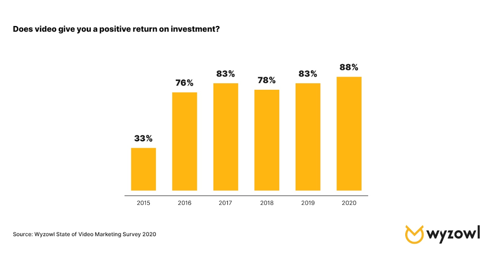
The image above illustrates how Slack communities have grown 2.5 times since 2016 and have over a million members. This highlights how communities like these offer benefits beyond networking. Tools like Slack, Twitter, LinkedIn allow you to tap into massive audiences by utilising a modern version of digital ‘word-of-mouth’ marketing, along with increasing brand awareness. As stated by  Masooma Memon (a SaaS content marketer) “Whether it’s content for social, your blog, or a webinar, it’s going to continue focusing on making your audience feel like a community,” she says. “Folks love this sense of community belonging. It makes them feel valued, so this trend should continue picking up pace.” which in turn will positively affect audience engagement.
  2. Going live with video and webinars: Covid-19 has resulted in video and webinar content becoming vital, something that will not soon go away. “My guess is video marketing including the boom in live video will continue to grow in 2021,” Masooma predicts. But it’s not only because of in-person restrictions; there’s a reason why live video was trending well before the pandemic. “The reason? Video is a quick and effective medium to communicate your message and educate your audience. Consumers want to quickly get information and video marketing is the most effective way of doing this.”
  3. Improving content experience: sometimes how you’re interacting with content is just as important as what content you’re interacting with.  Content marketing trends are now focused on content experience, be it, interactive content or better UX.
  4. Focusing on products and services
  5. Repurposing content

(I did not go into detail in the last two as they are self explanatory).


What is content wireframing?

  • A content inventory (audit) is a great way of looking at the content or even the layout of other more skilled designers and see if you can apply or take as inspiration to produce your own ideas. Bellow is the example Kyle gave us.

I found a great article showcasing how to conduct a great content audit – The Step-by-Step Guide to Conducting a Content Audit in 2021.

  • Site-mapping your site is a great way to create a layout for your website on paper before actually bringing it to life.

Here is the example Kyle gave us:

And here is my version – It is still very rough, I will need to continue revising this and improving it.

  • Content wireframing can be considered as the skeleton of the website. Think of the outline of a building and how everything is placed around (the blueprints). Once this is established then you can start making a more detailed wireframe. Design small first then big but only in reference to designing for mobile and then onto desktop view. This should not be as detailed as an actual digital wireframe. These are to be done in great quantities and quickly; they are just a way of quickly noting down your thoughts and ideas.

Think (scale wise) mobile then Tablet then Desktop and then Desktop HD. This is the best way to accurately figure out where the content should go.


Learning from others

Bellow are some great designers with great portfolios I would like to further research.

  • Jack Mcdade
  • John hicks design
  • Xavious Cusso
  • Vandana Pai: Her use of typography is awesome. It takes a real skill to reduce a site down.

Reflection

This week was very informative, in all honesty I had no idea how much work I had yet to do. It however encouraged me to start my research and to develop not only my website, portfolio and CV but also my personal brand.

I also discovered the importance of content designing and how the users should always be the centre of my focus when designing. The user is key and I should aim to design with them in mind.


Tasks for 30/09/21

  • Write the content for your portfolio – in plain text or in html. Focus on the content. Using your inventory and content wireframes
  • Research and discovery – google trends/job specs/look at language. Look at some portfolios, really study it at a granular level
  • Content audit
  • Sitemap your site
  • Write site content – 3 case studies, home page, about page, contact page
  • Sign up for Webflow.