Website update part 2

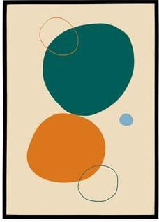
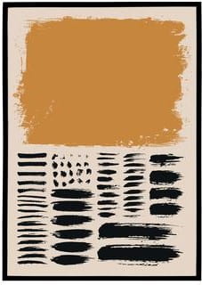
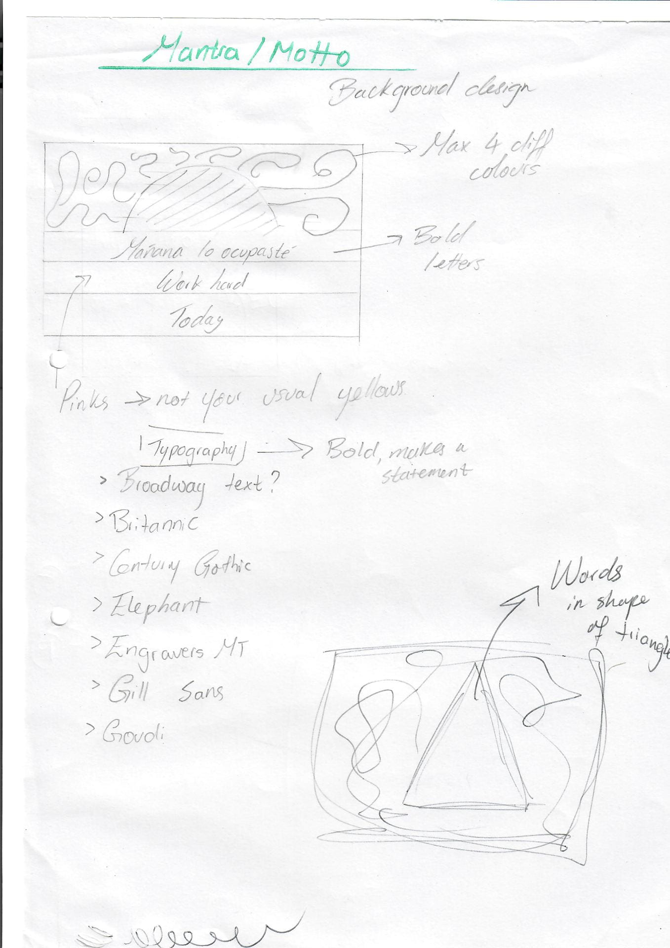
After learning so much about accessibility and how to design with a user centered approach I decided to make some changes not only to the layout of my website but also to the colour scheme I use not only for my branding but also for my website. Adobe colors was a great resource for researching typography contrast and colour combinations.

The colours while lovely did not have a high enough contrast so I made a few adjustments to ensure everyone who would use my website could use it to its fullest.

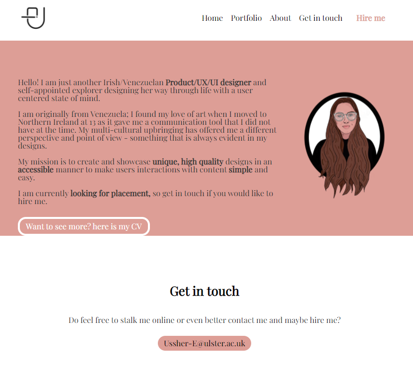
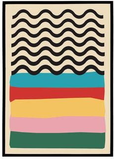
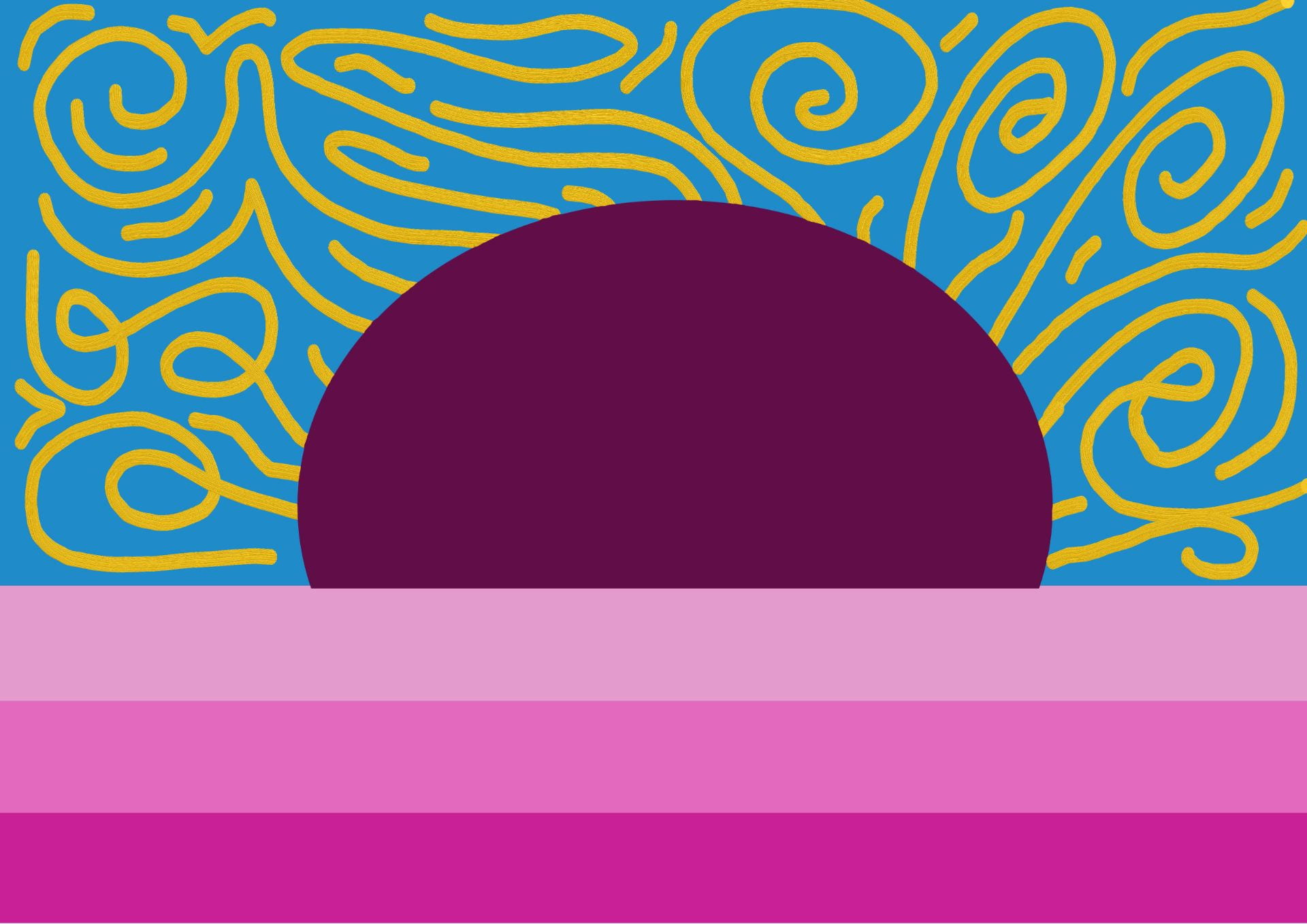
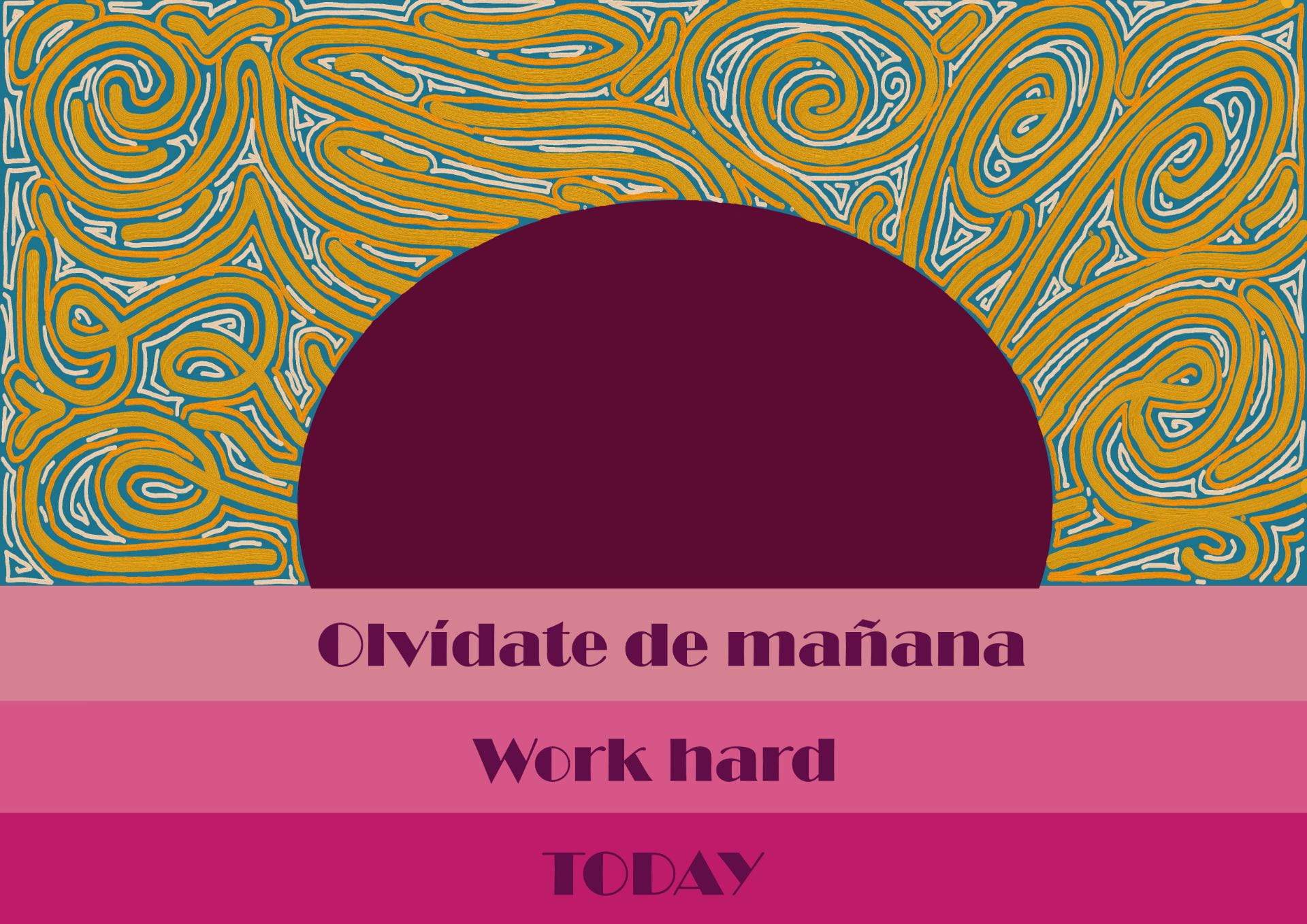
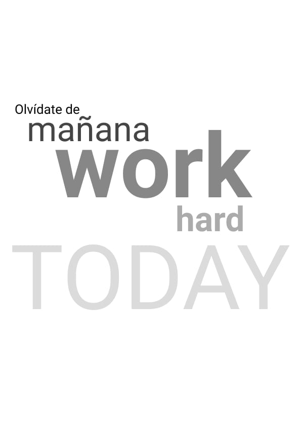
I then started considering these colour changes and took a look at my previous designs; it previous looked like this after working on it for a few days:

Now I realize that the pink not only clashes with my illustrations skin colour but as a way of highlighting text, it does not fully work as it is not dark enough. The contrast ratio is too low.

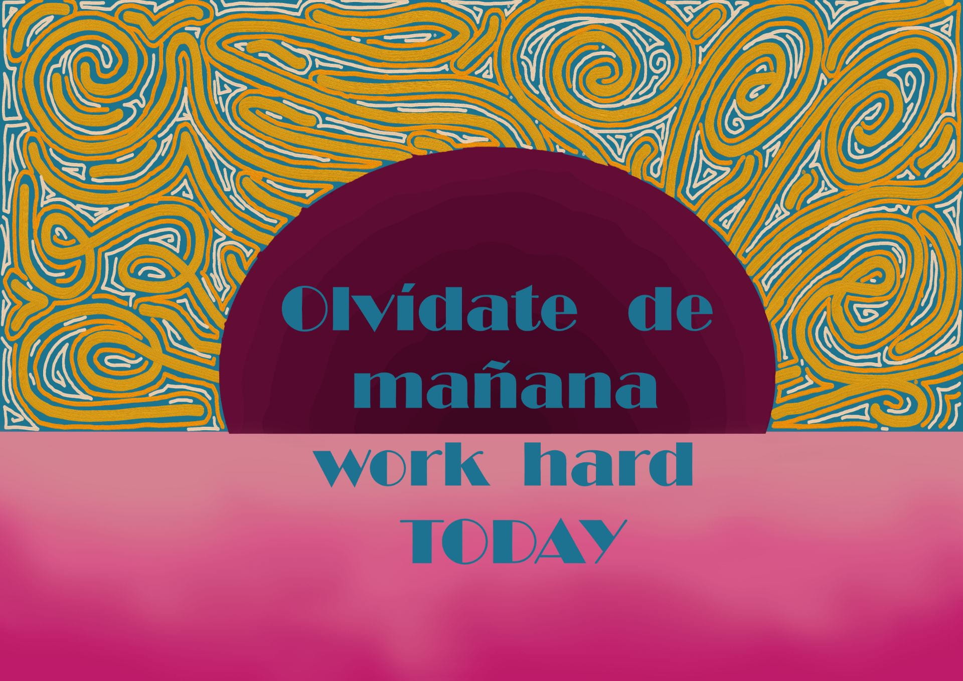
To make this section easier to view I removed the colour for the background; I think this made a big difference in the presentation of my illustrations, making my illustrations stand out more.

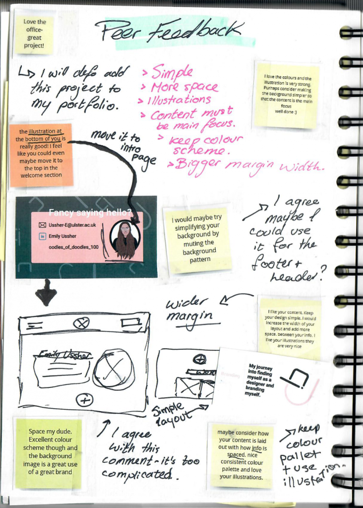
I also tried to add the social icons to link my socials but I could still not figure out how to align them to the center – so I asked Kyle.


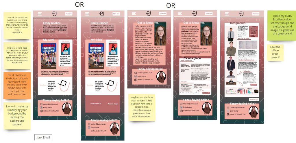
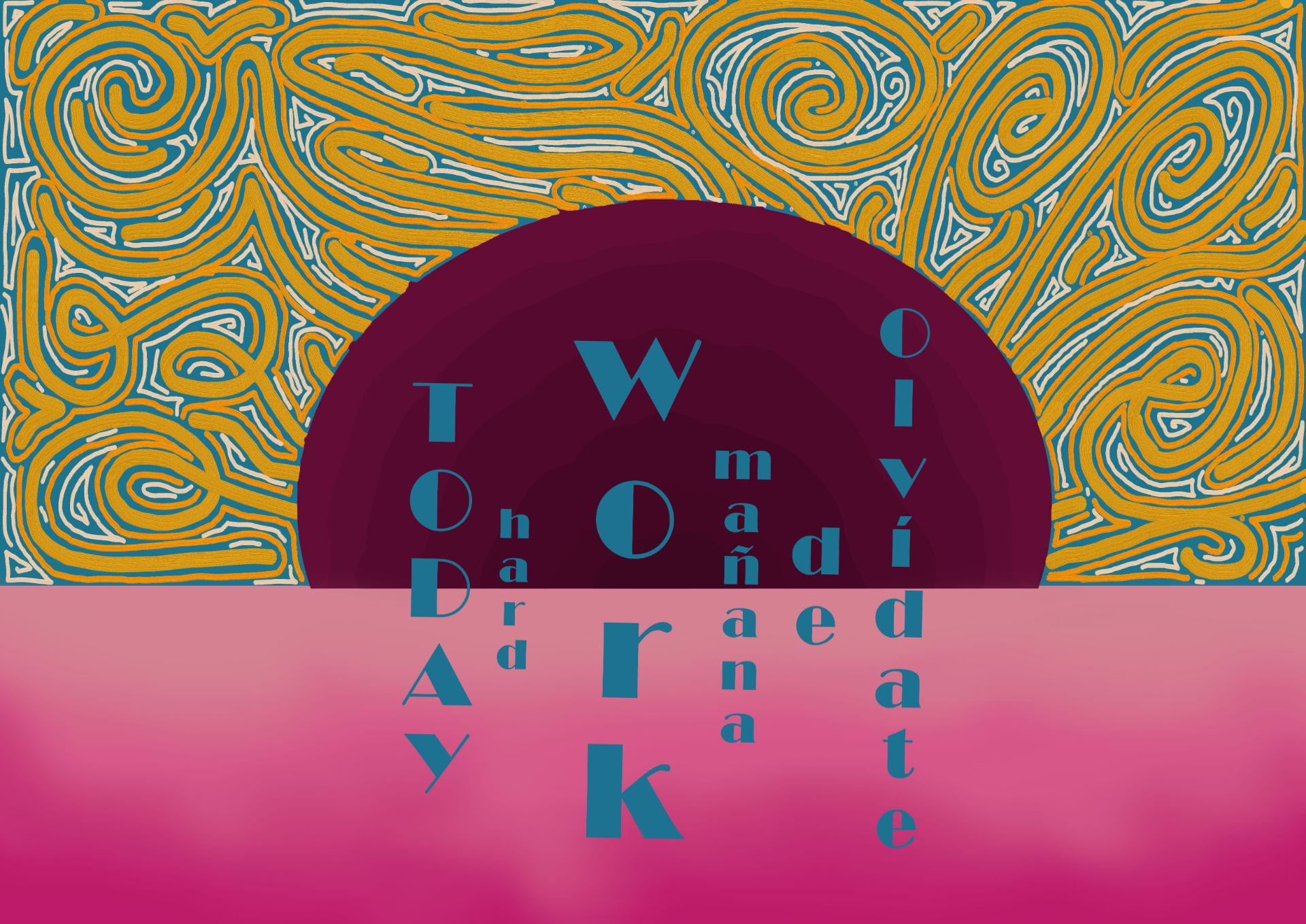
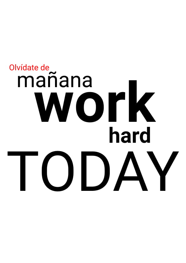
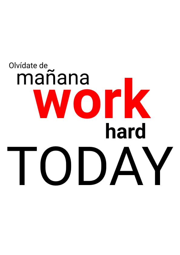
Here are some snapshots of the changes I implemented to my website to improve it:

I removed the block colours to separate the sections and instead stuck to white – I think that overall this looks and works better.

I tried removing the background colour for my intro section of my home page and I believe that it really improved its ease for viewing.


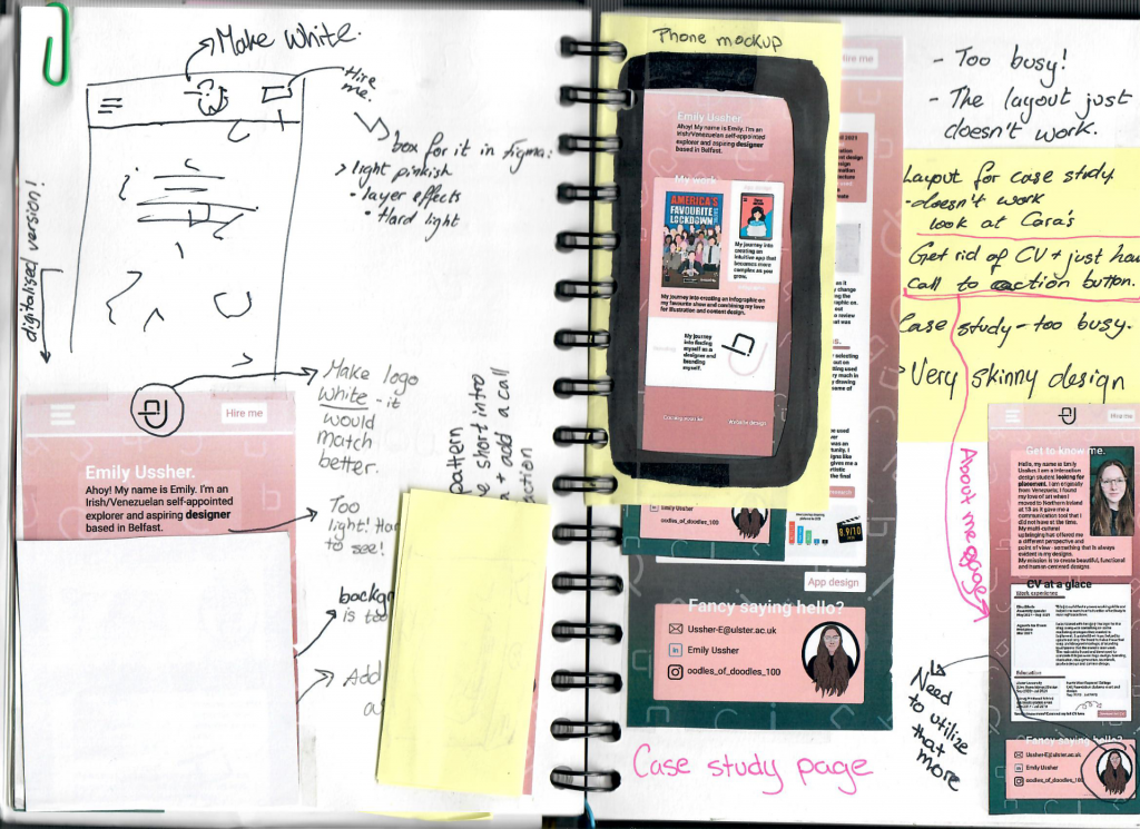
After Kyle helped me understand my issues with my navigation bar (It was no longer sticky) I was able to fix it. I really needed the navigation bar to be sticky as I had shown my website to some older family members both here and in Venezuela to see if the general layout of my site was easy enough for them to understand and navigate. I also sent the link out to other friends on Instagram (some who only speak Spanish) to see how accessible my site was – I sent it to my Spanish speaking friends to see if even with a language barrier the set up was straight forward enough to lead them through my website.

One of the things I learnt by doing this is that less is more and that consistency is my friend. The colour changes were also preferred as it made it easier for all who viewed it (They were all of varies ages, abilities and backgrounds) yet aside from aesthetic preferences, there was a general agreement that the higher contrast was the preferred version of the website.


As part of my IXD302 class Ronan McKinless came in to give us some information on applying to placements and how to make the most out of our time in placement. I reached out and sent him a link to my portfolio and he was kind enough to offer me some feedback.

I will be taking this on board and hopefully making the changes as soon as possible.

What I learnt the most through this process is that feedback is vital. Be it by peers, friends and even better yet more experienced designers. I also learnt to consider the user throughout the process.

Portfolio

It is easy to get lost in the infinite sea of information so I decided to make this a little easier to view by listing all my research blog post links and other relevant links here to keep things nice and tidy. I will also be organizing it by week.

Here is to hoping it works out!


Project 01 brief – Portfolio

Portfolio site and content strategy. Your Instagram, LinkedIn, Slack must be active and functional and professional ASAP – they should all match, think brand recognition.

This year I will need to create a new portfolio site. The portfolio should be simple and functional. A bit part of developing my website will be focused on research and learning from other more experienced designers.


emilyussher.com


Portfolio part 1

Week 01 – research conducted between 23/09/21  to  30/09/21

Portfolio part 2

Week 02 – research conducted between 30/09/21  to  07/10/21

Portfolio part 3

Week 03 – research conducted between 07/10/21 to 14/10/21

Portfolio part 4

Week 04 – research conducted between 14/10/21 to 21/10/21

Portfolio part 5

Week 05 – research conducted between 21/10/21 to 28/10/21


Something that really stuck out to me during this process is that feedback is gold, accessibility is a must, starting on paper is necessary and that a website is never fully finished and perfect and while my current website serves my current needs (showcasing my work for employers offering placement) it will have to grow with me as I grow as a designer. I have made small but good changes since having blogged my process. My website is changing along with me.

The HTMLs and the CSSs

Building a website with Webflow

By now I have completed the following areas of my design process:

  • Research
  • Discovery
  • Planning (sketches)
  • Content audit
  • Mock-ups

Now I have to focus on building a good and responsive website using Webflow.

Responsive Web design

This ensures your website will work in every device.

Book: Ethan Marcotte – Responsive web design.

Every website is made using HTML using an Editor like brackets or atom. When writing HTML it should all be in lowercase. HTML just basically wraps up your content in tabs to tell your browser how to display the information. There is always an opening and a closing tag.

Example <title> My website </title>

The only things that are seen in a website are the things within a body tag <body>

What to include under <head>

  • page title
  • CSS links
  • Other abstract things

What to include under <body>

  • Headings
  • Paragraphs
  • other things you can view

Having a good heading is vey important and useful as they help you structure your content and give the website a nice flow. Users skim the websites by headings so guide them to what you want the to see.

HTML links are very important <a href=” URL here  ” >This is a link</a>

HTML images    <img src= “name of image”   alt=””   This is a screen reader that will read the content for hearing impaired people.

HTML buttons: by only using HTML it would look very ugly but once you add CSS and add the proper code it will look more aesthetically pleasing.

Always add comments to your code to help other designers and coders. Be a team player.

Images are pulled into the website whereas links take you to a different place.

Link targets: this decides if once you click the link if you are taken to a new browser window or if the link opens in the current window being used. use target=’_blank’   to open in a different window.

Naming conventions; HTML spaces are bad. Do not use spaces for page names; its ok to do so for titles though.

Image format

Do not use a JPG file for your logo as if they are meant to have a clear background they will replace it for a white background. Use a PNG for images that need a transparent background.  PNGs keep the image quality better than JPG – these are all pixel based so once screeched they will lose their quality. SVG images however are vector based so they will not loose quality

Image dimensions: Consider image sizing very carefully as a very large image can make the website heavy and slow. Be considerate. If you need to resize an image, do so in Photoshop – it will make your life easier. They should not be over 600MG.

Always provide a text alternative to your images – Think accessibility.

Never style your content with HTML, always use CSS for this. HTML does not have the terminology to make the kind of design decisions CSS makes. For the HTML and CSS files to ‘talk’ to one another you must link them; that is why the CSS file is normally called “stylesheet” for easy access and linking.

CSS allows you to set up multiple properties within an element. It also allows you to select the sizes of your headings. Units of measurements used are PX (pixel), EM (this tells the text to scale and in what ratio to do so) This makes things easier to manage.  The EM tells the text to be that much bigger than the base size which will be shown in PX.

When writing your font family, make it so it applies to all your text at once so if you ever need to change it later on it will be easier.

In CSS   a {   means links.

Sectioning elements. These are defined in HTML (<nav>   <section>   <body>   <article>   <aside>) Aside is a sidebar. These are the primary links. When using the <nav> tag never use the actual word in the label as it will show up as “navigation navigation”.

The <main> element is were the content goes.

CSS Box model: this applies things like padding, boxes, boarders and margin. Padding is an essential element and if not well defined it will add padding to all the elements of the website. If you want to change it you would then have to specify with ‘top’ or ‘bottom’. Border, these can be added to a section. Margins are defined in the same way as padding. Margins are transparent and are not included in the click are of an element; paddings behave in the opposite manner. Explicit dimensions must be given at times to avoid an element taking up all the available space.

CSS selectors allow you to define an aspect of the content while keeping the rest normal. One does this by using class selectors. Using class styles allows you to  create different styles and apply it to many different sections.


Summary/Reflection

A nice and simple HTML file is invaluable as it will not break. As a designer the temptation to be super visual can be overpowering; a solution for this is CSS. When saving the files for the website it must always be well organized.

Making my website

I decided to use Webflow instead of coding it myself due to time constraints so I also kept notes of links so I would be able to organize my site correctly.

I had tried to make a mock-up of my website in Figma but truthfully I was inpatient and instead jumped right into Webflow – looking back I regret this as I would have been able to avoid some silly design decisions and saved myself time and effort if I had put in the work and made the mockups.

I realized early on that Webflow was a lot easier than having to do it yourself. It look a bit of learning and for that Webflow University and some YouTube videos were a great help in informing my process and teaching me how to more efficiently use the software.

During my 1st year I had purchased my domain name; this is something I am very glad I did as it fit in so much better into my CV than some random Webflow URL – it did however take me a very long time to figure out how to connect my website to my URL; cue in customer support for Webflow and Ionos (my domain provider).

I kept the home page simple and clean. I was however struggling with the layout options and alignments. It took a lot of tweaking but eventually I got it there. I made the navigation bar sticky as I thought it would make it easier to navigate the page. I also decided to add a ‘Hire me’ button to the menu bar that when clicked opens up my CV – I figured this would make me stand out?

I also added the illustration of myself as part of my introduction section of my home page as I thought it would bring across my playful and artistic personality as well as showcasing my skills.

I am having trouble fixing the blending of the button outline and the footer background colour. I do think that while the footer works it might be too simple and not informative enough.

I quickly realized that trial and error was my friend here as that is when I learnt the most.

I think it is really down to refining my ideas at this point and continuing to process.

Peer feedback, evaluation and improvements

After having a peer feedback session on my website mockups it became clear to me that I had created an incredibly busy and overcrowded website. Here are some notes on the feedback I received:

The biggest issue people had was my spacing and in retrospective I agreed, it was way too busy and the background clashed with the information, it made it hard to see and distinguish. Also the background drew focus away from the main purpose of the website which was to promote my work.

I then broke down the comments given to me and seriously considered them and came up with a few solutions. I first decided to go back to my mockups to see what I could do to maybe salvage the design or if I could create something out of my previous idea before completely scrapping it.

I made some notes on possible adjustments and then created a quick paper mockup of what each slide would look like on a phone and concluded that it indeed was just too much information and general business to give to a user.

I then came up with another idea but ultimately decided to not pursue it and instead I tried to create a design that would be simple, uncomplicated and easy to follow.

I ultimately decided to go back to basics and improve the design of my year 1 website – here is how it went:


This idea quickly developed and proved to be a better option than my previous one. I wanted to further explore it before going with it so I made more wireframes and kept trying to figure out how to make my website an enjoyable experience.

Travel app research

Research

I want to create a very different type of travel app, I want it to be very unique and memorable.

I started off by writing down some of my ideas, I decided to try and make it personal in a way.

Moodboard

  • Here is a link to my Wireframe Pinterest board.
  • UI moodboard link.

I really liked the simple illustrations used for this app design, this kind of design would work both for children and adults. I also like how they used a darker blue for the menu bar – it highlights and draws the eye there.

  • UX moodboard link.
  • Time travel moodboard link.
  • Space travel moodboard link.
  • Bible travel app moodboard link.

I really like this simple Illustrative style, the colours make it look nearly real while still keeping that playful illustrative style. I do however feel like it might have a more grown up vibe to it, like late teen/adult sort of aesthetic?

  • Gauntlet. This is an app I really liked, I loved the layout details.

I really liked the dark colour scheme as it is easier on the eyes.


My aim is to create a Bible app that takes kids through time to teach them bible stories. I know a lot of kids who have missed out in Sunday school because of Covid and I figured that this would be an ideal app for times like this and just in general. Growing up I would have loved an app like this as it modernizes the Bible without adapting the message. A teaching tool.

I think it might even be a fun idea to make it an app that grows with you? As you get older and are able to tackle more difficult Bible passages the app will help you and even offer recordings in a podcast manner of meetings with ministry and bible reading teachings.

I went into Procreate to start creating my illustrations for my app

I tried to create a rocky shore to illustrate Jonah and the big fish. I then decided that I didn’t really like look of it so I kept the wave and added the other elements of the story.

I started off by adding the sun behind it but I think I put it too low.

I drew a whale instead of a fish as in the Bible it is referred to as a fish and a whale.

I changed the look of the whale as it looked a tad too happy before. I also created a little avatar with a map with a cross on it to play on the whole bible travel app theme.

I then decided to focus on Noah and the ark, I kept the same wave as I started with as I felt like it added a bit of playfulness to the story.

These are the first drafts for my travel app screens.


IXD104 – Hand to mouse – Week 3

This course does not create illustrators but if  you are passionate about it then pursue it! Practice makes perfect.

Reminder:

Research 40% is all blog and backup work — Get on it!

Alex, Ethan, Georgia, Jessica —> IXD students to look up

What is illustration?

Anything. A visual material.

  • Marion Deuchars (traditional media) look up Samsung add
  • Dan Fern (Photocopier)
  • Love Fraud (short film) – Oliver Sax
  • Martin O’neill (Collage)

Now we have illustrating digital tools

  • Olly Moss
  • Jorge Colombo (Procreate) – Very architectural
  • Rogie King (Vectors) loads of icons, simple and clean.
  • Nigel Peake
  • Breno Bittercorp
  • Sarah Parmenter (UX/UI)
  • Veerle Pieters (UX/UI)
  • Von Glitschka (Linked in learning)

NI Illustrators

  • Oliver Jeffers
  • Peter Strain
  • Atto Partners
  • Jordan Henderson
  • Paddy Donnelly (IMD course student) Used textured papers and then digitally added elements onto them. Book covers.

Tools available

  • Pens, pencils, paper
  • photocopier
  • photoshop
  • Collage

Task

  1. Recreate the city scapes ( master apprentice exercise)
  2. Mind mapped ideas
  3. Sketching and wireframing
  4. Start creating your icons.

Tutorial with Paul

Need to ask:

  1. Is my bible app travel idea valid and explain it

Feedback:

Likes the idea.

make it so its a window into the event – time travel sort of situation.

tablet format instead of phone so its more appropriate – more kid friendly – maybe put it inside one of those tablets with the handles for kids.

Time travel taking kids to biblical locations.

cutitout.co.uk

Icon recreation

We were encouraged to take a master–apprentice approach to our studies and development as artist; searching for artists and in some cases reproducing their work to learn new skills and improve.

We were tasked with breaking things down, analyzing and reproducing them.

I will now reproduce an Icon set given my my professor; that I could use for my Project 01 (travel app) or simply just as a learning experience. I will be using figma to complete this task.


I began by attempting 3 of the blue icons, bellow are my outcomes.


OK, so I made them supper small ( Clearly I didn’t think it through) and so when I made them bigger they became pixelated – It was really annoying as I had done quite a few in this way which meant they were no good. In a more positive note, I learnt an important lesson.


I wanted to really challenge myself so I attempted to do the map from the second set of icons; this one was more complex than I thought as there were curves involved in the design. Overall I am quite pleased with my final outcome. I need to practice more as they took me an embarrassing amount of time to finish.


Project 01 – Manifesto

Manifestos, Mottos and Mantras


To me a manifesto is a declaration of intent not only to the world but also to yourself, it presents values which a person stands for or is inspired by – or as Paul put it ” a battle cry to inspire you when things get tough”. A mantra would be more like a slogan or statement repeated with the purpose of uplifting oneself. Mottos would also be a form or motivation much like the mantra and the manifesto. A creative method for artists to express their intentions – a way to artistically articulate something that is meaningful to you.

I am not a fan of the ‘typical’ uplifting quotes as I find them kind of empty of real meaning. I want my manifesto to mean something and to do that I think it has to be personal – maybe like an inside joke or private story? Whilst I understand that a wider audience than just me will view it, I think that the message my manifesto will convey should be directed at me to keep me going; it needs to be MY battle cry.

I want to not only consider the words I use but also the design and colorus I utilize as, for example, a background or design with a mainly pink colour scheme will feel more personal to me than a green color scheme would as this colour does not resonate with me as strongly.


Breton, a surrealist manifesto

Surrealism, as Andre Breton explains is the combining or merging of reality with dreams, in art and all aspects of life imagination is to be a person’s greatest quality. As Breton argued, there is no point in creating ordinary and boring art that reflects reality as perhaps doing this only pushes away the subconscious and the creativity in us. Breton stated that “realistic attitude” is the same to being “hostile to any intellectual or moral advancement.” I guess that he was trying to argue that if we only accept was is directly in front of us and look no further a different and perhaps better way of thinking, analyzing and imagining things can never be achieved as the rose-tinted glasses, or in this case the ‘wacky’ glasses have not been put on. Breton’s manifestos lay out the politics of the surrealist movement – he clearly conveyed his message, I would like my manifesto to do the same.

The Dada Manifesto

Dada Manifesto is not a singular writing, it was a movement. the best-known pieces for this movement were created  by Hugo Ball and Tristan Tzara. Ball wrote his piece in 1916, while Tzara’s wrote his in 1918.

The Dada movement originated during WW1 when young creatives living in neutral Switzerland decided to take their aim at the issues that led to the war, such as nationalism. They became known as Dadaists. They were searching for a way to disengage from the cruel reality of the times.

Dada was influenced by Cubism, Expressionism, Futurism, and Constructivism. This movement – the same as many other movements- had the urge or the aim to change the world for the better. They craved freedom. The anti-intellectualism of the time heavily influenced Ball and Tzara.

“Dada world war without end, dada revolution without beginning, dada, you friends and also-poets, esteemed sirs, manufacturers, and evangelists. Dada Tzara, dada Huelsenbeck, dada m’dada, dada m’dada dada mhm, dada dere dada, dada Hue, dada Tza.” – Hugo Ball, Dada Manifest.

“Freedom: DADA DADA DADA, a roaring of tense colors, and interlacing of opposites and of all contradictions, grotesques, inconsistencies: LIFE.” – Tristan Tzara, Dada Manifesto.

To Ball Dada perhaps meant goodbye but to Tzara Dada was meaningless, perhaps because he viewed art as also devoid of meaning. What comes to mind after researching this is that a manifesto can mean different things to different people – the way it is perceived and under which mindset will heavily influence its meaning to the viewer, even if the resulting meaning was not the one the artist intended to communicate.


What I would like my Mantra to be/do

  • challenge and provoke
  • Advertise me as a designer
  • Not be too long – short and sweet seems better to me
  • Theatrical – I want it to make a statement, to not be obvious
  • Motivate me

Famous quotes by artists that inspire me

  • “Every artist was first an amateur” – Ralph Waldo Emerson
  • “Creativity takes courage” – Henri Matisse
  • “Every child is an artist. The problem is how to remain an artist once we grow up.” – Pablo Picasso
  • “Art enables us to find ourselves and lose ourselves at the same time.” – Thomas Merton
  • “We don’t make mistakes, just happy little accidents” – Bob Ross
  • “The “principles of true art is not to portray, but to evoke” – Jerzy Kosinski
  • “As my artist’s statement explains, my work is utterly incomprehensible and is therefore full of deep significance” – Calvin and Hobbes
  • “Creativity is contagious, pass it on” – Albert Einstein
  • “Have no fear of perfection, you’ll never reach it” – Salvador Dali
  • “You can’t wait for inspiration, you have to go after it with a club” – Jack London
  • “Creativity is a drug I cannot live without” – Cecil B. DeMille
  • “You see things; and you say, ‘Why?’ But I dream things that never were; and I say, ‘Why not’?” – George Bernard Shaw
  • “Reality continues to ruin my life.” ― Bill Watterson
  • “I’m killing time while I wait for life to shower me with meaning and happiness.” ― Bill Watterson
  • “You can’t just turn on creativity like a faucet. You have to be in the right mood. What mood is that? Last-minute panic.” ― Bill Watterson


Motto ideas

  1. With hard work todo se logra.
  2. Tomorrow es el dia mas ocupado de la semana. Get on with it.
  3. Get on with it already.
  4. Mañana está ocupado, work hard today.
  5. Mañana lo ocupaste, work hard today.


Design research ideas


Sketches


Digital progress and final outcome


I really like this last version – after talking to my professor it was established that the previous 2 versions with the vertical writing were too difficult to read – Their complexity made them obsolete. Good design is easily understood – I did not take that into account here. My designs should be able to be appreciated by anyone. I would like to try and experiment using only typography, I want to make it – simple, BOLD and easy to understand.


Experimenting with type


I think that using only the type without a background really helps the words pop and solidifies their worth. Sometimes less is more; this is something that I learnt while studying the Fibonacci Sequence.