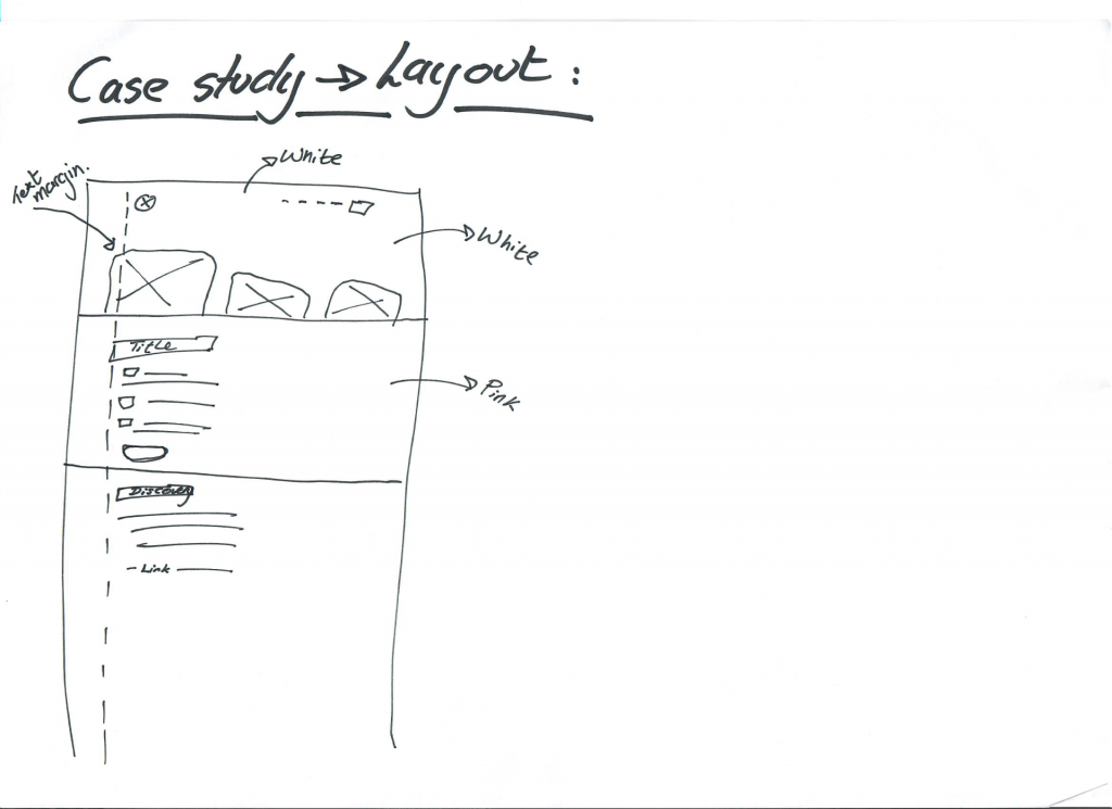
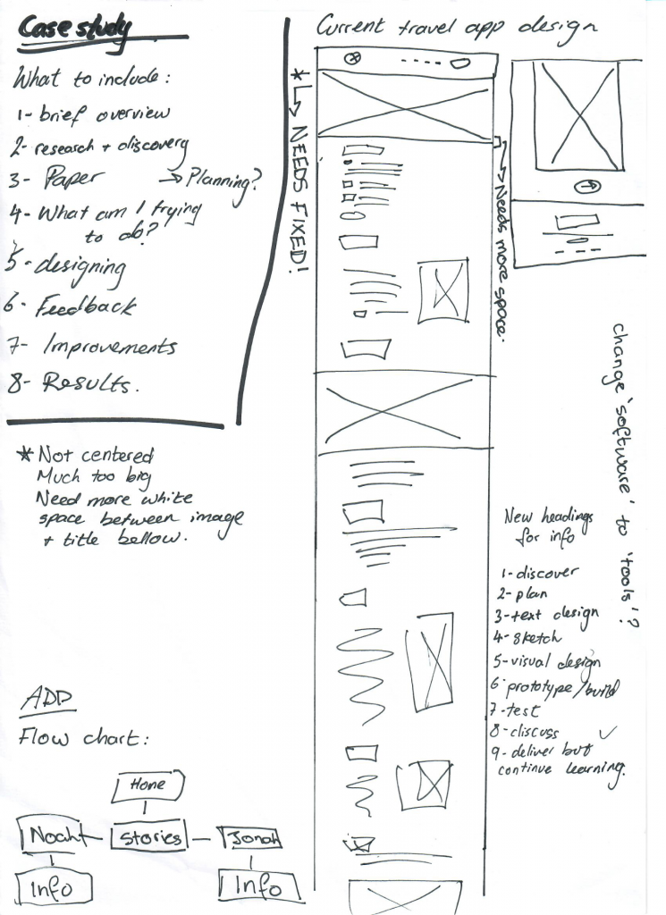
This week I started focusing more on my case study pages. I was going to follow the layout I had previously sketched out in my sketchbook but after doing some changes to the rest of my website to fine tune the mistakes, I started to see that maybe an image preview would best suit the layout and would inform the viewer of the contents in the page along with giving them a glimpse into the final product.
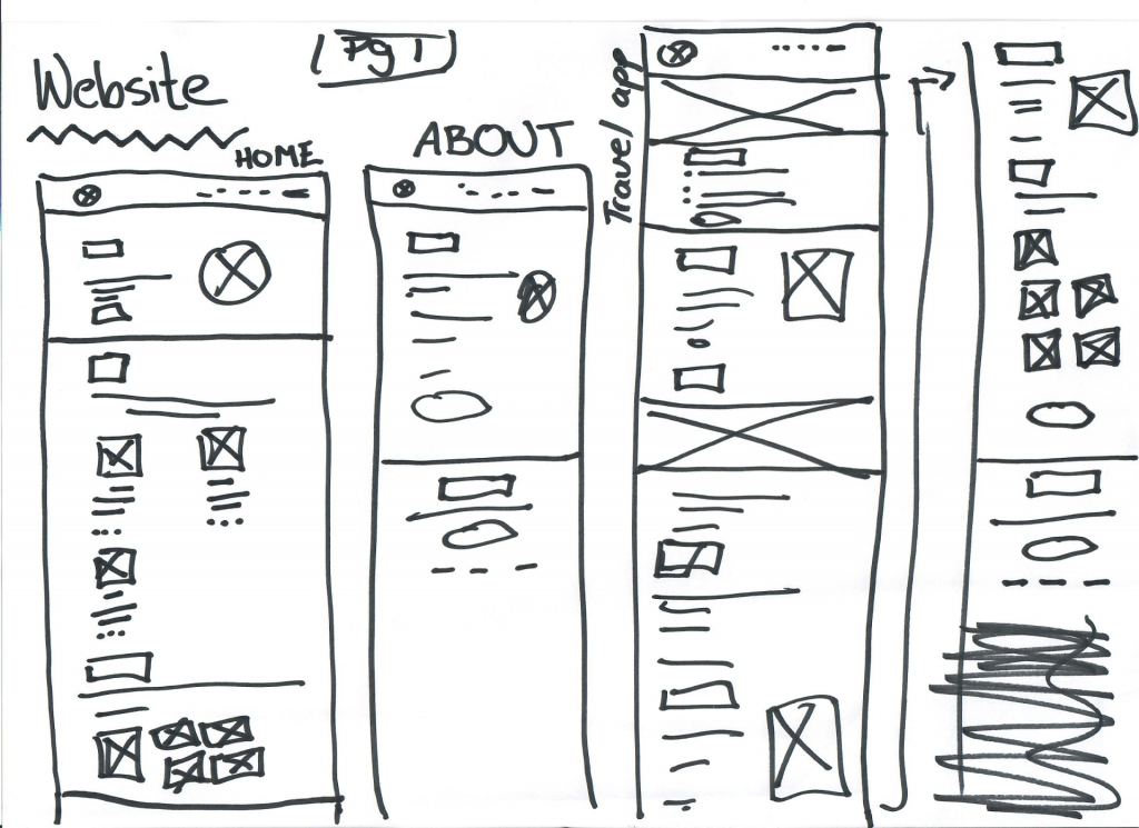
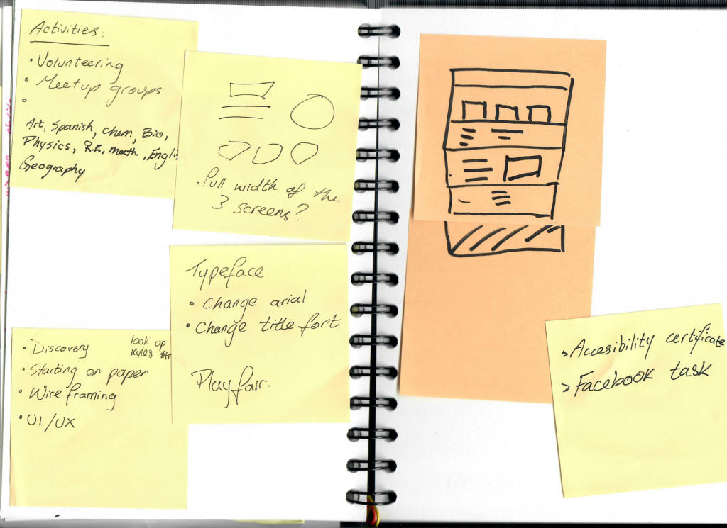
I started off by drawing up some wireframes – always start on paper.
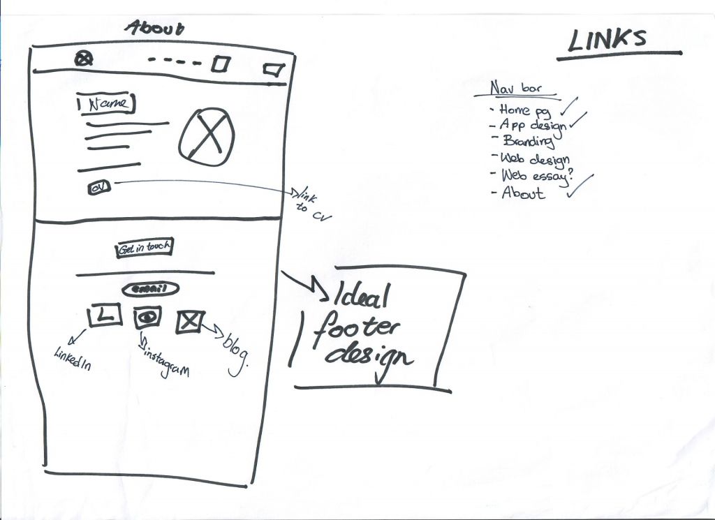
I also further considered the information I would include. It could not bee too much or too little. Enough to give prospective employers a glimpse of the skills I can offer them. Give them enough to see my potential.

After talking to Kyle I also changed some parts of the layout and the typeface. I changed my typeface from Arial to Playfair Display as per Kyle’s instructions – It really elevated the look of the website and give it a feminine touch (something I was scared of doing).
Here are my results:
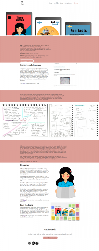
This is what I have accomplished so far with my case study page. I think it looks okay but there is still a lot of work I need to do to make it right. I also changed the footer and added my socials linked via logos but I am struggling to center align them. This is what I will be working on for the next few days – refining my design.