After having a peer feedback session on my website mockups it became clear to me that I had created an incredibly busy and overcrowded website. Here are some notes on the feedback I received:
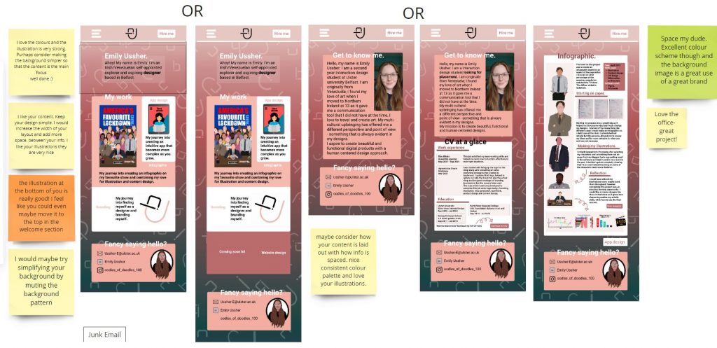
The biggest issue people had was my spacing and in retrospective I agreed, it was way too busy and the background clashed with the information, it made it hard to see and distinguish. Also the background drew focus away from the main purpose of the website which was to promote my work.
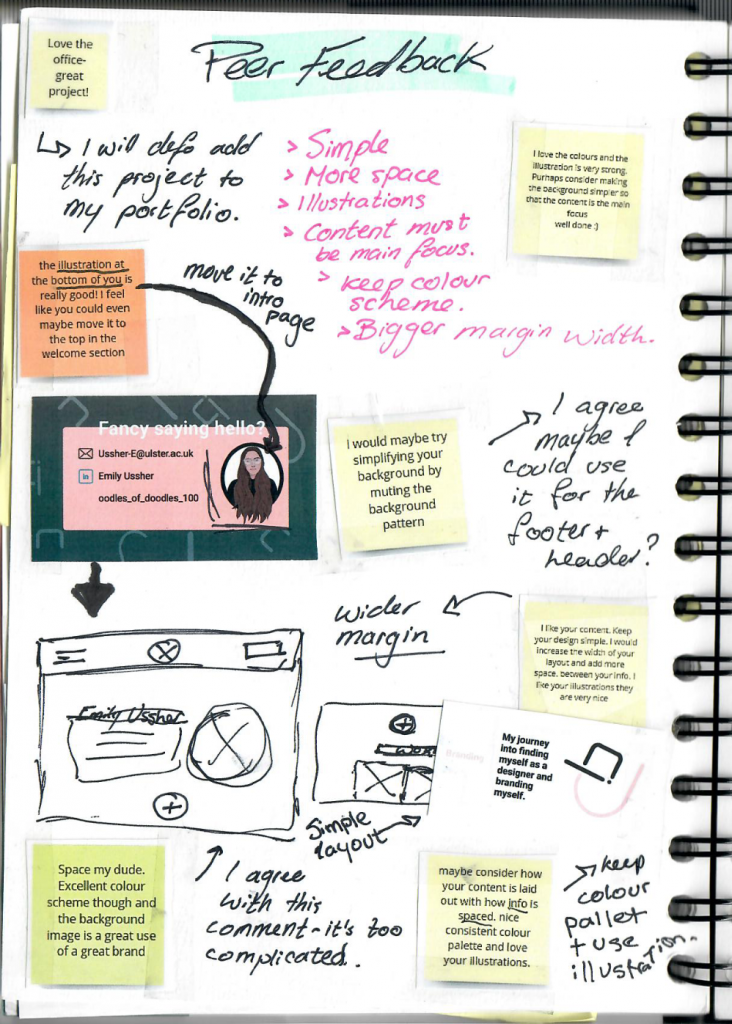
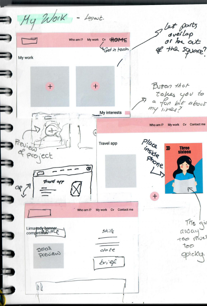
I then broke down the comments given to me and seriously considered them and came up with a few solutions. I first decided to go back to my mockups to see what I could do to maybe salvage the design or if I could create something out of my previous idea before completely scrapping it.
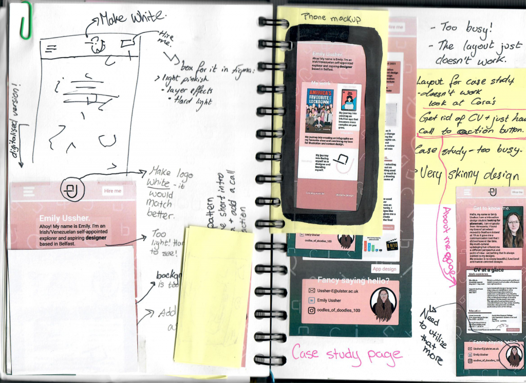
I made some notes on possible adjustments and then created a quick paper mockup of what each slide would look like on a phone and concluded that it indeed was just too much information and general business to give to a user.
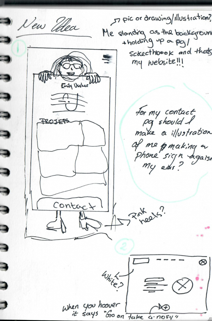
I then came up with another idea but ultimately decided to not pursue it and instead I tried to create a design that would be simple, uncomplicated and easy to follow.
I ultimately decided to go back to basics and improve the design of my year 1 website – here is how it went:

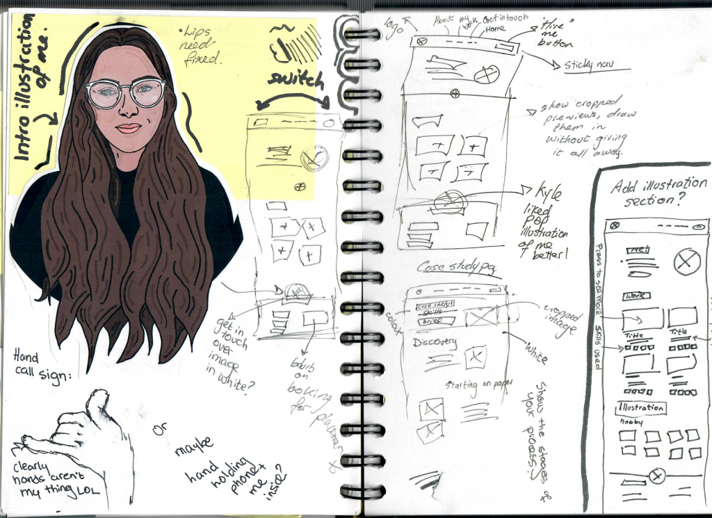
This idea quickly developed and proved to be a better option than my previous one. I wanted to further explore it before going with it so I made more wireframes and kept trying to figure out how to make my website an enjoyable experience.