Beyond the brand – Week 10

Personal brand, Portfolio website and research blog – These deliverables should demonstrate your understanding of the subject matter covered each week.

Recap

This should all be reflected in my work!!!!!!

  • Week 1: Language – values, tone of voice, bios, stories and strategies. This should always be the starting point when creating a brand.
  • Week 2: Monograms – Examples, case studies, requirements, Axes ( how to balance the letters) and sketching.
  • Week 3: Typography – Choosing and using type, Kerning, Anatomy.
  • Week 4: Visual identity – design programme, pictorial and abstract drawing.
  • Week 5: Colour – Colour systems, phycology, culture and meanings.
  • Week 6: Application – Business card, touchpoints, animation.
  • Week 7: Brand guidelines – Guideline documents, considerations and rules.
  • Week 8: Style guides – style guides, pattern libraries, element collage.
  • Week 9: Portfolio website – planning, inspiration, standards, wireframes, Osborne checklist.

Research blogs:

Needs to be updated more often, loads of content missing. Put the time in! Maintain it. if you don’t it will slip. Take an hour a day and post !!!!

  1. Lecture summaries – Class notes.
  2. Independent research (literature reviews, blogs and articles) be critical of your sources. Make sure articles are from a reputable website. Lean more towards book – they are credible.
  3. Backup and development work – paper sketching, you need to draw as much as you digitalise!!! Include all developmental work.
  4. Self-reflection – weekly summaries of what you have learned.
  5. Assigned tasks – progress and final outcome and reflection.

Read

  • Designing brand identity by Alina Wheeler
  • The future beyond brands lovemarks by Kevin Roberts

“The word ‘brand’ is overused, sterile and unimaginative” – Michael Eisner, Disney

To me this maybe suggests that branding needs a bit of a shake up, we are over saturated in them. We are bombarded with branding – it’s everywhere, even in our homes. Has it just become a way to compete instead of creating a meaningful interaction? Does brand now equal boring?

Values

Brands are all about values. You need to believe in something and you need to explain why you believe in it ( they might get on board because of this, if you don’t believe in it, why should the audience?) This enables you to form an emotional connection with your audience.

What are the functional benefits? without this you have nothing. Emotional benefits – what makes it better than the competitors?. Is it self expressive? If done correctly the customer will not only believe in the brand but they will feel like the brand expresses them as well. It allows the audience a way to be self expressive with the brands products.

“Consumers who make decisions based purely on facts represent a very small minority, yet, even for these people, there is always some product or service they buy based on impulse or emotion.” – Maurice Levy, Publicis.

We tend to make decisions based on emotions not facts, a good designer plays on this. They will create a brand that inspires loyalty beyond reason.

You need to make your brand desirable. How do you make your bio captivating? statement or story? A captivating tale. Frame your thinking process as see in the image bellow.

I need to become an idea person as this is what will make me valuable to customers and employers. Designers are here to sell ideas.  Professional and passionately creative. Passionately creative makes you think that the person thinks, eats and breathes creativity; they cant help but be creative.

A brand that not only creates a great emotional connection and sense of respect will create real, impactful value and that in turn will cause the customer to pay you back with loyalty and love. Don’t just dress the brand up nicely, make it something that will last. If you make an emotional connection with your client, they will not only keep coming back but they will also refer you.

What I stand for matters and this should be reflected in not only my brand but my work.

The Nespresso not only feels stylish but it also states good – its a lifestyle choice in a way. Kenco taskes good but its appearance doe not convey any sort of enthuthiasium

BxP Value proposition map

This is another way of looking at it – values are at the core.

  1. The brand: This is the number one indicator of value for a customer. Users develop emotional connections to brands that far supersede any …
  2. The experience: The experience of the users is key to reinforcing brand perception as it connects your products before it did. It might solve a problem that has not been solved yet or it might address an untapped need in the market. Just be better than everyone else basically. For me this will be the look and functionality of my website.
  3. The product: Ironically this is the last thing a customer will interact with.

Examples:

“A brand is the set of expectations, memories, stories and relationships that, taken together, account for a consumer’s decision to choose one product…..”

“If you don’t give the market the story to talk about, they’ll define your brand’s story for you.” – David Brier.

Is my bio captivating? or is there room for improvement? Is there a way to make it more exiting? Have my values evolved?


Task

  1. Post examples of 3 businesses you respect and study how they form an emotional relationship with their customers. Instantly I want to use Disney
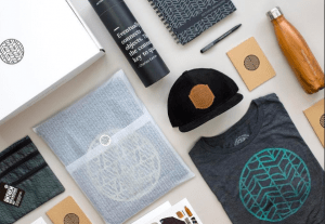
  2. One step beyond (for 3pm) Design one additional touchpoint for your personal brand. This can be anything at all and the purpose is to promote an emotional response to your brand. Design something that will attract attention. Don’t just slap your logo on a t-shirt.

Ideas

Animated loge, Animated gif show reel of work for website/social media. A wearable item but make it desirable. Branded merchandise (Look up Merchandise.com and awesomemerch.com). Supporting app idea or micro interaction. Desktop/phone/table/Wetransfer background.

IT must be relevant to the brand/service with customers and people in mind.

Look at

Twitter and Brand New (blog) for example. Selling a tweet (NFTs)


My outcome

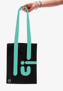
I started by mind mapping some ideas and exploring my options – I really liked the idea of a tote bag as it will not only help the environment but also give advertisement to my personal brand whilst also not being too in your face.


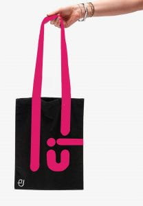
I think this could be a very cute idea as its very useful, I can never refuse a free bag for life so I think this would be a great marketing scheme for my personal brand. I would do many different colours, it doesn’t have to be the same background colour or even consistent line colour.

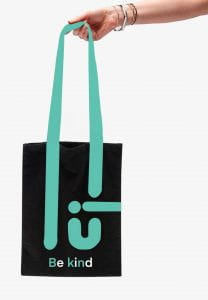
I would also like to make a few more with the phrase ”be kind” I think it is a strong and recognisable phrase with a lot of weight to it.

I really liked this, it’s something I would be happy to use..

I want them to be as unisex as possible – something for everyone to be able to enjoy.

I wanted to have something simple and useful; I love shopping and for me a bag for life or a tote bag is a must. I personally can not resist when one is being offered, so I decided to play on this. I used the handle to extent and also represent part of my logo to create a pattern that is interesting and a bit abstract. Ideally they would all be lovely, happy and varied colours. I added the phrase “Be kind” to my last one as it is a message that resonates with me and many other people.

I would like to experiment with notebooks, pens/pencils, Hair clips, “Thank you” cards for customers, water bottles (safe the turtles and stay hydrated), Antibacterial (To avoid Rona)

Feedback:

Great, simple idea, the logo in the bottom is not needed, take it out – other than that, its great.

Here is a link to my Pinterest moodboard

New Ideas:

  • Loading screen animation of my logo
  • Phone case
  • Try animation for portfolio site
  • Wall paper
  • Thank you cards/stickers
  • QR code that takes you to my portfolio website/app?

******** Try to animate your logo so the lines and dots fall and become the logo.


Animation

I decided to attempt to animate my name as a way of practicing – I used procreate to animate my name; I could not figure out how to put the animations onto my blog so I put them in a separate Miro board.

Click here to see them.

I was quite pleased with my outcome, my favourite one was the one I created of my name being typed out. I would love to use it in the future.

Brand progress review

Long Bio

Hello, my name is Emily Ussher. I am a first year Interaction design student at Ulster university Belfast. I am originally from Venezuela; I found my love of art when I moved to Northern Ireland at 13 as it gave me a communication tool that I did not have at the time. I love to travel and create art. My multi-cultural upbringing has offered me a different perspective and point of view – something that is always evident in my designs.

Short Bio

Just another Venezuelan/Irish self-appointed explorer, studying Interaction Design and doing what she loves

Tone of voice

  • Friendly
  • Professional
  • Creative
  • Comprehensive
  • Caring

Word bank

  • Dedicated
  • Diverse
  • Bilingual
  • Friendly
  • Professional
  • Original
  • Innovative
  • Unique
  • Well designed
  • Multicultural
  • Happy
  • Creative
  • Quirky
  • Diferrent

Brand values

My brand values will be to create high quality, well designed products centred around the customers need. To provide a unique, welcoming and fun experience to the customer and produce products of the highest quality.

Logo design

I decided to keep it simple and uncomplicated, the font I used for my name is FS Alvar in bold.

As part of my professional yet quirky brand I decided that it would fit best if I added colour to only the dot and maintained the rest black.

When turned upside down the logo reminds me of an elephant, I will try to play around with this concept and maybe turn it into a mascot or even create a series of illustrations in the same style.

Colour

  • C2CDEB


IXD103 – Application – Week 6

Exploring identity

Your brand is gateway to your true work, it will attract people who want the promise of your brand – which you deliver

-David Buck

What can I apply to my brand?

Think outside the box

What do I need, how would I introduce myself?

  • Social media/ online presence – CONSITENCY
  • Business cards – ESSENTIAL – they leave a lasting impression and are a must have for networking
  • Advertisement banners
  • Ads in newspapers
  • Website
  • Email signature
  • Packaging
  • Portfolio
  • Studio – could be interior décor. Office design ( eg monogram into a desk?
  • Corporate gifts
  • Apparel ( take it with you were you go eg phone case, tote bag, shirt. Become a walking ambassador for your brand)
  • Video Idents (signing off prototypes, videos and motion graphics)
  • Merchandise (stickers, phone case, laptop cover)
  • Literature (leaflets, pamphlets, etc)
  • Prototypes/presentations
  • Sponsorships
  • Blimps LOL
  • Headed paper (eg for letter or invoices)
  • Envelopes/Mailers (a good way to make an impact when sending CVs to employees)
  • Postcards (again good CV idea)
  • Stationary (they draw attention, provide more points of recognition)
  • Funding opportunities (using your brand to show professionalism and confidence when applying for funding for your digital products or start-ups) The more real you make something feel, the more willing/confident they will feel to invest. Solid mock-ups and prototypes are important.
  • ANYTHING

Task

Design your own business card, use your wordmark, typeface choice and monogram or symbol to design a business card. It must be 85x55mm. Consider both sides of the card.

Can use different paper types or colours and use a stamp to put in your details? paper finish

Resources

rugby printer

digit printing (Belfast)

http://lovelystationary.com/

www.underconsideration.com/fpo/archives/project-type

  • Look for examples of good business cards

Deadline 08/02/21

  1. Backup work on blog
  2. Monogram, wordmark
  3. colours
  4. Research
  5. Sketches
  6. Business card
  7. Artist research

—– It will be in the form of group critiques —–

Book a tutorial for Thursday if needed.

Visual identity and drawing – week 4

In 3 weeks (week 7) we will have a group critique ***

Recap

Bio, word associated with our values and tone of voice. We created unique marks based on our initials and investigated appropriate typefaces that encompass our character and personality. What am I doing and why am I doing it? To get an understanding of the foundations of branding so that we can create authentic branding for ourselves and for potential/future clients, to solidify our ideas and develop our skills. To be unique and stand out in industry. We are trying to make ourselves look desirable/employable. 

In my course alone there are 22 people, they are competition in the industry, that is why standing out is so important. I will be in competition with many people, I NEED to stand out. Who I want to work with will find me through my brand. MY brand will also dictate how people will perceive me.

Kinds of identification: uniqueness, value, holding power, description, association, tone of voice, graphic excellence (quality) reputation, discretion, repetition (& recognition). Which ones will my brand be focused on?

The power of identification and recognition – think of McDonald, Apple, Nike, Twitter, PlayStation, even if you don’t see the full logo in its original colour it is still easily identifiable.

Design program

When a trademark is used to identify an organisation it works together with other graphic elements in a design programme, each part of the plan for a visual identity. Through this a company can inform how it is (its values) how it wants to be seen (it’s image). A large part of it is informing people/the customer.

Includes basic elements like:

  • Name mark: company’s name written in a special way (typography)
  • Symbol: A picture mark or decorative abbreviation.
  • Colours: Selected colour(s)
  • Type: Selected typeface(s)
  • Fifth element: An extra, decorative element. ( example 1 monogram used to create an icon set; this gives an expansive tone of voice)

Note —> you would never use a name mark and a symbol, it is one or another not both.

Pictorial & abstract

Pictorial marks are non-abstract and iconic in nature. They depict a stylised version of something – anything’really: a fruit ( like the Apple logo), a mythical beoing ( like the Starbucks logo), an animal


This kind of logo may be preferable when your brand is a bit abstract or open to interpretation. Pictorial marlks can also be really efective is your brand lends itself to a specific image: Apple and Jaguar are good examples


Abstract marks arre abstract, they usualky consist of very simple geomatric shapes


They lend themselves to brands thata are more descriptive because their logog just needs to be  recognisable by repetition


Combination marks

A wordmark combines with either a letter mark or a symbol. They are versatile and can use the symbol or the wordmark in isolation as well.


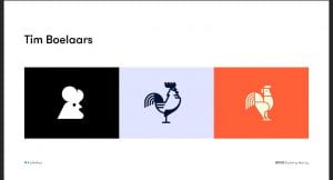
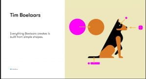
  • Tim Boelaars – forms and shapes are key for his designs
  • Jeroen van Eerden
  • Fabio Basile
  • Vic Bell
  • Ivan Bobrov
  • Airside
  • Jason Santa Maria

Process

Thinking by drawing – drawing loads and loads of ideas. Thinking it through as you draw. How can I represent it pictorially. You should put EVERYTHING down, it is an important part of the design process; put down your mistakes, realistically your idea stage should be 95% mistakes.

Pictorial Superiority effect

Humans process visual info 60,000 x faster than words


Sketch noting

The 5 basic elements: circle, square

Always keep a sketchbook with you; a good sketchbook will have a mixture of words and drawings.

Containers, Shadow & highlights, line and dividers, shapes, compound shapes, objects and icons, type styles, layout and structure (3points x 3 bullets).

Mind Maps: Helps put it all together.

Think outside the box

—-

Task

  1. Doodling talk by Sunni Brown – watch and analyse
  2. Book – Ed Emberley ( Make a world)
  3. Penguin drawing task on slides
  4. Make a mind map with words about yourself and use that as a guide for your word mark. Select the ones that are important. Find the important word and sketch out what you think it is.
  5. Sketch the following objects using the techniques talked about today _ iPad, Laptop, Camera, Sketchbook, Pencil, Browser, USB stick, Paper, Tv and Radio. ON PAPER.
  6. Pick 5 key words from your week 1 word association mind maps/bio (these could be your values) and explore a range of ways to represent them visually.
  7. Research visual marques – design a symbolic
  8. Look up brand new blog

Next week – Brand guidelines and colour.


Tutorial:

look up venezuelan type foundries

quirky – duality of 2 words organisation but whimsical nature. visually have loads of variety. ditot thick and thin lines.

type foundries that have quirky aspects. Fonts myths look up

variable fonts – more technical, google pioneered them.


Monogram progress

Why do I need a wordmark or word monogram

It makes you recognisable, It forms the basis of a lot of our communication. It can form the basis of everything.

Initial monogram designs

I created these initial ideas using Figma; I was really interested in the layering of the letter as it produced quite an interesting design. These are my favourite designs; they consists of my initials.

Tutor feedback

It does not have to be a monogram, it could be a watermark.

I should maybe try to use sharp shapes or points – make it different. Shapes can form part of the visual language later on.

I need to start on paper first, it will give me more freedom to experiment and broaden my ideas.

The typeface I used for my initial design ideas is too thin, it makes it look not fully formed. The typography used is doing me no favours, It’s like I am fighting it. It is restricting my creativity. Bold lines can come across as more confident and sophisticated.

Daniel likes the rectangular one in the middle ( 3rd row) It is one of the ones I liked the most also.

Avoid trying to do a name instead of your own as you may not like it in later years. Stick to your own name.


Pinterest moodboard:

After taking the feedback on board, I started sketching out some of my ideas.

Here is a link to my Figma logo draft.

Here is what my final monogram design looks like:

I created this monogram by joining my 2 initials (E and U). I liked its abstract nature as it kind of looks whimsically inventive . I would love to create an animation out of this monogram, I think it would be a great way to apply my logo to as many aspects of my brand as possible.

I could also use the logo design as an illustration design.


I decided to create an icon illustration, I started off by sketching out some ideas. I decided to focus on creating a simple line illustration of myself focusing on my defining qualities.

I then tried to explore my idea further using Procreate


Although I like the idea I am not sure I will be using it as part of my brand. I feel like the monogram has enough character and that adding this illustration would only take away from that.

Having said this, it was a fun learning experience.