What kind of designer?

Guest speaker: Ronan McKinless

His experience:

  • 17 years experience.
  • Worked for large and small companies and startups.
  • Currently working for himself. He has worked within agencies, startups and now freelance.

I found Ronan’s talk to be very helpful, afterwards he has a Q&A session, now this is what helped me the most. Here are pictures of the notes I made:

Ronan was also kind enough to give me his email so I could send him my portfolio for him to review and give feedback on.

Overall this session was very helpful.

IXD301 – Critique and elements overview

As designers we have to understand problems so we can try to solve them.

The brief: to design and create a digital product to explain the elements from the periodic table. the content is scientific to be used in the scientific profession. Nevertheless what about children or undergraduate students. Is the content aiding or confusing their understanding …

this project will ask you to look at the content of the periodic table from the micro packets of information in each cell.

In some type of device … but which? This is your choice eg TV, VR, Tablet, phone, smartphone.

Eg kids expect things to be touchscreen and they work best with iPads.

Do a competitor analysis, look at other apps that do similar things and do user stories and jobs to better understand your audience.

Think outside the box – is it a VR experience you  can walk into.

Project requirements:

  1. A branded homepage containing your version of the periodic table
  2. At least 5 additional elements pages aimed at 10 year old audience and bellow OR
  3. At least 5 elements pages aimed at undergraduate chemistry student
  4. A style guide, visual grammar and brand

To proceed:

  1. Design first
  2. Start on paper
  3. sketch/figma/Invision
  4. Final product Adove XD/Figma/Invision
  5. Also consider the visual grammar …

Think typical UX workflow

  1. discover
  2. plan
  3. text design
  4. sketch
  5. visual design
  6. prototype/build
  7. test
  8. discuss
  9. deliver but keep learning

Previous students

  • Antechamber – he created a website for this also. He interviewed undergraduate chemistry students. Visually very interesting. Visually very strong but kept it safe
  • Dan Gold – impressive from coding point of view. Visually nice and technically proficient. He focused on undergraduate students
  • Sarah Couples – Deadly elements. Used Beano style. For kids. Showed how elements are created and broke down the science of it. Showed how they could be combines to create an element. Looked at elements that could kill DR Bob – the avatar – and added the info next to the illustration.
  • Science lab The element. used nice call to action (Lets learn). For children.
  • Hope McCilroy – 118 elements street. Made it as a house. You can navigate through the house and can find diff things that represent elements in the periodic table. Science discover. Kids had to search and find things. Very nice and interactive. Looked at the products first then matched the elements to them.
  • Jemma Ferguson – Metal monster.
  • Detective Dimitri – Alex McCormick. She took a very different and cool approach. No mention of the periodic table yet subtle hints.
  • Scott McKee – undergraduate VR project were you could take a picture of anything in real life and it would tell you what it is made of.

Things to consider

  • Group
  • appearance
  • uses
  • Discover date
  • Discovered by

Why it is important to think of the audience:

  • managing disparate range of content
  • Organizing content into logical structure
  • Presenting content coherently
  • target content to specific audiences

Taxonomies

A method for groping and organizing content.

eg Tiny books website

You must organize your content!!! both for this and for your portfolio website.

Ideas:

  • interview students eg undergraduate
  • questioners
  • Make it a trip around a chemistry lab

IXD104 – Visualising data – Week 7

The end result is important but the progress is vital, it must be included at all times when handing in work.

IXD companies

  • Rapid7

Research blog

  • Loads of exploration
  • Not only links, also written thoughts

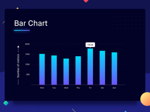
Data is all around us

Edward Tufte – the father of data visualisation.

The trick is finding the right type of data and presenting it in the right way.

Visualisations

Artists to look at

Software that helps

  • Processing
  • Illustrator will help you create these with your own data

Books

  •  Dear data
  • Designing with data by Brian Sudan

We can reveal or even hide data through design – slight of hand really. Apple have turned and tilted pie charts before to make their numbers look better and higher than they actually are – this is a clever slight of hand.


Project 2 (30%)

Create an infographic/data visualisation looking specifically at global population. Research the subject of data visualisation and infographic

possible approaches

  • births and deaths in the world – past/ and/or present    —–> ties in with the census    IDEA: deaths and births since the beginning of the pandemic and also point out causes of deaths
  • population   —>  Easier one

Research and supporting material is worth 40%

Master apprentice

Redraw a chart for week 8

Illustrator will help you create these with your own data


Brand progress review

Long Bio

Hello, my name is Emily Ussher. I am a first year Interaction design student at Ulster university Belfast. I am originally from Venezuela; I found my love of art when I moved to Northern Ireland at 13 as it gave me a communication tool that I did not have at the time. I love to travel and create art. My multi-cultural upbringing has offered me a different perspective and point of view – something that is always evident in my designs.

Short Bio

Just another Venezuelan/Irish self-appointed explorer, studying Interaction Design and doing what she loves

Tone of voice

  • Friendly
  • Professional
  • Creative
  • Comprehensive
  • Caring

Word bank

  • Dedicated
  • Diverse
  • Bilingual
  • Friendly
  • Professional
  • Original
  • Innovative
  • Unique
  • Well designed
  • Multicultural
  • Happy
  • Creative
  • Quirky
  • Diferrent

Brand values

My brand values will be to create high quality, well designed products centred around the customers need. To provide a unique, welcoming and fun experience to the customer and produce products of the highest quality.

Logo design

I decided to keep it simple and uncomplicated, the font I used for my name is FS Alvar in bold.

As part of my professional yet quirky brand I decided that it would fit best if I added colour to only the dot and maintained the rest black.

When turned upside down the logo reminds me of an elephant, I will try to play around with this concept and maybe turn it into a mascot or even create a series of illustrations in the same style.

Colour

  • C2CDEB