Designing Brand Identity by Alina Wheeler is a brilliant resource that covers brand basics, brand ideals, brand elements, brand and before and after’s. In this post, I reviewed a number of subcategories covered by Wheeler that I found particularly interesting.
Brand strategy
Wheeler describes effective brand strategy as providing
“a central, unifying idea around which all behaviour, actions, and communications are aligned”
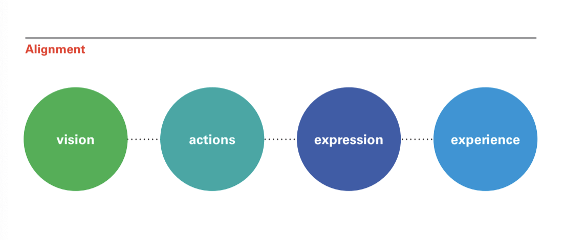
A brand strategy is built on a vision. This vision must align with the companies business strategy and arise from the companies values and culture. It also must reflect a strong understanding of the customer’s needs and perceptions. This is laid out really nicely in the below diagram. I take the below diagram to mean that the companies vision should impact the companies actions and expression which should directly impact customer experience.
The brand identity should not only be understood by company employees but it should resonate with everyone involved in the company. Here Wheeler includes a quote from Mario Bastida,
“The factors to successfully revitalize a brand: Be inspired by people your customers. Take risks- within your strategy. Be bold- to really make a difference.”
From my perspective, a large amount of the responsibility for brand identity will therefore fall to the company’s CEO and founding team. Wheeler appears to confirm this later stating that a brand strategy is developed through extended dialogue through the leadership team. This leaves me wondering as a designer what role do I play in brand identity and is there anything I can do when working with a company that doesn’t appear to have a clear vision or isn’t aligning their actions and expression. I think the answer to this is to start the conversation. While I won’t be able to force this approach to developing a brand identity on a company I can encourage it. Brand Identity is also something I can continue to reflect on and attempt to develop in my personal brand.
Brand architecture
Brand architecture is described by Wheeler as the hierarchy of brands within a parent company. Both parent and subsidiary companies should reflect the same marketing strategy and develop consistent verbal and visual order. A great example of this can be found in Alphabet.
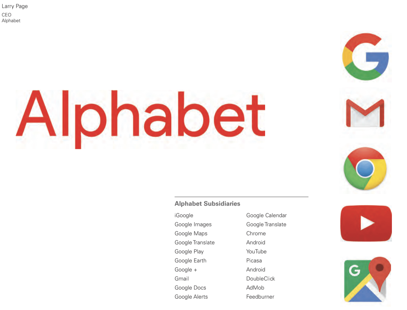
Alphabet is the parent company of Google, Chrome, Gmail and numerous other companies listed above. I think this is a great example of how a brand can be applied cohesively across multiple companies while painting the integrity and unique offering of the subsidiary companies.
There are various types of brand strategies for companies of this scale these include monolithic brand architecture, endorsed brand architecture and pluralistic architecture. Monolithic brand architecture is the approach used by Google. It uses one strong single master brand with customers making choices based on brand loyalty.
Endorsed brand architecture developed a marketing synergy between the product/division and the parent company i.e. the product/division has a defined market presents but benefits from the association of the parent brand an example of this is the iPad and Apple.
Pluralistic brand architecture is common among consumer brands. This approach is taken when the parent brand is invisible or inconsequential. An example of this is Kleenex and Kimberly Clark.
I think it’s really important to understand brand architecture and the different ways it can impact on brands and brand visuals. If I ever have the opportunity to work with parent or subsidiary companies I now feel I have a much better understanding of the various approaches they can take to a new product design or redesign.
Brandmarks
Brandmarks captures everything from the literal to the symbolic. They can be word driven or image-driven and come in a number of different shapes and personalities. Brandmarks can combine words and visual elements and as described by Wheeler consist of no hard and fast rules in relation to visual identifiers. Wheeler also describes the designer’s process when it comes to brandmarks stating
“the designer’s process is to examine a range of solutions based on both aspirational and functional criteria. The designer should determine a design approach that best serves the needs of the client and create a rationale for each distinct option.”
Wheeler then goes on to provide a topology of marks shown below.
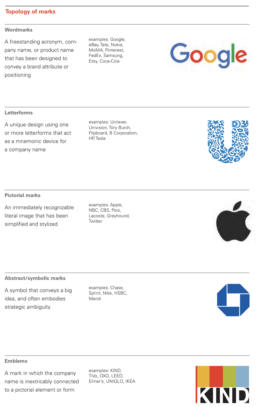
I thought this was a really great visual and as I have gotten a good grasp on a number of brandmarks displayed above it is helpful to consider outcomes that we haven’t covered in as much detail including abstract/symbolic marks and Emblems.
It’s also interesting to read about Wheelers take on the designers process and how it should meet both the aspirational and functional needs of a company. These two concepts, in my opinion, can often be quite different particularly if you are trying to represent them visually however this is something I will strive to consider and incorporate into my branding when working with clients in future.