There are two types of drawings/ illustrations that can appear in a logo, pictorial and abstract marks these can then be displayed independently or as part of combination marks including a wordmark. In the case of my personal branding, a combination mark will be more appropriate as my brand will be unknown and an independent pictorial or abstract mark will not be recognisable. I believe it will also be more effective to use a pictorial mark in order to indicate the services I am providing as a freelance designer however I intend to experiment with both.
Like with a monogram it’s good to consider pictorial and abstract marks in context as this can cause issues as a brand progresses as can be seen with slack as presented in this weeks lecture.
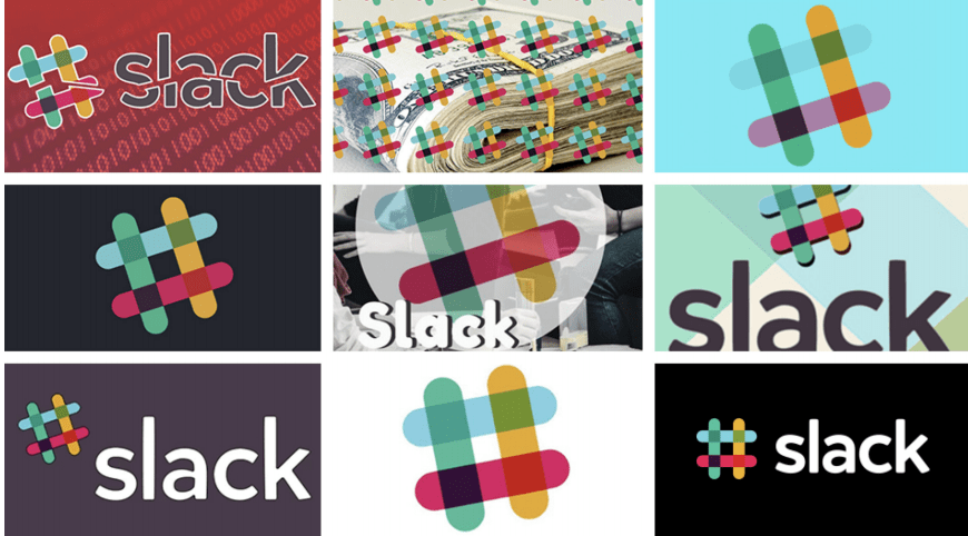
Slacks old brand while loved by many was not versatile as a stand-alone the hashtag outcome is really quite nice in my opinion with the playful reduced opacity effect. However while a cursory glance the outcome may not appear that complex it’s actually made up of 11 different colours at sat at a precise 18o rotation making it very easy for people to get it wrong as seen in the examples above.


The new logo while not universally loved by all does overcome these problems however the hashtag is lost and replaced with a more abstract mark. However, I have to say I am a fan of the update, I like the fresh feel of the solid four colours and feel the overall outcome is more modern and effective as a versatile brand particularly as the full logo can be changed to white or black and remain recognisable. This is a really great outcome and I would love to be able to achieve something as versatile in my own work.
I have spent a little time looking back at some of the fundamentals of drawing in order to help me with this.
Ed Emberly

Ed Emberly in his illustrative book Make a World breaks drawing down into basic elements and demonstrates how to combine these elements to make an object, animal, person, building etc. As shown above I have completed the giraffe exercise and while this was relatively simple it is interesting to consider how this could be applied to creating a visual mark for my branding and how by adjusting the elementary shapes being used and proportions of the shape a completely different style can be achieved when creating the same outcome which I feel is a really important element of visual branding i.e. adding personality and individual touches to outcomes.
How to draw a penguin exercise

Likewise, I also completed the how to draw a penguin exercise which again was a nice playful way to bread drawing down into me simple elements (perhaps not just as simplified as some of Ed Emberlys work). I think what was particularly interesting in this exercise was the consideration of light something I can perhaps experiment with, in my own visual outcome.
Tim Boelaars
Tim Boelaars is an illustrator based in Amsterdam and has worked with companies such as Apple, The Newyork Times and National Geographic.
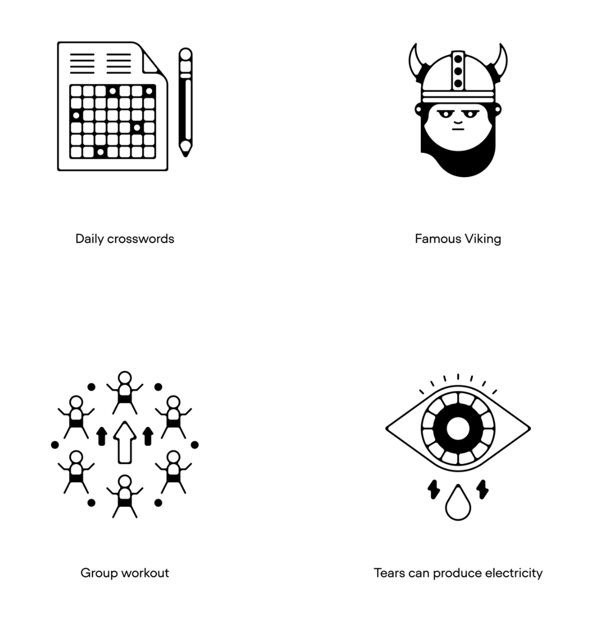
Boelaars work has a distinctive icon feel to it however there are still elements of personality as can be seen above in his work for National Geographic. The Famous Viking really jumps out to me as while it is composed of simple shapes it still has some really nice elements e.g. the swoop in the hair, the facial features all appearing in the top 2/3 of the face and small round ears. All of these elements work together to add character to the illustration and it becomes identifiable as a Viking when coupled with the distinctive horned helmet. I also feel that the line width and composition used in group workout and tears produce electricity have a nice cave painting feel to them resulting in more memorable and effective outcomes in my opinion.


I then looked at some of the logo outcomes created by Boelaars to see how he adds personality to his outcomes in this area. A concern I have on creating my own visual outcome is that it won’t be strongly distinguishable against other basic icons when depicting the same animal, person, object etc. What jumps out at me in this instance is the use of shapes to build the icon and again, the distinctive use of curved lines adding a level of individuality to the outcomes.
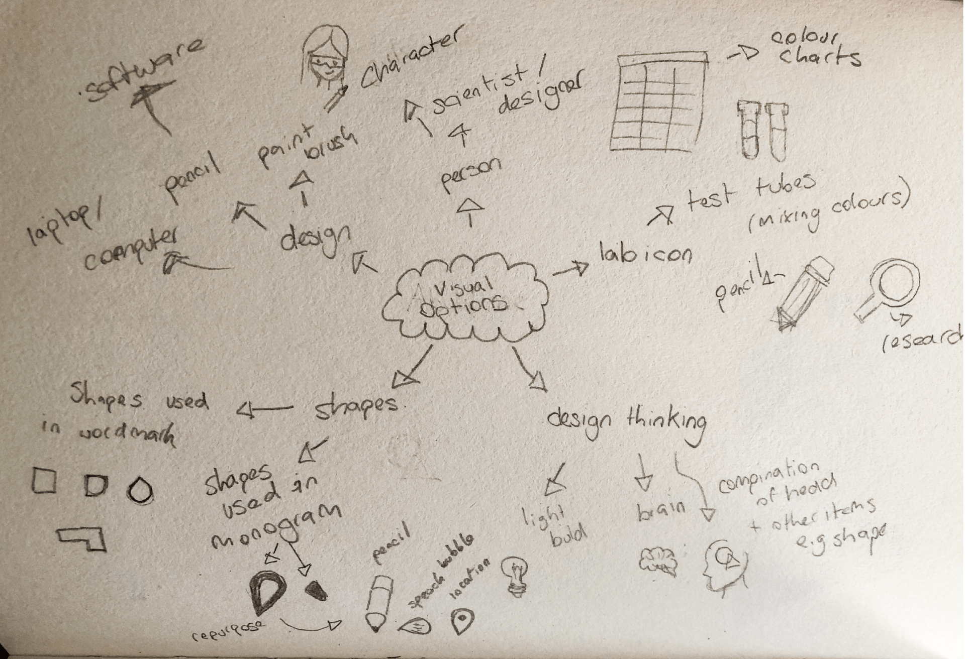
Drawing with Basic Elements
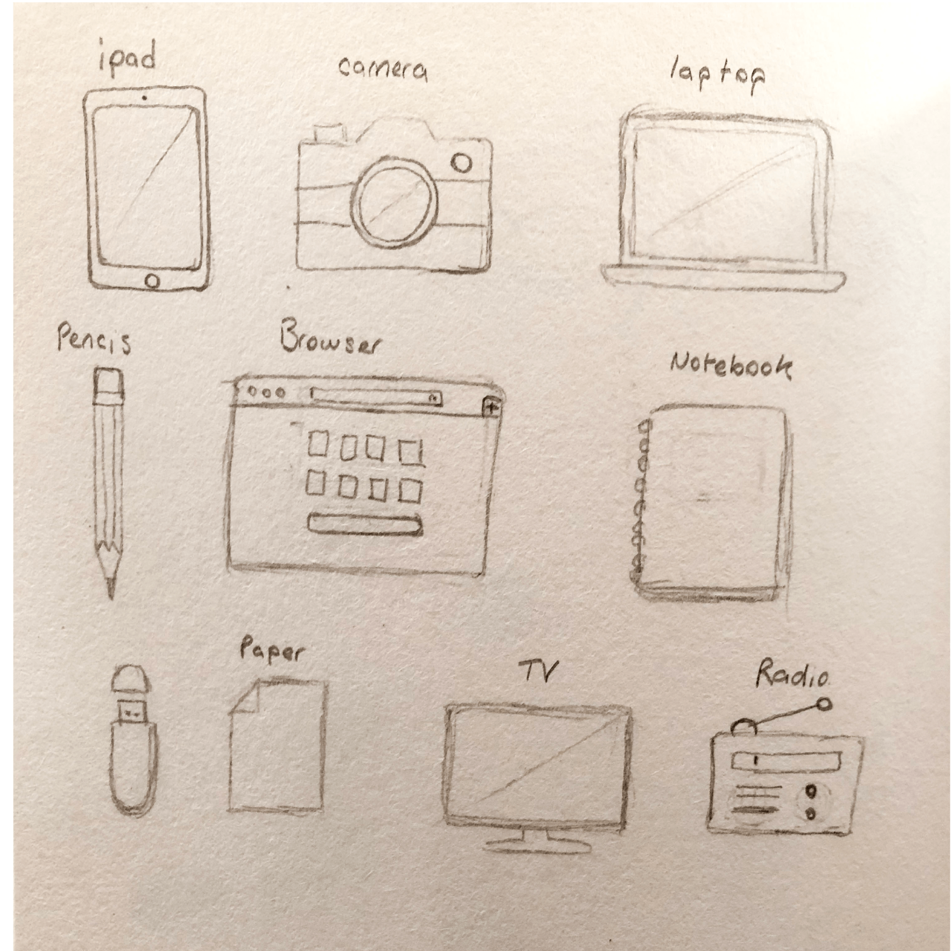
Above I have completed the drawing with basic elements exercise in which I abstracting a number of items down to an icon form and using basic elements such as squares, circles, lines and triangles to create very simple and recognisable outcomes. I am really pleased with these outcomes and feel that they display their intended outcome quite well. The outcome I am lease pleased with is the Radio as I think I may have added a little too much detail and may not be automatically recognized as a radio.
The Sketchnote Handbook

The Sketchnote Handbook by Mike Rohde is a book about how to present notes visually and it is emphasised at the beginning of the book that it’s not about drawing ability it’s about using hand-drawn elements to express thoughts visually. This is a lovely book to read as it’s so visual and presents hand-drawn illustrations on every page surrounded by short notes.
The first word of advice was to not use a pencil which definitely an approach I would shy away from. I hate making mistakes and I hate reading over notes in which I have made a mistake however as the suggestion is a small book and pen I can see how this would be time-saving as it prevents you from going over and fixing mistakes.
A challenge is set to draw more. Rohde presents sketchnotes as a visual map. I think this a really interesting way to describe it and places the outcome in context it about directing your way through big ideas not focusing on every little detail.
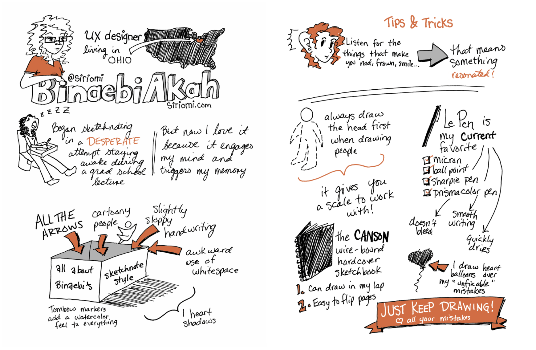
I particularly liked the above steps to creating sketchnotes including tips like use markers and arrows and focus on the things that generate a response e.g. frown, smile etc. Overall I found this book to be a really interesting read and particularly enjoyed the inclusion of theories such as dual coding theory which suggests the brain uses two channels to process information verbal (words) and visual (images). This fits with the concept of sketchnotes and really does make me consider trying to incorporate this approach into my own note taking.
Visual representation exercise
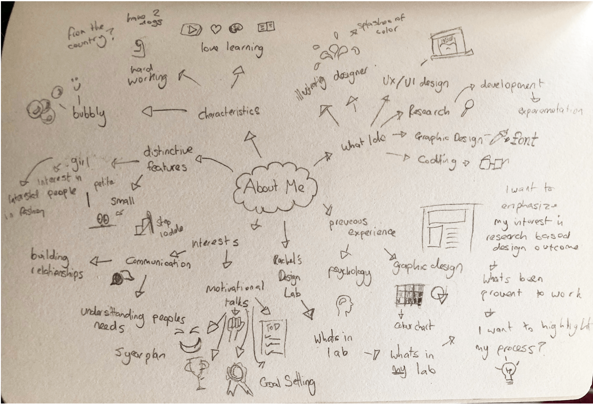
While I didn’t use a pen or markers I did use a small book and drew lots of images for my visual representation exercise. I started really broad in the above outcome and listed everything I could think of about myself and presented in writing and drawings using the elementary shapes circle, square triangle, line and dot as presented by Mike Rohde.
I then took the points I felt were most relevant to me as a designer and expanded further on these ideas as shown above. I found this to be a great way to help me generate new ideas it will progress my visual mark from here to create larger sketches than may work in combination with my workdmark.
What have I learnt?
- When drawing out ideas keep it simple and start with elementary shapes.
- Drawing with elementary shapes can actually produce fun and interesting outcomes that present information in a way that is more easily digestible.
- When creating a visual mark consider the context it will be placed in e.g. over an image and if the outcome will still be effective.
How can I apply this to my work in future?
- When working on visual marks in future I always need to consider the outcome in context and particularly in branding outcomes to ensure that the presentation of the logo can remain consistent across multiple settings
- When taking notes in future I will actively attempt to incorporate more drawings and keep my focus on the main points.
- When drawing in general, it is helpful to begin with elementary shapes. This is something I can apply to all my sketch work and illustrations.
- I can potentially create more interesting outcomes by playing with different shape types and curving lines as seen in the work of Tim Boelaars. This is something I would like to experiment with further in future.