Tatooine illustration
https://www.pinterest.co.uk/rachelmd46/travel-app-star-wars/
Before beginning my illustrations I created a Pinterest board of illustrations and app UI’s that grabbed my attention (see link above) and researched a number of visual artists including Victor Mosquera and Olly Moss.
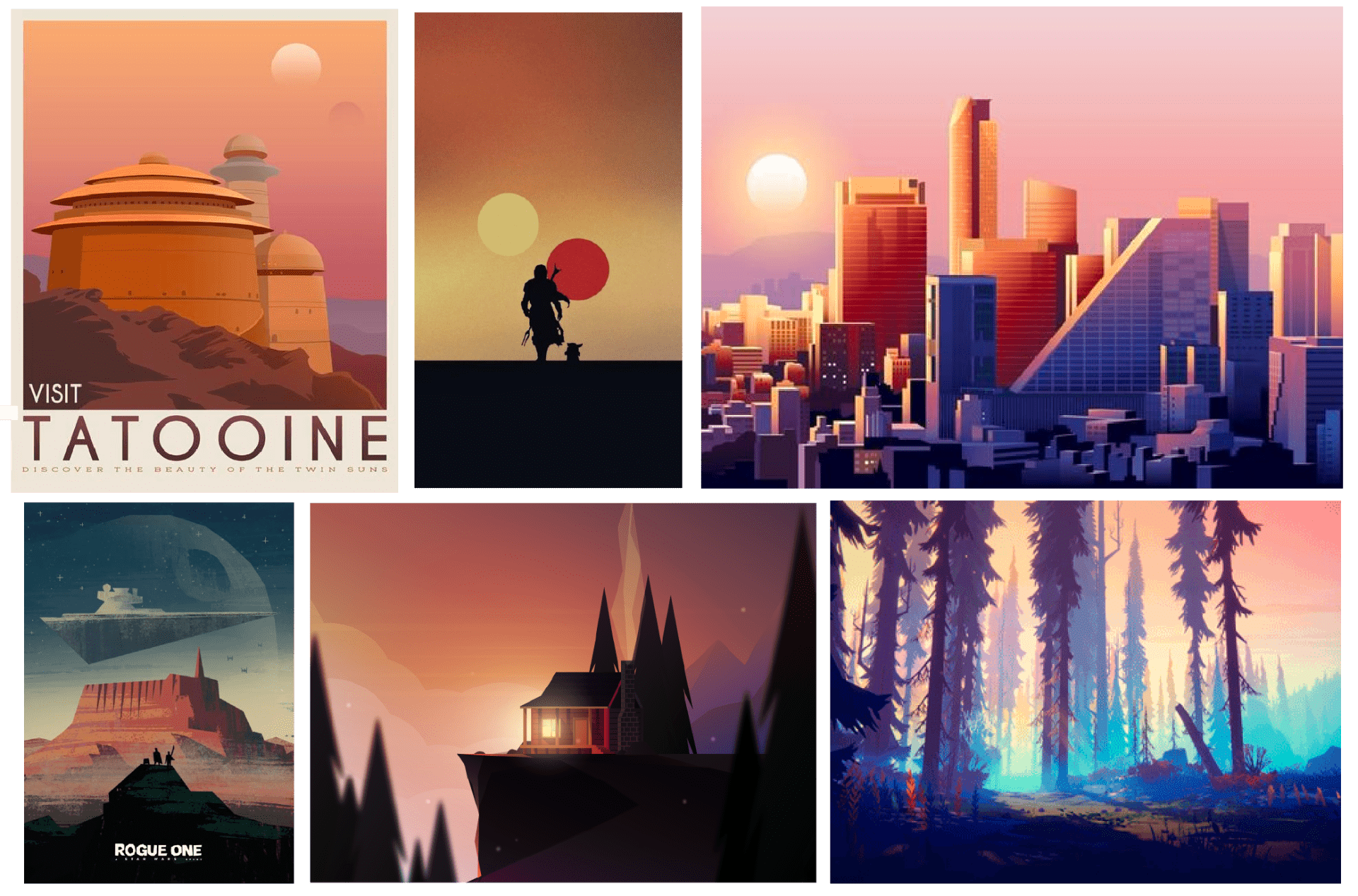
For my illustration of Tatooine, I wanted to create an outcome of the well-recognised scene of Jabba’s palace while adding in distinctive features such as the two suns associated with the planet. I want to create a warm outcome with a strong sense of light as seen in the outcomes above.

I began by drawing out a quick sketch before deciding to work directly from an image. This was still a helpful exercise as it allowed me to consider the placement of the suns.
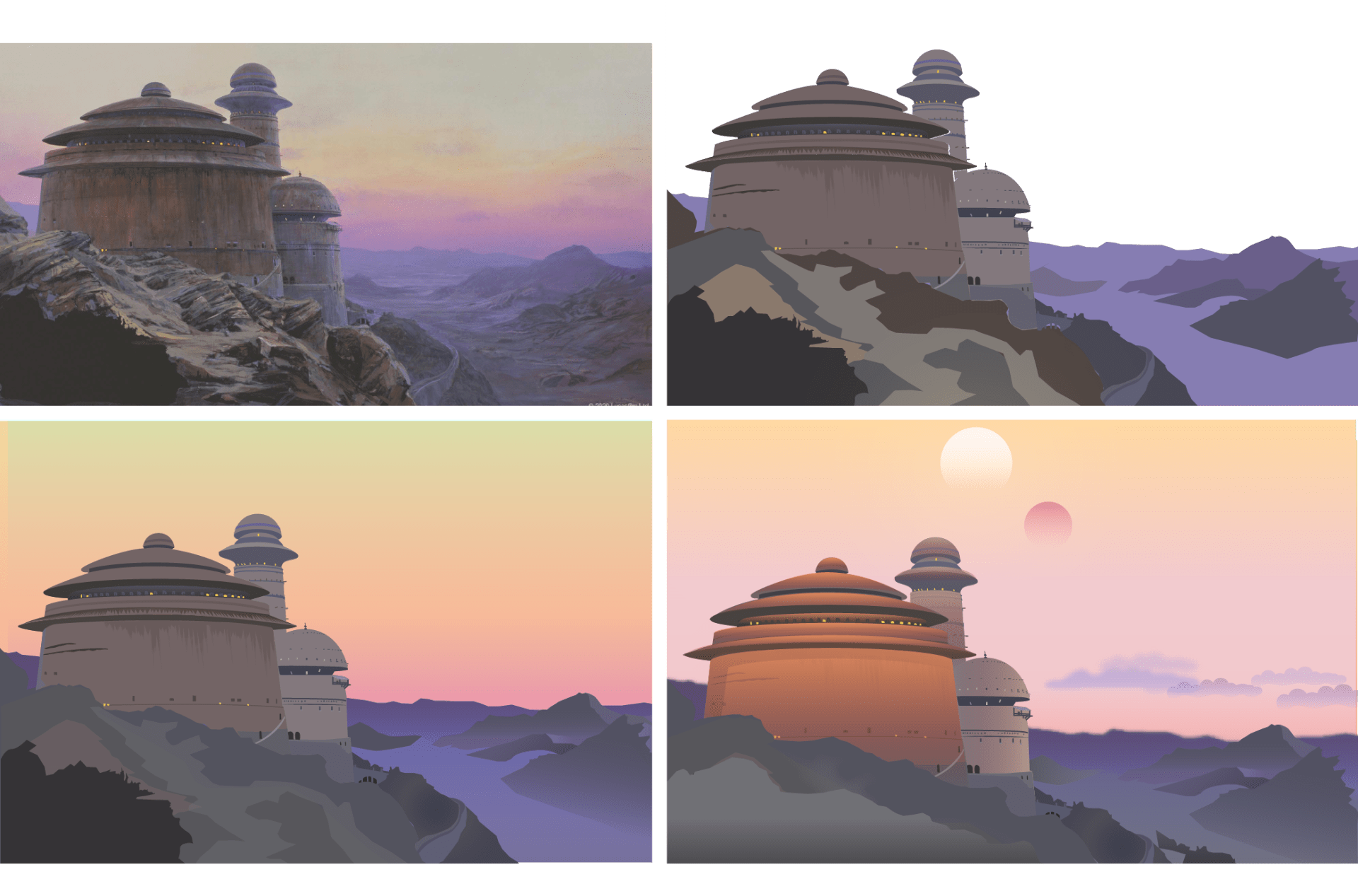
I then created a digital outcome by copying from the image shown above top left, My first outcome show the top right focused on the buildings and landscape pulling colours from the image and taking some consideration of light. I then added the sky using a gradient from yellow to orange to pink and added some feathering around the mountains to suggest mist. I then pulled the shapes that made up the buildings and added gradients bringing warmth into the outcome and adding a clear sense of light. I was really pleased with how effective the gradients were when placed over the buildings in achieving the effect I was after. I also reduced the amount of yellow in the sky gradient added clouds and two suns. While this was a time-consuming piece I am very pleased with the outcome.
Opening Page
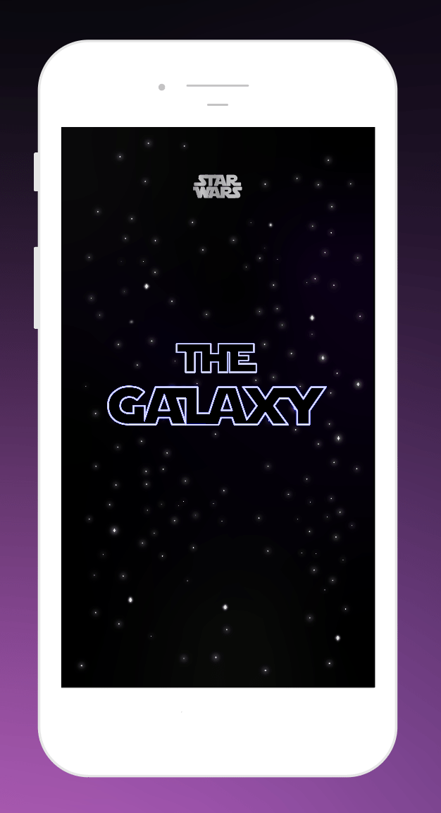
For the opening screen, I wanted to present the apps name in a space backdrop similar to the opening title of the films. I created the above outcome using illustrator by creating stars using the circle shape tool and adding a glow. I created the typography using a star wars typeface and creating an outline to outline the white text in blue. I wanted to create a neon light effect however in the above image I struggled with this as the glow effect was not viewable on black.
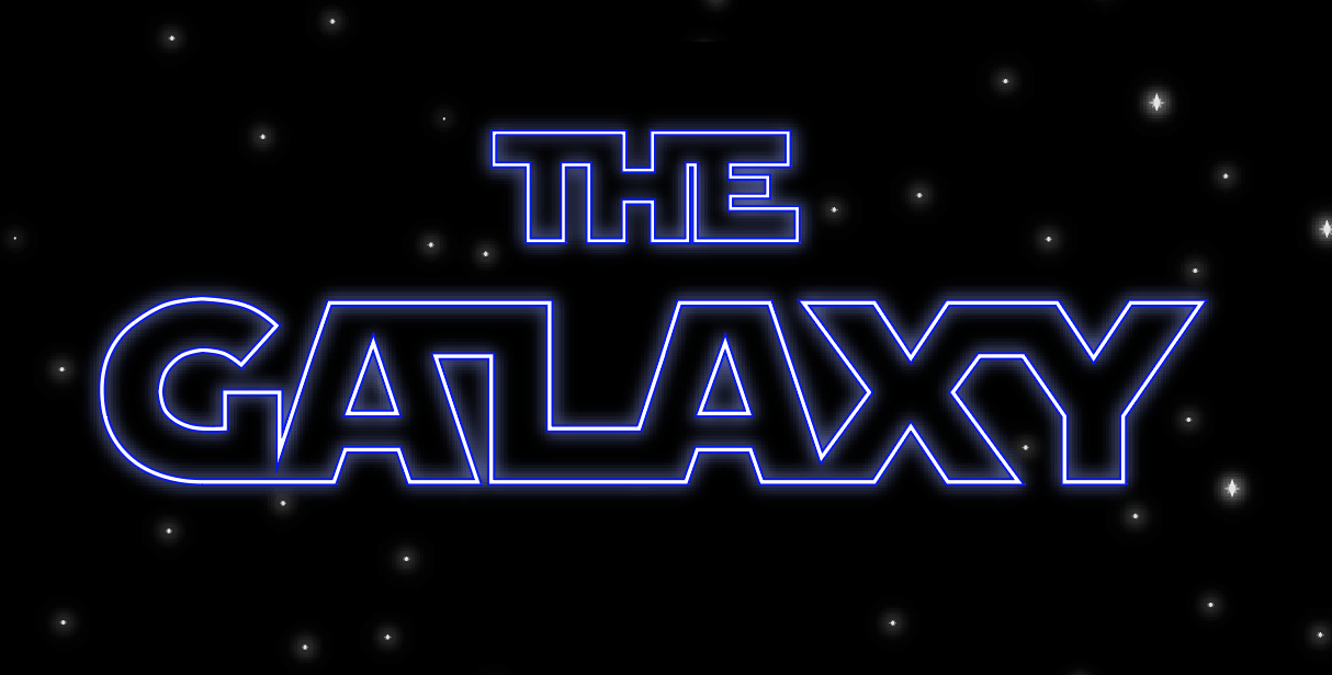
I played about with this and realised for the glow to appear on black I needed to select screen mode. This led to the above outcome. I’m really pleased with this and feel that the glow add an extra kick to the overall outcome,
Creating the galaxy
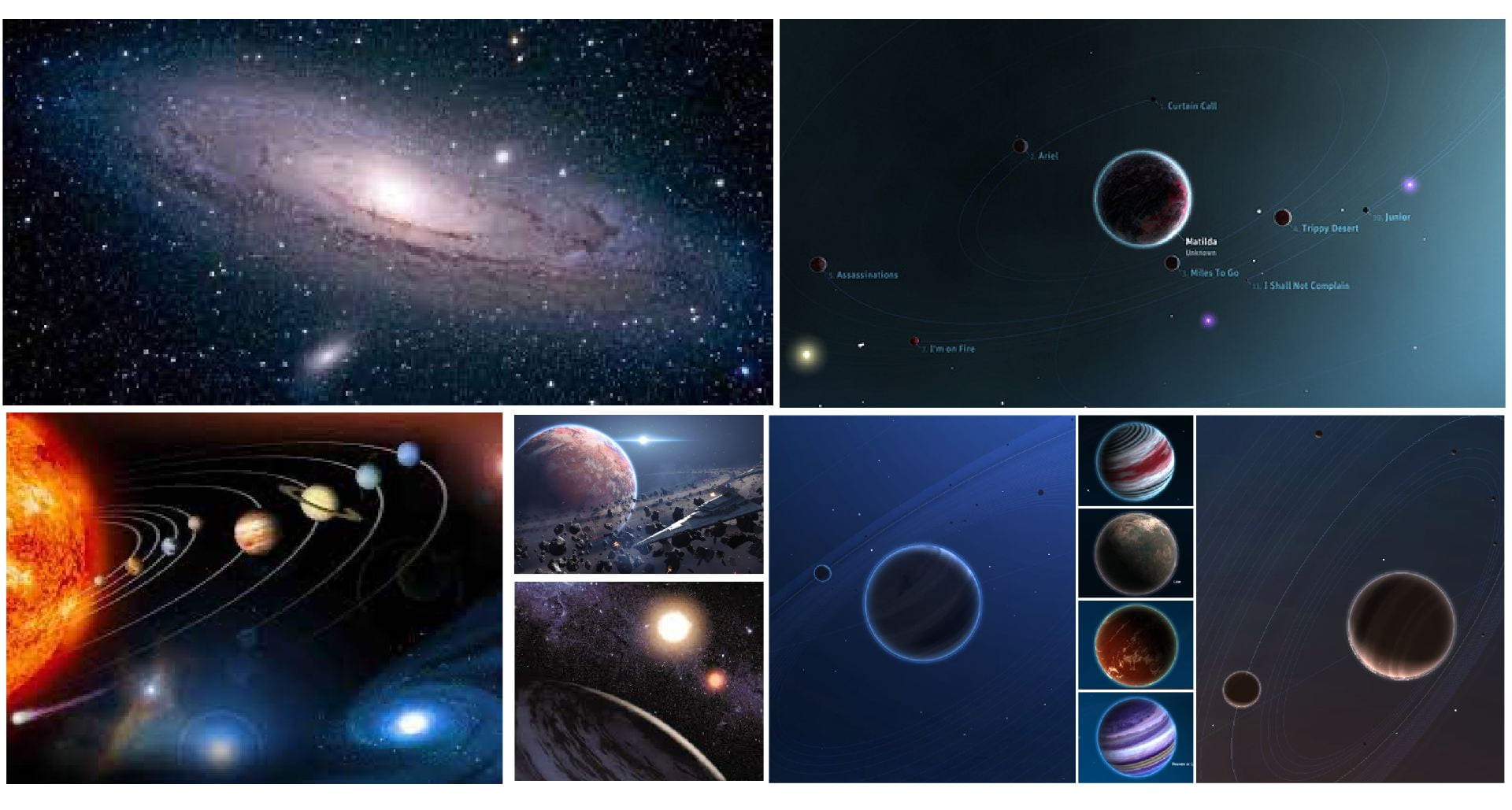
Before creating my galaxy illustration I first reviewed various artists including Chesley Bonestell the American pioneer of space art. Partway through the development of my space, I also reviewed a very helpful online app following a recommendation to check it out. This was Robert Hodgin’s app Planetary, see above images two the right.
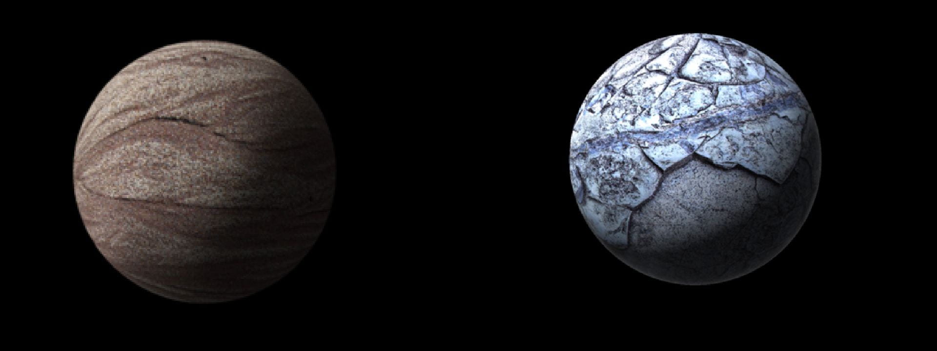
I began by creating two planets on photoshop opening a textured image on photoshop and using the ellipse tool and spherizing through 3D extrusion. I was able to create a sense of light using the paintbrush tool to create a shadow using 0% harshness on the paintbrush as well as lowered opacity to produce a shadow on one side of the planets.
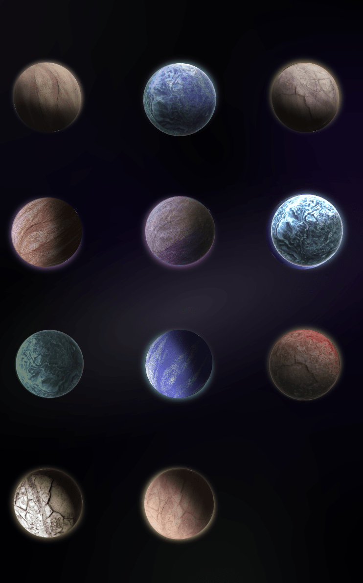
From the first two planets, I was able to produce multiple planets by changing colours and textures on photoshop and even layering the two together. The above outcomes are just a few of the variations which I attempted to match to the images of the top-rated planets on Star Wars. I originally created the above planets without glows however following feedback on my initial designs and after reviewing Robert Hodgin’s app Planetary I decided to add them in.
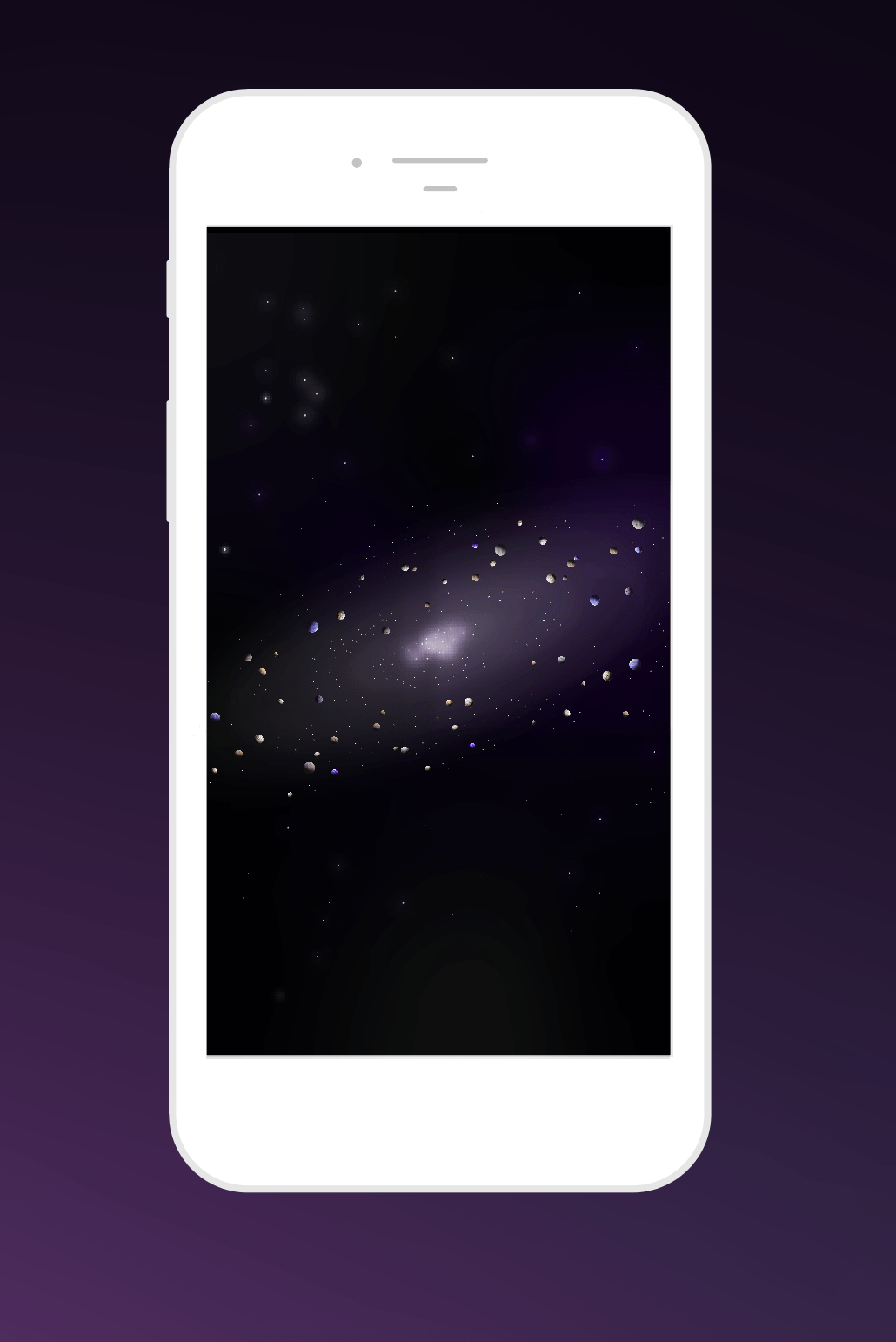
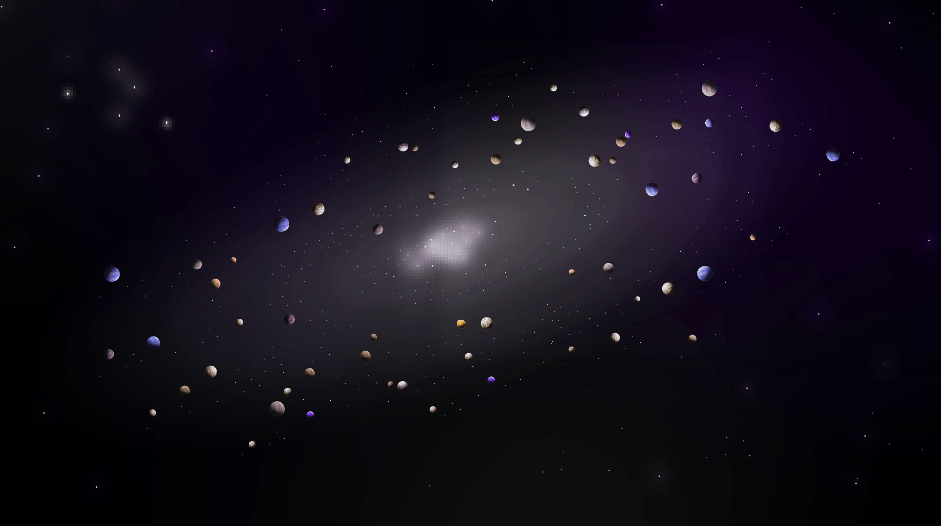
I then created a galaxy on illustrator by creating a swirl using a brunch effect with lowered opacity, adding a grey gradient to the centre of the black background and by scattering varying sizes of white dots with glow effects (stars) and the planets I had created on photoshop to produce the above. An added feature was a gradient layer of bright prupels and blues at lowered opacity which I feel really helps the final outcome pop. I am so pleased with this outcome and particularly the level of detail I was able to achieve even when zoomed in as shown below.
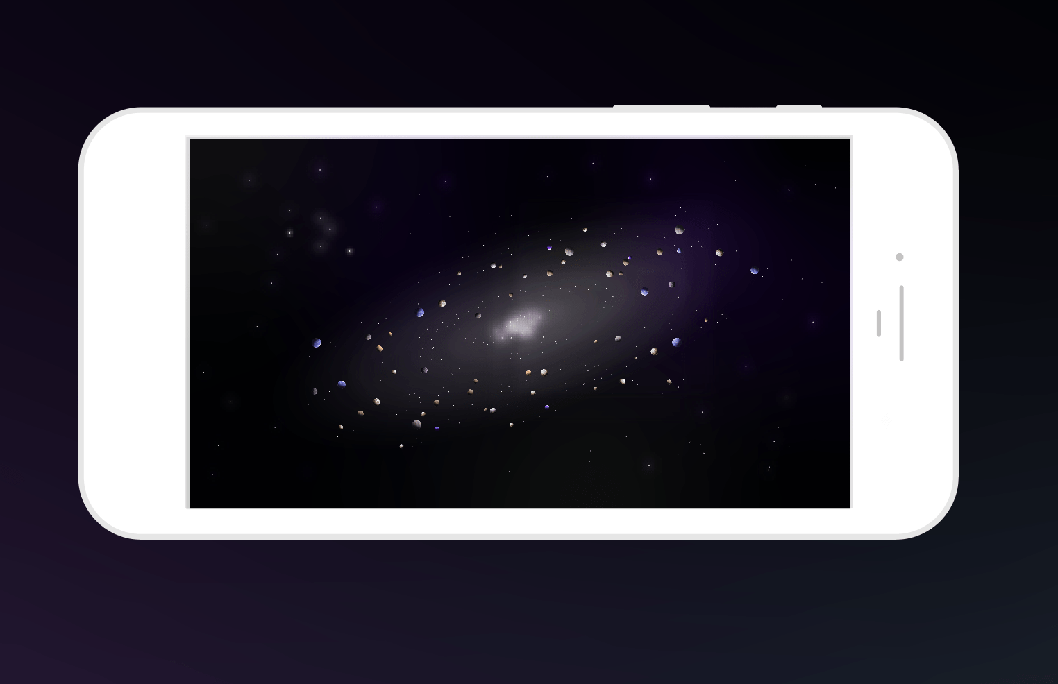
It was really important that I was able to achieve a good level of detail and a believable effect when zoomed in directly on a planet as this is how I want users to use the app and photorealistic illustrations will be a big part of how effective the UI is in this instance. I, therefore, have presented a series of images demonstrating how the UI will appear as it is being zoomed in on.
Zoom x1
Zoom x2
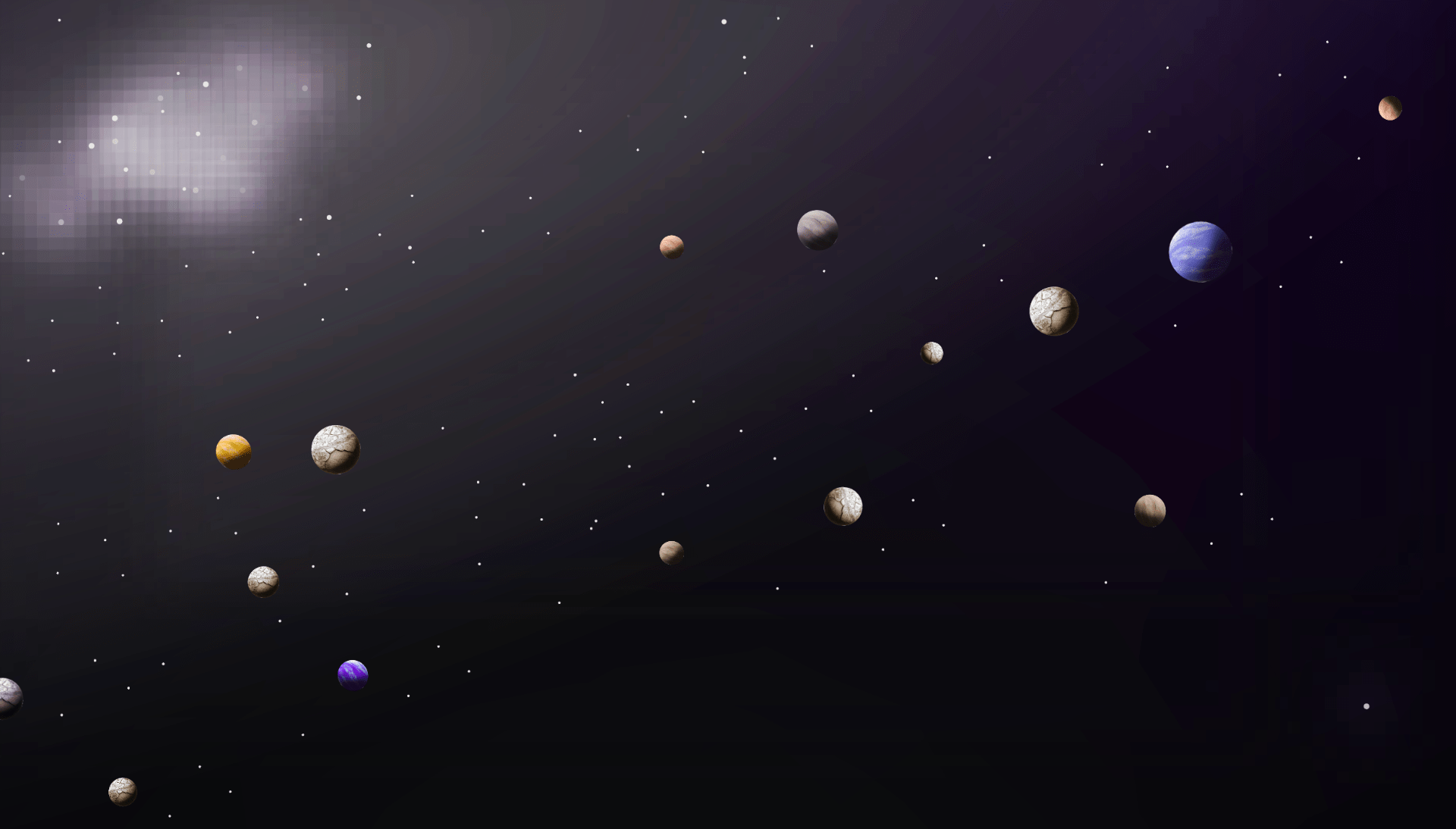
Planet labels will be displayed at this point as planets become selectable)
Zoom x3

Full zoom applied.
Overall I am really pleased with this outcome and am looking forward to adding the rest of the UI features including text, navigation and icons.
What have I learnt?
- When creating an illustration it is better to begin with the elementary shapes to build the composition and to add detail in steps rather than trying to add all of the detail at once.
- I found creating an illustration without focusing on colour too much to begin with and then addressing colour at the end was helpful as it allowed me to consider the full composition when making colour selections.
- Gradients can add warmth and beautiful glow effect to outcomes as well as helping in the presentation of form and light.
- I can now make shapes using 3D extrusion on photoshop.
How can I apply this to my work in future?
- When creating illustrations in future I intend to begin by building yo the image and key elements with elementary shapes.
- I would like to continue to make illustrations with the inclusion of gradients to build up my illustrative skills in creating atmospheric illustrative outcomes.
- Now that I have worked with 3D outcomes I would like to begin to focus on making simple 3D illustrations to build up my skill level in this area.