When considering the navigation of my app and designing my user interface I referred to a number of apps that I felt captured some of the key components in my App; space and travel. I have therefore researched and reviewed the Nasa, Google Earth and Airbnb apps to get a better understanding of how the user navigates their way through the app.
Nasa

Nasa app uses a hamburger menu in the top right-hand corner of the screen which results in a drop-down menu appearing. There is no nav bar at the bottom of the screen and the homepage consists of a grid layout with each image being selectable (shown above left). I clicked on the features options which led me to a similar grid interface that was broken into sections by grey bars and black text (shown above right).
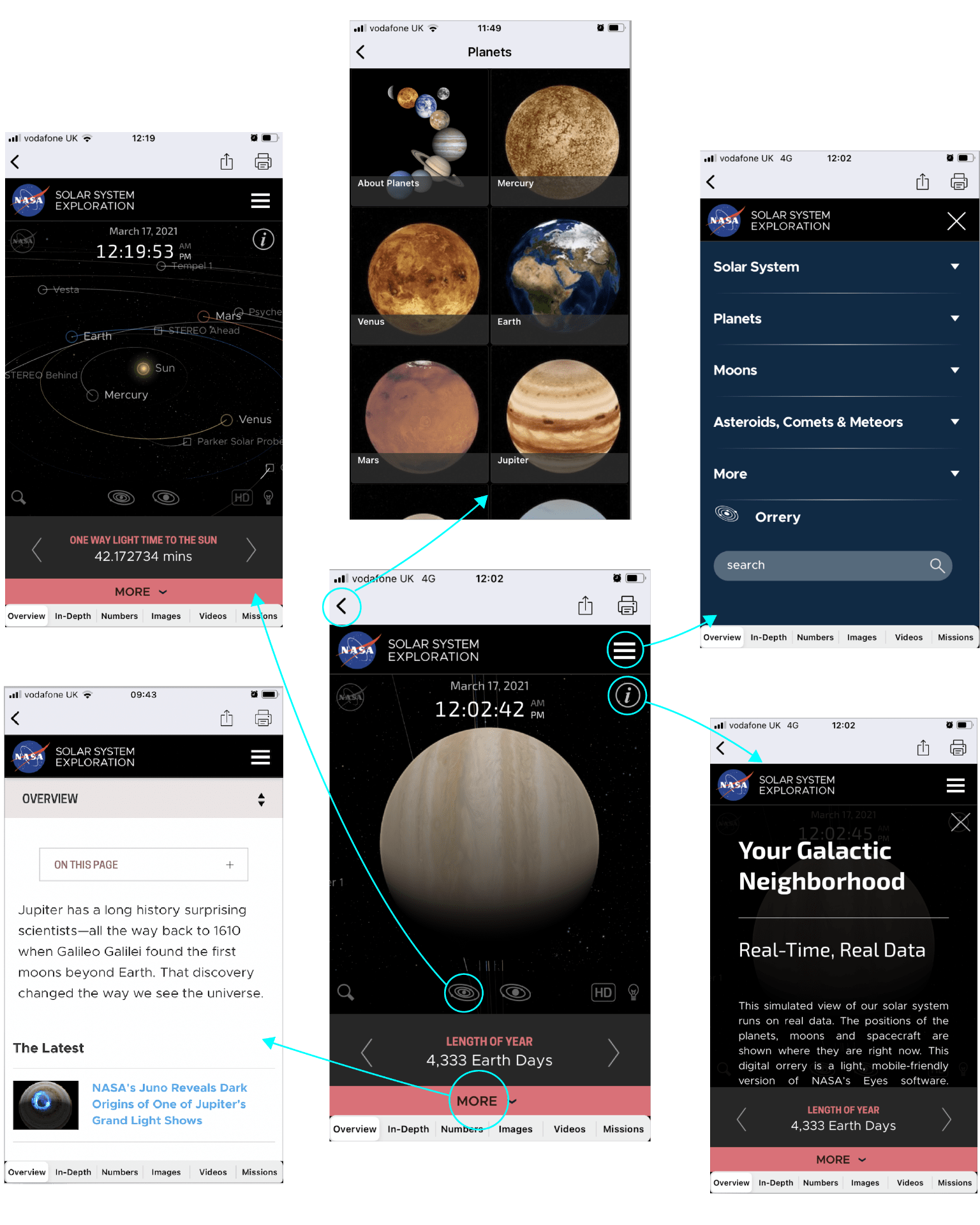
I then selected planets which brought me to the centre top interface shown above and after selecting Jupiter I was brought the centre bottom user interface shown above. This was the interface I was really interested in so I have broken down and displayed all the navigational options from here.
On selecting the planet you can return to the plant list using the back arrow feature on the top left of the screen. The hamburger dropdown menu is still available from the planet screen at the top right and leads to the drop-down list displayed on the top right screen shown above. By hitting the ‘i’ you are brought to real-time data that can be scrolled through and has a slightly reduced opacity so that the planet is still partially seen through the black background. To return to the plant you ‘x’ out of this screen (shown bottom right).
For more very detailed information you can select the more option highlighted in the red bar at the bottom of the screen or swipe up. This leads to lots of information about the planet including an overview section, need to know facts, latest updates, facts for kids and related news (the top of this page is presented bottom left).
The grey bar towards the bottom of the screen is a slide menu that provides lots of fact about the planet including distance from the sus, one way light time to the sun, length of year and planet type.
Finally, the 2 solar system icons displayed above the grey bar leads you to a view of the outer and inner solar system. This display can be fully rotated and moved through creating s similar 3D space to what I would like to achieve in my galaxy view screen. It also shows planet movements with lines and uses circles around each planet to make them easier to view as they appear like stars and are only viewable as planets when they are selected (this screen is displayed top left).
Further to these options, a bottom bar nav is included when viewing a planet with 6 tabs and no icons leading to more information on the planet. I found when selecting the tabs the bottom bar sometimes disappeared meaning the only way to get back to the planet was by hitting the back arrow.
Overall I think this is an incredible app with tonnes of information however I did find the navigational options hard to follow due to a lack of consistency e.g. sometimes there is a bottom bar nav and sometimes there isn’t and when viewing a planet and selecting the solar system view the only way to return to the planet is to find it within the solar system or return the planet list and reselect it and so on. I think part of what makes the app a little more tricky to get around is its academic focus and the amount of information available which is perhaps difficult or not possible to organise in a more simplified user experience.
Google Earth
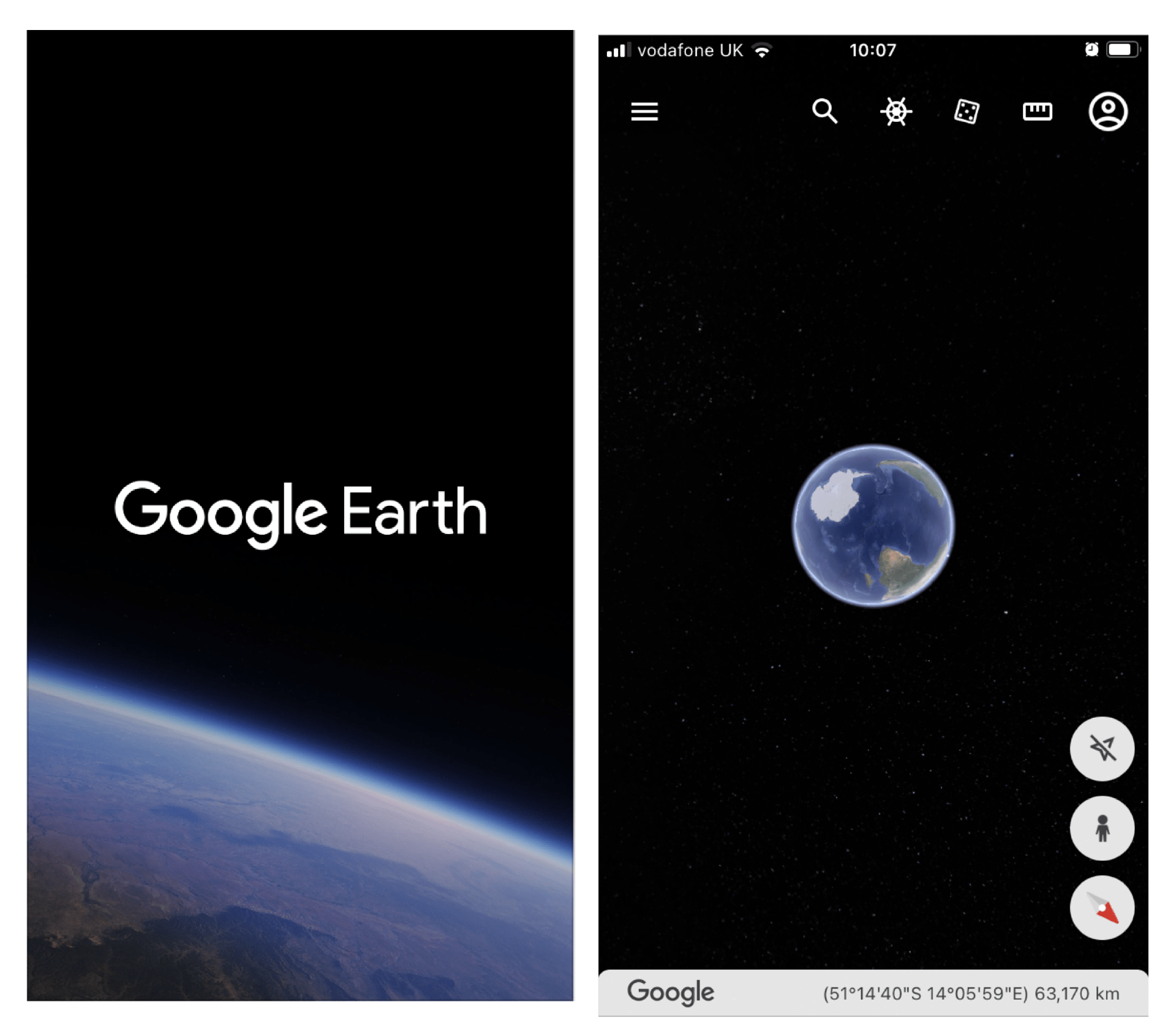
I also looked at Google Earth. This app felt so easy to get around in comparison to the Nasa app however there is less information displayed and of what is included I have a pretty firm understanding. On opening the app a nice title screen appears, I definitely want to include a title screen in my own app. This takes you to a very minimal view of the earth floating in the center of the screen which acts as an anchor point on the screen and can be rotated to view space from different angles and zoomed in on. Nav options are included at the bottom right and at the top of the screen presented as icons (see above screen top right).

I have broken down where each of these top right navigation options brings the user while on the app. The search icon brings you to a separate screen that slides in from the right with a search bar at the top followed by a slide bar of images of featured guide tours and a list of must-see views and an I’m feeling luck options which takes you to a random location (screen displayed bottom left).
The helm icon takes you to the voyager page which slides up from the bottom of the screen. The top section of the voyager page displays a slide shown (5 dots show how long the slide show is and it plays on a reel) There are a mix of options in the slide show from information on castle tours to the option to view a timelapse of google earth. This is followed by a list item that changes with the selection made from the above tab (see screen top left).
The dice option takes the user to a random location and an image and information about the location appear at the bottom of the screen (see screen top centre). The image at the bottom of the screen can be swiped through taking the user to new locations or x’d out of.
The ruler icon allows the user to add a point to a location and then generates a line allowing you to select another point and so on, at the bottom of the screen the distance is tallied (see screen top right).
The profile icon leads to a pop-up screen that can be x’d out of and allows the user to sign into their Gmail account, get help or send feedback.

In the above screens, the navigation options from the bottom right menu are reviewed. The top icon which is disabled in the above example, when allowed access to your location brings you directly to your location. A picture birds-eye view of a location as shown in the second screen can be accessed from the second icon. From there, an area can be selected by double-tapping which brings the user to a street view (see screen top right). The view of the location can also be changed from 2D to 3D (see 2 screens bottom right.)

Finally, the hamburger menu at the top left leads to a list menu appearing from the left. A lot of the items on the list can be found through the icon navigational options. I did however like that the photo option could be selected from here revealing photos of locations as you move around the earth (see screen top right).
Overall it’s difficult to fail googles user experience the navigational option where clear and fun to work through. At every stage, it is very simple to return to a previous steps which I think really aids this process.
Airbnb

I have also looked at Airbnb’s UI as I wanted to see how navigational elements are dealt with on a commercial app and I am a big fan of the Airbnb app. On opening that app the user is taken to the explore screen with a search bar in front of a nice image at the top of the page allowing the user to directly find accommodation in an area of their choice (see screen far left). As the user scrolls through this page, nearby locations are provided with detailed icons also included (see screen second from the left). There are also options to choose by accommodation type e.g. unique, pets allowed etc. and to choose different experiences e.g. outdoors, online etc.
When selecting a location the user is brought to a calendar to select a date, once this has been done the user is brought to a map with each accommodation option identified by price (by selecting a price a small pop up of the accommodation appears that will take you to the accommodations profile). The user can also scroll down to view images of accommodation along with location and price (screen flow displayed above right).

On selecting a property the user can scroll through images left and right using the slide function on the top image (above far left). Information is highlighted with accompanying icons (see second from the left). A map is used to highlight location (see second from the right) and a short paragraph describing the property is also provided along with sleeping arrangements that use icons and boxes to highlight the number of rooms and beds (see far right).
I found Airbnb’s app to be particularly user friendly and love how it divides up the information included on the accommodations page. This is an area I will have to look into when creating my planet profile page as it will include a lot of information and I like the idea of breaking it up using images, illustrations and icons as seen above.
What have I learnt?
- It’s really important to make navigating an app as easy as possible as it will impact user experience.
- A pleasing UI with interesting imagery will also impact on user experience so it is important to prioritise this when organising and presenting information on a UI.
- Icons are a great way to present nav options on navbars while text and an icon can be a great approach on a drop-down list
- It can be helpful to place information in vertical and horizontal scroll menus
- Icons can be used as part of the UI to help reinforce information and break up the text.
How can I apply this to my work in future?
- Making it easy for the user to go back and undo a step is really important for improving the navigation of an app and improving user experience.
- Using text on a bottom bar nav feels cluttered and is something I should avoid when designing a UI.
- If I were to add a rotation option to my galaxy view screen I would have to consider the anchor point e.g. this would probably only be possible when the user selects a planet as then the planet can be used as an anchor point.
- It’s important to break up text with lots of visuals so this is something I need to remember as I continue to design UIs.