Meet Your Type
Meet your type presents the anatomy of type and how to pair types together in a really fun and playful way while dropping in helpful tips about readability e.g. the x-height can dramatically affect readability so avoid extremes and also consider point size. The different measurements used in type are also included as displayed below.

Write up notes and how I have applied this to my word mark- Also think about typography throughout my portfolio site. The groundwork for pairing types is also set by a short explanation of type history and categories and families.
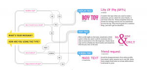
The importance of considering the target audience is also covered as shown above. The need to think about the medium your type will be displayed on, what tone you’re trying to achieve and what format e.g. headline copy or body copy as well as the amount of text is also highlighted. These are all important considerations and I feel that taking the time to choose a typeface while addressing all of these considerations at the beginning of the project is a great way to avoid changes and revisions further down the line.
Other formatting considerations are also highlighted such as alignment, leading, kerning and letter spacing as well as the don’ts of distortion. All of these aspects are really important as they impact the finish and professional feel of your work and should therefore always be considered. I have discussed these in a little more detail below.
Pairing typefaces is an area I find particularly important and I am often indecisive about and generally will avoid going beyond pairing typefaces outside of traditional and extended families. This seems to be a safe bet as simplicity is highlighted as key when matching typefaces as well as sticking with only one or two. However, pairing contrasting typefaces is also recommended, this is something I intend to play about with more in future.
Kerning
Kerning is the process of adjusting the spacing between letters within a proportional font. This is generally to achieve a greater visual balance. There are a number of letter combinations to look out for these are WA, MW, TA, and VA. Kerning and have a massive impact on the outcome of type and therefore it is important to get a good grasp of how to kern correctly. It is generally best done by however you can practice at type.method.ac

This was really fun to play about with though definitely more difficult than it looks the highest level of accuracy I was able to achieve was in the 80s however this is definitely a site I see myself returning to.
Other terms that are worth expanding slightly more on are leading (the space between adjacent lines), ligatures (when two letters or more appear connected) and letter spacing (the overall spacing between letters).
Wordmarks
There are various approaches that can be taken when creating a wordmark. A good first decision to make is whether you want to create a script/calligraphic outcome or a serif or sans serif outcome and what font to use. Other considerations include weight, colour and case. It is good to consider how a wordmark could be customised which may leave room for some playful and creative outcomes. Customisation is definitely something I want to experiment with in my own wordmark.
Thinking with Type
Ellen Lupton’s Thinking with Type covers a lot of the topics outlined in Meet Your Type however in a lot more detail which is very helpful in terms of getting a good understanding of the variety of typefaces that are out there and when they were designed and how they fit with the history of type.

A page that really jumped out to me was the page shown above including Fat Face which I am quite fond of, Extra Condensed, Egyptian and Gothic fonts. What caught my attention here was the boldness of these typefaces and they could be incorporated into a brand as a really strong and memorable feature and help add personality to the outcome. This is something I would like to experiment with in my own logo and particularly with in my wordmark.
The Grid System
In Josef Muller-Brockmann’s Grid systems in graphic design type arrangement is addressed. Below is a diagram is taken from the book of the different ways t construct the type area and how these columns can be used to house text and in what content this is appropriate e.g. no.13 might suit a textbook while no. 16 would be more appropriate for a newspaper and no.18 magazine. It also interesting to note the technical names for the edges of the paper:
Inside Edge= back
Outside Edge= left and right, foredges, (gutters)
Top Edge= head
Bottom Edge= tail

This broken down further The Elements of Typographic Style in which Robert Bringhurst presents 4 examples of modular pica sticks.

A and B are whole and half pica modular scales based on the Fibonacci series, is a Medieval Interval scale based on 2:3 and 1:2 proportions and Timaean scale is a simplified version of the Pythagorean scale. These scales are then used by Bringhurst to shape the page in various grid layouts, see below. 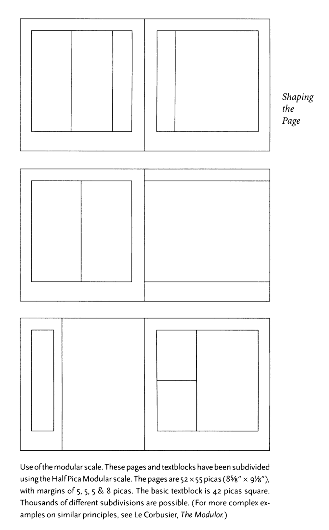
While I am unlikely to measure out layouts at this level of precision it is interesting to note the different theories and mathematical responses to design that can be employed. I think using grid structures such as the above may be useful to me in a number of ways:
- In the design of my logo and how I use scaling in my monogram, wordmark and even my pictogram.
- In the development and organisation of text and imagery on all related materials such as my business card and brand guidelines.
- In the wireframing and organisation of my website.
I feel that thinking about formatting in this way lends itself to web building in particular CSS grid and therefore by dividing my website in a similar fashion to the pages shown above I will have a clear idea of how to apply the correct CSS grid format.
Moving Type
I then moved on to a little research on moving type and looked at some examples that I felt were particularly strong in television series and film title sequences. The first title I have chosen to look at is Stranger Things.
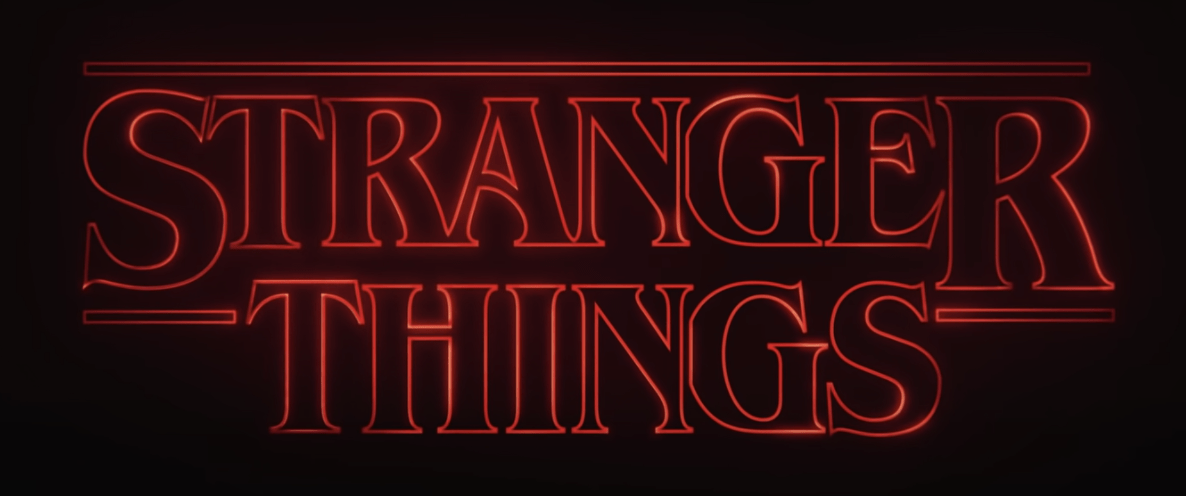
It is also interesting to quickly note the structure of the above title and how it could almost be divided into a 3 column grid structure with the S and the R taking a column each. I also really love the typeface choice and feel it automatically sets the mood for the 1980’s (the time period the sci-fi mystery-thriller is set in)
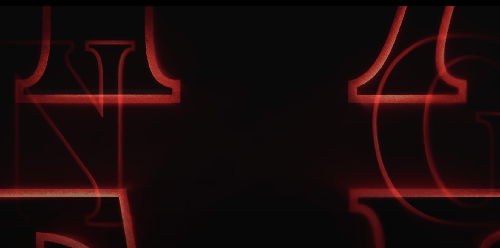
This is complemented really well with the close up flickering view of the lettering used in the title creating a neon light effect. The letters overlap and the camera pans out at the end to display the entire title. This works really well along with the colour theme, timing and music choice to create a very ominous feel to the moving type.
Similarly in the title sequence for Killing Eve an ominous feel is created however it feels much calmer and more calculated reflecting the plot of the series. Here more muted colours are incorporated and a strong Extra Condensed typeface is used with a sharply extended overshoot on the V. This is coupled nicely with the simple motion element of the drip which movies the scene from the title to the rest of the sequence. This is a very simple yet effective inclusion of motion.

Finally, I wanted to look at a more playful title sequence and have included the Saul Bass inspired title sequence Catch Me if You Can.

In this instance, a much softer Coolvetica style typeface is employed with the moving elements centring around line (a single pulls you up the screen before forming the letters in the title and two further lines appear hitting the top of the screen as shown above). A much brighter colour scheme is used and the white ‘me’ is almost swept away by the animated aeroplane creating a cloudlike effect on the letter and once again reflecting the plot of the film.
What I feel is common to all of the above titles is the use of distinctive typefaces to set a clear mood along with a colour scheme that enhances this effect and finally, movement, which is added in a similar fashion e.g. to build tension or add playfulness and set the scene.
I hope to employ all of these features in my work and to produce a playful and interesting animated component that will hopefully add a little more personality to my brand and “set the scene” in terms of the strength of the design and creativity in the body of my work which will be displayed along with my branding on my portfolio website.
What have I learnt?
- I have a much stronger understanding of type anatomy, alignment, leading, kerning and letter spacing.
- I have a better understanding of font families and how to pair them.
- I now have a base knowledge of how to use and experiment with grid structures in layouts.
- Grid structures can also be used in the presentation of titles and wordmarks
- Moving elements are just one part of animated type colour theme, timing and music choice are also important factors to consider while music would not be appropriate in my own brand animation would effect could be effective e.g. feedback from pressing a button inline with the lab theme.
How can I apply this to my work in future?
- When selecting typefaces and creating wordmarks it will be helpful for me to consider the tone of voice, target audience and the context the type will be found in, in order to present a consistent visual language throughout the project and avoid changes being required later.
- By selecting the right typeface and through the correct pairing of typefaces a really strong and effective visual can be presented that I feel can often be overlooked by designers and therefore has the advantage of being unique particularly in web design. This is defiantly an area I need to continue to explore and develop in.