The history of type and why it’s so important!
The history of type might be mistakenly viewed as a “good to know” topic rather than a “need to know” topic. As a designer, I have realised this couldn’t be more wrong. The history of type is a definite need to know topic because it helps us to understand use case and how to choose the right typeface for the right occasion.
Use Case- words have clothes?
“Type is the clothing for words” Erik Spiekermann.
As very aptly put by Erik Spiekermann type is clothing for words, therefore we have to dress our words appropriately which brings us to typeface. Choosing the right typeface can be very important e.g if you want to grab the attention of children, Times New Roman is probably not the way to go. Rather playful bold typefaces will be much more appropriate and far more likely to get a 10-year-old reading. But the question remains, how can the history of type teach us when to stick with serif and when to stand by sans?

Gutenberg and the Printing Press
This takes us all the way back to Gutenberg and Germany in the early 15th century. Often known as the inventor of printing Johannas Gutenberg was not however the inventor of the printing press! In fact, neither was Gutenberg responsible for the invention of printing ink or even movable type. Gutenberg did, however, invent the adjustable mould. The adjustable mould was a piece of apparatus that allowed the person casting the metal characters to lock both wide and narrow characters meaning that a character could be replicated many 1000 of times. The idea of movable parts was the beginning of a system that has now been adopted globally in the production of mass-produced products.
Gutenberg’s typography took its cues from the dark, dense handwriting of the period called black lettering.
Among many of his accomplishments and inventions, Gutenberg has become well known for his production of the Gutenberg Bible. Through his approach to print Gutenberg radically changed the map of Europe weakening the power of the Catholic Church by making the bible more readily available and sparking reformation along shifting learnt knowledge from the religious domain to the secular in as quickly as 50 years. The printing press grew in popularity throughout this time and the Huber of books and publication being printed growing radically at this time. This lead to the common use of printers marks making people aware of which printing house the publication came from and were later replaced by publishers makes.
Albrecht Durer
Albrecht Durer was the first international artist who used his mark to show his work with an AD monogram that became widely recognised as his trademark.
Durer was born in 1471 and died in 1528 and was considered to be one of the greatest German Renaissance artists known best for his work as a painter and printmaker. His work includes altarpieces, religious works, numerous portraits and self-portraits, copper engravings as woodcuts such as his Apocalypse series created in 1498 shown below.


Durer was massively dedicated to his work and took to compositions of typeface very seriously arguing that German artists and craftsmen were inferior in comparison to Italian artists and craftsmen and produced a course in the art of measurement with compass and ruler to prove this point.

Industrialisation and the typeface
Early typefaces such as Roman Type created by Nicolas Jenson then came about as a more readable alternative to black lettering. This was followed by Italics created in 1501 by Aldus Manutius as a way to fit more words onto a page, now however it is used as design detail or for emphasis. In 1816 William Caslon IV created the first typeface without serifs which are now known as Sans Serif typefaces. During this time, type grew in popularity, and many variations were created to accommodate advertising as sans serifs were commonly used in newspapers in order to prevent damage during the printing process. Following the progression of Sans Serif typefaces, type is now generally categorised in 2 groups serif and sans serif.
The Anatomy of a typeface
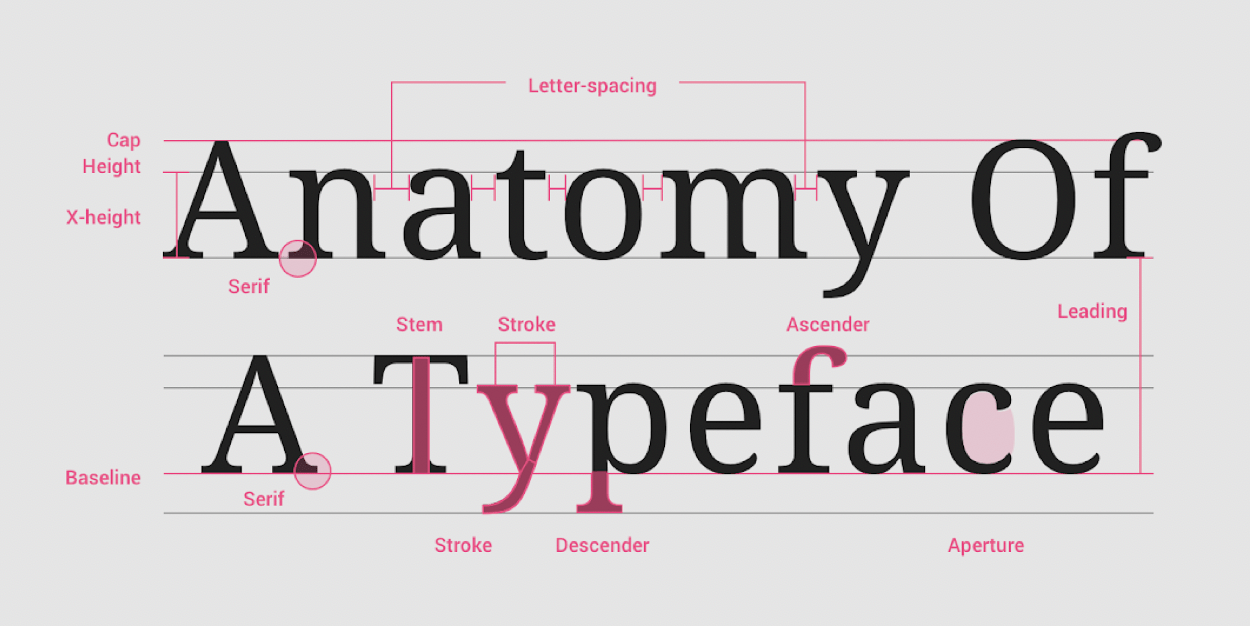
A typeface is a collection of letters with shapes and patterns being shared across letters. When choosing a typeface it is important to consider style, legibility and readability. Letters are made up of letterform parts including aperture, ascender, baseline, cap height, descender, leading, letter-spacing, sans serif, serif, stem, stroke, x-height all shown above.
While generally typefaces are categorised as serif and sans serif other categories are also used such as monospace, handwriting and display. Categories such as display should only be used for large scale text such as heading while other categories or families including geometric sans, humanist sans, old style, traditional and slab serifs are all suitable body typefaces.
What have I learnt?
- When selecting a typeface always consider use case.
- Gutenberg did not invent the printing press but did invent movable type which lead to the rise in popularity of printing due to the newfound usability of the printing press.
- The earliest forms of branding were used by craftsman which were then adopted by printers and artists such as Albert Durer.
- Various typefaces have been created over the last 500 years in order to produce more legible, readable, durable and stylised outcomes.
- Types can be primary split into 2 categories: serif and sans serif however other distinctive categories such as monospace, handwriting and display also exist.
How I can apply this learning?
- When choosing a typeface my primary concern must be readability, particularly in body type and therefore it is best to choose from font families such as geometric sans, humanist sans, old style, traditional and slab serifs.
- When considering readability I should also review line length and tracking.
- If I want to add style to my text keep it in the Header, reserve type families such as display and monospace for headers.
- Consider contrasting fonts and how to mix and match.
- Other considerations include size, weight, colour and use of italics.