Point
Below I have experimented with point in a 2, 3, 5 point formation. For might outcomes, I wanted to add a conceptual element using point to create a simplified flower, face and person.

The first column was created as a representation of a flower, the top composition the simplest form, 2 points representing the head and stem of the flower. the second 3 points with a more detailed head and the 3rd solely focusing on the flower head from a zoomed-in perspective. While I do not feel it is particularly obvious that the 3 outcomes are based on flowers I am still really happy with the final result and feel that if the above formations were place in context and perhaps with added colour, the concept of a flower could be made clear creating an interesting and modern style outcome.
In the second column I wanted to produce a simplified almost cartoon-style representation of facial features, the first image is representing eyes, similar to that found on a fly, the second features eyes and a nose and the 3rd, eyes with pupils and a nose. I am happy with the outcomes however I don’t find them as appealing as the flower outcomes as they are more obvious in their form taking into consideration the human eye naturally forms facial features when looking at even abstract imagery.
In the 3rd column, I have created a stickman style human figure with its arms up through the placement of points along with the consideration of negative space in the top two rows. I am happy with these outcomes as I feel they require a little more effort to be distinguishable as people. In the final outcome, I have not attempted to present any conceptual idea and instead experimented with layering structure and placement. Of all the outcomes this is my favourite as I feel it has the strongest composition as it features a primary point of interest in the large point layered with a smaller point at its centre offset by the column of 3 points to the right producing a deliberate and interesting outcome.
Line

In my line compositions, I also used a 2, 3, and 5 line formation. Here I wanted to experiment with vertical, horizontal and diagonal line placement along with consideration around the use of negative space and breadth of line. I am very pleased with these outcomes and feel they could be used in the formation of layouts as I feel that are simple and make good use of the entire space. Of the outcomes above only, the first and second outcome in the bottom row present conceptual ideas, the fist showing horizontal lines placed more closely together as they move from the bottom to the top representing steps and the second drawing from inspiration from the Mac and side placed smile however rather than a screen my outcome uses two lines as eyes.
Plane
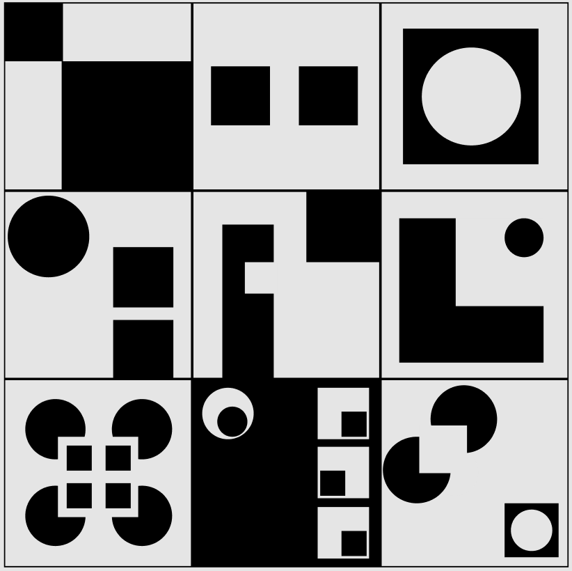
For the 9 planes in 9 different ways, I was very aware of the use of negative space here I wanted to see how I could play with negative space a layering to create various cutout and shape effects. I also wanted to see where possible how I could create a sense of balance in none symmetrical layouts. I found this exercise very interesting as it brought me back to basics and I feel helped me to produce interesting and creative layouts that could be transferable to app and web page layouts.
What have I learnt?
- By restricting myself to elementary forms such as point, line, and plane I can generate interesting and creative solutions to presenting more complex forms such as flowers.
- The importance of white space and how it should be considered in all layout.
- The different tone that can be set when using point and line e.g. I find point to appear more playful and line to appear stronger and more dramatic.
How can I apply this to my work in future?
- Restrictions can be helpful when creating layouts as they will push to present outcomes in ways I may not have considered which may lead to more creative outcomes
- I know the importance of white space and can incorporate this in my design work in a more considered way in future
- When trying to set a specific tone e.g. formal, playful, dramatic I can consider the role of point, line, and plane in my design outcomes e.g. in formal designs use buttons with straight-lined edges and in playful design use rounded edges.