IXD303 PlantCo Group exercise

During class Paul give us a brief which asked us to draw an app for a company called PlantCo Smart Pot. I decided to team up with Emily and Leonie in a group of 3 to work on this small group exercise. We frist dicussed the main target audience of our app and how it could benefit the user. We felt it applied to 21-30 year olds.

Our task today was to draw wireframes and make a user follow for this App.

User Flow

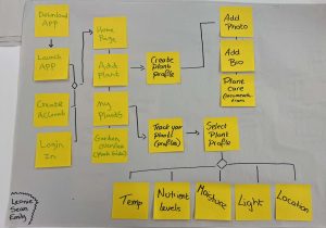
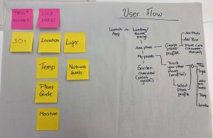
We created a simple step by step user flow of the path the user can expect to follow when using this app from the launch screen.

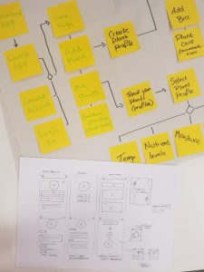
We each wrote the following requirements of the app on postit notes:

  • Plant Guide/ Identification
  • Plant Recommendations
  • Moisture, light, Nutrient Levels
  • Temperature
  • Plant Location
  • Home Screen
  • Add a Plant
  • Plant Care
  • Check Moisture Levels

We stuck these on a big sheet and placed them order of the flow chart. This allowed us to see the path the user would follow and how many screens we would have to produce for the app. This user flow starts from the download scren and shows the all possible options they could click on.

Sketches

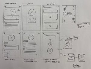
Once we were happy with the user flow, we made some indidviual wireframe sketches on paper. We all took a page of lined paper each and sketched our 6 different screens representing the app screens. This meant we had a choice of wireframes to choose from.

After we combined our ideas by choosing the best ones to draws on a larger scaled paper.  We dicussed the screens and choose the final screens. At the end of class we pitched our idea to Paul and talked through the 6 different screens and what it allowed the user to do.

Here’s the instagram post we took of our work.

Reflection

I enjoyed this team excercise as it got me working with other people in the class. It allow us to be creative and share ideas with one another. The more ideas we came up with the more succesful our final outcome would be. I felt we all worked well together. I would defintely work with them in the future. I thought their ideas and wireframing were excellent and they contributed so much.

Week 4- Sketching Interfaces (IXD303)

This Week we focused on Sketching Interfaces. Before designing it’s good to put alot of effort into sketchin/wireframing. Drawing is a very important phase in the design process. Any projects you work on make sure to always start off on paper as it helps you to brainstorm you ideas and allows you to try out different designs.

Why choose paper?

Well firstly its quick, it’s cost efficent, fast and flexible, simple and allows you to share your ideas. By using paper you can come up with different ideas before finalising it. Start getting comfortbale using pens in your designs.

According to 2020 design tools survery, the majority of designers use pen and paper when brainstorming/sketching ideas. The top software they use for digital wireframing is figma and for research it’s notion.

Diverage before configuring. Start off with low fidelity.

The key point to remember is that pratice makes perfect.

Some designers I will look at for inspiration is Sarah Cupples, Cathal Dixon and Paddy Donnelly.

Relearning to Draw

Doesn’t matter if you are a designer or not everyone can draw. Sketchnotes is a great tool to use to help you sketch out ideas on paper. When you are taking notes you can sketch out images/icons which can help you make it clear and easy to understand efficently. When doing this limit your palette focus more on drawing.

Another tool you can use is visual starter kit which can help you make your notes and planning more visual.  Visual images/ sketches are great as they allow people to process content much faster than text by getting striaght to the point. Images are a lot clearer to understand than word. For example when you see a sign you automically know what it is.

Sketching is a thinking process. Getting the point of communication across is to the user is more important than the drawing.

Speed Drawing Excerise 

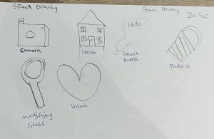
To help us feel more confident in are drawing ability. Paul set us a task to draw the following:

A Camera, house, speech bubble, a padlock, a magnifiing glass and a heart in 20 seconds, then again the same in 10 seconds then 5 seconds respecitvely. This was a fun task as it allowed us to be free and as creative as possible in the short time frame given for each image. I think it was good seeing the drawings we could come up.

2. Mapping Flows
  • Start on paper then develop it.
  • Get the logic right
  • Test use flows on research users
  • Then when happy build it.

You can use Figma or Miro to design user flows.

By making sketches it mimalises the risk of mistakes. Innovation is easy. An idea is nothing than a combination of ideas.

Example of a userflow is when you make a post on Instagram.

3. Sketching Interfaces

Sketching is not nesscary about being a good artist it’s more so being a good thinkier.

Tips to consider when sketching

  • Use a thick Pen
  • Draw striaght Lines
  • Add Colour
  • Make sketches clear and easy to follow
  • use the right tools
  • time yourself
  • Best to prototype early and often as possible.

Reflection

Following todays lecture I learned that when making sketches it’s better to keep them simple and clear rather than to over complicate them. It’s better to have the process and idea on paper to allow the use to grasp the understanding. I enjoyed doing the excercises as it allowed me to be creative. I can also take away from today how important it is sketching on paper is before jumping into any project. I make sure to sketch and wireframe my app before digitalising it as it help to enchance my protype and improve the users experience.

Apollo Project Competitor Analysis

This week I’ll begin to sketch out on paper ideas as well as beginning to wireframe my site in detail. To help insprire me I thought it was a good idea to research different sites on the Apollo mission.

The frist site I wanted to look at was the offical NASA site. I thought the content was interesting. I liked that I was able to view a range of stunning images and videos from the Apollo Mission.

https://www.nasa.gov/mission_pages/apollo/index.html

On the Nasa site I was able to look at seperate sections to view the stunning images and videos of the Apollo Mission, which was amazing.

The second site I looked at was the Air and space site and specific Apollo topic. I liked the typeface, images and interactive features used throughout.  This site walks the user through the whole story of Apollo program, the people that made the mission happen and where you can go view the collection.

https://airandspace.si.edu/learn/highlighted-topics-/apollo

The 3rd site I looked at was the planetary.org. As soon as I clicked on this site I was drawn in by it’s vary of interactive videos. Once you scroll down further you can view information from the frist ever mission and each of the following Apollo missions.

https://www.planetary.org/space-missions/apollo-11.

Reflection

The use of images and videos on the website creates a visual interaction for the user. These websites tell an excellent story of the Apollo Program. They make sure not to overload the user with infromation.

The use of animation and visual interactions will make the user want to stay on the choosen site for longer to watch the videos, view the images or click the animations.

Each of the websites I looked at where very engaging. Hopefully I will be able to create a full functioning website which caters to the users needs and tells the story of the Apollo mission.

Law of Ux- Hicks Law IXD303

Another Law we briefly covered was Hicks Law which is named after Psychologist William Edmund Hick. It is commonly used in the field of UX design.

This laws states “the more choices avilaible to the user, the longer it for them to make a decision. ” Therefore the less choices they have the quickier they will take to make a decision.

It’s important as a designer not to overload the user with information as they will lose interest. By following Hick’s Law you can improve your website and make the process smoother.

Key things to do:

  • Break down complex task
  • Simplify the choices availible to the users which will increase their decision making.

Example

A good example of this is a classic remote with alot of buttons. Most of them buttons are not nesscary. Therefore it causes frustration and congintive load as users are unable to decid what to click. But by creating an simplified version of remote with less options it makes it easier to use and process.

Reflection

I will use this Law in my project to improve the user’s experience. I will esnure to only provide them with relevant and simplifed options when creating my app/website which makes it clear and simply for my targert audience to process.

Healthcare-Autism Research (IXD303)

What is Autism?

Autism is a disability/ condition which is spotted from an early age. Other’s names used for autism are ASD, ASD or Asperger’s. Autism means your brain works differently from others.  Autism is easier to spot in boys than girls. It’s thought that over 1 in 100 people are on the autism spectrum and around 700,000 of adults and children in the UK who are autistic.

People with autism have a wide range of complex problems both physically and mentally. They may have difficulty with social interactions, communication, behavior/repetitive issues, anxiety, stress, sensory issues such noise, lights, etc. as well as understanding or processing information

Each person with autism is different. Therefore, there needs, and problems may be different depending on the individual. Some people may need little support while others may need a lot more.

Other physical or mental health Conditions people with autism may have

  • ADHD
  • OSD
  • Bipolar Disorder
  • Dyslexia/Dyspraxia
  • Anxiety
  • Epilepsy
  • Schizophrenia
  • Allergies
  • Asthma
  • Diabetes
  • Heart Disease
  • Cerebral Palsy
  • Depression

Top Apps for autism

Proloquo2Go– An app designed for people who are nonverbal.

Endless Reader– An App which helps them to develop their reading skills

Language Therapy for Kids- MITA

An app used to help them to communicate, develop their language and speak confidently. Available in multiple languages worldwide.

Otsimo/ Special Education AAC

An App that improves children’s speech It has different games which can personalized for a child’s specific needs.

CommBoards Lite-AAC Speech Assistant

An App that provides a communication assistance method that lets users tap on images, hear sound and word pronounced aloud to help them learn.

ABC Autismo

An App that allows people develop their skills, confidence and have fun while learning.

https://www.spectrumnews.org/news/adults-with-autism-are-at-risk-for-host-of-health-problems/#:~:text=The%20health%20complications%20that%20accompany,disorders%20such%20as%20cerebral%20palsy.

www.autism.org.uk

www.hns.uk

https://www.healthline.com/health/autism/top-iphone-android-apps#language-therapy-for-kids

https://www.autismspeaks.org/medical-conditions-associated-autism

Research- How Users Read on the web?

This article was written on nngroup.com website.

Jakob Nielsen found out that 79% of people they tested scan a new page and around 16% read word by word.
Due to their research, web pages must employ more text which scannable by:

• Highlighting Keywords
• Sub-headings
• Bullet Points
• One idea per paragraph
• Inverted pyramid style
• Lower word count

It’s important to use credibility such as using high quality images, good writing and use of hyperlinks. This make’s it easier for users to trust the site. If you make the understanding clear and get straight to the point, you’ll boost the credibility of the site.

Measuring the Effect of improved web writing

They developed 5 different versions of the same website and tested them performing similar tasks in order to measure the effect of the content.

  • The concise version had a usability of 58%
  • The scannable version had a usability of 47%
  • Surprising the objective language version had an improved usability of 27%. The results were better than the promotional site as predicted.
  • The combined version of the sites had a usability of 124%

What they overall found out was that promotional language creates a greater barrier on sites as they have to rethink the statement and slows down their process throughout the site.

Reflection 

From reading this article I found out users perfer websites which are simple to read and understand. They like a wepage that gets striaght to the point and is easily to scan through rather than having to read word by word to understand it.


Apollo Space Program Task

Following on from the lecture on Art Direction. This week during class we were given a task. This is were we were given the word “Apollo Space Program” and had to experiment with a typeface and colour using Figma. We had alot of time to work on this and helped us to produce ideas.

Below is the Miro board were we posted up examples of work from the class.

As you can see in the next image an example of the typeface. I was going for a Star Wars vibe for this. If I had more time I would experiment with further colour and typefaces.

I really enjoyed this task and getting to see my fellow class mates work. I thought the standard  and quality produced was amazing.


Week 3- Art Direction IXD304

This week’s lecture was on Art Direction. Fristly we learned what Art direction was, examples of were they are used efficently and how how ux designers can use it to enhance their work on projects. For the Apollo project we will be expected to be Art Directors as well as visual designer and font end developers.

  1. What is Art Direction?

An Art Director focuses more on the strategy and process behind a specific design. Art direction is important as it helps to create a connection with the users by allowing them to get emotionally attached to particular product and service you design. Art direction happens before you design.

It’s also very important to provide the digital experience which matches the read life one.

Art Direction can explained as two Journeys which are different but get you to the same direction. Essentialy the art direction is your own decision. It doesn’t have to be the same as everyone elses. It’s about showly what makes you unique.

Art Direction is learned through school and personal experience.

Example of a local company which uses Art direction well are little Thunder. They show the process of there designs.

What does Art Direction Mean?

The product you design should be useful and have an impact on your users experiences. The aim is be a ux designer which creates a lasting impression. That’s why when using Art Direction I have a connection with my users though creating meomrable experiences.

AirBNB efficently tell a story on their own stie. They say “We make sure we tell the right stories” This is there selling point to their users.

Anyone can be art-director not just designers.

Stories can be told through social media.

Influenial Designers

  • Dan Mall
  • Koi Vinh

2. Style Titles and Element Collage

Style Title is a design tool which includes font, colours and visual interface elements such as buttons and forms, etc. This is used to represent the app or website.

Element Collage

The element collage is just like style title. It’s collection of visual designal elements used to make up the website/app. It allows me to document of the different elements I will use.

Visual Grammar

Visual Grammar refers to a set of design principles used in design to commuciate a message through imagery, pictures and othe visual elements, etc.

Things to consider:

  • Typography
  • Colour
  • Images

Other Resources

Kyle stated even though the internet is great it’s important to look at further resources. Maybe even consider offline resources of inspritation such as the libary, magzine and newspapers.

Reflection 

I thought it was interesting learning about Art direction and how use this when designing my project. I’m aware this will help me when breaking down the process of my project/design. I enjoyed looking at different examples and how they use art direction efficnetly in the approach.

This week I’m going to work try continue my research as sketching out ideas, drawing wireframes in detail and thinking of the content I will use for the Apollo space project.


Week 3- Design & Strategy(IXD303)

This week in class we had a lecture on Design and Startegy. There were a number of different strategies we covered.

  1. AI and UI Techonolgy.

Paul showed example of sites which can allow users to create, logos, videos, banners mockups instantly. Although these online tool are great but there is no creatively. They all follow a similar layout. In future these designs may become more sophicated but they can’t  be used to replace the designers. There was an article Will Al replace designers which would be a good read.

Outstanding Ai

Everthing we’re doing currently in ux design such as:

  • Empathy
  • Creativity
  • Idea Generation
  • Lateral Thinking
  • Strategy

These are examples of UX Design

There are big companies which are mostly Design Led these include:

  • Facebook
  • Apple
  • Instagram
  • Twitter
  • Uber
  • Mailchamp
  • Adobe

2. BHAGS- Big Hairy Audacious Goals. This is basically a long term goal that inspires everyone in the business to understand and get behind. They are used to help boost and exite people in order to achieve their goals.

Examples: JFK: The Moon, Microsoft or SpaceX

What might that look like?

Website, App, Email Channel or Social Media.

Frame Your Design Challenge

During class we were asked to Frame our own design Challenge based on IDEO’s idea. We had to consider the following questions:

  1. What is the problem you’re trying to solve
  2. Try to frame it as a deisgn question
  3. What’s the impact you are trying to have?
  4. What are some of the possible solutions to your problem?
  5. Write some of the context and constraints you are facing?
  6. Does your question/Design need a change/edit?

I wrote my own.

Laws of UX

  • Hicks Law states that that time it takes to make a decision increases with the number and complexity of choices avaible.
  • Basically simplify the choices of people to increase decision making. The less decisions the quickier the choice is made.
  • Break down complex tasks

Congnitive Load

Don’t overload the user with too much Information. Make your design clear and simply for your targert audience. Good examples of this process used efficently is Google. They make it clear and easy to understand.

Onboarding

(Defintion)

Offboarding

(Defintion)

(Examples)

Dark Patterns

Dark patterns are used on internet to catch users out by making them do things they don’t really want to do. For example buying or subscriping to something.

Users/ Human 

These are the targert audience of the design. It’s important to empathise with them.

The Blank Slate

User Personas Vs Jobs to be done

We’ll need to focus on developing these next by undersanding your personal users. User Personas are your typical users whose needs you should look to meet. It’s important to get into the mindset or the users and their goals to help your design.

Things to include the User Personas:

  • Bio and Photo
  • Name
  • Age
  • Location
  • Goals
  • Threats

Example: Ul Generator or Username Generator

Common Problems with User Personas

They are amalamtion an average of attributes. There is no indivually they are all similar answers.

The Persona Spectrum


We watched a video explaining Mcdonalds Milkshake Process.

Jobs to done

There is number of jobs to be done:

  • Dentifty Jobs customers are trying to do
  • Catergoise the jobs
  • Define
  • Competitors
  • Priortise the JTBD expectations
  • Releated outcome expectations
  • Outcome Statements
  • Jobs evolve much more slowly

We watched a short clip from Mad men

So what is your “Job to be done”? Consider this.

Inclusive Design

We then looked into Inclusive Design and Accessibility. As a Ux designer this is very important to consider. Inclusive Design is a method that enables and draws on the full range of human. The design we create should be accessible to all users.  There is a range of impariments and different disabilities to consider when it comes to design.

In the image below you can see different types of disabilities both peramanent, temporary and situational.

Disability Defintion


Consider the Who, what, where, when, why and how approach in your design. When designing a product empathy with your audeince. This can be done through an empathy map.

This week:

I will continue my research and hopefully start coming up with ideas for my designs.

Reflection

Today’s class gave me an eye openers into different design strageys and things I could in my design for my project. It also made me more aware of different users and there complex needs and how I should make my design to meet all their needs.


Skip to toolbar