IXD304: Apollo Project Sketches & Wireframes

Before we started working on prototype we had to make a couple of sketches of our ideas.

I started sketching out typefaces which I felt was a space vibe. Then I thought of sketching the moon and rocket. My idea was to focus more on the 3 men that were appart of the Apollo mission landing on the moon.

I drew out sketches of how the content could be possibly laid out.

I thought for the first screen have an animation of the rocket going to the moon then have start of at the corner of the screen and then it gets bigger and bigger. The impression is like the user is travelling on the spacecraft and feels like they are part of the mission.

I showed these sketches and pitched my inital idea to my group tutorial. I got some postive feedback. He said he liked my idea and sketches. I should continue working on them and begin to prototype and have my content on screen.

This week I asked a class of primary school pupils what they would like on a website as my target audience is kids. I will make my design appriotate for them. I will design this using Figma and hopefully get them to test it.


IXD303 Laws of Ux- Peak End Rule

This we looked at another Ux Law called “Peak End Rule”. This rule is a cognitive bias thats impacts how people remember past events. “People judge an experience largely based on how they felt at its peak and at its end, rather than the total sum or average of every moment of the experience.”

When creating a design or movie pay attention to the users interest and how they will react at each stage of the process. Leave the user on a positive experience which will create a lasting effect. Work out when the product or service was used to eneterain the users.

This Law orgined in 1993 following a study by Kahneman, Fredrickson, Charles Schreiber and Donald Rederlmeir to help they gather evidence for the peak-end rule.

Example

They put this to the test by getting participiants do different trials were they sumergered their hand in 14 c of water for 60s. Then followed by the other 60s, keeping their hand submerged futher 30 s during which the temerpature was raisen to 15c. They were then asked which trial they were perfer to do again. Both were in favour of the 2nd test as it was in recent memory.

Reflection

When designing my website it’s important to interest users and get them to test the usbalitiy in order to improve.


Week 5- Immersive Storytelling Prototypes

This week is a reminder to work on our Immersive Prototypes.

Frist step is:

  1. Wireframe
  2. Mockup
  3. Prototype

It will a 3 versions of the prototype produced for our critque session which will give us an opportunity for feedbacks.

Its important to Keep up to date are Research Blogs.

  1. The Blurring of Lines

For our immersive sites we should consider working beyond the small screen. This includes films, tv, images, etc.

Set the tone of your project. Examples of this is Netflix and Apple. They use this well in their opening start up screens for their products or services to good effect.

I need to consider:

  • How Will I make my website immersive that will peek the interest of my chosen audience.
  • How will this tell the story of Apollo Space Program.

2. Creating a World

Consider my back story of the Apollo program and how I can get users interested in my website.

Graphic design storytelling is an excellent way of getting your point across in a professional way.

Designer- Simon Wild

A secret world of Annie Akins

3. The Power of the Pause

A simple pause can have an immeditate impact. Pauses can be soo effective on a website. Pause can enhance your story. They can create intension. Pauses create emphasise. The right words can be effective. Steve Jobs famously says “One more thing”. Pauses can be used on websites when doing transitions.

It’s important to consider were can add pause on screen.

4. Film

We can add by leaving out content. Not everything is nesscary. Make sure content has purpose and understandable.

Films can give us inspiration.

Transitions

How do transition from one point to another. Stanely Kubrik was known for using this in his work.

Colour and Constrast

This week it’s important to consider the colours for our Apollo project. Sometimes little colour can be effective. Don’t use too much. Theres a movie called Schindlers List which is in black and white with a bit of red for little girls coat.

Prespective

Consider this weather it be birds eye view or front camera etc.

5. Structure

Structure on your story is very important. Alot of films follow the 3 act structure.

  • Setup
  • Confrontion
  • Resoloution

Example: Iron Man movies use this structure for their films effictively.

The Heros Journey

Star Wars is a good example.

The Art of Dramaturgy

This is the process of applying strucuture to a story.  It teaches us there are specific acts to the story.

Classic story structures start with a beginning, middle and end.

It’s important to tell the story of Apollo to the user so theyu understand what it is about. By following structure you can make the concept successful.


Week 5- Content Design (IX303)

Today’s topic in class was on content design.

Pre-content

Before we went over our content. Paul spoke said we will have a group critque session in Week 7 on our prototype health care Apps. For Wednesday the 9th of March he wants us to have the following content on a slide deck:

  • Brand Name/Logo
  • User Persona
  • Brand Guideline
  • Wireframe
  • Prototype
  • Three Screen Demo

These will be saved and named appriotately and emailed to Paul.

He showed us some interesting examples of the content from previous students work as a guideline for what we have to produce.

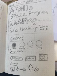
The brand Guidelines include:

  • Fonts
  • Colours
  • Icons
  • Buttons
  • Typography

Paul Recommended us to use Material.io for further research and guidiance.

So now the main content

  1. Everything is Content

Content Underpins Everything.

There are increasing number of roles out there in world which focus mainly on looking at content such as:

  • Content Designer
  • Content Strategist
  • Copywriter
  • Editor
  • Publisher

Users depend on copy to interact with Apps and other products. It’s the designers job to make sure this content is written correctly and makes it easy for users to understand in order for the product/app to be successful.

Content Forms

Text- 95% of information on the web is written language. So the type of typography you use is essential in order for the user to use your site and be interested. Before adding content to your website, test out the typography by writing out content and choosing different fonts to see which works well. It’s easier to work with live text over lospem.

Words play a very important part of the design process when working on any product.

A vs B Testing

This can be done by looking two different types of content or strategies to see which one works best for you to gather the information.

We breifly looked at digital Service Standard and Sarah Winters.

According to the Goverment Digital Service the 10 standards of design are:

  1. Design starts with the needs of user.
  2. Do Less. Anything you produce replicate that.
  3. Design with data.
  4. Do the hard work to make sure it’s simple
  5. Itreate. Iterate again before you are happy.
  6. Build for Inclusion. Make sure it is accessibly to all users and their needs.
  7. Understand the context.
  8. Build Digital Services, not websites. Services are there to help people.
  9. Be Consistent, not uniform. Keep all your content consistent throughout.
  10. Make things open, make thing better. At the end always share your ideas for feedback.

Laws of Ux

We covered another law of ux called “Peak- end Rule”. This states that “People judge an experience largely based on how they felt at its peak and its end.

Example of this being a Survey.

Key points to consider:

  • Pay close attention to the most intense points

A good book to look at is Thinking, fast and low by Nobel Prize Winnter Daniel Kanneman

Congnitive Biased

Uber good example of Cognitive Biased

2. Journey Mapping

A journey Map is a visual process the user goes through when using an app. A customer Journey Map is a map the customer goes through when purchasing a product,

We should start create different user persona’s being get into the mind set of the user. Once you gave that create an empathy maps. The next stage is then:

Developing your Journey Map

  • Start with an idea of what your soloution is.
  • Start by writing 1-2 word headline.
  • Write down other words
  • Break down the content simply

3. Touchpoints

A Touchpoint is were the user interacts with a product or services. A touchpoint can be button on a website/app a poteintal customer or user can click on to contact.

Consider where do you do and how do you get there.

We then discussed as a class the Touchpoints for Amazon, McDonalds and Ulster Univeristy.

Paul then give us 10 minutes to list as many Touchpoints for our own products.

I came up with the following:

  • App
  • Phone
  • Brand/Monogram
  • Email
  • Call Number
  • Button
  • Web
  • Photo
  • Word of mouth
  • People

Examples of further Resource-

  • Gel by the BBC. This explains the breakdown of Typography. Choosing the Appiorate typeface is important. Focus on sketching and planning.
  • Mailchimp

Reading habits have changed. More people read online articles rather than books. Paul recommended us to look at the article called “How Users read content on the web?” by Nielsen Norman Group to help us understand their approach.

Reasons for change

  • Level of Motivation
  • Type of task
  • Level of focus
  • Personal Characterists

How was can improve this?

  • Use clear, noticable headings and subheadings.
  • Place infromation up front
  • Format Techniques
  • Use Simple lanaguge for users to understand

Limations

  • poor lighting
  • Small text
  • not interesting
  • too many words

Users Seek..

  • Trust in the source of content
  • Brevity of content
  • Retrieval

Call to Action

  • Imagery
  • Videos
  • Data
  • Icons

Designer- Brendan Dawes

3. Brand Dictonary

This week Paul asked us to write our own Brand Dictonary

4. Trialbrazers

  • Hiut Deniam Co
  • Mail Chimp

TLDR

Inspritation 

Content Delivery by Sarah Richards

Readable Guidlines

Next Week think about about user stories. Write up a few user stories for the following:

  • As a user/role/who
  • I want to task/action/what
  • So that objective

As well I will write a Point of view statement to understand the need and reason for the user.

Lastly make designing content to consider all content of the web weather it be web or images or data, etc.

Reflection


Laws of UX- Millers Law (IXD303)

Millers Law is another Law used in the field of Ux design. Miller’s Law states that “The Number of objects an average person can hold in their working memory is about seven.” This is known as The magical Number Seven. Therefore if your users need to make a choice, it’s important not to give them too many choices.

Basically in order for the user to understanding the content, it’s important to break it down into chunks.

This Law was published in 1956 by Professor George Miller when he discovered the theory, were he tested users to see how much memory memory they could hold.

It’s important when designing my content to make sure I break down the information into mangeable chunks to help users process, understand and memorise information easily.

Short term memory captaicity will vary depending on the user.

Research External Interactive Websites (IXD304)

During our class we looked at interactive and immersive websites. We learned how we could these techniques to enhance our own websites. Below our some of the example websites we looked which will hopefully help inspire us while working the Apollo Project.

The Snow Fall Story- New York Times

https://www.nytimes.com/projects/2012/snow-fall/index.html#/?part=tunnel-creek

This is my favourite example. The illustrations and animations they use are stunning. I thought the arial view of the mountatins were amazing. It felt like you were flying in a helicopter above the mountatins. I liked the snow capped mountatins and paths it was extermely pictureque and beautfiul imagery. It makes you want to go visit these images.

It’s the type of site you love to click through and makes users want to return to the site. I liked the way it used visual interactions to tell the story of the snow fall.

It’s my benchmark to eventually be able to design and illustrate a website as good as this one.

If the Moon was only one Pixel

I found this website extermely innovated and not like your traditional websites. It is very simple but sophiscated at the same time. I loved the concept of scrolling through space to understand the scale of the planets and the distance between them if they were only 1 pixel. Absoutely fantastic. I liked the text in-between as it keeps the user interested. This is a very effective interactive site. The user feels like they are on a journey of discovery and very interesting.

https://joshworth.com/dev/pixelspace/pixelspace_solarsystem.html


SteelWavellc.com

While researching I came across an interactive site called Steelwavellc.com which I thought was quite good. I looked at their portfolio and specifally their space-craft. Fristly I loved the red dot Icon they used for their cursor. I thought it was eye catching and something different to the normal cursor. This is something I would consider in my own website. I liked the way when I scolled down the page the text and images would fade into view. I also liked that once I was halfway down the website, there was an Interactive image gallery. Once again using the red circle icon I was able to drag left or right to view the images of their project. I thought this was class. This is another feature I may possibility use.

https://www.steelwavellc.com/portfolio/space-craft

Reflection

From the research I gathered I have realised that more and more sites are dyamic and interactive. These websites today are alot more interesting to the user than the previous static sites from years ago. These sites will make the user want to view them time and time again as they are appealing, eye catching and use their content efficently to tell a story. I hope to use some of the features I have seen on my own website.

My visit to Armagh Planetarium (IXD304)

Today I took a trip to the Observatory and Planetarium in Armagh. I thought this would be beneficial as part of my “Research and Discovery” phase of my project. The purpose of my visit was to hopefully gain more knowledge and a better understanding of the Apollo Mission and some of astronauts.

I thought this exibition was very interesting. I found out alot of facts about the first astronauts to land on the moon, the space craft they used as well as discovering the different planets of the solar system. I also attended a show in  Planetarium called “We are stars.” Even though it wasn’t specifically about the Apollo program, it was still very interesting. I thought it was fasinating spectacle to watch. I liked the use of the 3D graphic images above me of the stars, atoms and night sky while I lay back and viewed from my seat. It was really amazing as it felt like I was moving through the sky.

All and All it was a fun day out. I felt I have a better knowledge now of the astronauts on the moon and Apollo program.

I would defintely recommend anyone who is interested in space, planets, and our solar system to pay a visit. If you do go make show to book one the shows you won’t be disappointed.

Below are some images I took during my visit to the Planterarium in Armagh.


Typography and Movie Inspiration.

I started looking at different Typography which I could use for my project. There was soo many different types of fonts I could use for my Apollo themed website.

I frist looked at space films and the font they used for their posters/dvd covers. I really like the typeface used in each one. Alot of them are very similar but the position of the text and theme in the background makes it stand out.

Some were fiction, others based on a true story. I also looked at sci-fi films like star wars and star trek.

I’ve seen some of these films. They have a really good storyline to them.

I wanted to do this compare different typefaces. I noticed the simple and sutle typefaces have the more impact as long as their is a effective background image.

Below is a moodboard of different space films posters I gathered from the internet.


Reflection

I liked competely this research as I liked looking at the different types of movie posters for inspiration.


IXD303- Group Exercise (Patient Form)

In week 3 Paul asked us to get into groups and using the data he provided to complete a mediical form in a clear and apporitate way.

I worked with Florence and Cormac to complete this task efficently. We dicussed ideas how we would breakdown this task evenly. We started off writing the data out on sticky notes and determined the structure of our form. We put the most important information to the top.

Once we were happy were the data would be going on the form, we went onto to figma to begin creating this form. We made sure our designs were consistent throughout. We choose an appriotate font type and colour scheme.

We finished working on the form in our sparetime. Once we were happy we came together and finalised our form.

I’m happy with the final outcome. In the future we could possibly add more options or leave out information that isn’t nesscary to the user.

The benefit of having an online form compared to written one is you have more options to choose from and more space to type your answer.

Below is how our form looks like on screen.

Form IXD303

Reflection

I enjoyed working on this task with Cormac and Florence as I felt we worked well together. Hopefull we can work on future projects or tasks together. I felt be doing this it was good practice when producing our own app when we take our own data into figma and stuctuely create our prototype.

Week 4 Journeying Immersively (IXD304)

Today we looked at Immervsive Prototype which will we look to complete on week . For Deliverable 1 Mockup we have been expected to complete wireframing, Mockups and Prototypes.

The frist thing we looked at was:

  1. Immersive Storytelling

Printed artefacts are largely static. At the Macro we expect interactive. At Micro level we expect similar feedback, clearly commmunicated through interactions. Alot of sites in past used to be static but now adays most sites move to Dyamic site.

Macro Interactions focus on

  • Users interaction with the site
  • Page to page
  • section to section

Micro Interactions

  • Interaction with user through animations
  • Component to Component 
  • Button to Button

Common things users may expect to see on a website

  • Scrolling
  • Animation
  • Interactive Data
  • Live Maps

2. Interaction at Macro Level

Example of a Immersive Sites on the web:

  • Snow Fall story by the New York Times
  • Vinny Bakery
  • If the Moon was only one pixel
  • SpaceX
  • Big Apple Hot Dogs
  • Aesop
  • Then & Now
  • One Million Dead
  • 7 Deadly Sins
  • Bbc

These enchance users experiences on the site. I thought the use of animations on these website were amazing. The all told an interesting story and captured the users expierence making them want to scroll or click on options to find out more information.

Advice when creating an Interactive Website

  • Use simple Word
  • Simple and sutle Animations are more effective.
  • Dont Complicate users
  • Icons are useful
  • Illustration Images are nice

3. Designing Micro Interactions

5 Keys things to think about when designing a Micro Interaction Site:

  • Triggers
  • Rules
  • Feedback
  • Loops
  • Modes

These can be effective. Uses know whats happpening. Get into the habit of practing these.

Inspiration

  • http://www.awwwards.com
  • Val Head- Desinging Interactive Animation
  • Watch videos On Youtube

My Aims for this week

To have my moodboard of images and typography complete. Work on my sketches and wireframe. Design Style Tile of all the elements I need to include. At this moment I should be at the sketching and Mockup up stage on Figma. I’m slightly behind as I’m struggling to come up with ideas in order to tell the story of Apollo. I need to quickly get on top of my work and get myself up to date in my design.

Hopefully by the end of next week I’ll have a clearer approach and I’ll be more confidence when designing my prototype.

Reflection

I felt I learnt alot today about Immersive Protyping and I enjoyed looking at the wondeful examples. This will hopefully help me in my design. I also got a reality check of were I am in terms of my work. During tutrioal it was good to see each others work to date and were I was compared to my group.

Skip to toolbar