
Below are links to my final submission for the Apollo Project.
IXD304
Updated Apollo Prototype- IXD304
From the feedback I recieved in week 6 I made a few changes to my Apollo Prototype. I feel the content, images and buttons looks a lot more cleaner and presentable now as they are nicely laid out and professional.
As suggested by Kyle I changed my Logo from the star to the NASA logo as the start looked random didn’t have a purpose. Someone said it reminded them of russia. Whereas the NASA symbol fits the theme and makes sense as it’s to do with the 3 Astronauts who work for NASA setting on a mission to the moon.
I also wanted to make sure my buttons at the bottom were placed and aligned approitately at the left and right of the screen. I wanted this to be consistent through my prototype. As orginally it was randomly placed and it jumped about the page.
I made sure I got clearer images of the moon and astroanuts as they looked a bit pixeled and blurred before. I feel they look a lot better and sharper quality the images now.
Also I changed around different sreens of my prototype by making sure the screens were in the correct order to tell the story of the Apollo mission. I feel by doing this is flows better.
I think the advice I received was very helpful and I feel my prototype is looking better than before. I am happy with the final outcome and feel I put it a good effort. Hopefully it is successful.
Updating my Apollo Website- IXD304
https://theapollomission.webflow.io/
Following on from my group critique session and user testing I worked on updating and making changes to my Apollo Site in order improve it.
One of improvements Kyle suggested was create an Icon set to add into content on the missions page. I felt this has made the content more visually appealing to the user. Before it was just lines of text now this section has been transformed.
Lucy in her feedback confirmed this said “I like the video because it shows how they get there and the Icons for the information”
Kyle also thought the content in my site was a little light. I took on board what he said and as well as the pupils and have included more content about space race and the astronauts as well as the rocket.
I enlarged the block quotes and changed the background colour to make them stand out. I took on board what he said and I agree they look more visually apppealing and eye catching. As well as seeing these famous words. The primary 2 teacher said the pupils enjoyed hearing the famous words also in the videos.
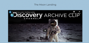
Alot of the users loved the videos I had on my website but unfourntely there was no sound. Therefore taking on board the feedback I added in videos from Youtube which had sound. I made sure to source videos which were short to cater for the attention span of primary school pupils.
The primary 2 teacher reported after the changes were the childern gave the website the thumbs up!
The things the primary 2 childern lliked were:
- hearing the famous words
- the celebration video
- launch video
- moon footage
Also I changed the video in the return tab to only start playing when the user activated it, as suggested by the primary 2 teacher.
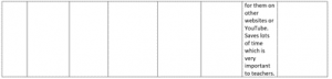
Mrs Joyce commented “It was excellent having all the video on one site rather than having to go searching for them on other websites or Youtube. This saves lots of time which is very important to teachers!!
“I have saved the websites to my favourites and intend to use the website in the future.”
Another User talked about adding in a little bit of content about “The Race to Space”. I thought this was an excellent suggestion. So I researched and found information on space race and included it on my website in the missions page.
![]()
Some of the other suggestions was add further background information about the 3 astronuats:
- Their childhood
- Background
- Images
So on the home page I added some extra information which I thought was useful.
Orginally I wanted to add 3 seperate pages, when you clicked learn more it would to take you to a different page but webflow would not allowed me to add extra pages under the basic membership. I tried upgrading but membership but it wouldn’t allow me to add these pages.
Overall, I am happy with my final website design and I gave my best effort. I feel it meets the needs of my target audience. I was aware from my first questionaire that primary 4 and 7 school pupils did not want long pargraphs of information but wanted important information, colour with interactive elements such as videos, images and buttons to make it fun and educational. They wanted to learn all about the Apollo mission in their 25 minute class time tabled in the ICT suite.
I feel listening to the feedback from pupils and critque from kyle, my website has improved. I feel it flows better and tells a excellent story of Apollo 11 mission. Hopefully the pupils have learnt a lot of information from my website which they can share with their friends and family. I feel I kept the layout professional and brought a fun and educational vibe to it.
Mrs Joyce Primary 2 teacher said “I have saved the websites to my favourites and intend to use the website in the future.”
It was great to hear the postive feedback and that the website will be used by pupils and teachers wanting to educate their childern on the Apollo 11 Mission.
Pocket Profile- Giorgia Lupi (IXD304)
Giorgia Lupi is an award-winning Information Designer based in New York since 2012 and who works for Pentagram. She was born 1981 in Italy. From a young age she collected and organizing a range of items into folders according to size, colour and dimension. She is also a former co-founder of Accurat, a research and design company are.
She received her Master’s Degree in architecture her Doctorate in Design in milan where her main focus was on information mapping.
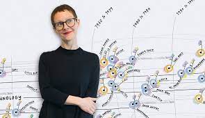
She helped write “Dear data” and a collection of hand drawn visual data. A lot her work can be found in Museum of Modern Art. She received multiple awards for designs and books and this is inspriational.
She is well known for creating visual data and storytelling techniques. During lockdown over 2020 she created a visual data poster which represented what she did before and after Covid19.
Reflection
I thought her work was very interesting and inspritational. It was good to find out about her.
Article-The Dribblisation of Design- IXD304
In the world of product and interaction design is a lot of exciting things happening. From their research they discovered too many designers are designing to impress their peers rather than solving clients’ problems. Interaction and product design should focus on the needs of the client rather than the design. A lot of products may a appear great to the eye but doesn’t mean they necessary work properly. Product and UX designers should consider trying to solve everyday issues that people face which will help make a different to their life’s. Dribble can be a useful medium showing colour palettes, icons, and images, etc. People can use for inspiration. Although of a lot of the examples may look similar. Doesn’t matter what software you use the styles are the same.
The Most important product design work is usually the ugliest.
The best piece of work is where the designer shows their thought process. For examples sketches, diagrams, strengths & weaknesses, solutions, prototype work, etc.
The worst is where flat images are used, pdfs of your work, no context, no indication how the problem is solved. The images may look great on dribble but not in the real-life product.
Redesigning other people’s work is pure folly. Many brands are being updated. But there is no explanation why and their process behind it.
Although making products look nice is a great skill but doesn’t necessarily make you a UX/product designer. UX and product design focusing on user’s needs.
Product design involves the company’s
- mission
- vision
- architecture
Design is multi layered process:
- Outcome
- Structure
- Interaction
- Visual
Designers should consider on 4 layers.
Designing systems will matter more and more as the web permeates everything.
We need to evolve with the technology as it is everywhere.
Reflection
I think this article is interesting and I will consider the different layers in design for UX.
Usability Testing- IXD304
Usability Testing
I carried out usability testing in a local primary school. I targeted 3-year groups as this was where I had carried out my research on what pupils and teachers were looking for from a website on Apollo. The 3-year groups were Primary 7, Primary 2 & Primary 4.
I wanted to test their experience using my Apollo Website and find out their thoughts and how it could be improved. I wanted to make sure my website met the needs of my users as my design was centered around them.
The Primary 7 and Primary 4 Pupils used their time in the computer suite/library session to evaluate and feedback on my Apollo Website.
Primary 7 and Primary 4 pupils took time to view, browse and fill out an evaluation sheet some added further comments. The Primary 2 teacher used the interactive white board in her classroom to browse and allow her class to view the website.
My target audience for Apollo website was Primary school pupils, I had alreadly carried out a questionaire what they were looking for in a website on the Apollo program.
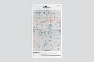
Now was the time to test my website and find out their thoughts and opinions. I decided to test 9 users and ask them to reflect on my the website. The 9 users consisted of four Primary 7 pupils, four Primary 4 pupils and one Primary 2 teacher. I put the results into a table with their comments displaying their feedback. I’ve also scanned their written feedback showing their thoughts and comments on my questions and asked my users for suggestions of what they would like the designer to add or any further comments.
Click on the link below to see the Usability testing in full.

Below you will find the actual feedback from the P2 teacher Mrs Joyce and the Primary 4 and 7 pupils. I have scanned their feedback sheet which I composed.
Mrs Joyce Feedback on Apollo Website
Reflection
I thought the usability testing was very helpful and I appericated all the Pupils and Teacher comments. It was great to receive postive comments and their overall experience of using the website was good. I pleased to hear that the Primary 2 Teacher has saved my website to her favourites and intends to use the website in the future. I was delighted to hear that the childern in her class give the website in the class the Thumbs Up.
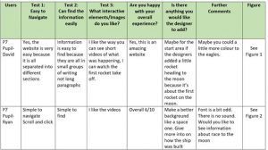
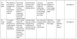
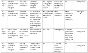
By completing the usability testing I will hopefully to able to reflect on the pupils and teachers comments to further improve my website and solve any underlying issues. From the feedback of the primary 7 and Primary 4 pupils, generally they felt that the website was very good and well sourced and the short videos showed the actual events happening but 80% of them felt that the videos needed sound.
P4 Pupil Ben stated succintly “I like the videos but if there was sound it would be better.” So he went on to suggest the that I add a wee bit more information and sound to videos.
Other Pupil Ryan suggested that “He would like to see infomation on the race to moon included”
Another P7 Pupil Dara noticed that “videos lag a lot and the middle of it stops” so I wanted to address this issue.
The P2 teacher noticed the videos started playing immediately and she suggested for the designer to possibly change this so that they don’t start to play until user activates them.
I will attempt to take on board all this feedback and try to add more content which pupils suggested. I would like to improve the videos by ensuring the videos have sound make changes which hopefully enchance my website.
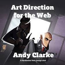
Research Art Direction for the Web- Andy Clarke (IXD304)
Art Direction for the web a video written by designer Andy Clarke. He often looks outside of the web for inspiration.
Jeffery Zelman wrote “On the web, art direction is rare, partly because much of the work is about guiding users rather than telegraphing concepts, but also because few design school teach art direction.”
In Andy Clarkes book called “Art direction for the web”, he explains what art direction means, why its important and who can do it.
Throughout the Book, Andy shows us some inspiring examples of the most influential art directors about which will hopefully inspire fellow designers to apply their knowledge to of art direction for the web.
Based on his 20 years of experience working with clients, or directors and designers.
This books three main chapters are:
- Explaining art direction
- Designing for Art direction
- Developing for art direction.
This book is also available to download on Kindle
Andy says “You needn’t have been to art school to learn and apply the principles I teach you. Just like art direction itself, they’re something which everyone — no matter what your background and current area of expertise — can use every day to improve the effectiveness of a product or website’s design.”
In this book Andy aims to teach people how important art direction is for the web and explain how art direction can help people tell stories through design.
It’s essential products and websites are designs to keep users engaged. After going through different methods, Andy explains how to accomplish this on the web using CSS.
Art Direction for the web is great book to help improve your sites by making them more user friendly and interesting and able to get your message across to your users in fun and professional way.
If you are designing products for the web this book will be very helpful and make your experience more enjoyable.
Hopefully I can use this book to help improve my web designs efficiently. I will try apply Art directions in my own work. This will in favour better my designs.
Good Idea Grow on Paper (IXD304)
I recently looked at an article which was wrote in 2010 called “Good Idea Grow in Paper” This article explains the importance of using paper to help us designers to grow and develop our idea. Paper of also the starting point of any great design. We should resist jumping onto the computer straight away and take time to brainstorm idea on paper.
A great design isn’t necessary about technique but being able to come up with a great idea.
How do we generate those idea?
Sometimes ideas can just pop into your head out of nowhere. As a designer it often consists of coming of a range of good ideas. There are good ways to help us come up with great ideas.
The must important thing is coming up with the right process.
Most great ideas start off on paper rather than the computer screen. It’s necessary to spend time coming up with a good idea it will be rather your time.
Generating ideas involves the process such as iteration, sketching and thinking aloud. These are the best methods in this fast environment.
The use of sharpies and flip chart combo is recommended to encourage generation. The tools we use can help us to quickly process our thoughts.
Key point
It’s the idea that matter not the medium.
Idea can be explained as
Input > Synthesise > Output
It’s important to put in constant input, in order to get a constant output.
Try and remain focus, trigger your brain and this will hopefully help you evolve your idea.
Many designers will have previous experience and knowledge of trying to come up with ideas. The more effort you put into coming up with an idea the easier it comes. The best ideas come after years of tired and tested approach.
They recommend writing out ideas to help in case your thinking and storing information in your mind. Scribing down ideas can help you quickly digest your info.
As well as writing, they encourage designers to make sketches as it helps you generate better ideas and think of ideas you might not have necessary thought about. Sketching is an important part of any design process.
There second piece of advice is always carry with you a sketchbook and pen. It should natural as remembering your phone and wallet.
More you use your sketchbook the better you can process ideas. A sketch room and pen allow you to survey the world around you.
“Sketchbooks are not about being a good artist, they’re about being a good thinker.” Jason Santa Maria
Learn to love old dusty buildings.
There are a lot more resources out there rather than Google such as exploring museums and libraries to increase your knowledge. They can help inspire you.
This can help set you apart from your peers.
The idea generation toolbox
Tools and techniques can hep solve the problem of blank canvas.
It’s important to be patient when coming up with ideas. Don’t just use the first idea in your head. By putting your minds together, you can come up with better ideas.
Making connections
Deciding Mind maps are a great way of making connections and generating idea visually. This involves grouping together data to see what data can be related.
The curveball
This forces you rethink your ideas and address the problem from a different direction.
This technique involves picking a card and try to address the problem in hand.
Reflection
This article is very interesting and makes you think of ways you can come up with ideas simply from paper. The tools are very useful and by following this advice in the article it can help set great designers apart.
Hopefully be looking at these techniques I can come up with a great idea.
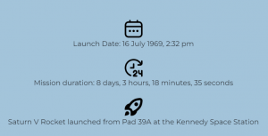
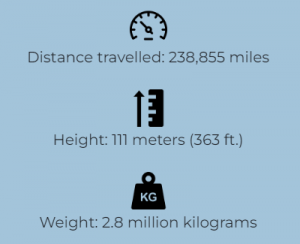
Icon Set: IXD304
Following feedback from my lecture Kyle during the final week, it was advise I added in an Icon set to my website to make my content stand out. These Icons would be added to “The Missions” page on my Apollo site.
I think be adding in Icons it will make my content and webpage more visually appealing and help to divide the content.
Below is my Icon Set:


Icons on Webflow:
Here is how the Icons look on Webflow beside my text and sentences.
I made sure the size and style of the Icons were kept all the same size to make it consistent.
Updated
For the weight and Height Icons I slightly changed them and decided to not fill in the shape to keep it accurate with the rest of them.


Reflection
I think the advice Kyle give was really helpful and I am happy how these Icons look on the website. I feel they create a visual effect In the future for any piece of work I do I think I’ll add in an Icon set to my work.
Book Research-The Design of Everyday Things (IXD303, IXD304)
The Design of Everyday Things
The Design of Everyday Things is a book originally published in 1988 by Don Norman. He is well known designers and author who has written other books. This book has been since revised and expanded upon since it was first written.
This book promotes good design and gives designers a realistic view how and why some products meet clients needs over others based on the design. The book explains how great designs can be nice to look as well as usable and useful in the everyday world. Whereas some design can be disastrous and ruin the way the product works and take the joy out of the users experience and possibly cause harm. This book gives many examples and anecdotes to back up their points.
This book is timeless and still used today by many first time UX, product and graphic design students. It’s great book and it is a must read to help you get a better insight until design of everything things. It is an enjoyable read and the author is very down to earth. He is someone we can relatable as we all get mad with bad designs.
This book will help your spark your ideas on how you can make a great design which focuses on the needs on the user.
I hope to find other books written by Don Norman which I can read to further my knowledge.
The key point I’ll take away from this book is that when designing a product, it’s important to meets needs of our audience.

