Mental Health Illustrations
I also researched a number of mental health illustrations to see how they presented the various mental health disorders. The above outcomes are a variety of outcomes I found that I thought captured mental health effectively. I love the illustrative style and colour palette of the top left outcomes. I have also included the bottom right illustrations even though it wasn’t related to mental health as I liked its style and the idea of incorporating a backdrop behind my illustrations as seen here.
Before creating my own outcomes I wanted to take a look at a couple of illustrators to draw inspiration from. I have also created a Pinterest board of examples I liked.
Chris Markland
Chris Markland is an art director and designer based in London. I found Markland’s work through his illustrative and animated outcomes for Headspace.
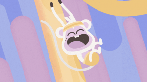
Above are two images taken from Headspace animations, the first is taken from a set called Changing Perspectives and the second is taken from a set of illustrations called Monkey Mind. I love the soft colours and playfulness of Markland’s work in these outcomes and was keen to see what other projects Markland has worked on.

Above is a graphic from Slapstick an app that allows users to use their cameras to apply animation stickers to their camera view. This is a really fun one and one of my favourite animations includes this little horse in heels. I really like the bold stroke and colours in this outcome and the use of elementary shapes resulting in a playful and memorable outcome.
I also wanted to look at the geometric outcomes above as I love how Markland has created really interesting patterns from shapes. As mental health doesn’t always have clear visual representations I’m a little concerned that my infographic will lack engaging illustrative elements. However, including patterns like the ones displayed above could provide nice backdrops or these patterns could be used to draw the users attention to particular facts I want to highlight.
Jerome Damey
I also wanted to look at a designer that created illustrations of people as I like the idea of having illustrations of people included in my infographic to present the Mental Health disorders that are included. I found some beautiful minimal outcomes my Jerome Damey, a Seatle bases illustrator, brand and graphic designer and animator.
Above is an outcome called Morning Routine. Damey talks about his goal in creating the above outcome and rather than focusing on the scene he wanted to present an atmosphere or mood. I feel he has really achieved this in his outcome as love the texture elements and calm colour paled and well as the smooth covers and curves used throughout.
In relation to the outcome above, Digital Detox Damey talks about the tendency we all have to spend too much time on our phones. This illustration targets health habits and I love it. I love the scene created and the mood it established as well as the way Damey has played with the proportion of his illustration using a small circle for the head, no neck and large hands.
I also like how in both outcomes Damey hasn’t included facial features. For some reasons in these instances, I feel like it adds to the scene of calm in the scene, perhaps as it adds to the overall minimalist feel of the outcome. This is definitely something I want to experiment with in my own work.
Sketches
I began by drawing out the 5 main concepts I wanted to create digitally each one representing a different mental health disorder that would be included in my infographic.
Overall I was quite pleased with these outcomes however I do feel I relied quite heavily on how others depicted the disorders as I wanted to ensure that what I was creating would be an accurate representation of the disorder I wanted it to reflect. On reviewing my illustrations I now think it may have been helpful to draw out a few more variations of each and experiment more with styles in order to create a more original outcome.
Illustration outcomes
This resulted in the above outcomes I drew elements such as the coloured backgrounds from inspiration gathered in my original mood board. I also wanted to make sure that I included both men and women in my illustration to ensure I didn’t exclude either gender. Overall I am quite pleased with the outcomes however I do feel they might be lacking in originality and would like to continue to develop my illustration skills, particularly when creating people.
What have I learnt?
- It is always helpful to explore new designers work and learn from their approaches.
- Patterns can be found everywhere and the use of elementary shapes are the building blocks of illustrations.
- The right colour scheme really impact the mood created by a piece of design.
How can I apply this to my work in future?
- It Jerome Damey’s illustrative approach to creating an atmosphere rather than focusing on presenting a scene. This is something I would like to experiment with in future.
- It is always a good idea to explore variations at the sketching stage and this is something I intend to do in future.


