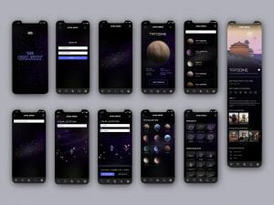
Above are all the screens I have created for my prototype of the Star Wars travel app The Galaxy. I am really pleased with the outcome as a whole and would be excited to continue with the design and development of this app.
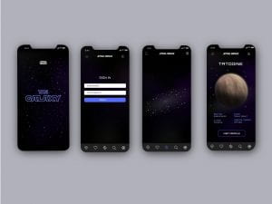
The above screens are the first four screens a user will be met with on opening The Galaxy App. To transition the user from the title screen to the sign-in screen (the user will skip the sign-in screen once they’ve signed in and move straight to the galaxy view screen) if the app were to be developed I would want the title to reduce in size disappear and then a warp speed animation to run. Again if further prototyping was to take place or the app was to be developed I would want the user to be brought to their user profile following signing in. From their user profile, the user would be able to select a character icon that would then appear in place of the profile icon at the top right-hand corner of the screen. I would also like to give users the option to pick a side and change the colour scheme throughout the app from either blue to green or red.
When the user lands on the galaxy view screen for the first time (shown above third screen from the left) if I were to continue the prototyping process it is at this point that I would include onboarding notifications. These notifications would highlight the functions of each navigational options and a short gif of the galaxy view screen being zoomed in on and a planet selected would also appear. I would also provide the option to skip through the onboarding process. If the app were to be developed I would like the user to have the option to zoom in on the galaxy view (as presented in my development) and have the names of the planets appearing as they come closer into view. I would also like to have a single tap option that would apply an anchor point to the planet in order to allow full 360° rotation. A double-tap on a planet takes the user to the planet overview (screen presented above far right)
This screen provided the planet name, some basic facts about the planet and a close-up view of the planet that if the app were to be developed I would like to rotatable also. By clicking on the view profile button at the bottom of the screen the user will be brought to the planet profile page which I will discuss later.
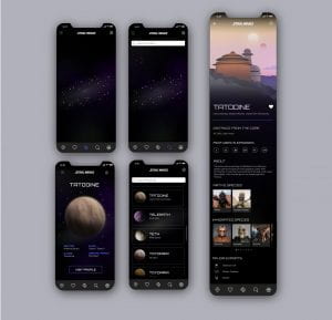
The top left screen presents the search screen which can be navigated to from the bottom bar using the search icon which is then highlighted in blue when selected (I would also want a dark themed keyboard to appear at the bottom of the screen at this point). The search option allows the viewer to search for a planet in galaxy view when they can’t find the planet they are looking for. I found this to be a continual problem for me when I was looking at any Star Wars galaxy maps and therefore think this is a really helpful and important function. When they have typed in the planet they’re looking for and hit return/find they can then view the screen presenting an automated zoom which brings them to the planet they are looking for. This view would be the same in providing an anchor point on the planet allowing full-screen rotation from this point as with single tapped planets. To view the planet overview again a double-tap would be required.
The second screen from the left is the screen the user is brought to after selecting the hamburger icon at the top lefthand side of the screen. This screen presents an alphabetical list of planets that can be scrolled through and a search option that narrows the below list e.g. once the user type in a letter only planets that feature that letter appear. This function has been incorporated to help users than cant remember full planet names to locate the planet they’re after. On selecting a planet from the list the user is brought to the planet overview and from there can go to the planet profile.
The favourites screen (shown above third from the left)can be navigated to using the heart in the bottom navbar. This lists all of the planets the user has selected as a favourite on the planets profile page. The user can select planets from this view also and be brought to the planet overview and then planet profile.
The rewards page (shown above far right) displays the badges and spaceships specs the user has been reward with as they use the app. If the prototyping process were to continue on this app I would like to develop additional information pages on the badge symbols and spaceship specs. For the spaceship specs, I would want to create a highly detailed, beautifully presented data visual that would break down the mechanics and scale of the ship to add to the desirability of the reward.
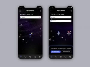
The location icon displayed at the far left of the bottom nav takes the user to the your location page (above left). This allows the user to log their location and track the distance between planets as well as add stops to their journeys (see above right) and have each stop tallied providing a breakdown of the distance between each planet and a total distance for the full journey. If the app were to be developed I like the idea of experimenting with a slightly more interactive experience here and have the app provide feedback with additional information about the journey e.g. characters that completed the same journey and in what film/ episode.
Finally, above I have included the planet profile page for Tatooine (the four screens to the left have already been reviewed). The planet profile page opens with an illustration of a notable location from the planet. It then details information about the planet including distance from the core, episodes featured in and native species. The information has been broken up using slide options, images and icons. The option to add the planet profile to the favourites page can be done by selecting the heart beside the planet name. When the planet has been added to the user’s favourites a confirmation notification appears on the screen and the stroke heart icon is filled white as shown in the example above. If further prototyping were to take place I would also like to make the species selectable allowing the user to view species profiles as well. Note dots have been used below slide menus to inform users how far along they have scrolled.
I am really pleased with the above UI designs and the over concept ideation for this app. This has been one of my favourite projects to work on to date. I am happy that I have effectively targeted and catered for my target audience, Star Wars fans and Star Wars newbies in my virtual travel app. I have loved considering the navigational and functional elements of the app with the hope of generating an outcome that is focused on the user’s experience and enhances their knowledge and understanding of the Star Wars Galaxy as they travel virtually through the Star Wars The Galaxy app.
What have I learnt?
- It’s important to use the target audience, user experience and function of an app to inform illustration and icon styles as well as the overall UI development.
- The onboarding process is an important part of the UI and this is something that it can be helpful to run through properly by providing visuals to make the steps and design options clear.
- Using a combination of illustrations, icons, images and text lead to a really nice balanced UI design.
How can I apply this to my work in future?
- When considering the design and the function of an app right from the research stage of a project I will keep my focus on my target audience.
- I will actively try to make time for the prototyping on the onboarding process on future projects as this links to the usability of the app and will also make explaining how the app works much easier.
- On reflection I think the onboarding process could be used to prompt actions by the user rather than simply explaining what selecting an icon will as this will encourage the user to engage with the UI. This is something I would like to explore further in future projects.


