


I am super happy with the work I was able to complete. I’m very happy with the cohesive feeling of the set of photographs and I feel it conveyed my story well!
^ My main video, based on the word “Bonding”
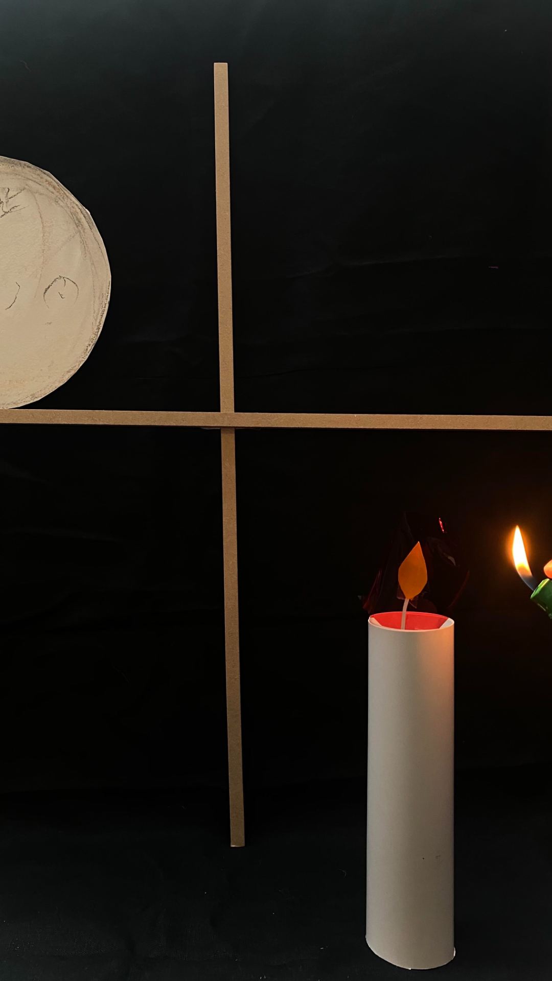
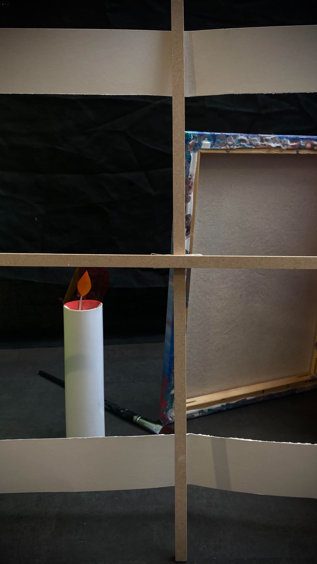
^Based on the word “Destruction”. If I had the opportunity I would remake this video. I really like my basic concept however, I would prefer to better the execution, i.e., darkening the lighting, removal of the baseboard, better framing, ensuring the ball is stuck down, etc.
^Based on the word “Waiting”. A play on the phrase, tea time.
^My final and favorite video was created, based on the word “Watching”. I really love the feeling that this one conveys. I feel it’s a juxtaposition between the feeling of comfort found within childhood videos, crossed with an uneasy feeling conveyed by the loud white noise, set design, and lighting from the TV. If I was to redo my project, I would love to explore this video more as I really feel it’s a great candidate for this type of work!
^Based on the word “Waiting”. Although I do like the above video, it was created before I was in complete understanding of the task. I later found that still videos work better for this type of project. I also would redo this and include more objects within.
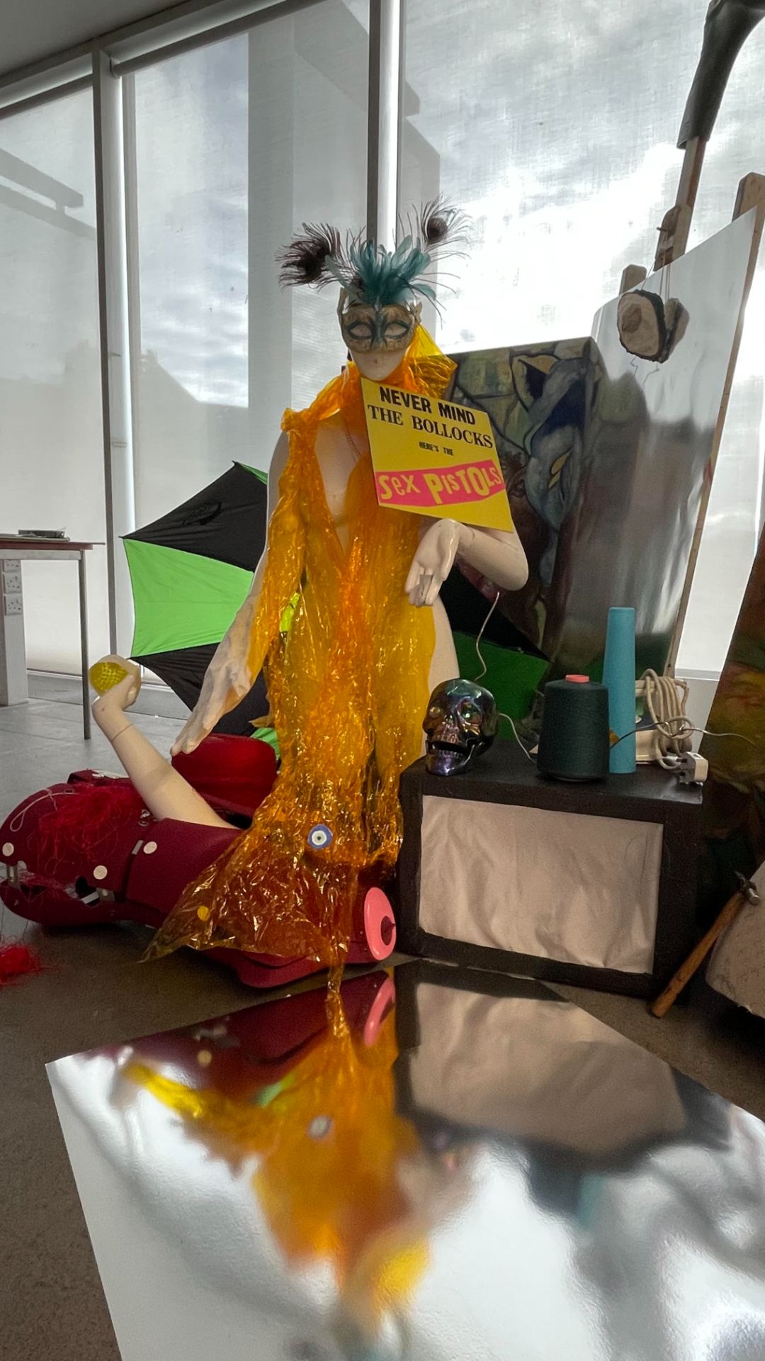
MY FINAL WORK!
^I am very happy with how my end project turned out!


Below are links to the completed self reflection for the completed unit!
^included as it did not upload correctly for the last submission!
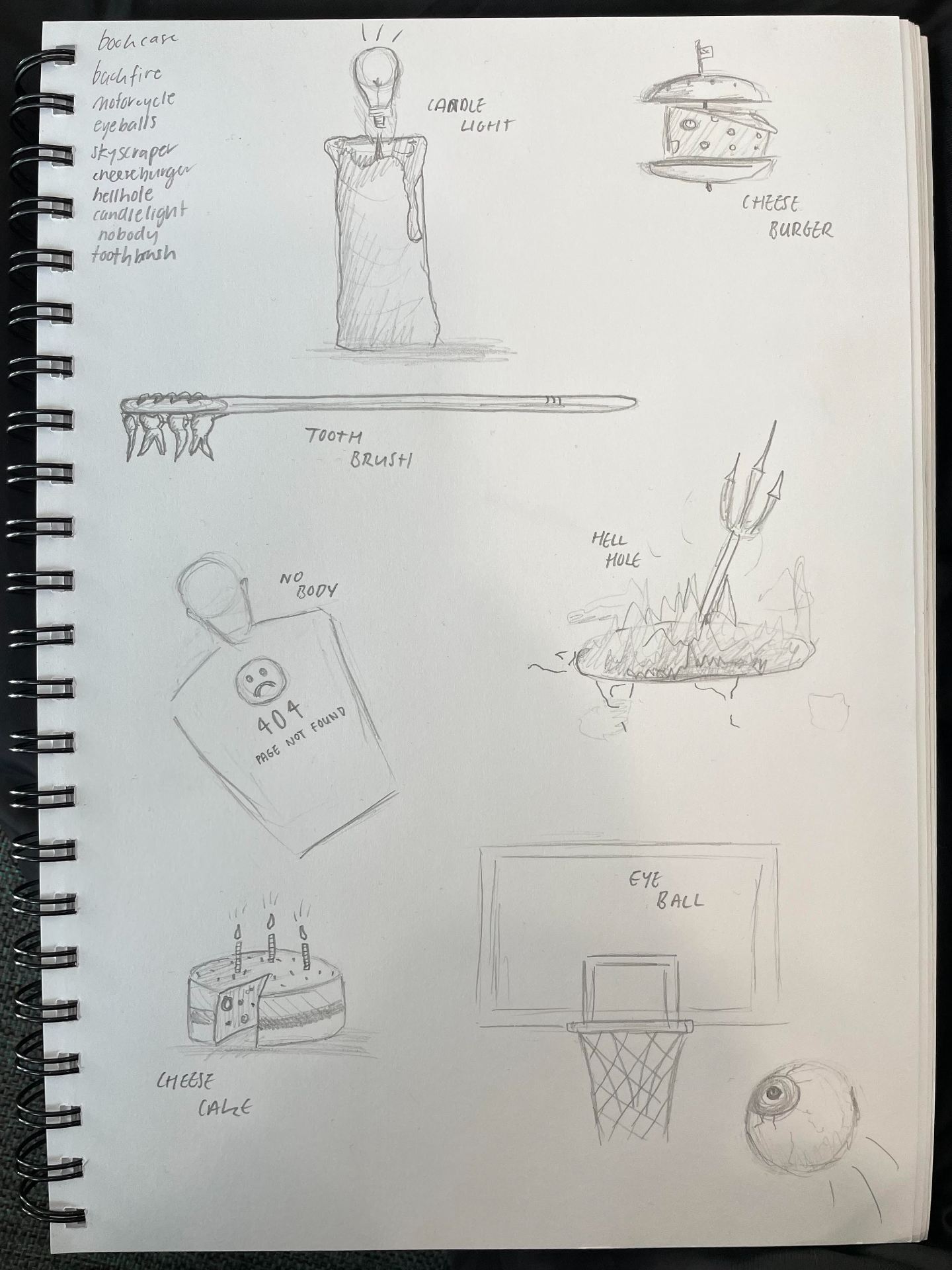
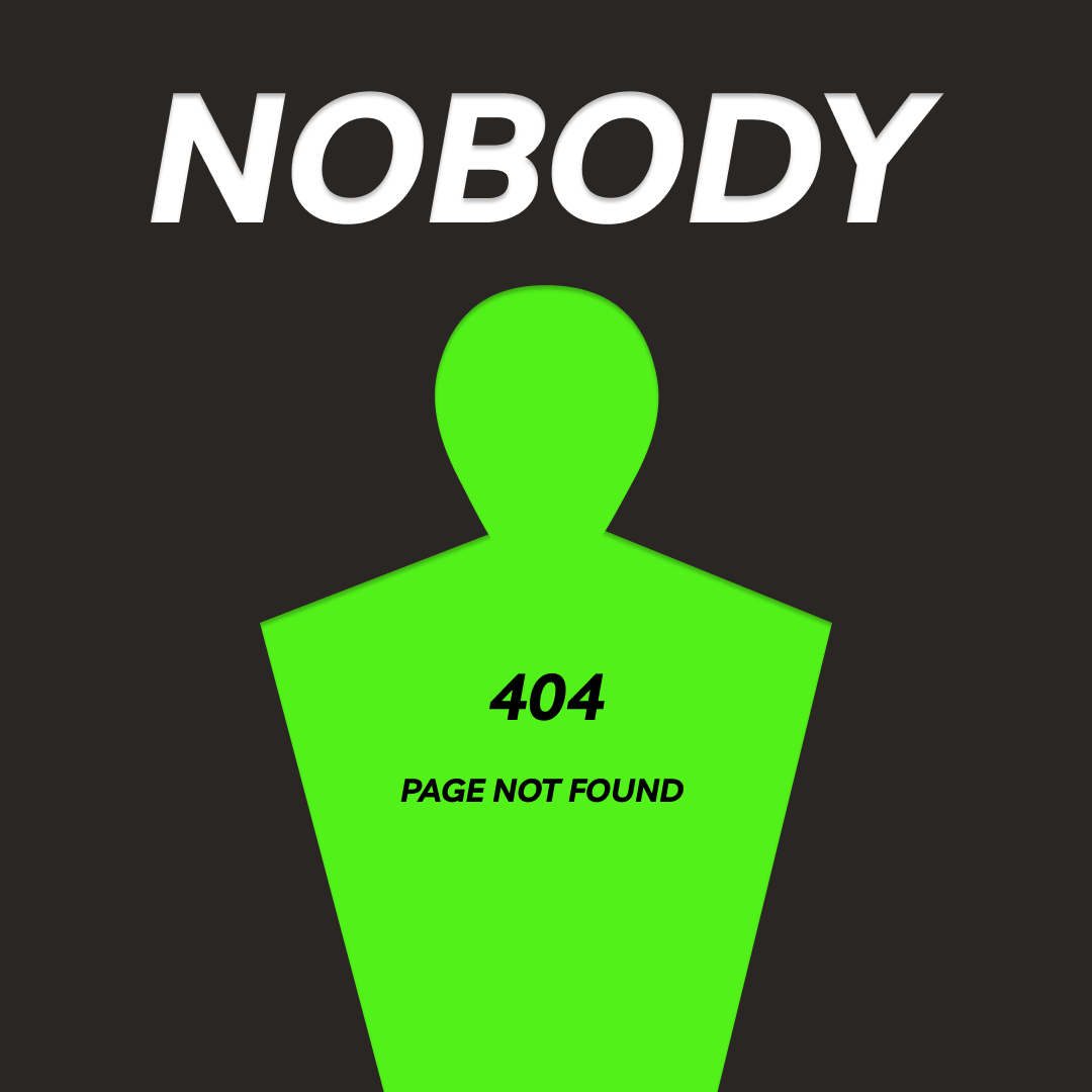
^Main contextual research for my Digital Design workshop
^Practice sheets

Find below video attachments to the work I completed during our animation workshop! I thoroughly enjoyed this class. If I was to do it again I would love to spend more time learning how to perefect my animations. Although I’m happy with my outcomes, I would love to better my technique to make them more fluid and clean!
^my research for my animation class!
^final product of my 3D animation work
^work in progress of 3D animation – no distortion to the shape added yet
^ quick work on creating a 2D animation of a bouncy ball
^ 2D animation – learning how to increase/decrease speed via changing how far the object moves frame by frame
^final product of the 2D animation with distortion of the circle to add character, movement and fluidity
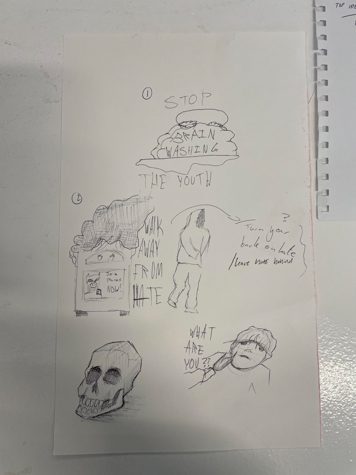
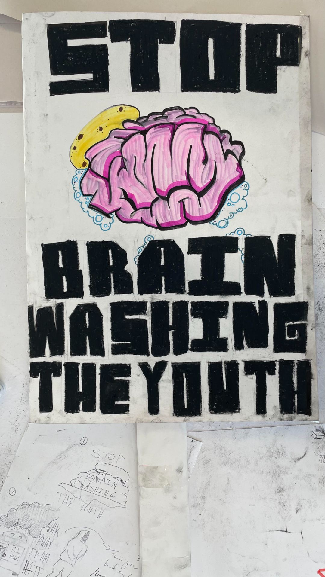
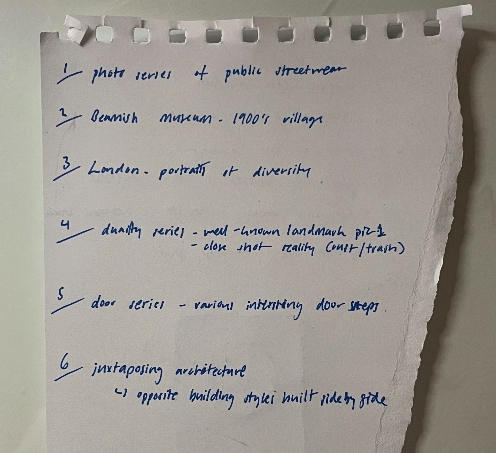
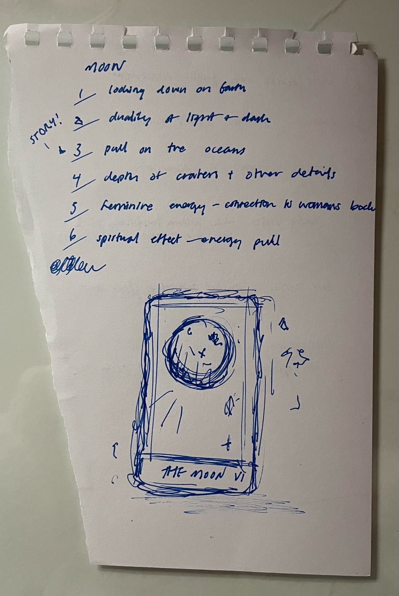
^my initial research into how protest and graphic design have interacted historically and into the modern age