Category: VISUALISE [2D Creative Practices]

Fine art final piece

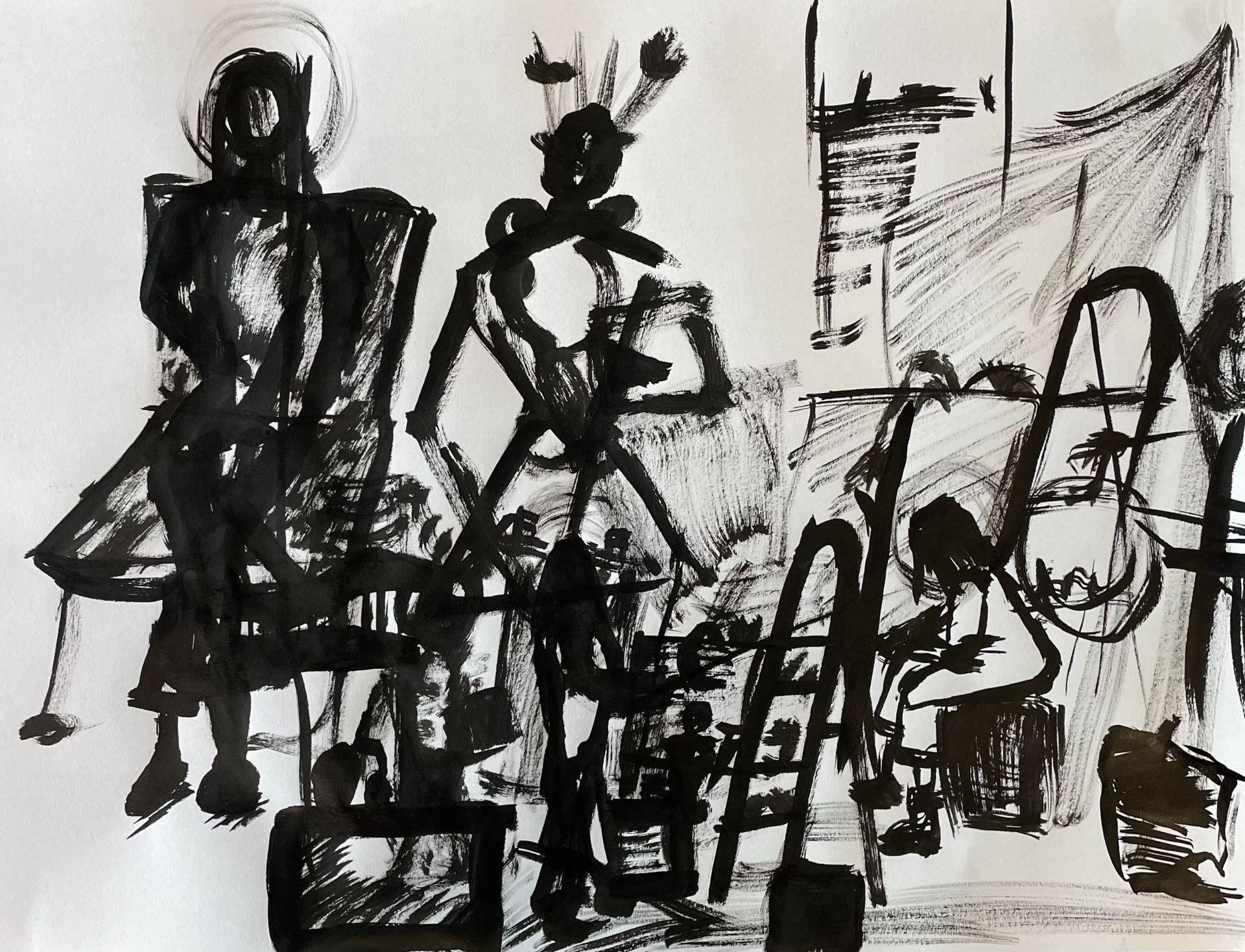
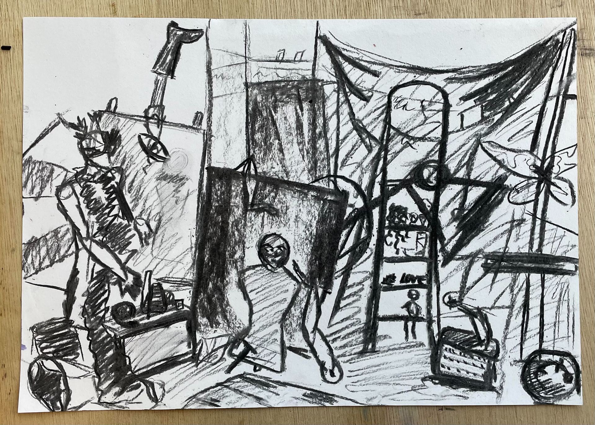
For our final two days in this workshop, we were tasked with completing a final piece. I really wanted to challenge myself. Therefore I picked a medium I have very little knowledge of or experience with – paint.

For this piece, we were tasked with keeping to the theme of transformation. For me, I interpreted that as transforming various elements of work created over the last couple weeks to create one big project. For this piece, I used mainly paint, mixing my own colour to allow for a more rounded feel. I am very pleased with my final outcome. Obviously, if I had more time I would have been able to edit and reconstruct more elements of my work but for what I was able to complete I am satisfied with. I am also happy I took the risk of building upon my piece by adding more abstract work overtop. Although I was very hesitant to do so in fear of it not feeling as polished or well executed. I feel it added some much needed depth and visual interest to my work, also allowing for less pressure to be placed upon created a ‘beautiful’ outcome, but instead one that pushed boundaries and showed use of various techniques and ideas!

^ My work contains elements from my work created over the weeks. The top left part of the piece is a painted section depicting my favourite piece of material I used during the print workshop. The feathers painted behind the mannnequin is a reference to my collage work. The mannequin itself is taken from our assemblage. I used a yellow ochre colour to sketch it in and added details using oil pastels to add dimension and visual interest. The halo of paintmarks is a reference to the draping I studied on our life model on the day i tried gouache for the first time. The gecko sticker painted on the top right is another piece from our assemblage. The more abstract yellow ladder overlay is a nod to my collage work. The same is said for the orange overlay which is to resemble a cutout of the second manneuquin cut from orange, marble paper. Second to last is the pink sqaure. This was inspired by the original assemblage where the mannequin central to my work held a record. I later interpreted this as a pink graphic cutout during my collage work. Lastly, the TV in the bottom left refers to the TV found within our assemblage titled, “Let them eat cake”. Within the TV, I wrote a short quote from an article that discusses this quote and its origins. I wanted to do this so that from a distance, it comes off as TV static!

Photography – session two – photobook


PHOTOGRAPHY RESEARCH

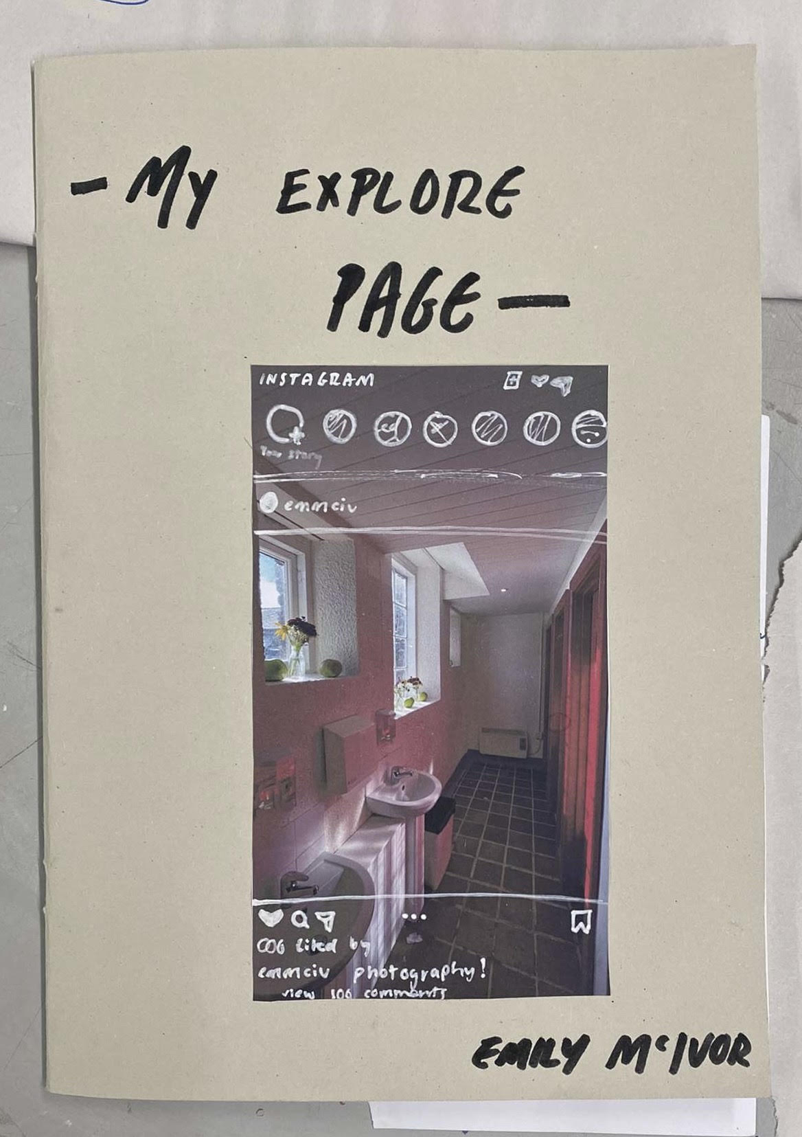
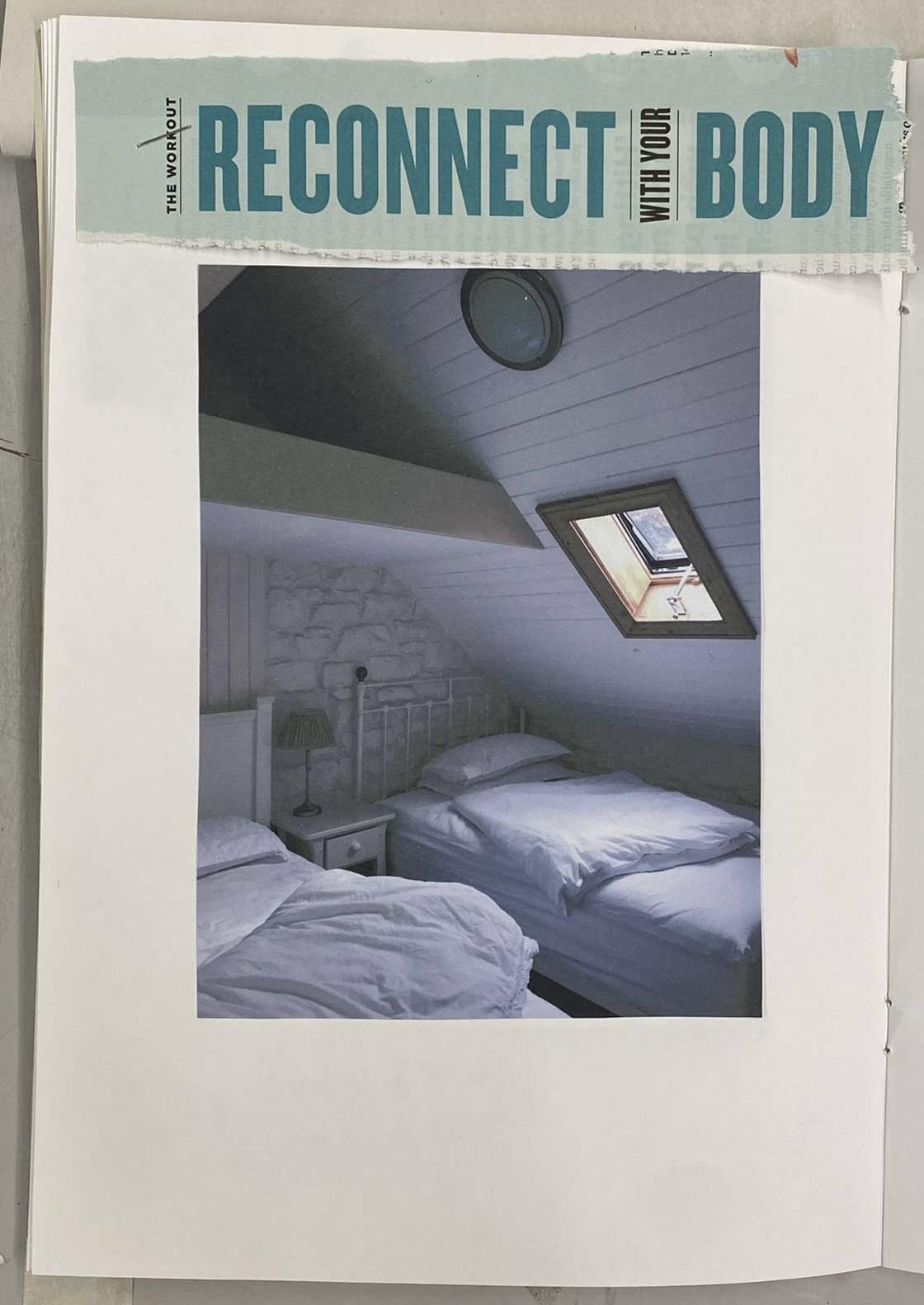
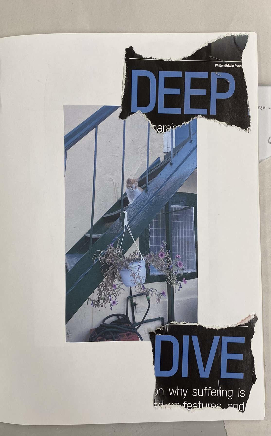
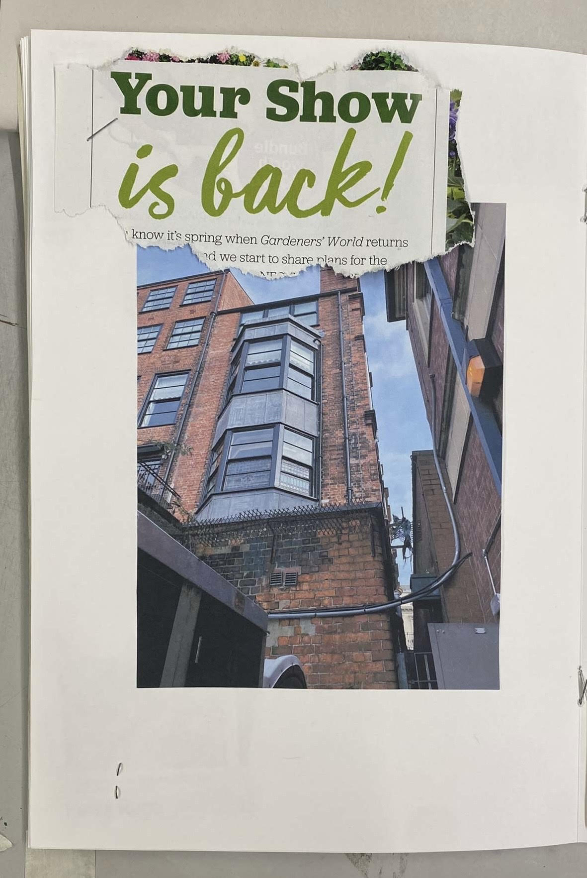
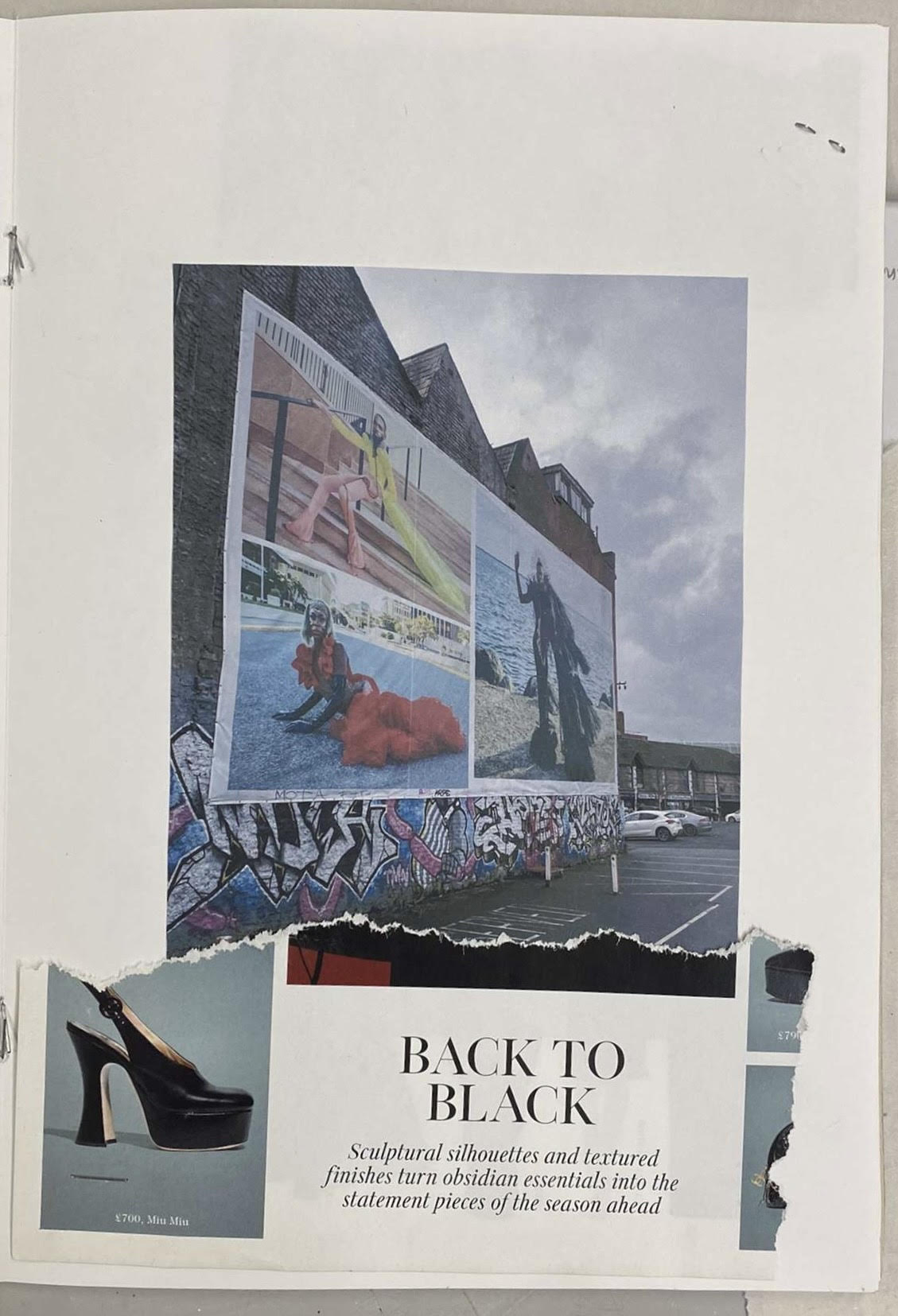
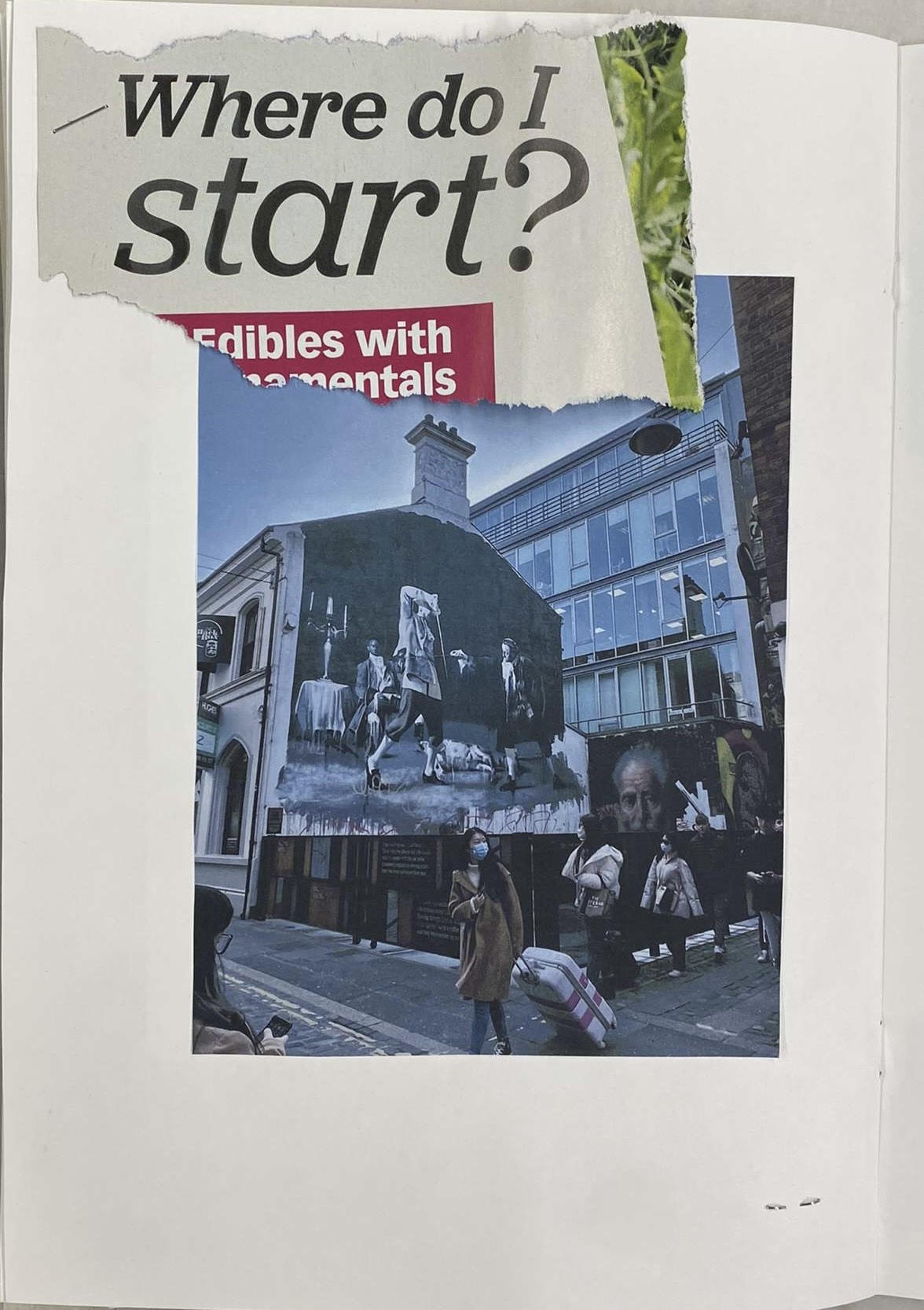
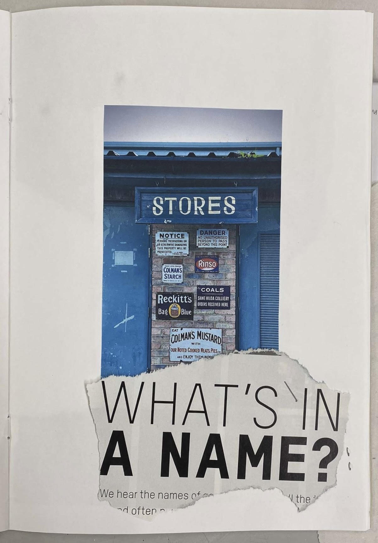
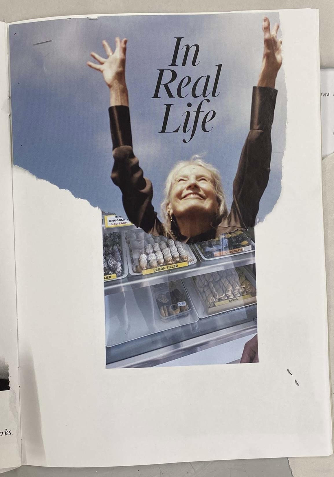
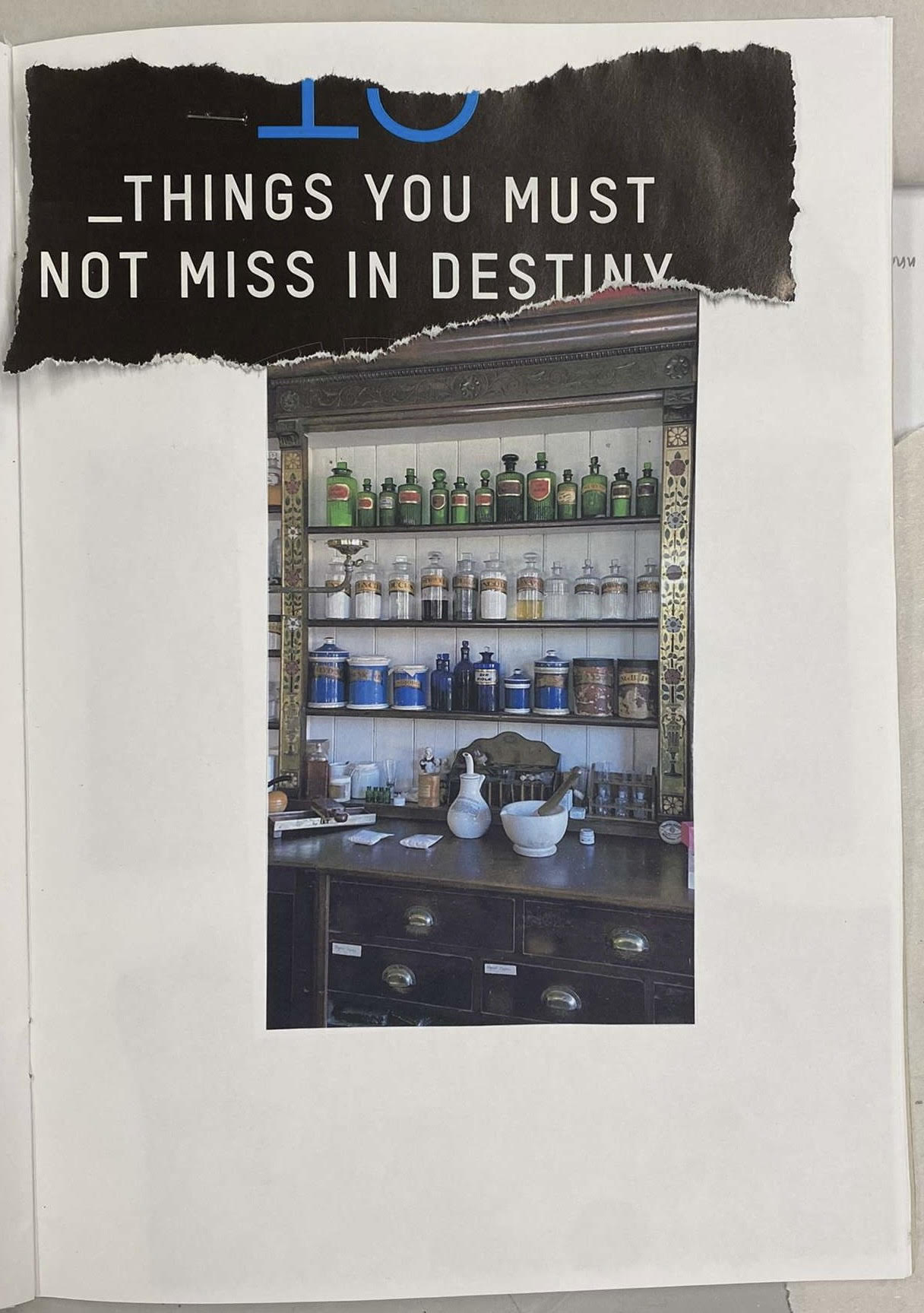
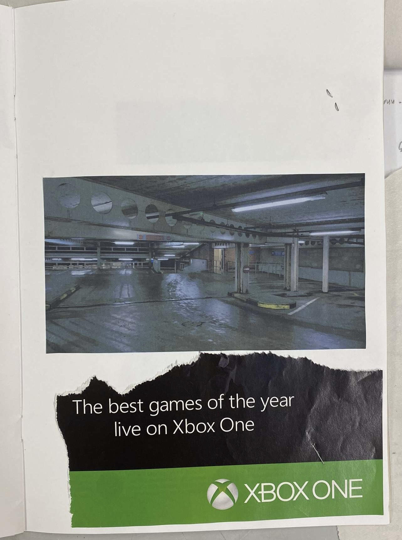
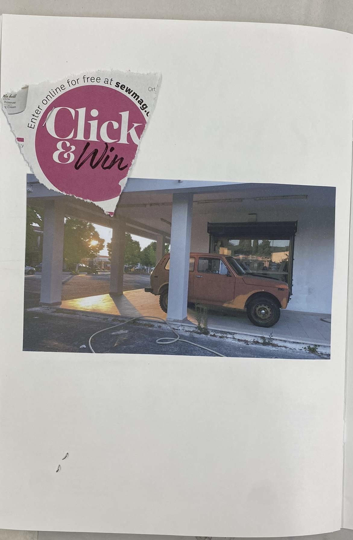
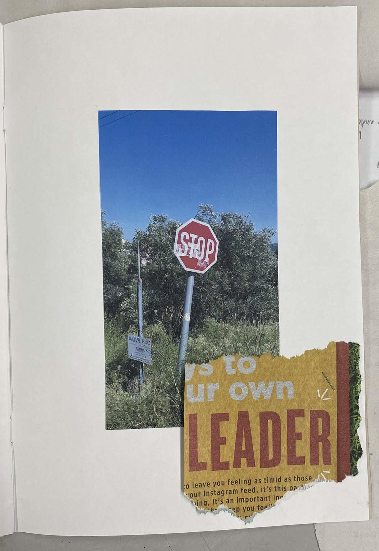
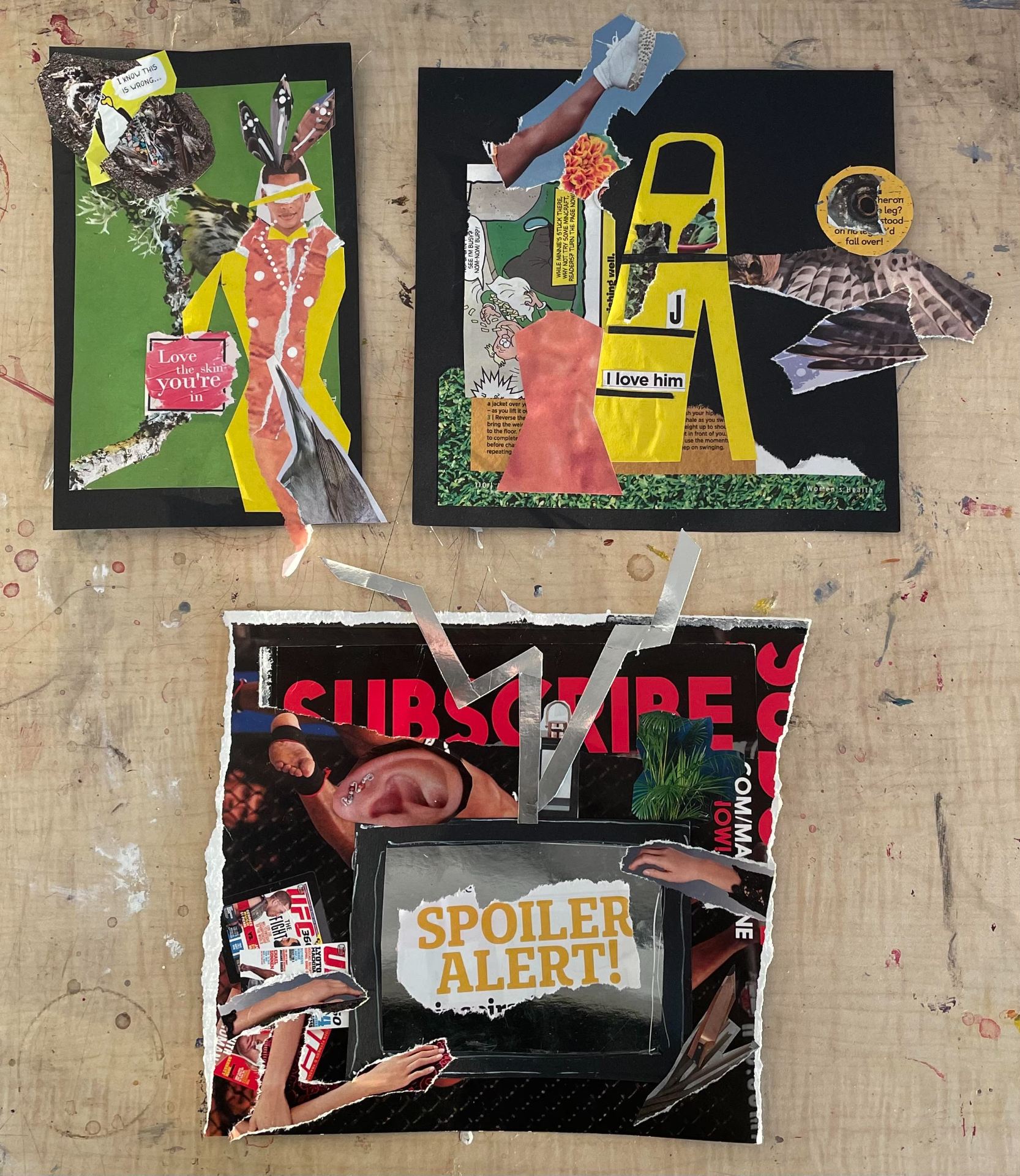
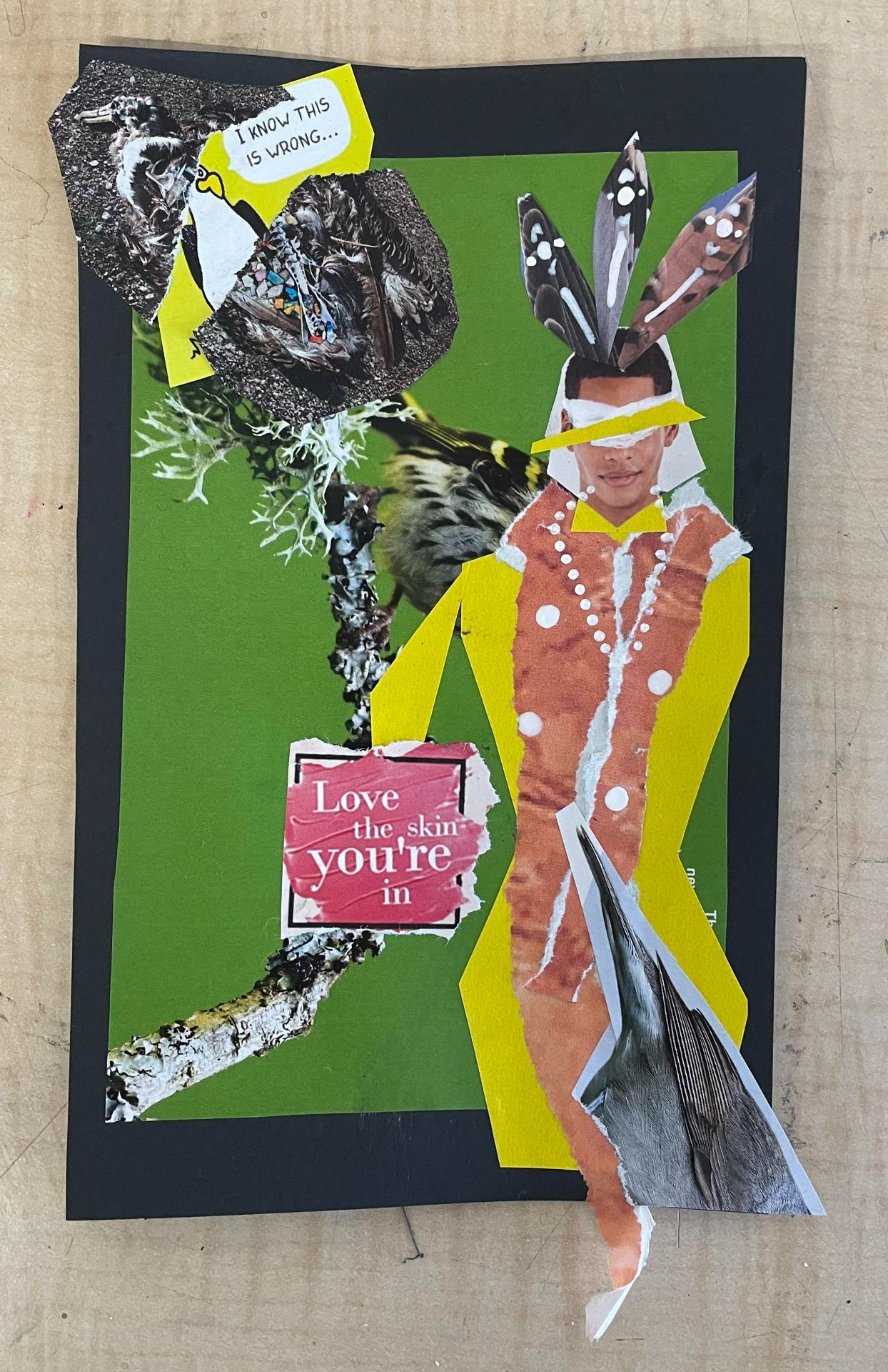
Below are photos taken on my photo book titled – My Explore Page. This book is themed around the huge difference between posts as you scroll through your feed on apps such as Instagram. It explores very different subjects and different topics. I have added excerpts taken from various magazines that i feel connect to the images and the overall content on social media in general. I am very very happy with my work. If I was to do it again, i would 100% of got my photos printed professionally to allow for more definition to my photos, and a overall better viewing experience.

Gouache and Ink work

My 30-minute gouache study using the assemblage and life model. I’m very happy with how this turned out. As we were instructed to try to capture how the projection influenced the image we could see, I decided to go with a blue/green colour scheme to reflect the main projected colours. During my painting time, there were many small flashes of red from the projection therefore this was also reflected in my painting. I decided to go with a sort of angelic/historic/regal theme for my work. This decision was informed by our life model’s choice of clothing – an all-white, draped garment that flowed softly and gathered around her neck and arms. I also made this decision as, to me, her positioning on the chair, central to the assemblage, with her head laid back, reminded me of the process of monarchs getting their portraits done. This also influenced the use of gold throughout my work. I was super happy with my outcome and concept as having never used gouache before, I was very apprehensive.
My 15 Minute gouache study. Although I do like this work, I really struggled with it as I had never worked with the medium before. It was only about halfway through that I started to understand the way in which I could use it to achieve the best outcomes. If I was to do it again, I would pick a tighter colour scheme for more cohesion, and also utilise more space on the page by releasing focus on details in a short time frame.
The page above contains my 3, 5-minute studies using Indian Ink. I really started to get into this medium by the end of the sessions, and i would love to experiment with it more.

Print work

My first go at print. The basic idea of replicating the TV from the assemblage was created using a pencil and a fine toothcomb.
My favourite print I created. I really loved experimenting with what effects different tools could make.
A concept based on an image I took for the photography portion. It was interesting incorporating text as it all had to be written inverted.
Work inspired by the charcoal work I previously completed that focused more on the shapes of the objects. Cake included as a nod to the name of our assemblage.
A more realistic sketch of our assemblage based on one of the photos I had taken.


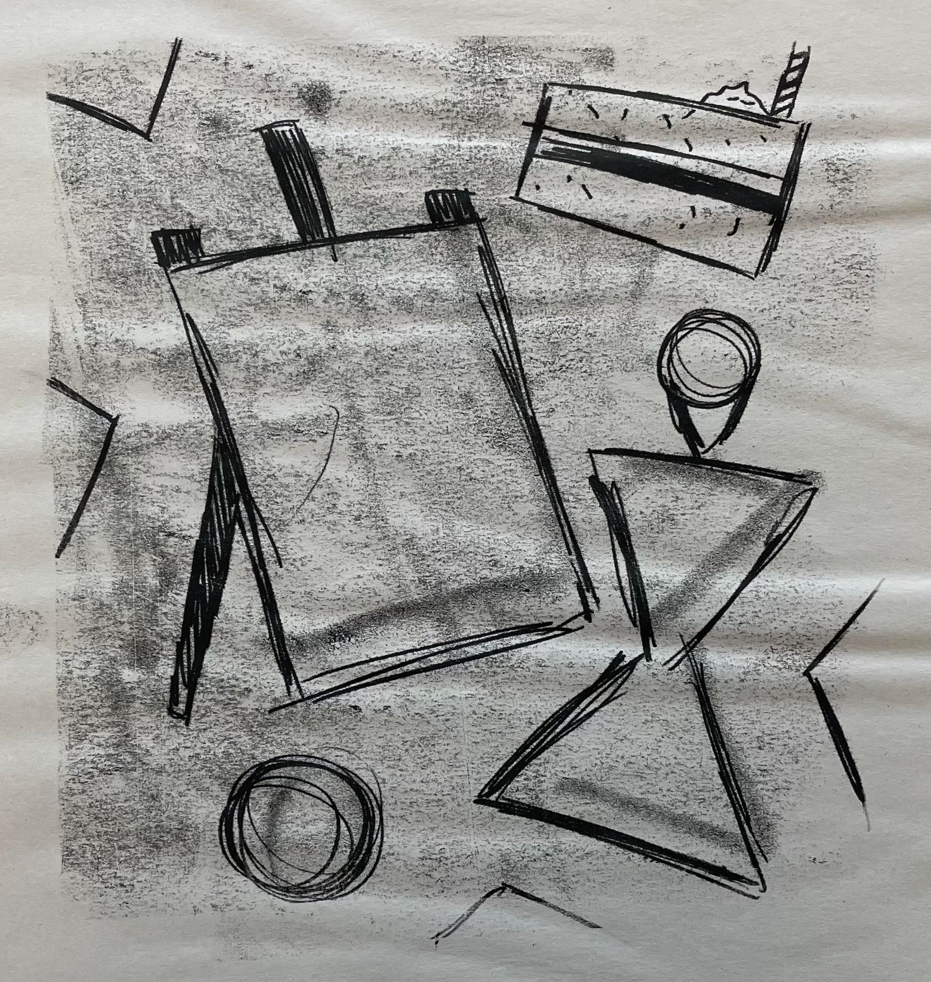
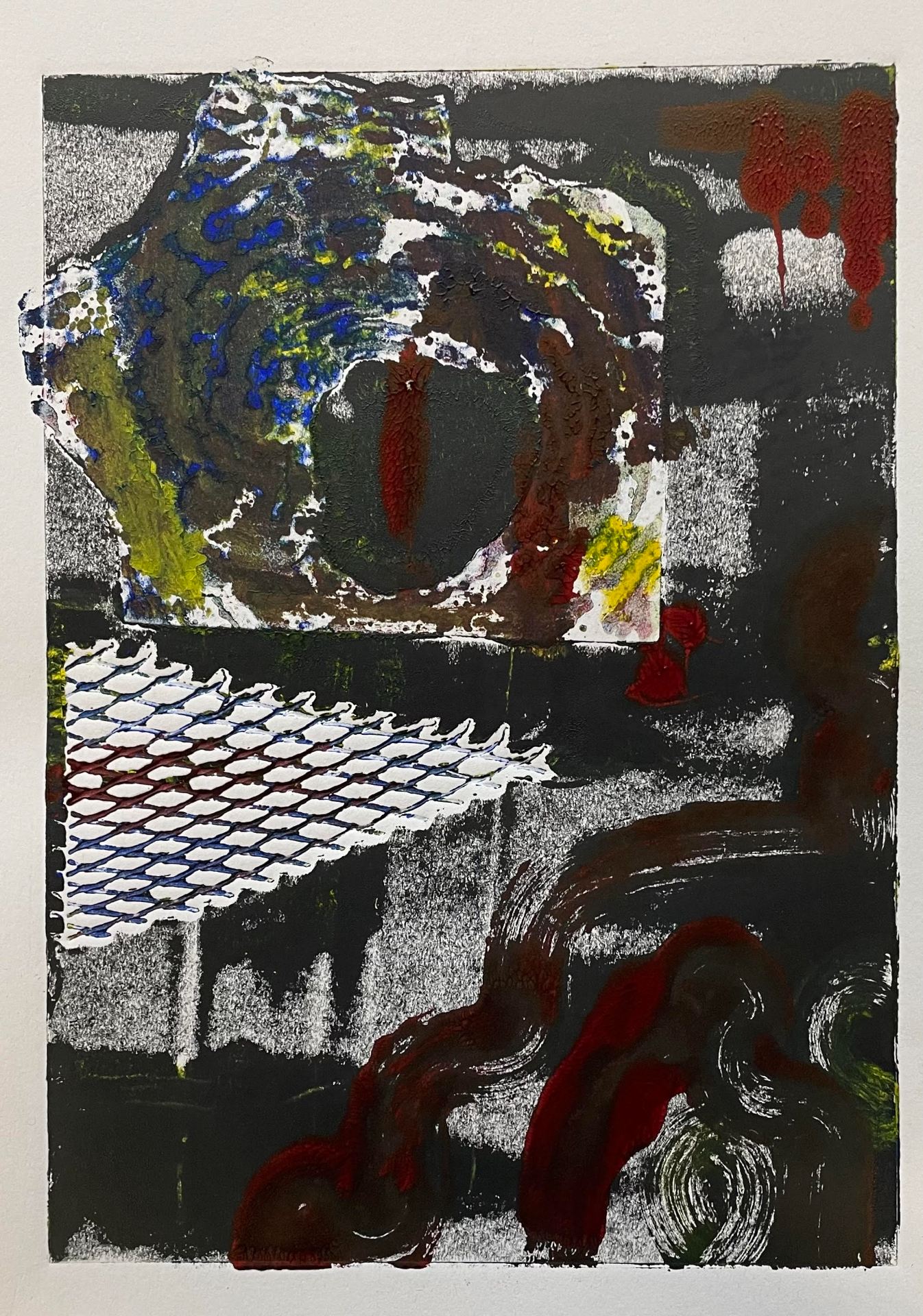
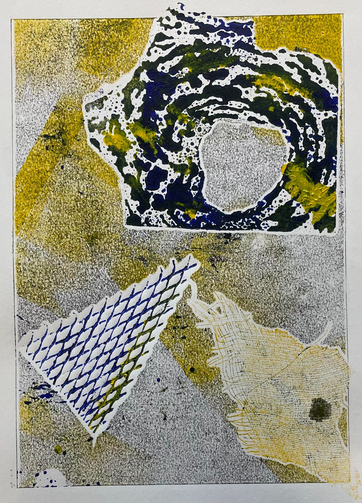
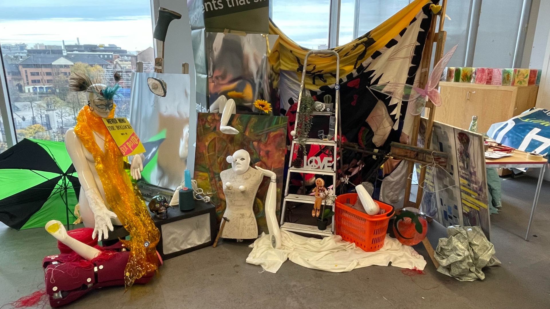
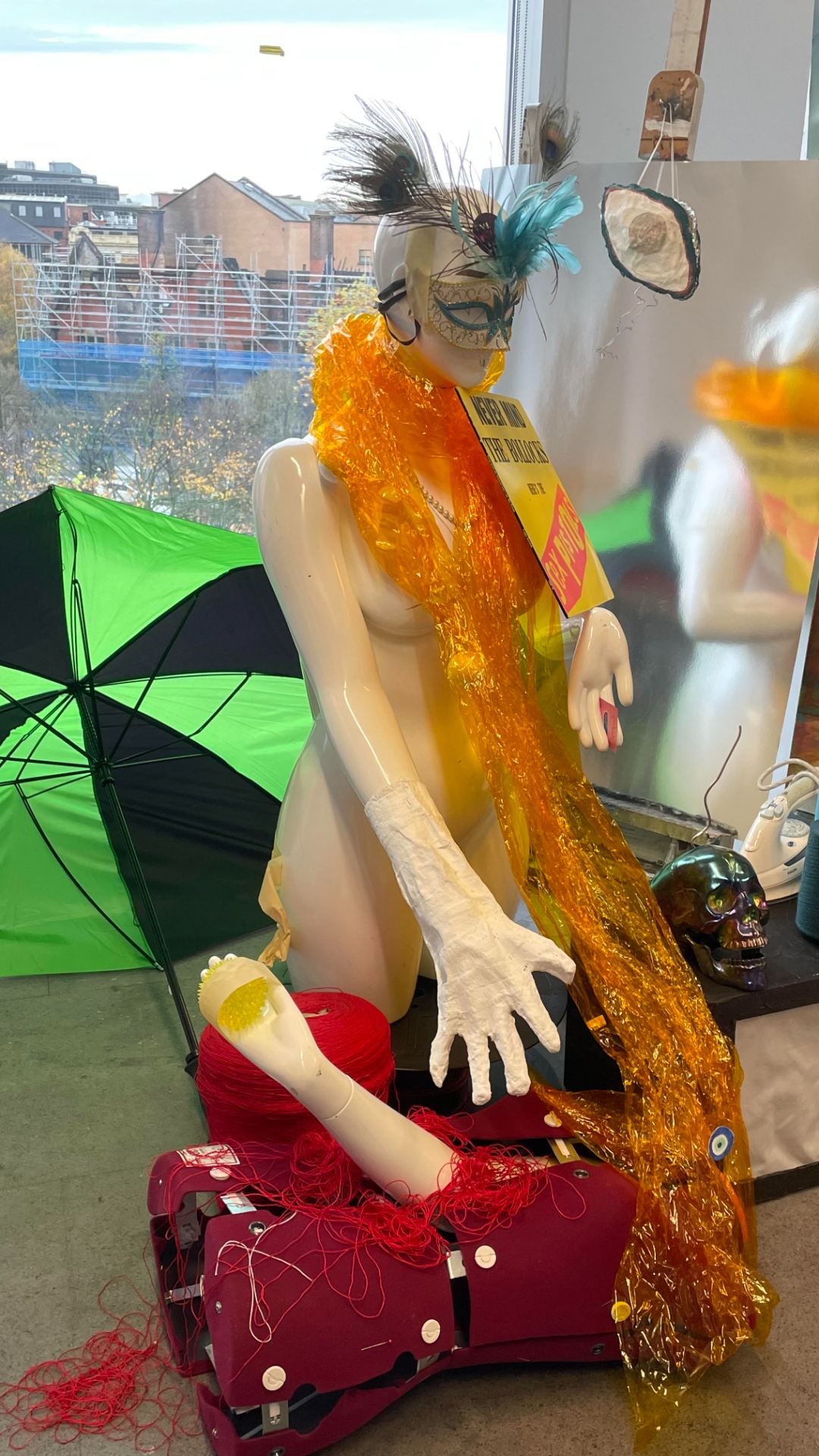
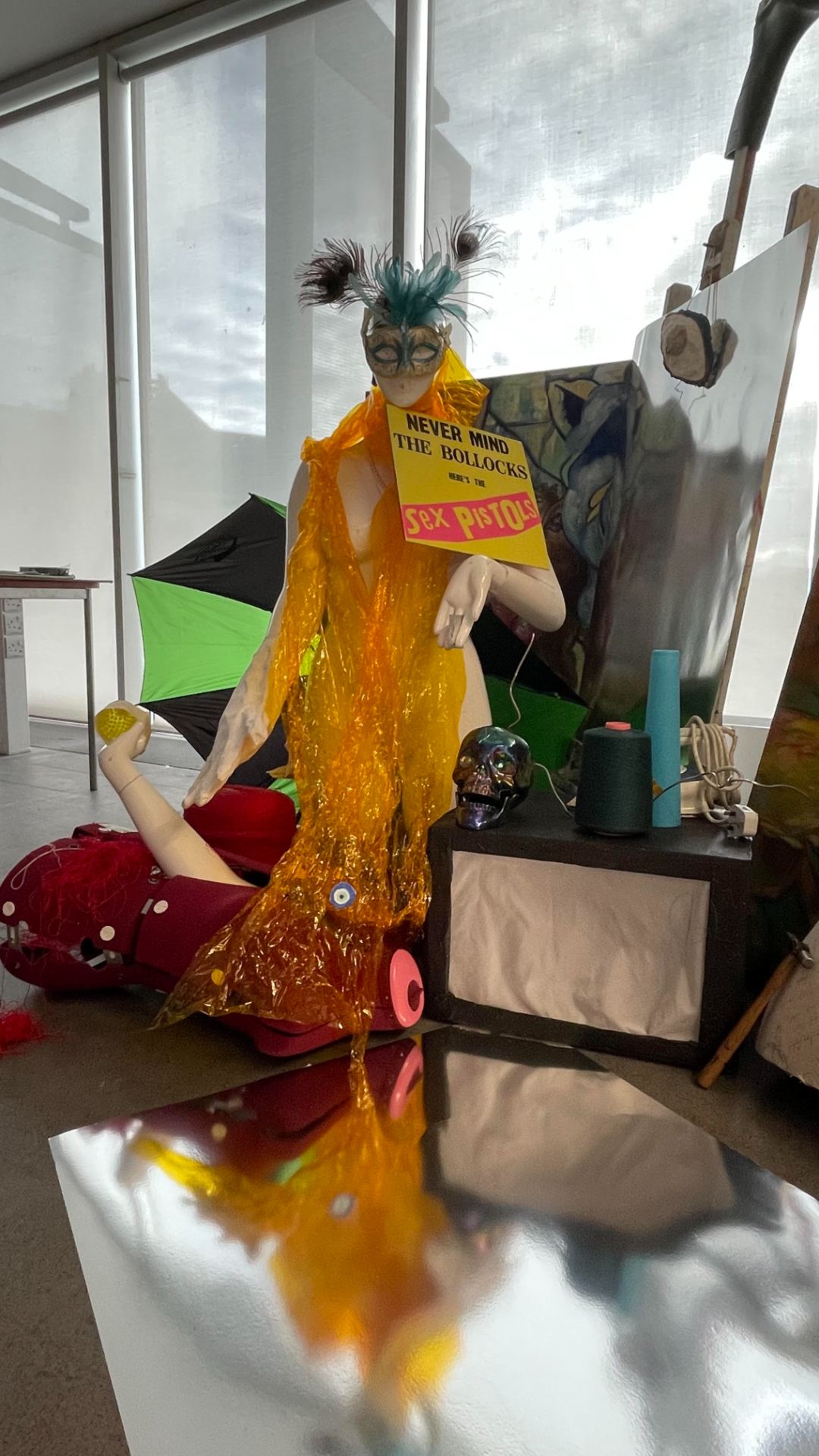
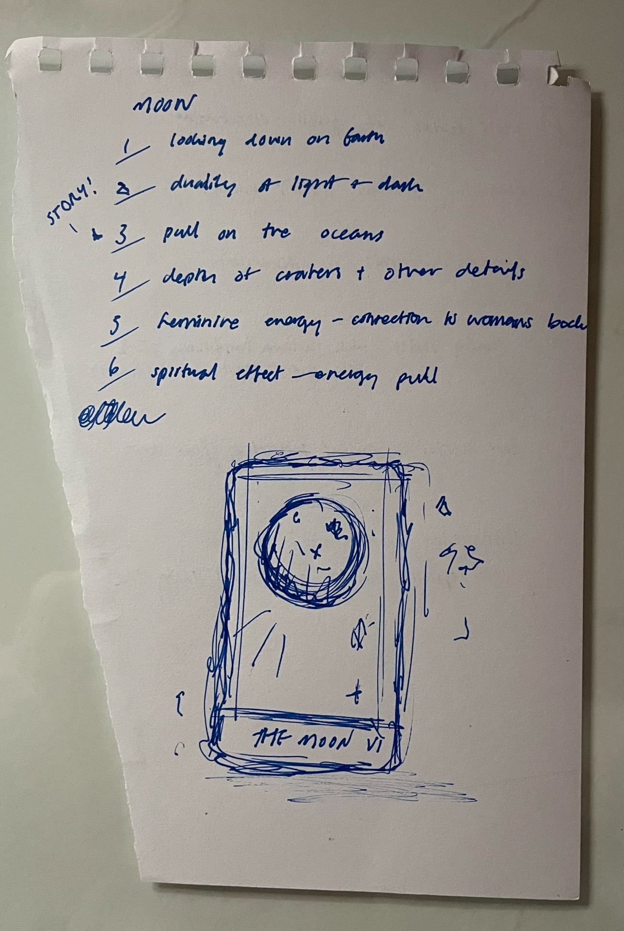
*I had also completed two colour studies using this technique, however, when collecting my work from the foundation room, they were no longer there. I created a blue piece detailing a moon over the ocean. For my second piece, I layered yellow and blue ink to create a duplicate effect based on the mannequin within our assemblage!


My favouite of my work using the print press. I really love the colour pallete i used. I love the way the hole in the wallpaper paired with the paint created what, to me, looks like a reptilian eye. I later used this as inspiration for my final piece.
Due to how heavily inked this work was, I decided to run it through the press again to see how it would develop. This was the second run.
The third run. Some underpainting came through which created a really interesting effect. If I had more time, I would have continued with this process as the outcomes were very interesting and I feel this could make a very eye-catching print series.
My first attempt using the press. I was happy with the result, however, I eventually got the hang of the basic concept and was able to improve my work.

Assemblage – collage work

My finished collage work. For me, this was my favourite part of this workshop which was really unexpected as I have never done any collage work before. I found myself being really inspired by this type of creation and I am definitely planning to get exploring this means! Very happy with my outcomes!
This piece was inspired by the Tv set part of our assemblage. I wanted to create something that felt loud, and eyecatching and I think I captured that very well!
For this piece, I took a section of the assemblage and made it using only collage. I really love some of the symbolism I used for this piece, for example, using the bird wings as the fairy wings or using the reptile eye as the gecko.
For my final piece, I wanted to focus less on the physical assemblage and more on our concept of ‘Let them eat cake’. I creates our mannequin and added commentary on the overuse of real animal products in the fashion industry – an especially common practice for the wealthy in such time periods. I was really happy with how this piece came together. I really love how simple I decided to keep the colour scheme. I think it makes it a lot easier to take in as a whole.

Assemblage – charcoal sketching

Detailed sketch of my chosen area of interest.
Focusing on the shapes I could see within our work.
This a very quick sketch to aim to capture as many elements within our assemblage as I could.
More detailed work on our assemblage. Here I was able to capture more details and begin to work in depth and tone through shading and variation of line.

Assemblage- “Let them eat cake!”

For our assemblage, our class came together to build it fairly intuitively. We edited it a little once the majority was done to ensure all areas had equal amounts of interest. Once we all took a step back to really take in our work, we almost immediately decided on the name – “Let them eat cake”. This is inspired by the feeling of high-class and low-class folk we felt were perfectly depicted in our scene – with the high-class woman on the left, and the poor folk climbing to get to the top. I really liked our end product. I think there are so many interesting points in this assemblage and I’m very happy with the work we managed to create in such a short space of time! Find below some other angles.

Photography – session 1 – final outcome

Starter activity – 6 photography projects I aspire to create!
My given character – the Moon. My 6 scenes that could be portrayed within a photograph.


Image one in the storyline – I quickly drew up a sketch of the moon using available chalk pastels. I utilised some scrap blue plastic to create the sea. Tara and I added pieces of double-sided tape to stick the material together to simulate a wave pattern. I then took a sponge and some white acrylic paint to add the ocean froth. I am super happy with this image. My suggestion to use the black fabric over black card worked really well and gives a beautiful depth to the image.
For the next image, we wanted to simulate a candle being lit by a window with the moon visible outside. My group made the candle while I created the window pane by simply attaching two wooden rods. I am super happy with this photo. I think it is so simple but conveys exactly what I had imagined for the image. If I was to redo this. I would make the window more detailed and also make a separate moon for this shot that is smaller, as to increase realism.
The next image was set to show an outside view of someone painting by candle light. We really struggled with getting a good photo for this shot, however, I’m very pleased with how it turned out in the end!
For the final image I took, we planned to show someone standing in the rain. Although we didn’t have the correct weather type for the shot, I’m super happy with the image I was able to capture. I  am very proud that this photo creates my intended feeling of a dark, yet comforting ambiance. Although it is our only photo taken with a real subject and surroundings, I feel it still manages to fit the feeling of the previous images!

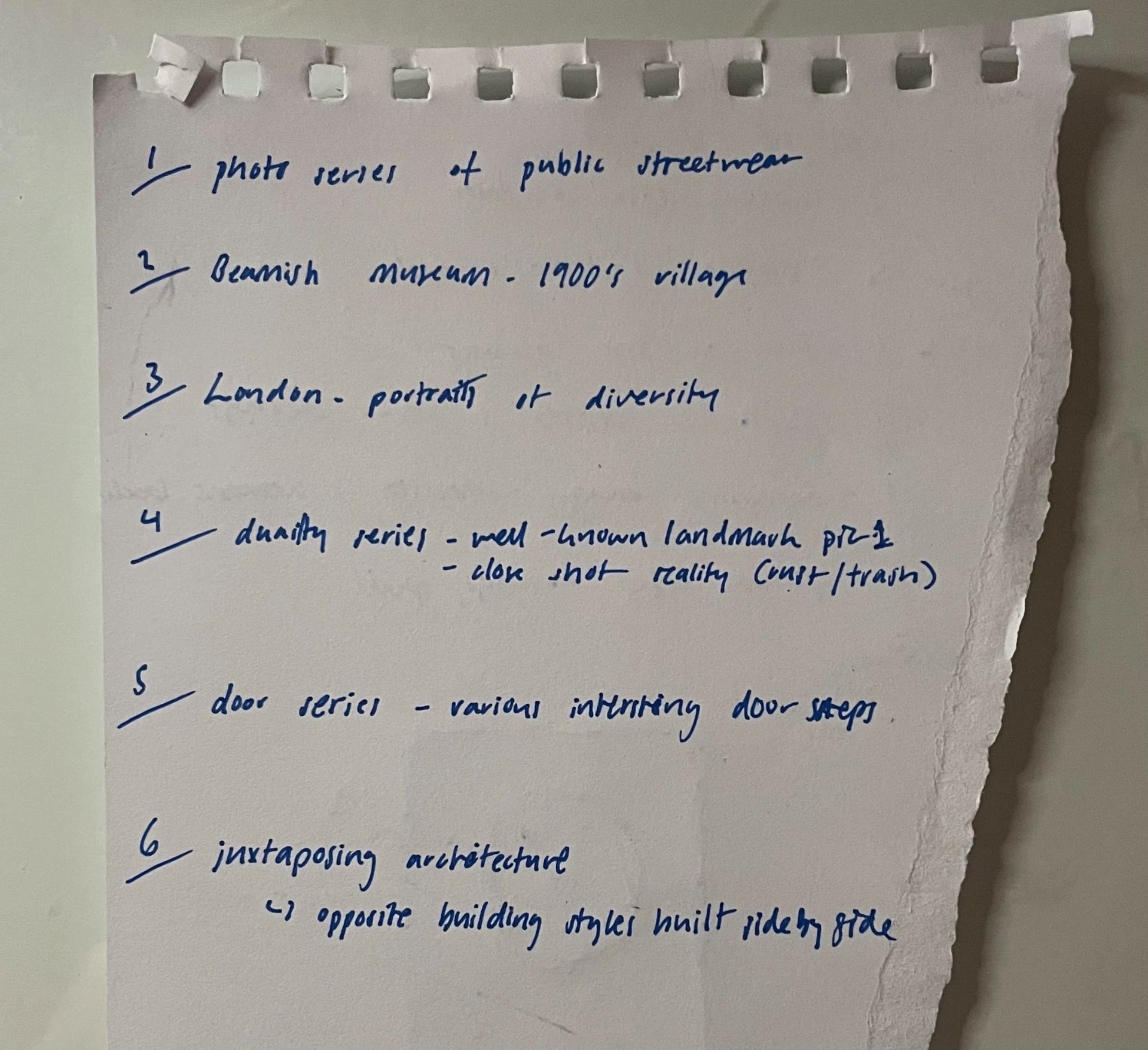
I am super happy with the work I was able to complete. I’m very happy with the cohesive feeling of the set of photographs and I feel it conveyed my story well!