Below are links to the completed self reflection for the completed unit!
^included as it did not upload correctly for the last submission!
Below are links to the completed self reflection for the completed unit!
^included as it did not upload correctly for the last submission!
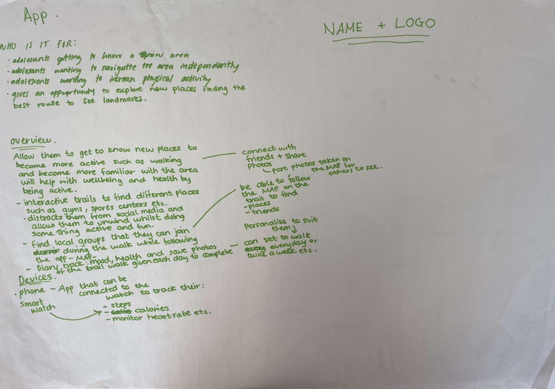
^Main contextual research for my Digital Design workshop
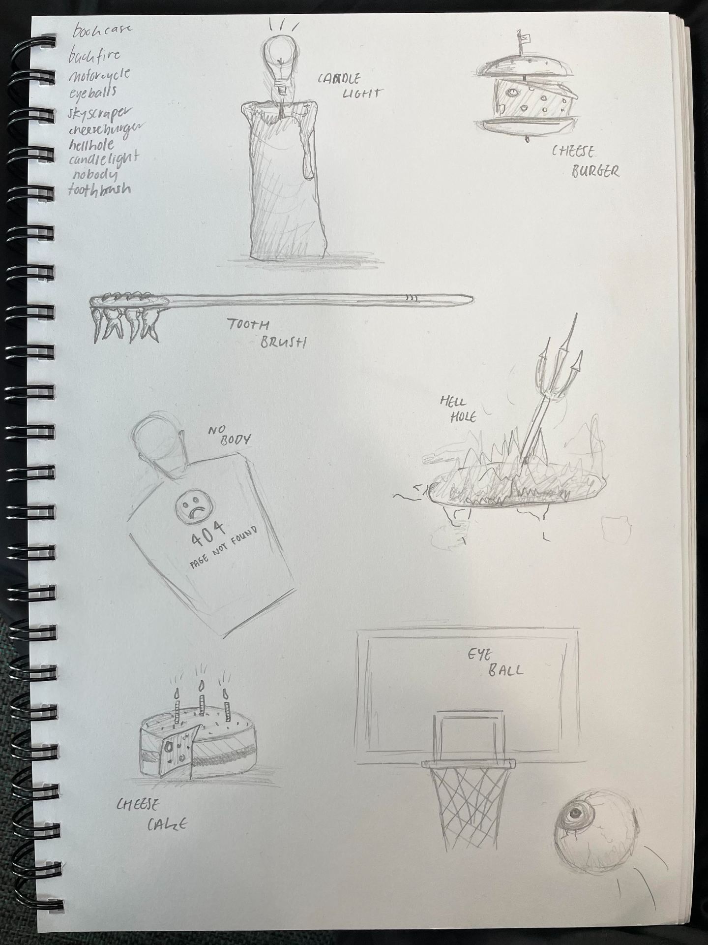
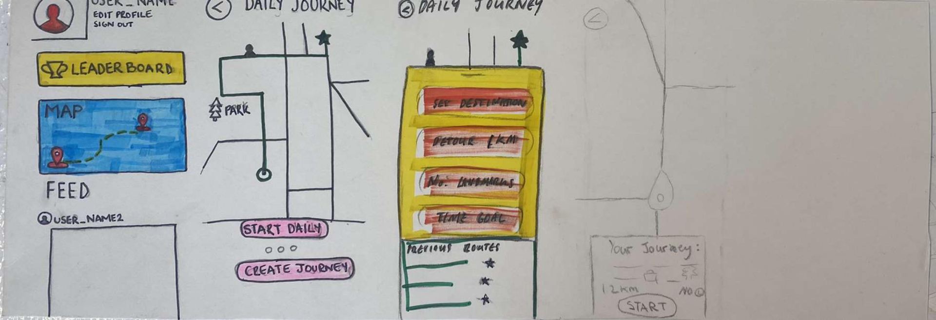
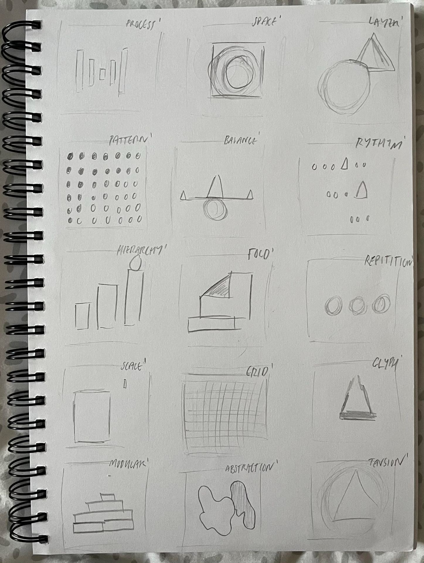
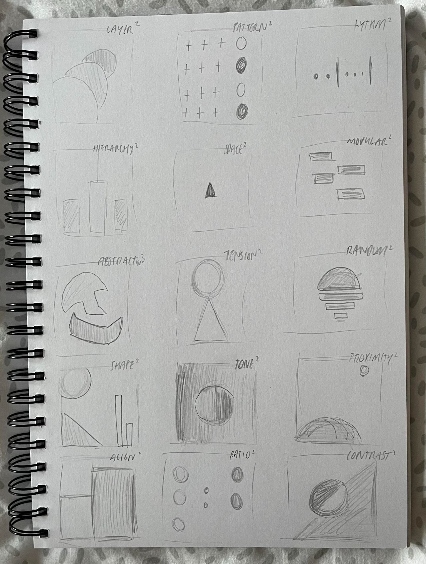
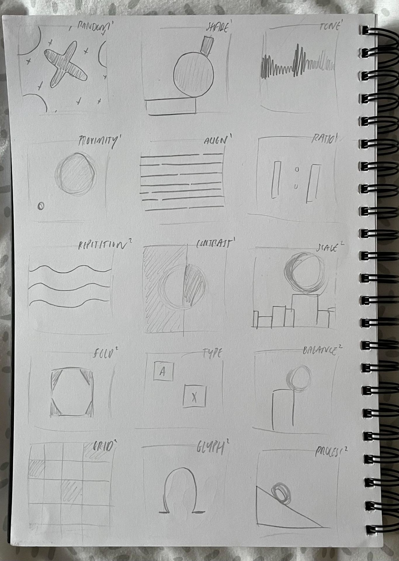
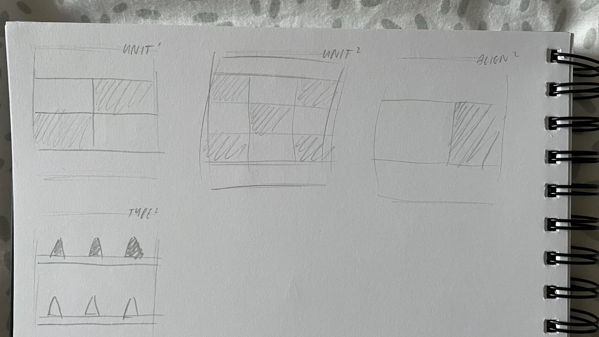
^Practice sheets


Find below video attachments to the work I completed during our animation workshop! I thoroughly enjoyed this class. If I was to do it again I would love to spend more time learning how to perefect my animations. Although I’m happy with my outcomes, I would love to better my technique to make them more fluid and clean!
^my research for my animation class!
^final product of my 3D animation work
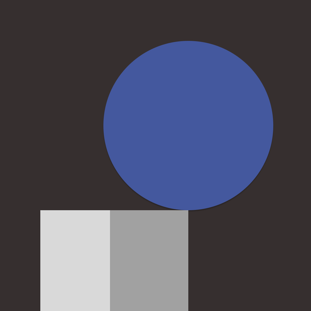
^work in progress of 3D animation – no distortion to the shape added yet
^ quick work on creating a 2D animation of a bouncy ball
^ 2D animation – learning how to increase/decrease speed via changing how far the object moves frame by frame
^final product of the 2D animation with distortion of the circle to add character, movement and fluidity
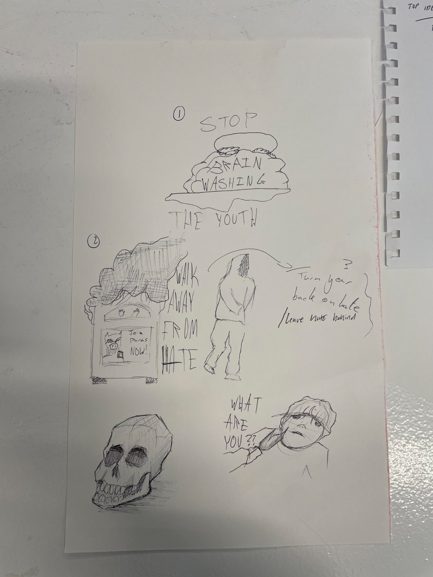
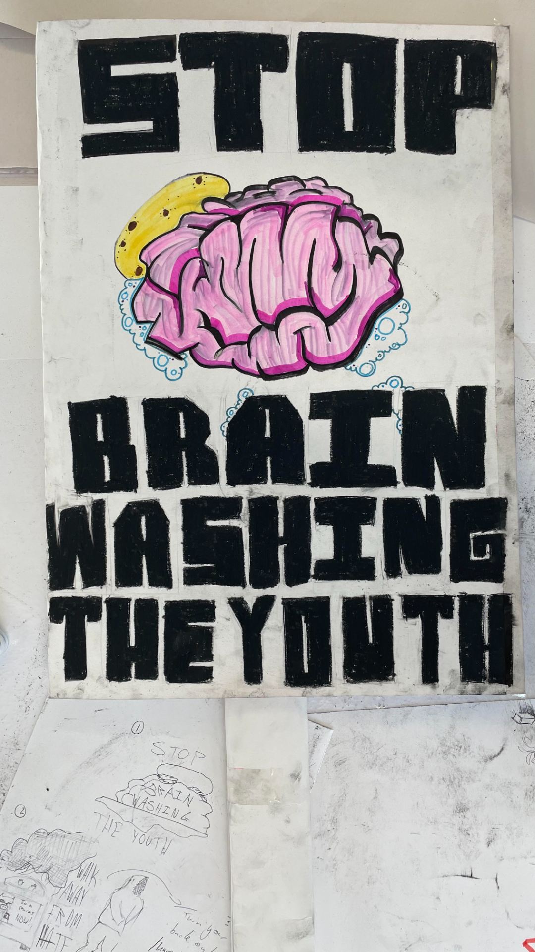
^my initial research into how protest and graphic design have interacted historically and into the modern age


^attached!