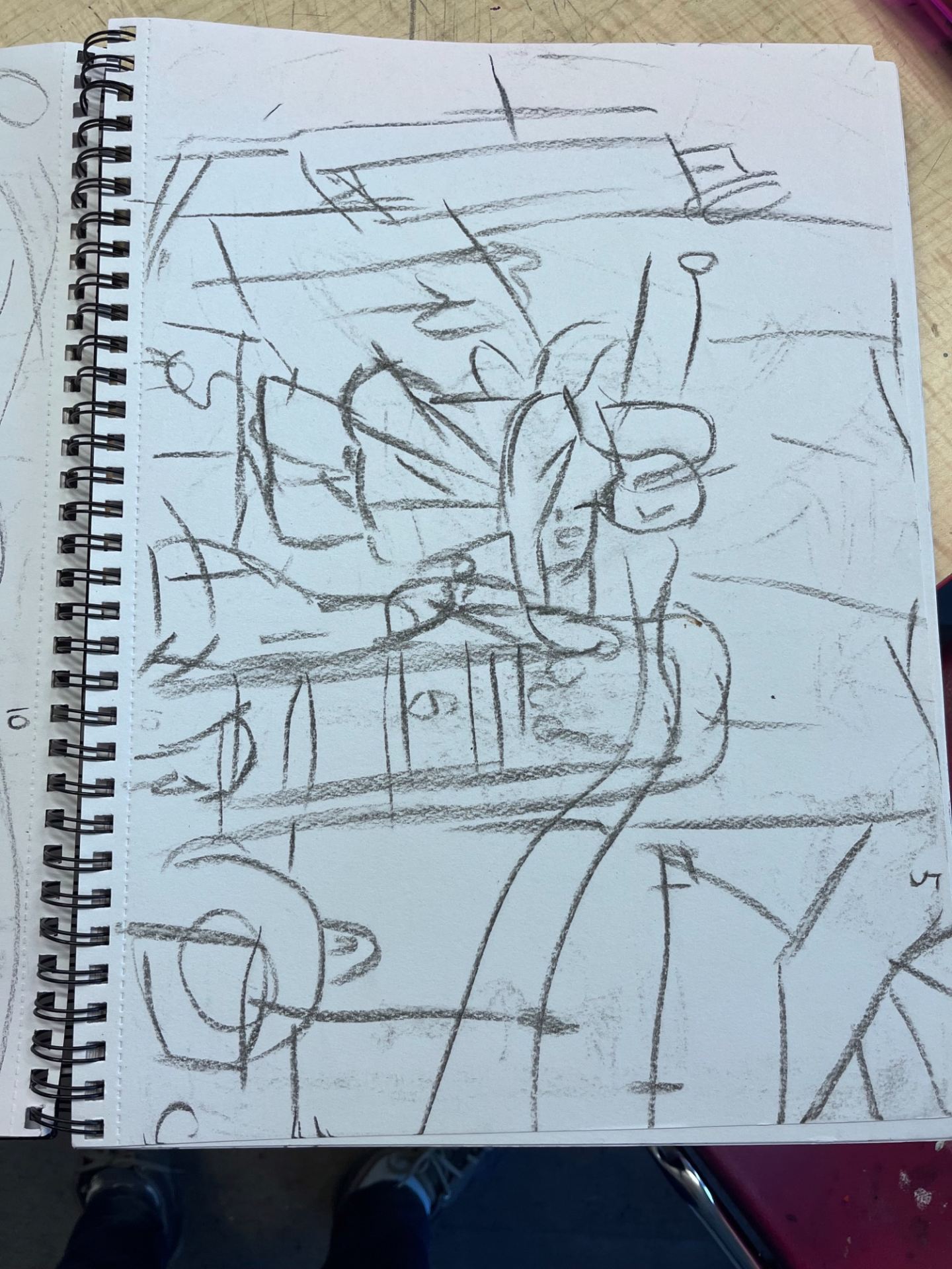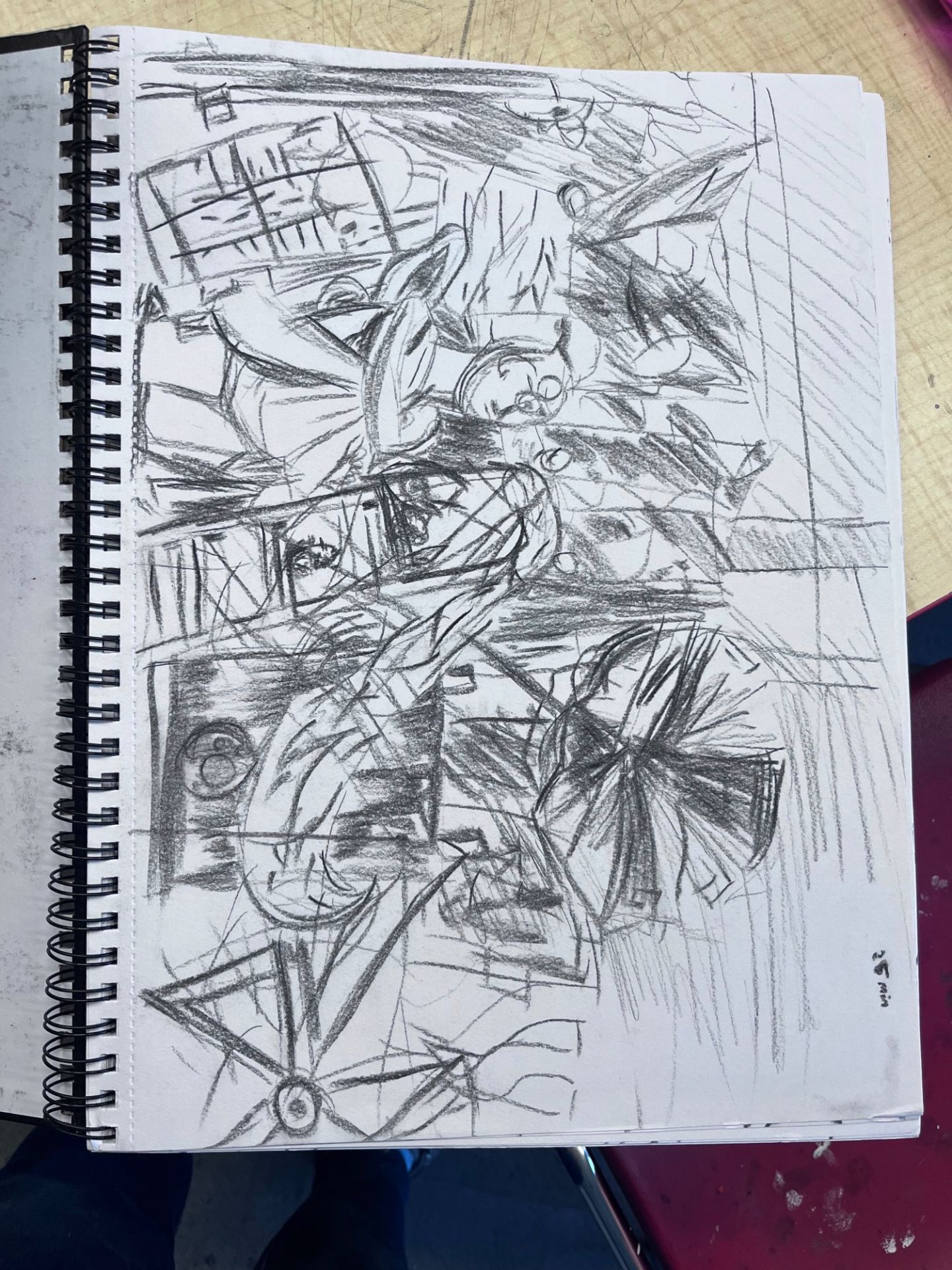

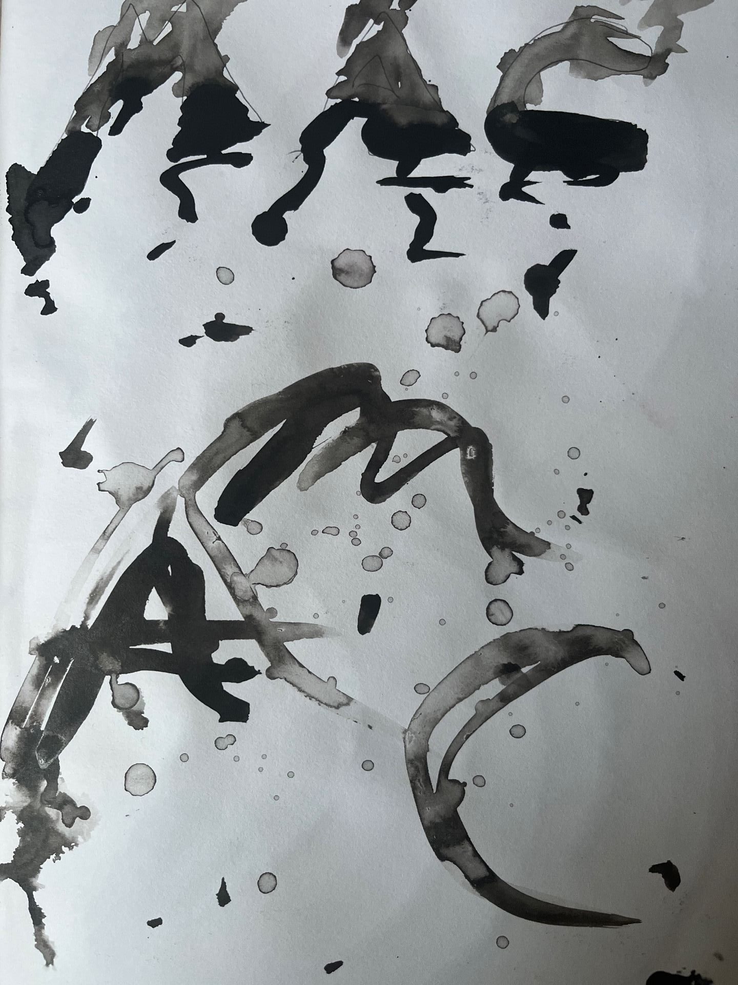

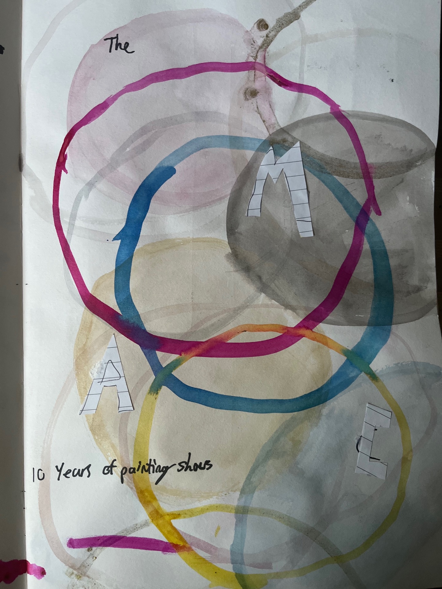

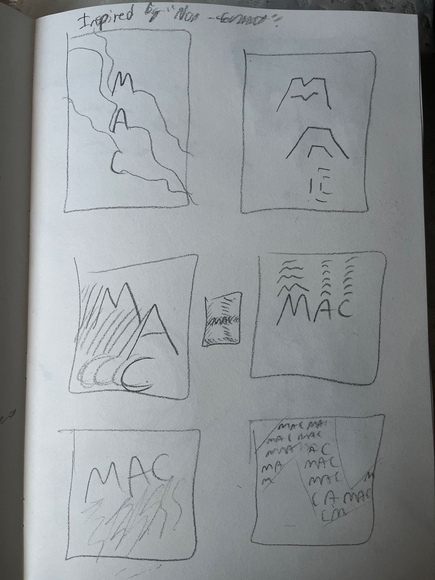


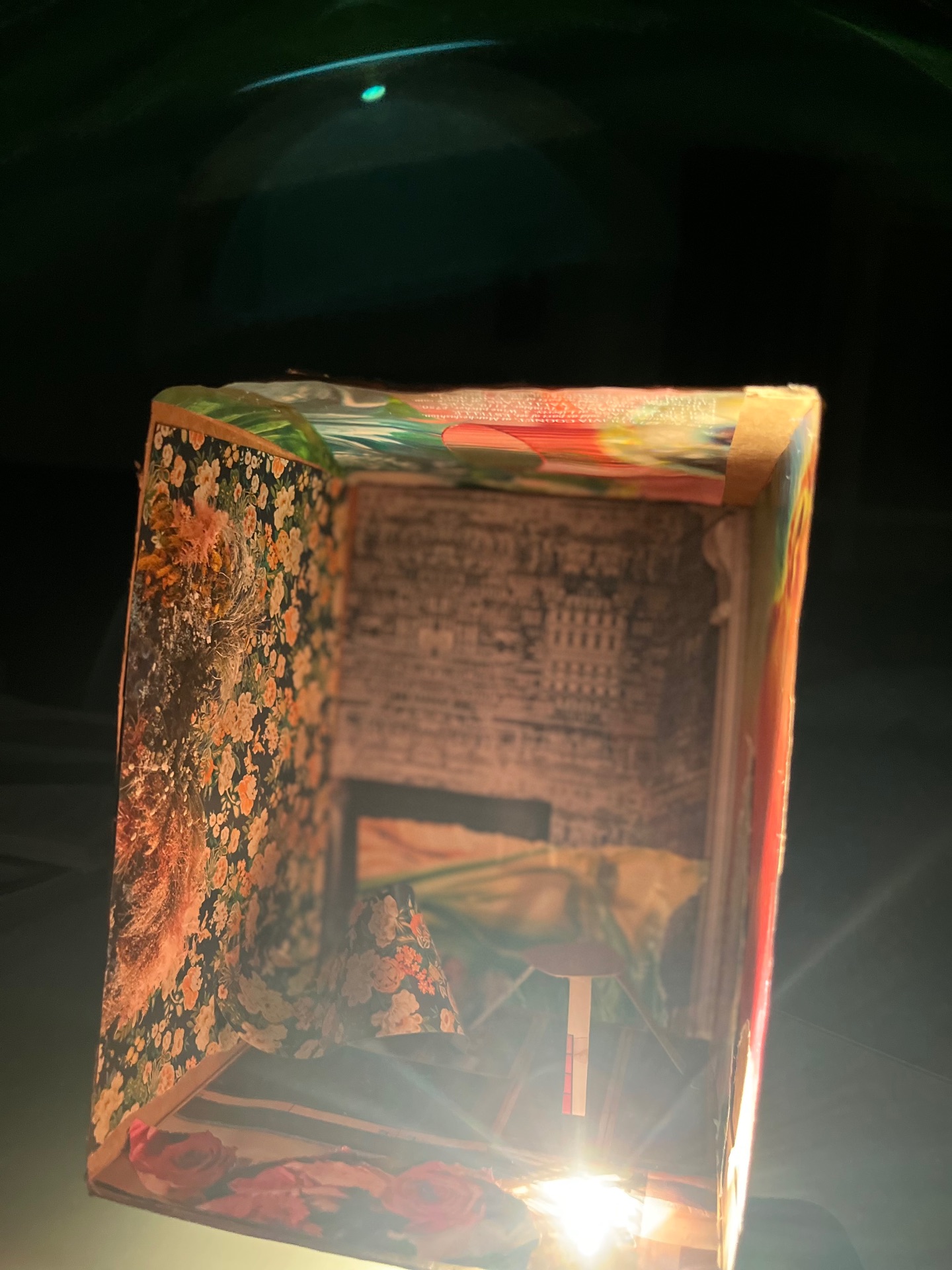
While experimenting with variations of the poster design for my chosen exhibition-The Mac “10 years of painting shows”-I decided to step away from digital means and experiment with sculpture and photography. Using found waste (cardboard box and magazine pages) around my house I created a textured and patterned “collage” room with a stool to add a 3D aspect to the piece. This room was meant to represent the gallery while the use of multiple colours and designs represented the exhibition’s abstract feel and the variety of pieces. I cut a small hole in one corner of the box and shone a light through it to create a dynamic lighting effect on the work.


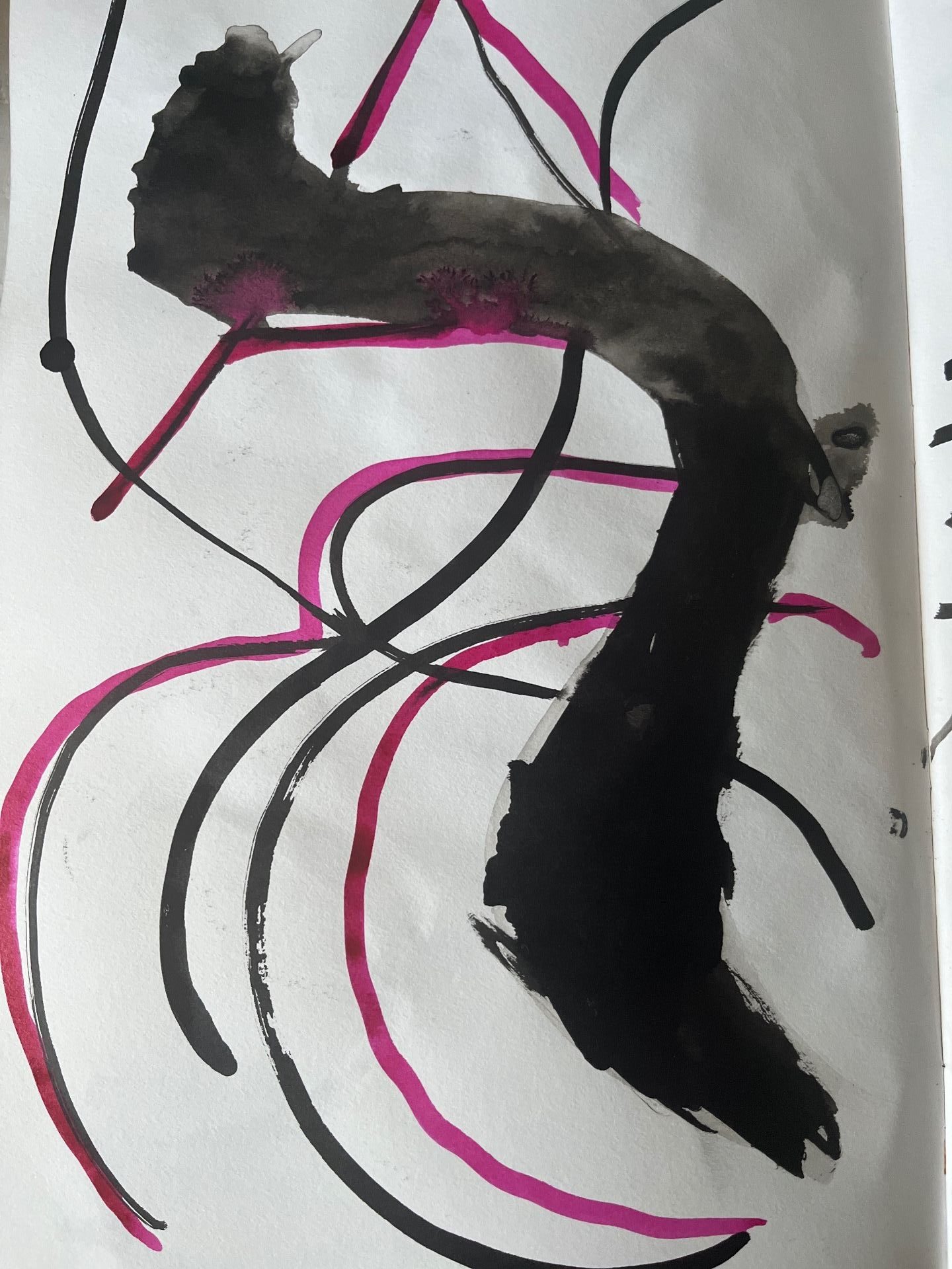
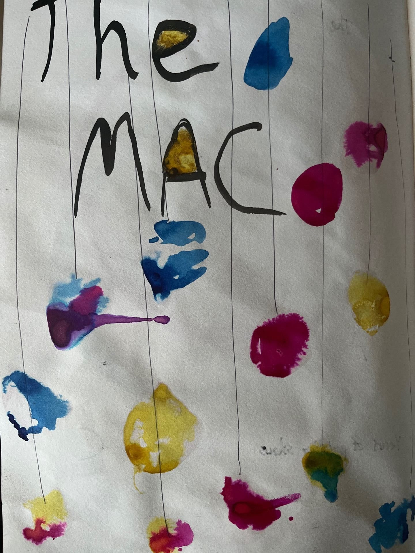
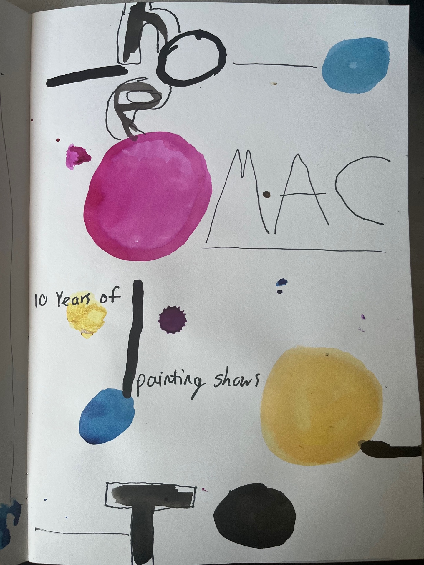
Using Figma I added string-like lettering and a black background to the piece.

For this week I looked back at what I believed to have interesting qualities and what I could do differently. I have been finding it difficult to make slabs and decided to take a different approach by concentrating on dipping materials in the paper clay as well as adding to previous pieces


PROJECT TWO-
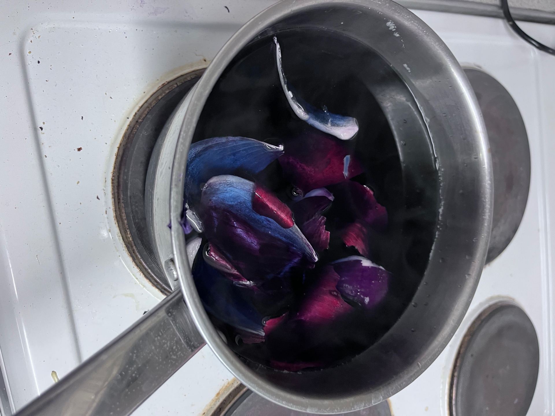
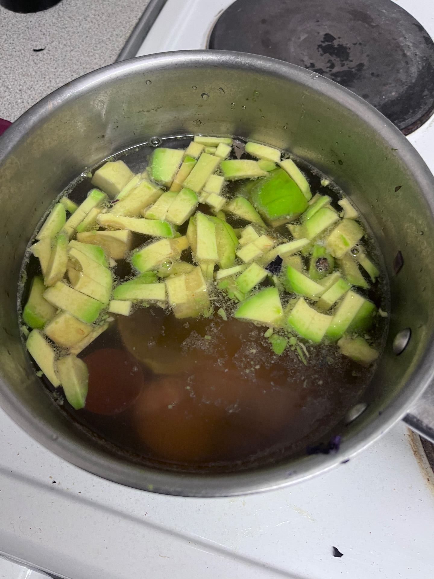
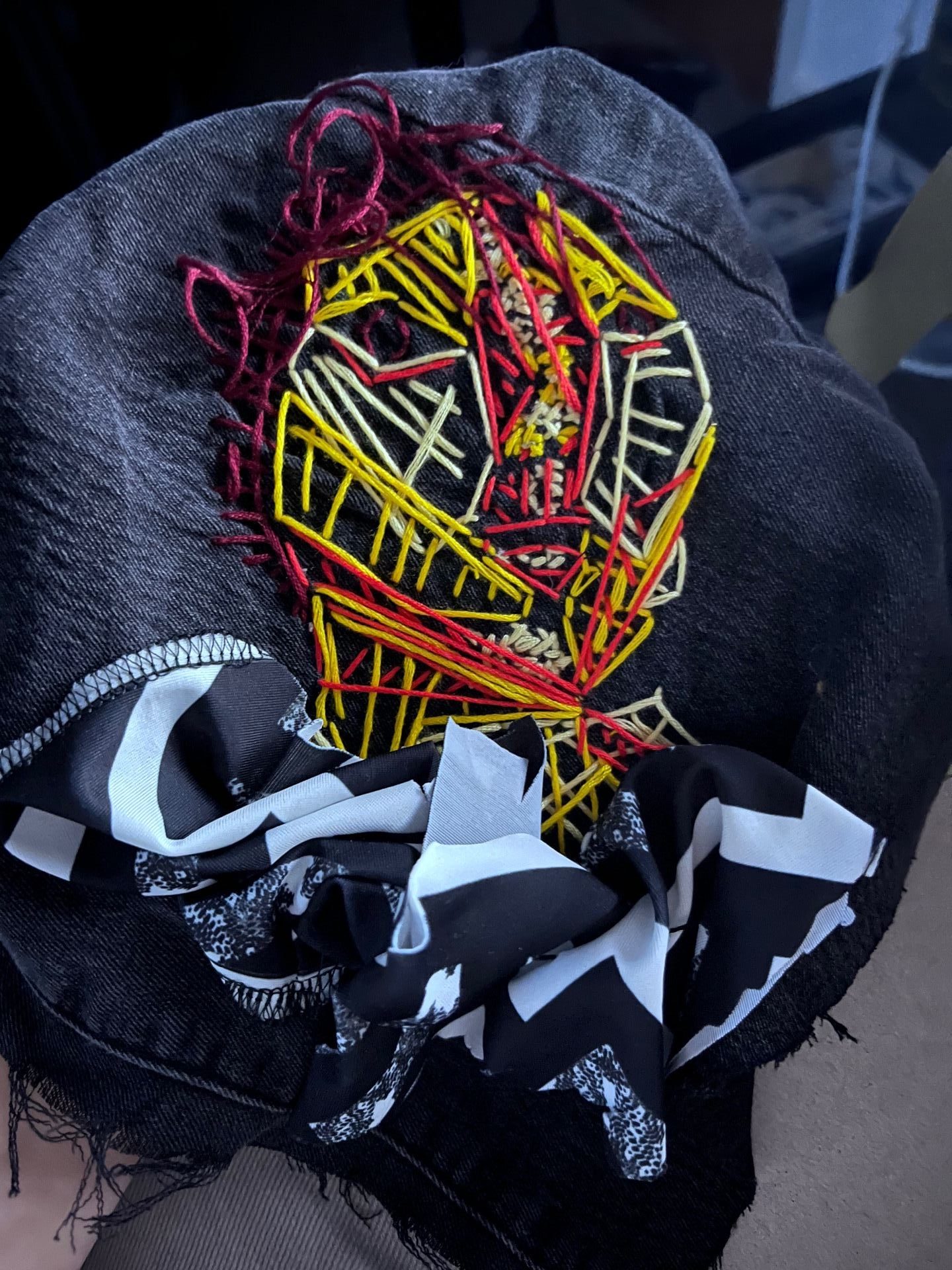
For my second denim piece I wanted to combine dying fabric using natural means and stitching.
First I attempted to dye the fabric using red cabbage, red onion and avocado (both skins and pip).

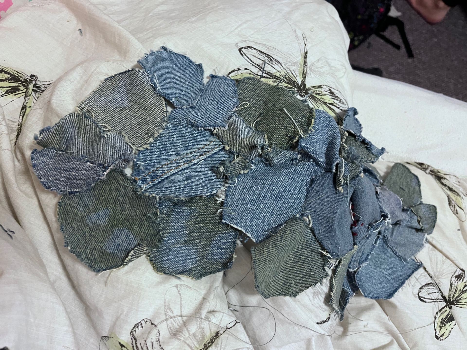
Next I used a thin thread to stitch the pieces together onto a patchwork pattern as I wanted the project to have a more chaotic and random feel to it then the first project where areas of shade had to be precise.

After this I stitched together the sides and gaps to create a pouch bag, using the button from the original pair of jeans for the buckle.


I experimented with the type of buckle the bag would have or if it would be a strong drawn one instead. I settled on using the seam of the Jean legs to create a handle and stapled then in place to provide extra support.
As a final touch due to not being satisfied with how the colour dying came out-I dipped the bag in a jar of beetroot juice and let the colour travel up the bag.

Once washed and dried off this was the final result. A functional, patchwork denim bag.
For me this project was exploring aspects of the workshop I was unfamiliar with, this is the first time I have tried tying something using natural meals and stitching together the material. This experimental and trail and error made it overall very enjoyable and satisfying for the end result.
For the theme of layers I wanted to originate my ideas from a very literal idea of “layers.” After some brainstorming between pages of a book and the layers of bird feathers, I landed on the idea of cake layers.” I first make a draft moodboard to just target colours and textures for the final piece.
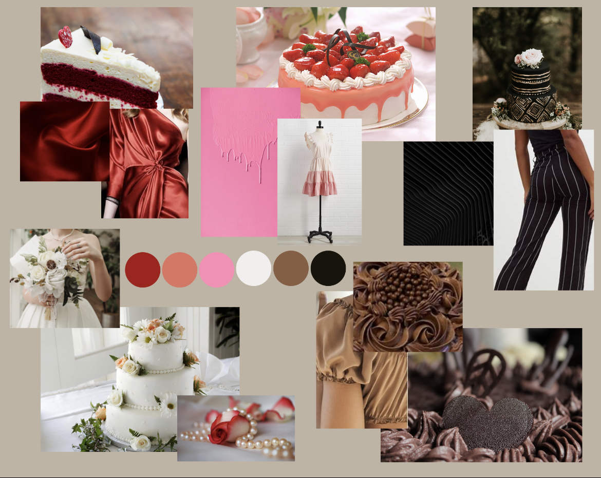

following this I focused in on one individual cake flavour/type. Again I made a draft moodboard using Canva that is shown below, followed by a final one.


I still wanted to further the red/pink colour combination saw in the original moodboard so decided to using various materials to do so.


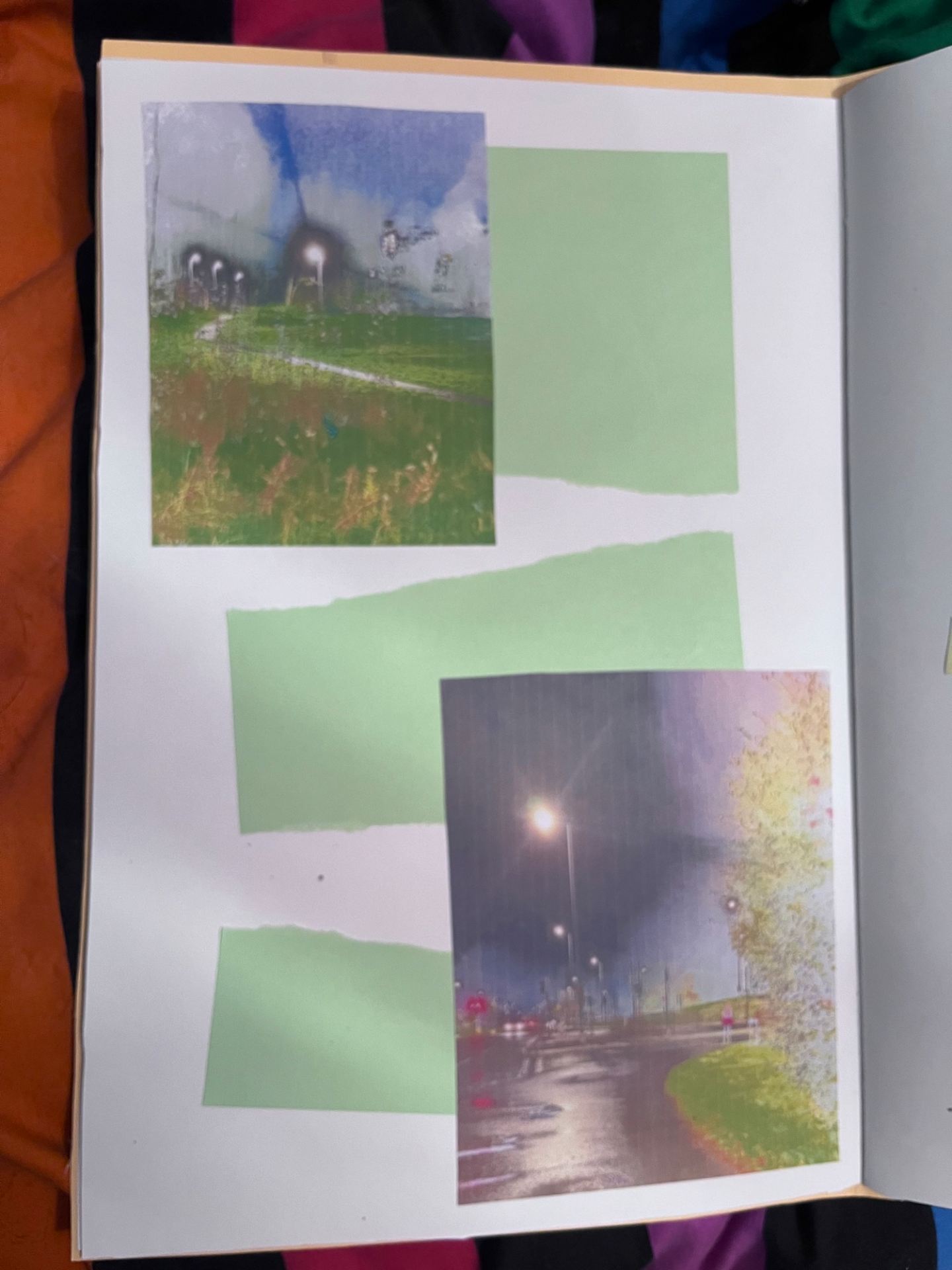
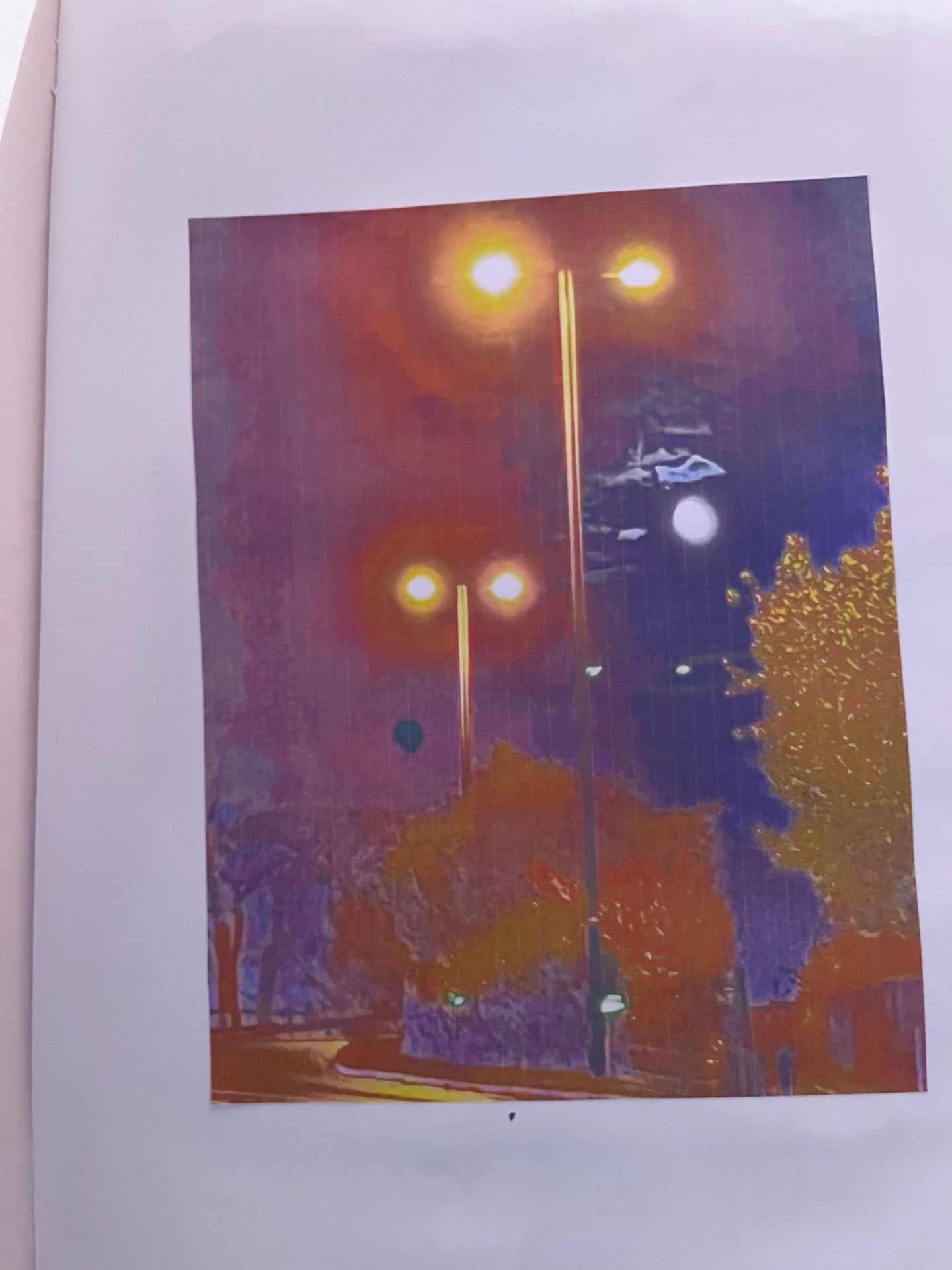
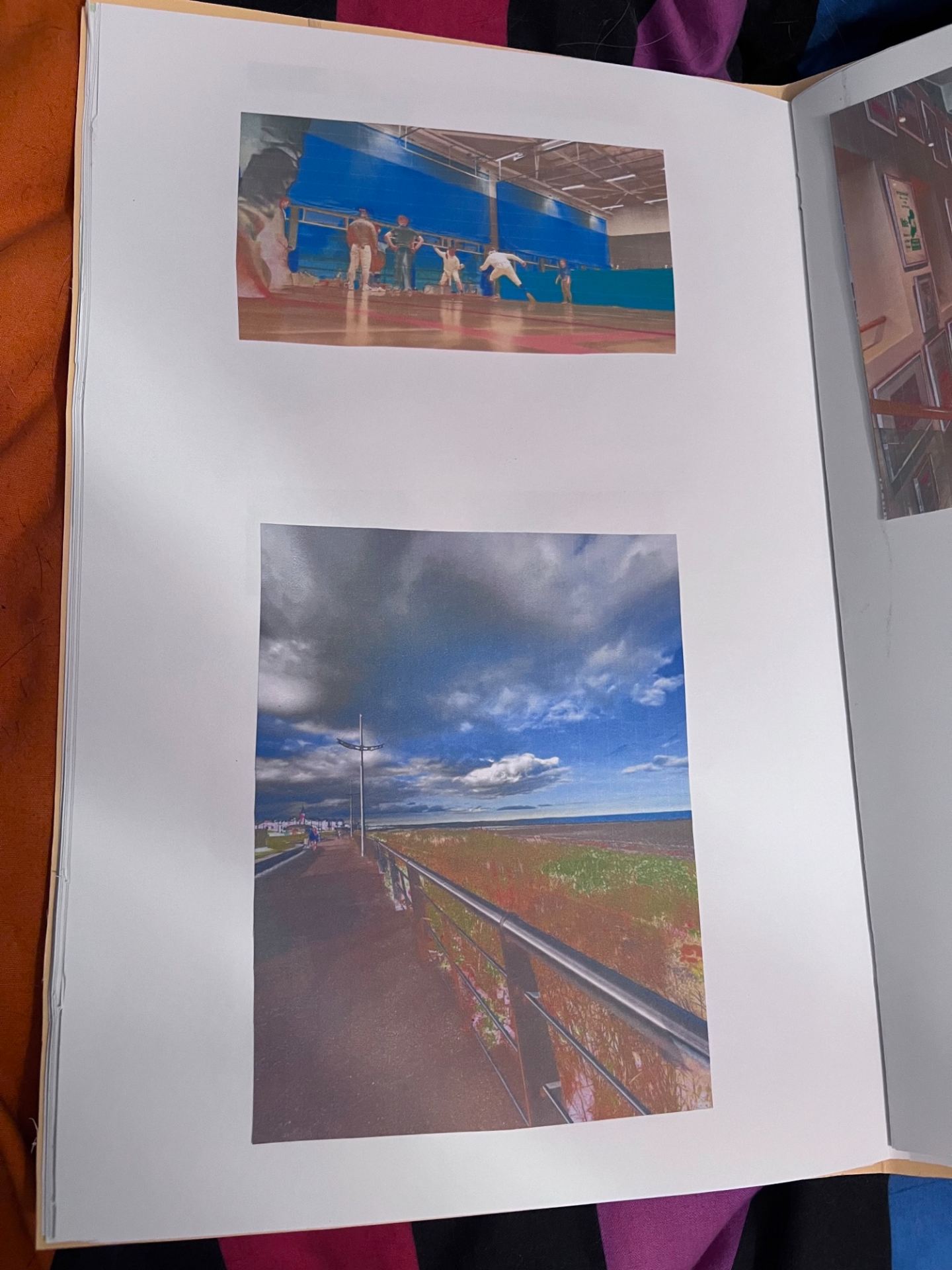
For my photo book, I decided to focus on the chaos and blur that often my everyday life can be. These photos follow me around university, fencing, work, and everyday life between my home in Belfast and responsibilities in Coleraine. Though often there is a harsh break in my photo sequence that looks into me more as an individual without the busyness exploring the fact that I am and identify as a transgender man. As seen in my photobook extra details and decoration usage becomes null after the first few pages, this was to illustrate how my energy feels as though it is gone throughout the day.
The photos themselves are printed on paper, adding a fragile and breakable aspect to my piece that for me represents how often my plans and routine can be left in pieces due to the amount of work that often I need to do.
Additionally, the photos contain no black ink, offering a more exposed look to them. This makes them more eye-catching to the audience due to it highlighting different parts of the picture and for me, it represents the daze my day can be.
For the more individual breaks in the book, I switched between two outfits, a more stereotypical one I have with heels and a more masculine one. The feminine side is illustrated as being killed or upset while the masculine side seems more confident.


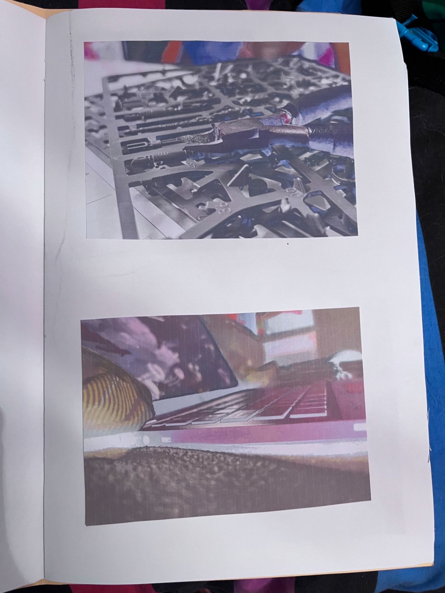


My final piece for the Sculpture/Lens workshop was made of cardboard, plastic discs, tape, black and white card, metal wire, fabric, magazine pages, bubble wrap, plastic sheets, paper, and a wooden block. Together they formed a wheel that was able to be rotated to allow the video to be protected on the different materials within the same shot. This piece was inspired by Joan Jonas’ creation called “Vertical Roll” which I explored further in my contextual knowledge research.


Please see the below link for a video demonstrating how the wheel can turn and all different materials can become visible.
This was the result of my work, with the video projected on my sculpture. I tried to experiment more and edit this video slightly to add a similar “glitching” effect as the inspiration video by Joan Jonas