Category: DESIGN [2D Digital Design]

Protest (Illustration)

In my group were Molly, Letitia, Jude, and Shakira

This was our main poster made by myself alongside a recycling symbol made by Letitia. Our aim is to illustrate some quick facts in an easy-to-digest format
This wonderful shirt was made by Jude using a t-shirt she had at home and ink
Jude made this amazing sign to mimic a clothing label and bring attention to how toxic acrylic in fast fashion can be

Powerpoint

This was our PowerPoint made by myself using all of the information our group had obtained. It outlines what fast fashion is, how charity shops and clothes bins can be a good alternative, how you can help, what others have done to help, and our demands

Game Design

In my group was Letitia, Rebecca, Jude and Shakira

To start with I worked on our tank with Letitia helping me bounce ideas. We ended up with a double-decker tank of sorts. With 360-degree rotation and SONAR on board. Both these aspects gave a challenge to stealth players during their approach to the tank. As well as this the tank would be split up into four heavy armor pieces that would need to be taken out to damage the tank itself. These pieces could be destroyed, either in one shot by stealth players up close or by multiple shots from offensive players.
To start off with Letitia and I attempted to brainstorm ideas for our board game, coming up with a combination of the existing games like “Talisman”. The aim of it was to reach the top by battling attacks, buying power-ups in the shop, and defeating the dragon to win the quest.
Letitia wrote down an initial draft of the rules as we were brainstorming the gameplay
Letitia and I then tried to break the rules down in a simple-to-understand manner while fully explaining how the game works
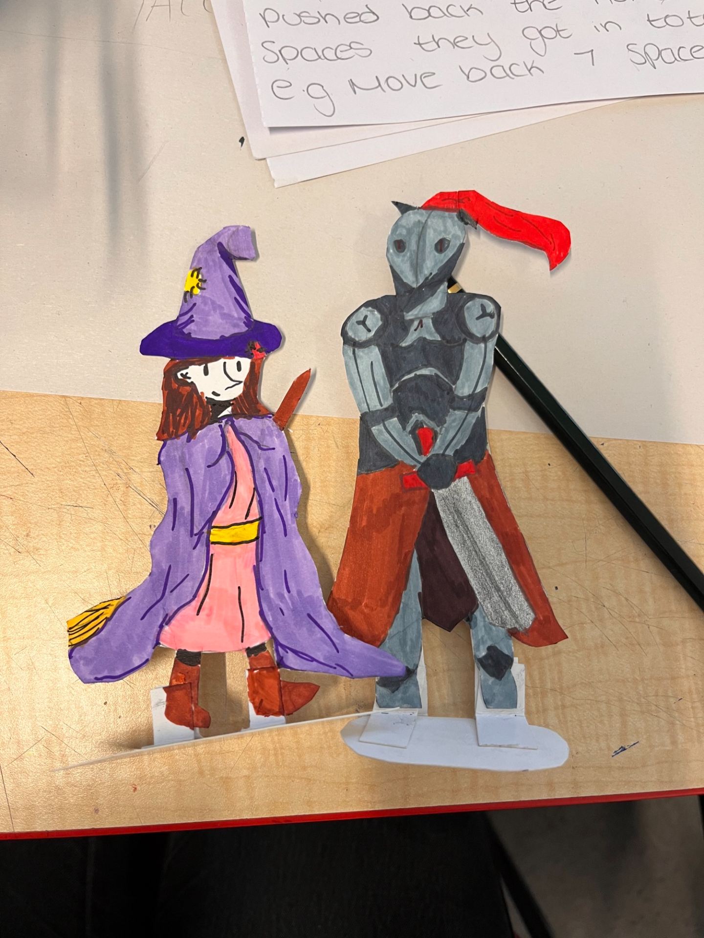
I was able to make player tokens of a knight and a witch/wizard, out of cardboard, which the players would use to move along the board


This is the final design for our board game. We have Jude to thank for making the castle in the middle and helping me to colour the board as she was unable to come in the first day. Shakira made the goblins who attacked you at the start. While Letitia produced the dragon that wraps around the board and is the main enemy of this game.
For redesigning a battleships type game, Letitia, Rebecca, and I brainstormed a few variations of the game based on our knowledge of it and other iterations of the game we had played. Our design included the idea of a shop where you could trade in your ships for currency to buy different weapons, including a SONAR bomb that would reveal the other player’s field for a few seconds
This was the finished product and interface the player would have during the gameplay

Animation

August Belhumeur

Above is my research into an animator whose style I really enjoy as well as someone I find very inspirational in the industry.

Practice exercises to help gain line confidence
Exploring contour lines and how forms can come to be from basic shapes
Further exploring forms using basic shapes and demonstrating the flour sack method
Exploring various animation ideas
Test drawing using Krita

An animation using Krita for the first time

A 3D model made using Blender


On reflection, I am happy with this introduction to animation and model creation. I definitely want to strive for improvement and to experiment more with both software in order to create a cleaner animation in Krita and Blender. All of my pieces were inspired by using a limited palette or simple shapes to illustrate the bigger picture such that, by using minimal shading, etc, I was able to concentrate on shaping my subjects and the animation itself. This simplicity also came from my contextual research of both Noma Bar and August Belhumeur, giving me the reassurance to work at my own pace. The 3D model gained inspiration from the main animal character in the video game “Untitled Goose game.” Again, another format that does not use line art or too much detail to convey their effect.

Contextual knowledge

AAD010_C.S.Worksheet 3

My worksheet 3 was based around DESIGN [2D Digital Design] and contains an array of artists who I only started looking into recently and some whose work I’ve been a fan of for years.

Noma Bar-contextual research

As well as doing my contextual research, I wanted to focus more on Noma Bar as I really enjoyed their art style and how he disguises messages in his pieces.

Rodrigo Corral

I also wanted to do a small piece on Rodrigo Corral as I had previously found his book jacket illustrations and really enjoyed, again, how simple a message can be shown through artwork.

Jamie Reid exhibition visit

Before completing the illustration group project centered around protesting, I paid a visit to the James Reid exhibition. Below are the photos I took of various pieces. I found his work very interesting and eye-catching. It achieved its goal of “making a mark” for me and some of the statements on the pieces still stick with me now. My favorite of which was one of the smaller pieces that start with “Your Bus Service”, although unassuming at first its message immediately hits you when looked further into.

Interactive Design (our final product)

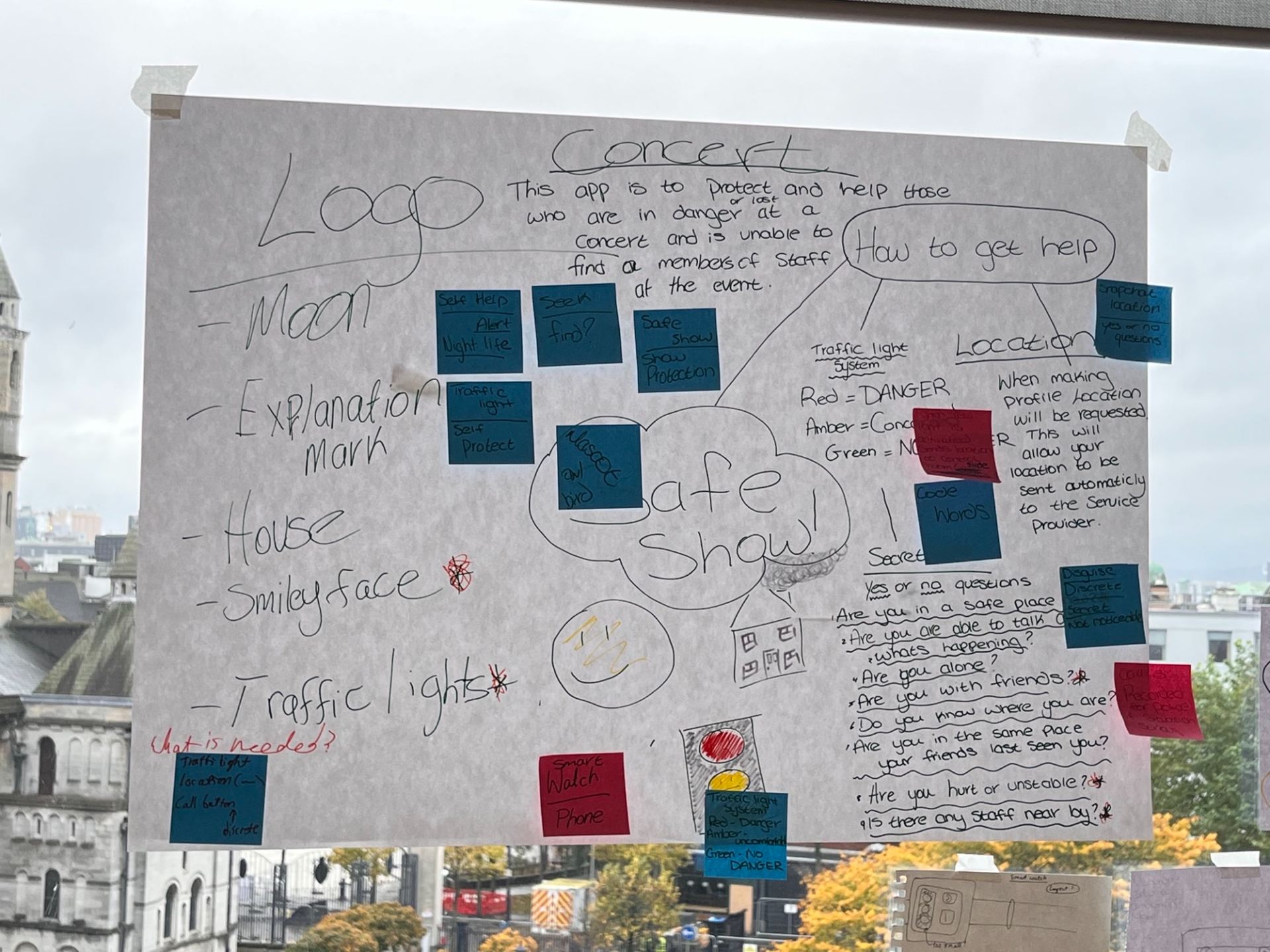
This is where we conceptualized our first ideas on how to create a service and app using the selected words “Microphone, Male, Security, and Simulation”. All of our group contributed to this.
Close-up of our original planning sheet post-it notes
This is where we revised our ideas and focused on what would be in our final project. All of our group contributed to this.
Exploration of names and typography by Rebecca using markers and paper
Initial dashboard designs by myself and Letitia
This is the first draft of our flowchart that I contributed to our group-showing the different paths of use for our app
This is the second and much simpler draft of our flowchart that I contributed to our group-showing the different paths of use for our app
One of the first concepts for our app’s logo was made by me. The idea came from the concept of “nightlife” and where the app would likely be used.
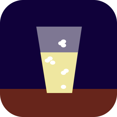
One of the first concepts for our app’s logo was made by me. It is based on the idea it most likely would be used around a drinking atmosphere.
One of the first concepts for our app’s logo was made by me. This was the concept that was voted upon for our logo and incorporates our traffic light system.
One of the first concepts for our app’s logo was made by me. It came from the idea of returning to “home base”.
One of the first concepts for our app’s logo was made by me. A simple smiling face quickly gets across the idea of safety and friendliness.
One of the first concepts for our app’s logo was made by me. The simplest of the logos which was meant to bring across the idea of caution or emergency.
This watch prototype was made to illustrate how our app would work on a smartwatch. It was made with paper and cards by Letitia
This phone prototype was made to illustrate how our app would work on a smartphone. It was made with paper and cards by myself and Judith
This was the final piece of our project to show off our “Safe Show app”. The typography, owl mascot (Bob), and titles were done by Rebecca. The printed visuals and articles were done by Judith. The user profile of age and personality traits was done by Shakira as well as the labeling of the red, yellow and green circles. Prototypes were made by myself, Letitia and Judith. The post-it notes and layout was contributed to by everyone. The materials used include cards, paper, pencil, pen, and marker.

I.D presentation script
This script was made by myself and outlines the aim of our app, where it is used, and an example scenario

Illustration (taking words literally)

Using pencil to brainstorm and map out thumbnails for each compound word concept and piece
Using a fine liner pen and alcohol-based markers to focus in on four of the previous ideas and create more detailed thumbnails to use towards the final piece
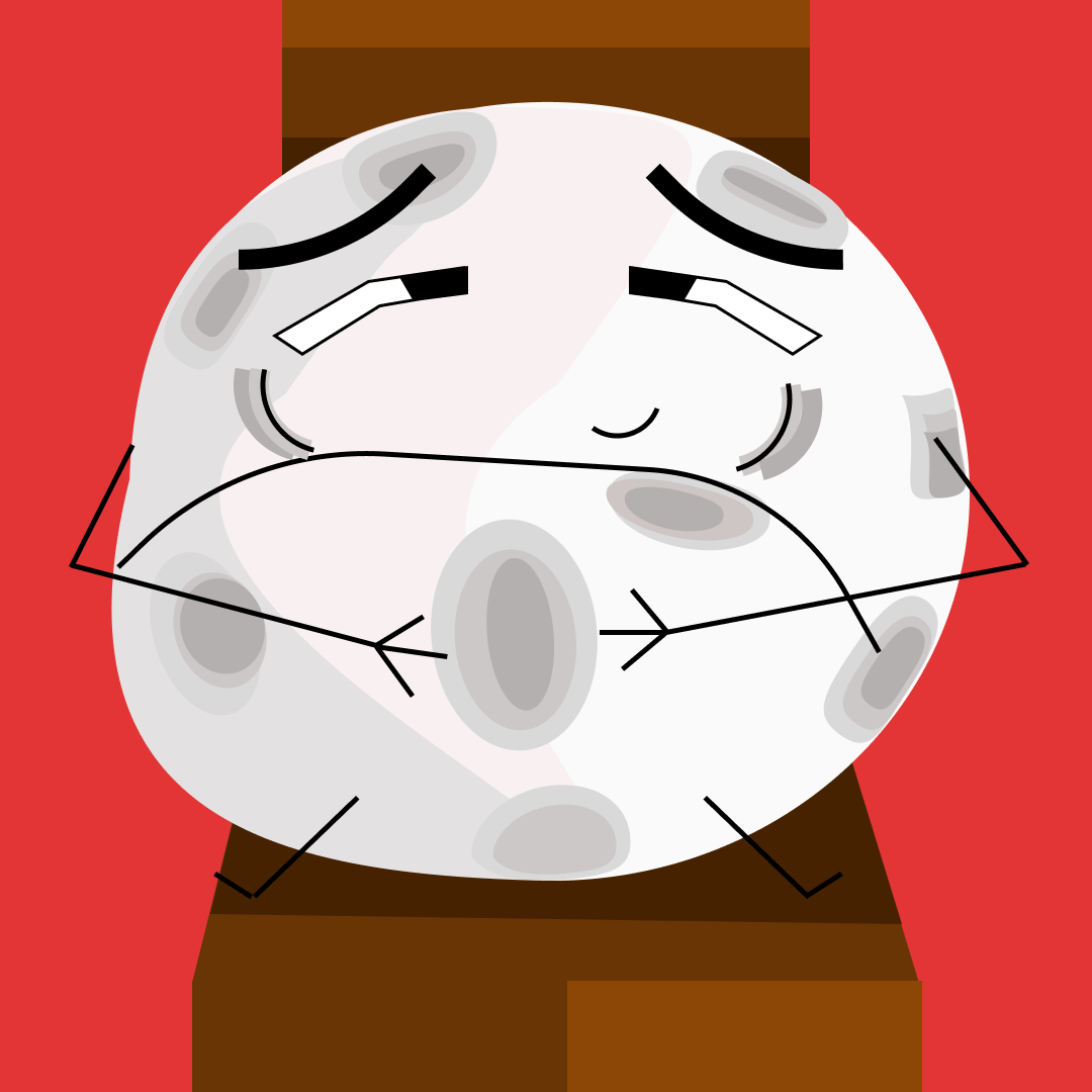
Figma was used to create this piece using the open compound word “Full Moon”
Figma was used to create this piece using the open compound word “School Bus”

Graphic Design (Graphic language)

The first draft of thumbnails using a thin liner pen and a limited marker colour palette to illustrate a simple artwork that represents the given word
The second draft of thumbnails uses a thin liner pen and a limited marker colour palette to illustrate a simple artwork that represents the given word
\

Gif to show all created final piece icons for each word on the list as well as several variations for some words via Imgflip