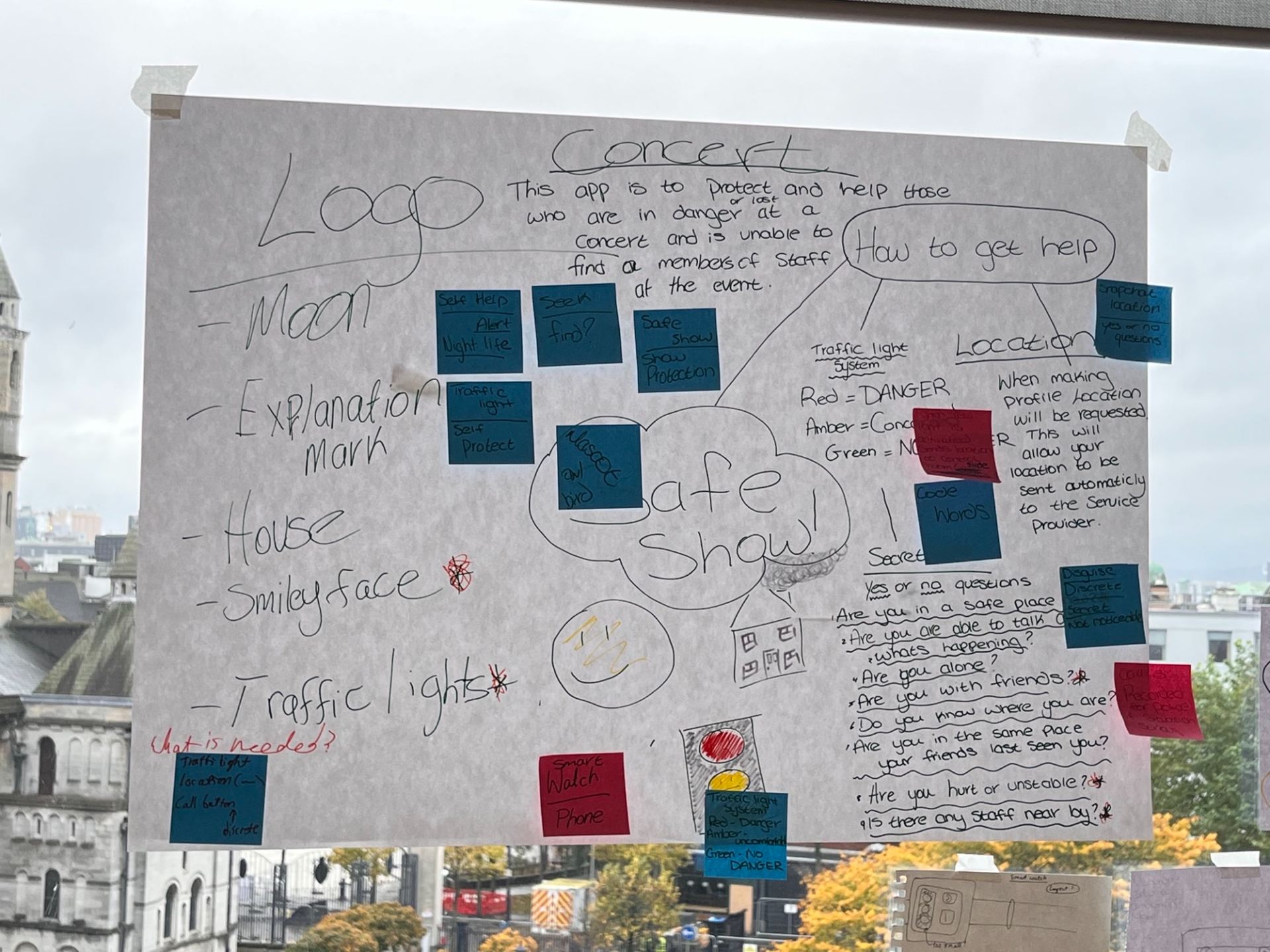
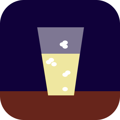
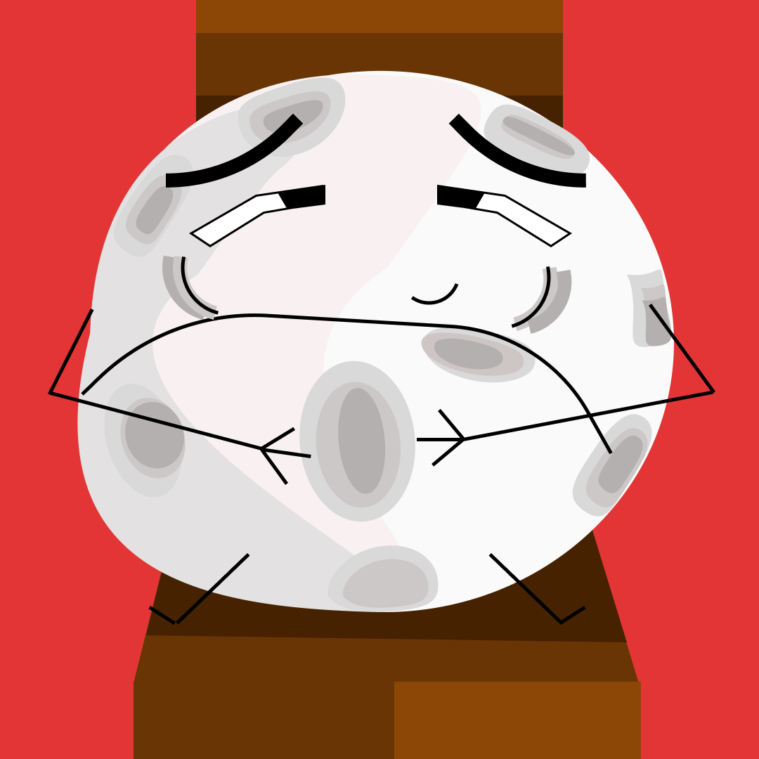
This is where we conceptualized our first ideas on how to create a service and app using the selected words “Microphone, Male, Security, and Simulation”. All of our group contributed to this.Close-up of our original planning sheet post-it notesThis is where we revised our ideas and focused on what would be in our final project. All of our group contributed to this.Exploration of names and typography by Rebecca using markers and paperInitial dashboard designs by myself and LetitiaThis is the first draft of our flowchart that I contributed to our group-showing the different paths of use for our appThis is the second and much simpler draft of our flowchart that I contributed to our group-showing the different paths of use for our appOne of the first concepts for our app’s logo was made by me. The idea came from the concept of “nightlife” and where the app would likely be used.One of the first concepts for our app’s logo was made by me. It is based on the idea it most likely would be used around a drinking atmosphere.One of the first concepts for our app’s logo was made by me. This was the concept that was voted upon for our logo and incorporates our traffic light system.One of the first concepts for our app’s logo was made by me. It came from the idea of returning to “home base”.One of the first concepts for our app’s logo was made by me. A simple smiling face quickly gets across the idea of safety and friendliness.One of the first concepts for our app’s logo was made by me. The simplest of the logos which was meant to bring across the idea of caution or emergency.This watch prototype was made to illustrate how our app would work on a smartwatch. It was made with paper and cards by LetitiaThis phone prototype was made to illustrate how our app would work on a smartphone. It was made with paper and cards by myself and JudithThis was the final piece of our project to show off our “Safe Show app”. The typography, owl mascot (Bob), and titles were done by Rebecca. The printed visuals and articles were done by Judith. The user profile of age and personality traits was done by Shakira as well as the labeling of the red, yellow and green circles. Prototypes were made by myself, Letitia and Judith. The post-it notes and layout was contributed to by everyone. The materials used include cards, paper, pencil, pen, and marker.
I.D presentation script
This script was made by myself and outlines the aim of our app, where it is used, and an example scenario
Using pencil to brainstorm and map out thumbnails for each compound word concept and pieceUsing pencil to brainstorm and map out thumbnails for each compound word concept and pieceUsing a fine liner pen and alcohol-based markers to focus in on four of the previous ideas and create more detailed thumbnails to use towards the final pieceFigma was used to create this piece using the open compound word “Full Moon”Figma was used to create this piece using the open compound word “School Bus”
The first draft of thumbnails using a thin liner pen and a limited marker colour palette to illustrate a simple artwork that represents the given wordThe first draft of thumbnails using a thin liner pen and a limited marker colour palette to illustrate a simple artwork that represents the given wordThe second draft of thumbnails uses a thin liner pen and a limited marker colour palette to illustrate a simple artwork that represents the given wordThe second draft of thumbnails uses a thin liner pen and a limited marker colour palette to illustrate a simple artwork that represents the given word
\
Gif to show all created final piece icons for each word on the list as well as several variations for some words via Imgflip