Design and Prototyping
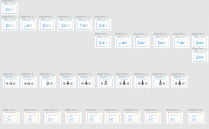
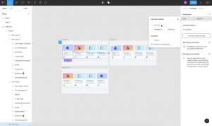
I began creating mockups by selecting my favourite wireframe for each task and creating assets on illustrator and then moving to Figma and creating a new frame for each step of the UI.
At this stage, I began considering some of the visuals of the UI such as the frame the task would be placed in. I also wanted to use a soft UI effect throughout the app as shown particularly in the example above. I felt this worked really well as it gave the UI a nice clean and futuristic feel. While on the spaceship I also decided to maintain a blue to turquoise gradient through the UI as demonstrated above.
I wanted to give my button a very clear button design. I, therefore, incorporated the gradient used throughout the UI and added a strong drop shadow and used lines as the top and bottom to provide a more 3D style outcome. I used the typeface Educated Deers on all buttons as I felt it was the clearest and more authoritative in appearance than Mouse Memiours.

For the rest of my typography, I used Mouse Memoirs as it presents a more playful tone. For headings, I also included a stroke. For positive feedback, I really wanted to make the text stand out so I decided to use a coloured gradient and stoke. I also increased the size.
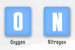
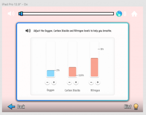
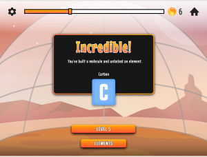
For my elements, I decided to only include the letter symbols as I didn’t want to confuse the user by adding the additional information generally included on the periodic table. I also used gradients and drop shadows to give the element symbols a more 3D effect.
When the user makes it to Mar’s I wanted to create a clear distinction between the UI’s. I, therefore, changed the gradient used throughout the UI to an orange to yellow gradient. I really liked how this adds to the feeling of progression throughout the game and if I were to continue to create further levels I would keep this as a fixture i.e. every three levels the background scene would change along with the colours in the UI.
Prototyping
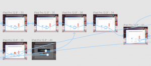
I began prototyping my app by first watching some tutorials on the basic prototype functions. Where I struggled most was when it came to the click and drag function. However, I was fortunate to find a youtube video on the feature and have included a screenshot taken from the video above. This tutorial brings you through each step of how to produce a click and drag effect on Figma.
I then prototyped the first four tasks before beginning some usability testing. This was great as I was able to develop the foundation elements of the design and test what worked and what didn’t before completing the full outcome and having to make major changes at that point.
Background Illustrations
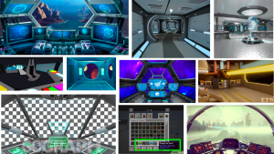
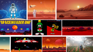
When developing my spaceship and Mars scene I began by looking at various examples of illustrations and considering reference points I had from my own childhood. I revisited games and cartoon characters such as space invaders and Marvin the Martian. I had also pulled influence from current films such as The Martian and this is refracted in the tasks completed in levels 4 and 5. I also found looking at illustrations and 3D outcomes of the inside of spaceships really helpful in creating an illustration for my spaceship scene.
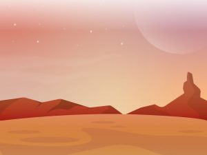
For the Mars scene, I wanted to use a warm colour palette as all my references for Mars display the ground as almost red. I used a variety of gradients to create the sky and moon. To give the world a more alien feel I wanted to display phenomena not found on death such as no visible sun, a massive moon and stars still visible during the day. I also gave the planet some mountainous landscape another component generally found in representations of Mars. I wanted to keep the foreground in the illustration clear as various items will be added as the levels are completed throughout the game.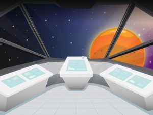
For the spaceship, I wanted to include a large view window similar to what is found in an aeroplane or car. This also gave me the opportunity to include the planet of Mars outside the windows. I created a planet outcome similar to the planet used in the logo to help carry the brand throughout the app. Again I decided to keep the control station fairly minimal with touch screen control desks using a blue and light grey colour scheme to give the spaceship a futuristic feel.
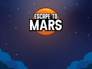
For my load screen, I decided to use a space landscape similar to what I had created in the spaceship scene. I also added a layer of gradients of reduced opacity behind the logo to give the logo an ethereal glow as though there were light shining down on the planet which represents a safe haven on the game as the player has to escape from Earth which is now under attack. I also included clouds to represent the player leaving Earths atmosphere.