Typography and Colour Choices
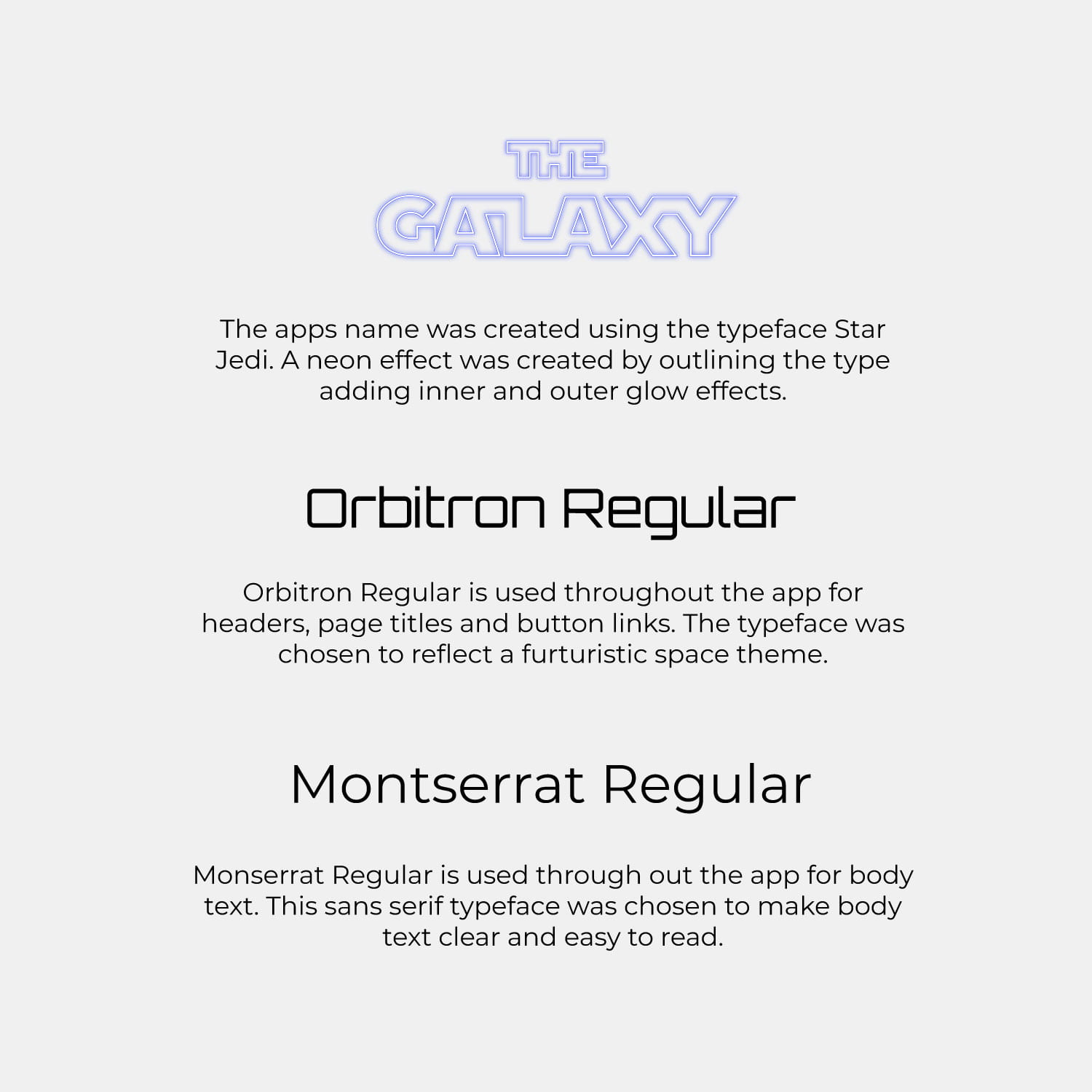
Above I outline my typography and colour choices. I wanted to use the Star Wars typeface on the app title to clearly demonstrate the apps Star Wars ties. I have also included a neon effect as I feel it fits with the futuristic sci-fi theme of the genre. I selected the typeface Orbital Regular for headings as it has a boxy digital feel that I felt was a good fit with space travel. I selected Montserrat Regular for body text as I felt its wide lettering paired nicely with Orbital Regular and that sans serif typeface was clear and easy to read.
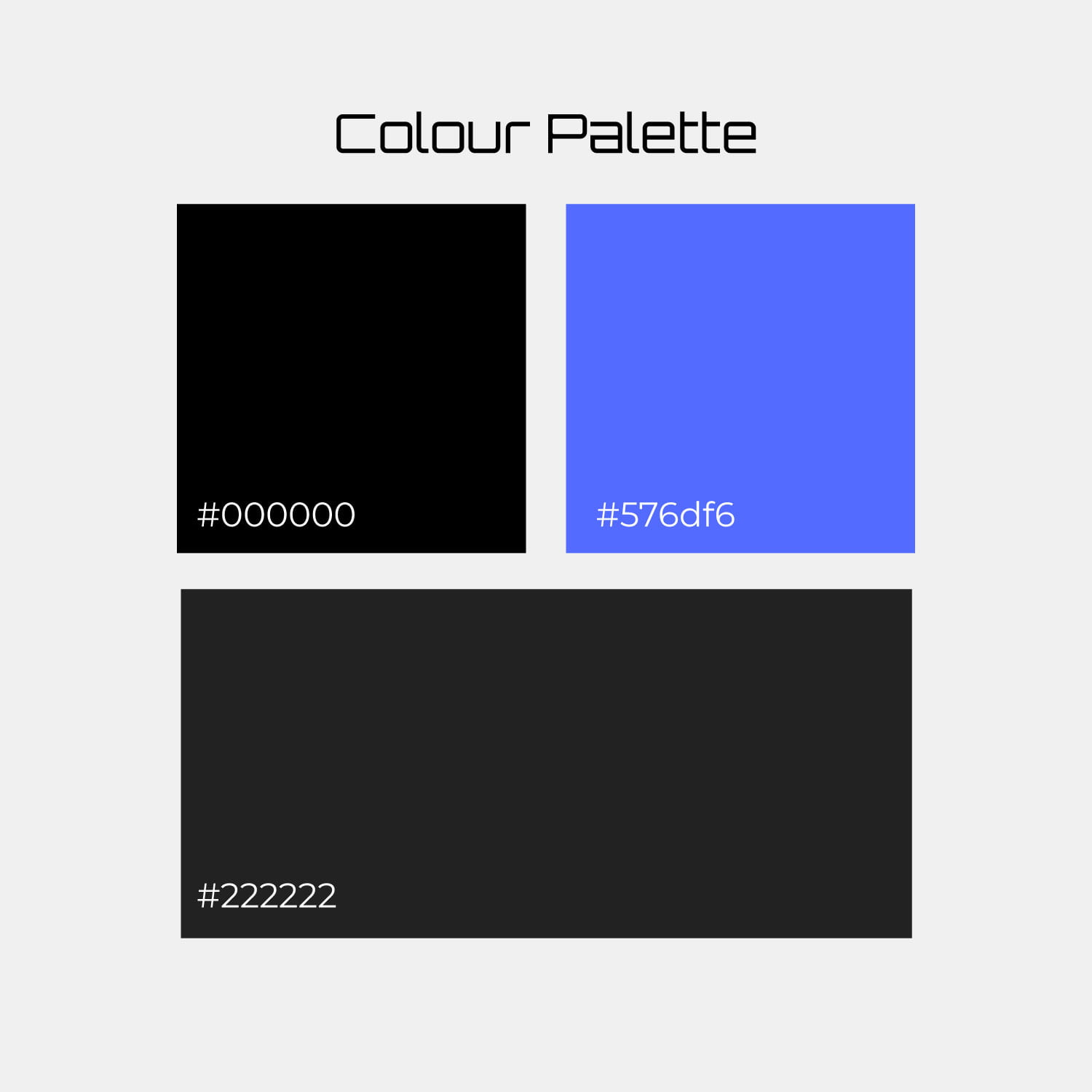
For my colour palette, I selected full black which not usually and colour I would go for as I find a nearly black generally looks likely slicker however due to the space theme of my travel app and the fact that in all instances the black background is layered with a purple/blue gradient at a lowered opacity. The nearly black is used for the bottom navbar and the blue for a highlight colour throughout the app. As the app develops I like the idea of allowing the user to pick a side a change the highlight colour from blu to green or red throughout the app.
6 Initial UI designs for The Galaxy Travel App

Above are my first 6 UI designs for my Star Wars themed travel app. I opted to run with a bottom navbar with 5 icon/ navigation options. At the top I of the screen I have included the Star Wars logo which appears on all screens and profile and a hamburger icon which will lead to a planet list page. The list icon is not always an available option and is replace with a back arrow in some instances as the user navigates through the app. This app also supports landscape view and when the phone is flipped to the side the bottom navbar is hidden and the nav links appear in a list on the right-hand side of the screen to facilitate thumb reach.
On my planet profile page, I have included my illustration of Tatooine with the rocks as the bottom of the illustration fading to black facilitating text placement as often seen in posters by Olly Moss.
Peer Review
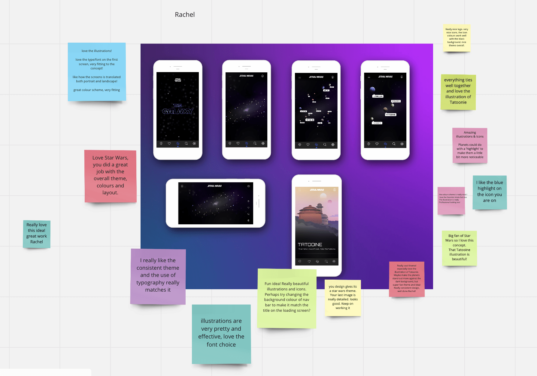
Overall my feedback was really positive with only a few small suggestions such as experimenting with my navbar colour, trying a lighter blue on my highlighted system icon (I have since made this change resulting in the blue included in my above colour palette) and adding a glow to around the planets.
Following up on this feedback I have decided to run with my dark grey bottom navbar as I feel anything lighter or more colourful drew too much attention from the rest of the UI. I decided to add a glow to the planets as seen in Hodgins Planetary app. I also felt at this point that including planet titles in boxes appeared a little too cluttered and have since opted to include white text instead as also seen in Hodgins Planetary app.
What have I learnt?
- It great to stop a take stoke of outcomes and improvements that can be made part way through a project as this allows changes to be made at an earlier stage and results in less work at the end.
- Setting out a clear colour scheme and typography choices before is really helpful when moving into the UI design stage.
How can I apply this to my work in future?
- When working on projects I plan to set stages in the project when to get feedback from lecturers/ team leaders/ managers and peers/ colleague to make sure that I am on the right track and to help catch required changes as soon as possible.
- Advanced planning and solid groundwork including, research, wireframing, illustration and icon development as well as typography and colour consideration has been vital to the successful UI design of the project, therefore I intend to make sure I fully take the time to do this properly at the early stages of future projects as it leads to better UI design.