Creating Icons
What I found particularly helpful in this weeks lecture was exploring the number of consideration that need to be made when creating icons e.g. style, level of detail, scale, harmony and the ability to differentiate one icon from another.
The Icon Handbook
In John Hick’s The Icon Handbook, he covers a number of topics about icons including history, meaning and development. In the section “Rules for Drawing ” Hick’s highlights two rules for drawing icons that particularly caught my attention: drawing in context and in company.
Drawing in context means taking into consideration if the icon will be placed on top of other elements and including these elements as a backdrop when creating the icon set e.g. images or tools bars. This means that icons will be tested on the appropriate background before completion and avoid the creation of icons that don’t fit their context. This is not something I had ever considered including in the creating process before rather I would have simply sent the completed icons out and reviewed them in context after completion. The second rule, creating icons in company i.e. in the one document using numerous artboards is an approach I have adopted in my work previously as I find it to be particularly helpful in achieving consistency (harmony) across a set
Another important point highlighted by Hick’s was the impact of sizing on detail e.g. when an icon needs to be smaller less detail can be included. This is definitely something I need to consider when creating my own icons.
Balance and Consistency
Hick also covers the topic of drawing for balance and consistency. I have looked at this in Vic Bells work and how she approaches creating a level of consistency in visual size however it’s always interesting to look at multiple approaches to a problem and experiment with what works best.
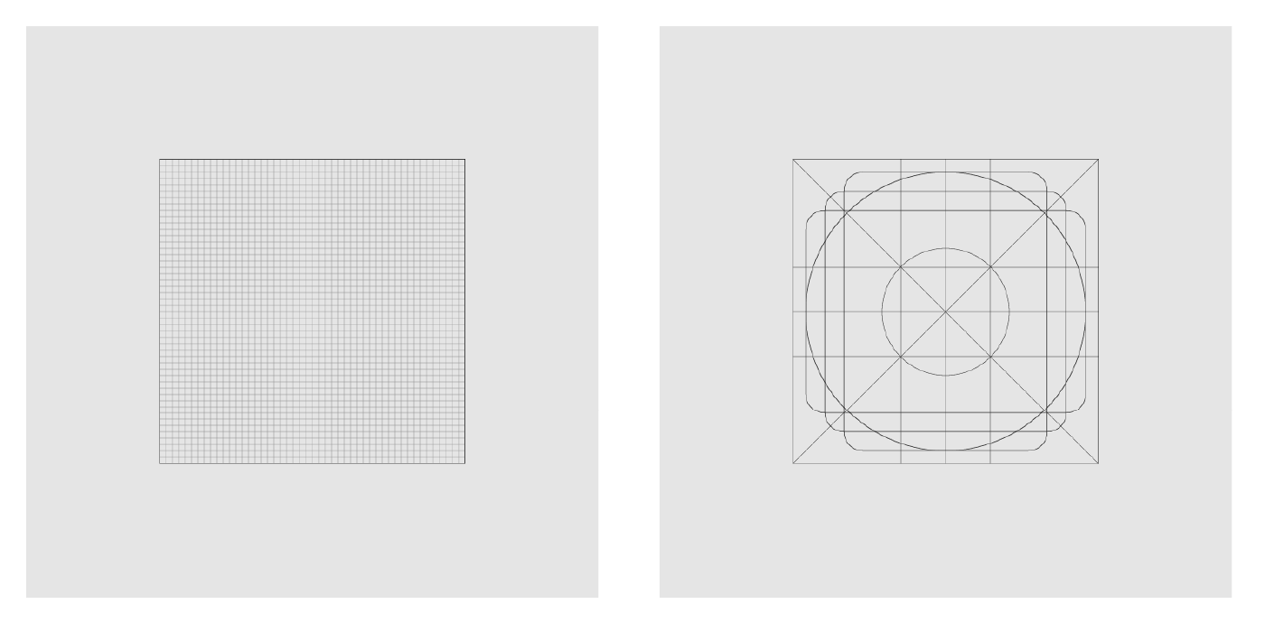
Hick’s highlights the tendency to pick a size for the icon set and then fill the entire space of the artboard while creating each icon. This is definitely something I have been guilty of in the past and as a result, it has let to an icon set that while technically includes icons of the same size visually this did not appear to be the case as depending on the shape of the icon an inconsistent amount of the artboard would become filled.
Hick suggests a solution to this by creating an additional square 80%-70% smaller than the original square and placing it inside the original square. This can then be used as a guide as shown in the above examples. Irregular shapes can take up the full space while squares and circles remain within the diagonal space. A cross is placed in between and diagonal bars remain in the smaller square. This seems to me to be a great way to create balance when producing an icon set and is definitely something I want to experiment with when creating my own icons.
Generating a consistent style within an icon set is another way to achieve balance as highlighted by Hick. The primary contributing factors to this in my opinion are the use of fill or stroke, level of detail, straight or curved edges and stroke width. Hick looks more closely at the topic of stroke width as again depending on the angle a stroke is placed at it can appear larger or smaller e.g. a 2px stroke width will appear thicker at a 45° angle. In these instances, Hick suggests making small changes by eye to balance out the overall outcome.
What do icons communicate?
Liverpool Biennial 2018- Paul Elliman
Paul Elliman is a British artist based in London and primarily focuses on communication through sound, languages and typeface. In the short clip shown above, Elliman talks about the shift in post-war/ modern art from sculpture to now being almost entirely about communication and language. Elliman then goes on to talk about the found font and how he began by pulling out old car parts and collecting items and arranging them in a meaningful way that he could draw language from. This was really interesting and got me thinking more about communication in relation to icons and how icons have almost become a language set of their own.
Icons- The Only Language Everyone Understands
This led me to Gasper Vidovic’s article Icons- The Only Language Everyone Understands. This was a great quick read as it gives an overall view of not only the communicative power of icons but also how they have developed through time and how they can be enhanced by colour. Firstly Vidovic highlights the fact that icons have the power of being understood independently of words, language or culture and how they have played an important role in international trade. This is pretty impressive and for me reinforces the effectiveness of icon use as a form of communication.
Vidovic also talks about icons as metaphors (the association of 1 object or meaning with another). The importance of this association and how associations can change over time is highlighted in the save icon. As shown below the original icon for save was a representation of a floppy disk, a commonly used item for saving digital material. However, with time and new innovations, the floppy disk has become obsolete and so has its metaphorical representation. Therefore a number of new icons have been developed to represent save in the virtual world.
This takes us to the importance of icons being recognisable and how to find the right metaphor. Vidovic explains that his process begins with a google search followed by a search for icons on icon finder. This is a very straight forward process but it makes sense. While I might not stick with the styling I find on a google search I will want to use the metaphors that are the clearest when it comes to my icon production as the utility of the icon is on of the most important aspects of its design i.e. if it’s not communicating what it should clearly then it is useless/ineffective.
Vidovic then goes on to discuss the usefulness of colour and how colour can aid in the message being communicated e.g. red accompanying a closing without saving icon, green accompanying an eco-friendly icon and yellow accompanying a sun icon.
Material Design- Iconography
Material Design goes into a detailed description of how to create product icons, system icons and animated icons. As I am not yet at the stage of working with animated icons I am going to focus on what material design has to say about product and system icons.
Material Design describes product icons as
“visual expression of a brand and product, including their services and tools”
Therefore product icons must reflect a brands identity through colour and key elements. In the design approach section, Material Design displays how they make physical prototypes with paper to review how shadows should be presented, displaying the step from a physical prototype to the final colour study. It was really interesting to see this approach to icon design and the level of detail that goes into Googles research when creating product icons in order to reflect the real-life physical properties that should appear.
Grids and keylines are then discussed with the measurement of 192 x 192 dp given for viewing and editing icons. I think it’s great that Material Designs gives you the exact size of artboards icons should be designed on as this has been something that I have been unsure of when attempting to create icons in the past.
Material Design also suggest creating icons on either grids or keylines see above (grid left, keyline right). These grids are used to establish clear rules in order to create consistent and flexible designs. Keyline shapes can be used as a baseline in product icon development and preset standards for circles, squares, rectangles, orthogonals, and diagonals. They also appear to help form the bases for shading. The Spec for product icon development is also laid out with the anatomy of product icons underlying structure depicting each element that makes up an icon being detailed. This is followed by a number of do and don’ts relating to shadows, lighting, layering, overlap, fold and so on. This is a great reference and definitely something I will return to when creating my own product icon.
Material Design system icons are described as being designed to be “simple, modern, friendly, and sometimes quirky.” They are produced at a much smaller scale of 24 x 24dp and use similar grid and keyline guides as displayed above. There are further guides provided as well including scaling 20 x 20dp as a live area with a padding space of 2 x 2dp additionally dense live areas scale at 16 x 16dp.
With system icon Material Design details standard on geometry, clarity and cross-platform adaptations as well as breaking the anatomy of a system icon into stroke terminal, corner, counter area, stroke, counter-stroke and bounding area. A lot of detail is provided here and I think this is a brilliant resource to refer to when making system icons.
What have I learnt?
- How to create icons that scale the same visually
- How to create balance within an icon set
- How adding context during the icon creation process can help with the overall outcome of an icon
- The role of icons as a means of communications
- The importance of presenting the correct metaphor when producing icons
- It can be helpful to make physical prototypes if making detailed icons to effectively capture light and shading.
How can I apply this to my work in future?
- When creating icons in future I can add the context and visual scaling solutions to my process as suggested by Hick’s in The Icon Handbook
- Before beginning the icon design process I can do quick scans of the most common representation of what I am trying to communicate in my own icon and use that as a starting point in my design.
- I can also take into consideration the effectiveness of icons in different circumstances e.g. if an icon cannot communicate what I want it to I can consider using text instead.
- It is really important to consider the anatomy of an icon and this is something Material Design layouts in a very detailed and clear way. Therefore when producing icons I will refer back to this resource as a check and balance.