IXD304 Week 12- Apollo Critique

Today was our final class of semester. It was very important to attend this class in order to get my final feedback on my website of the Apollo project so far. We posted our work onto the Miro and Kyle went through each persons work and give honest feedback. It was also a good chance to review each other’s work. I thought personally everyone’s ebook/website looked great and there was so much effort put into them. It was interesting to see how people turned their original prototype into the ebook/website. Everyone brought a unique style to their ebook/website which was very eye catching.

It was a great session and allowed me to get helpful feedback which will further improve and makes change to my very own website before the final deadline.

The sections and content told me to improve on which was great. I think by doing this it will alreadly help me to better my site overall.

I will take all the feedback on board and during the next few weeks I will take my time to make these nessacary changes to update my project.


IXD304- Designing my Website

After creating my prototype on Figma, the next step was to choose either a website or ebook to design. I choose to design a website as I felt it was the most apporitate method to communicate the story of the Apollo Mission to my target audience. I liked the idea of being able to use big images and videos to show the mission as this was what my audience requested when researching them. I felt more confident creating a website using webflow as I previously used this in a earlier project I completed last semester. To help me to improve my layout and structure I decided to use a free website template which I added my own content to it.

Designing on webflow

Using my prototype I followed the same approach for my website. I started off making sure I structured and laid out my content nicely.

Font- I choose an appriotate font type for the header, body and footer of my website to make sure it was clearly visable.

Navigation- I added in a Logo image, background colour, buttons with links.

Other content- I added in wide range of images and videos in each page to bring a fun and interactive element to my website.

So far I’m happy how my website currently appears in the browser. From my experience of using webflow this time around I felt I have learned more and improved my use of the program. At the moment my website is a working progress. Hopefully this Friday I will receive some helpful advice and feedback from my peers which can help me to further improve and update my website to make it look professional and meet the needs of my users. Once I am satifised I want to get my target audience to test my site.

Here is a link to my website:

https://theapollomission.webflow.io/


Week 10- Storytelling in Design (IXD304)

This week we had a guess lecture from Rachel Orr and Pearse O’Neill of Big Motive. Big Motive are a design company. During the lecture they explained what storytelling design is and how can use it to communicate and the importance of using it in interactive design projects.

Defintion: Storytelling is how we communicate with our users.

Orgins: Storytelling has been told from early cave paintings.

The 7 main elements of storytelling from Aristole’s is:

  1. Character
  2. Plot
  3. Dialogue
  4. Decor
  5. Melody
  6. Theme
  7. Spectacle

I was curious to find out more. We went into more depth into each one and how they relate to design.

Character: This is the designers equivalant to User Persona’s, Mindsets and empathy Maps. This is where you carry out user research to try cater to their needs.

Plot: This is the designers equivalent to storyboarding and user journerys. During this stage you think about the path the users may take while using this product. From here you can make changes. Example of a company that creates a good user journey is “AirBnb.” Storyboarding is good in animated and digital design.

Dialogue: This is where the designer should consider the tone of voice or language used. Think about accessibility of your users and make it’s clear for them to understand.

Decor: This is the designers equivalent to visual identity. People have emotional connections with specific brands and visuals. Therefore if a product looks good and is realiable they will have better user experience.

Melody: Designer designs a product which flows well. When creating products we must make sure it has a postive emotion. The goal is to ensure the products play a postive role and leaves a lastly effect.

Projects Big motive worked on are:

  • CCS Service Storyboard
  • ICO
  • Patterns
  • Resilco

There two major projects they recently worked on are:

Project 1: Aflo which stands for Air Flow. This is app which reminds users to breath. The aim is they want the keep the users relaxed.

Project 2: Our Place in space by Oliver Jeffers. They worked with Oliver Jeffers to tell the story of us and them. Users can use to app to walk in trails across Derry, Belfast, North Down and Cambridge. This is an educational App to take user’s on the Journey through our Solar system. This allows users to discover 3D Assets and AR APP.

Reflection

I thought this lecture from Rachel Orr and Pearse O’Neill was really interesting. I thought this was good to learn about the different elements of storytelling . I enjoyed viewing the projects of Big Motive and give my good inspriation. I thought by listening to this today it can help me enchance my storytelling ability through design.

Lasting thoughts to consider:

  • Think of the story
  • Create empathy maps and user personas
  • Carry our user research
  • Design visual identity/Branding


Week 9- Amplifying Data (IXD304)

Amplifying Data

Data gives us opportunties to create stories which will engage the users. Data is very important part of the design process. It’s essential to try and include data in our designs. Many websites and social media platforms collect data on their users when they frist sign up or use the site. Data is used everywhere. Data can be used to advertise products based on interests.

Migrating figues, referenda, election campigans and pays scales. e.g the national minmuim wages are examples were data is used.

A good example of a visual data is the recent covid 19 which keeps on track the daily cases.

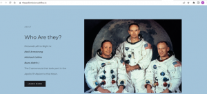
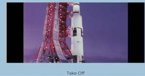
Kyle says we could consider using data to present the Apollo project.

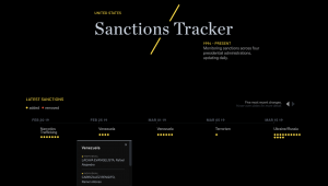
Sanctions Tracker by Enigma

This website tracks the USA Sanctions from 1994-2019. This allows you to visualise the sanctions on a country and theme. It tracker is used to present data clearly to the user. This site uses dots and colours which is a good way of presenting the data.

Practice what your preach

Another Two Examples were:

Lightyear

Business simulation.com

Using colour, layout, shapes are excellent ways of presenting data.

Trailblazers or Inspriations

David McCandless– A designer and data- journalist who works for local newspaper. He is great at visualising data in an interesting way. He does alot of charts/diagrams for the newspaper.

Manuel Lima- A designer and aunthor of 3 best selling book. He trains creative designers and companys on creating digital user experiences.

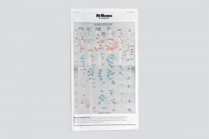
Giorgia Lupi– An information Designer. who works with data and storytelling were creates innovated designs in a unique way. She created a hand drawn visual data poster about the Pandemic and her life at home before and after lockdown. This was posted in the New York Times.

Brendan Dawes- A uk based Artist and designer. His works involves data, machine learning and alogrithms to create interactive experiences, data visulaisations and posters for users both online and print.

Article: The Moon Miracle by the Telepgraph (“50 reasons why the Mission should never have happened”) This article shows data visually. They clearly wanted to put the data of the moon landing into everyday context.

Article by Guardian “Lies, damn lies and Steve Jobs Keynotes”

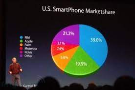
Apple clearly make the slice of the pie appear bigger which is a good sales techique.

User Interview– The stat of user research in 2022

Book: A practical guide to design with data.

Six Key principles of Chart Design:

  1. Be Honest
  2. Lend a helping hand
  3. Delight users
  4. give clarity of focus
  5. embrace scale
  6. provide structure

Tools and Libraries can be used to create charts. A good website to hep create a chart which can be used in webflow is chart.js.

The most important things to remember:

  • Keep data truthful
  • incorrupt data in your design
  • visualise data
  • bring these together

This week:

  • Carry out research.
  • Work on website on webflow
  • make changes to my prototype

Reflection

Overall I enjoyed the lecture. The examples shown were really interesting and I would like to look further at different designers and how they respresent data clearly in their work. I’ll gone to try include the use some of the point I learned and work I was shown to visualise data in my website which will interest my users in clear and understandable way.


Research- Apple’s Aspirational Storytelling (IXD304)

I was recommended to read an article called “How Apple’s Aspirational Storytelling Created Decades of Growth?” which Written in 2019 by Matt Clement.

This article explained how Apple used their brand storytelling succesfully throughout the decades.

Apple’s campaign “Think Different”. This came about in late-90’s. Steve Jobs helped Apple to restore it’s past by seeing what made them successful.

Apple uses their brand story successfully to advertise their products.

Importance of Brand Storytelling

Research Shows that “Humans Thrive on storytelling.” Marketers and brands should focus on their storytelling ability. Not many have used this with as little as 10 % of brands are actively engaging their audiences through storytelling content.

Storytelling helps make the audience engaged with specific products through building an emotional connection with them. When it comes to storytelling Apple and its team have successfully understood the concept.

Throughout the years apple have engagement their audience through the impact of powerful storytelling as far back as their early commercials in 1984 to their Think Different campaign today.

Reflection

Apple famously use the technique of storytelling to engage with their audience and playing on their emotions. They make their products both innovated and interesting. Users can have a better connection between themselves and mobile devices. Their approach has successfully paid off. I learned that by telling a brand story it can be important and go along way to order for the design to have an impact of your audience.

From this article I understand how important Apple value their customers and what makes them successful.


Week 8- IXD304 Reflection

Today’s class was through zoom. We were joined today by David Henderson of DHD company. He give us a brief lecture on the Art of Storytelling. I thought he spoke well and there were a lot points to learn from.

From his own personal experience and explained about the use of Music and Animations which can contribute to creating an effective and magical story that emotionally attaches the users. Brand stories, social media platforms have a good way of capturing the attention of the audience by making the story memorable. Users can be drawn into using your product effectively.

“90% of our decisions are made on an emotional basis. The other 10% are our rational minds used to justify those decisions.”

I thought this statement was very interesting and true.

How storytelling affects the Brain?

This image above explains different ways in which storytelling affects the brain. This is important to know as it can impact our thinking behind our design.

Storytelling examples

Case Study 1: Brand identify

Case Study 2: Film. Example: Slient Valley Story, Landscapes, View, etc.

Case Study 3: UX/UL Desiign. Example: Halfstack online 3- Javascripts

Designer- Lucy Cook

We then had an opportunity at the end of class to ask David any questions we had on design, storytelling or anything. I thought it was interesting what we had to say in response to the questions.

For this week Kyle asked us to update our Blogs which I will continue to work on.

Reflection

I think once you understand the users and have a structure to your story this can improve your design. By creating an emotional connection it will make the story memorable. If you can have an effective impact on the audience, they therefore will likely access your application or website in the future.


Empathy Maps (IXD304)

These empathy map were designed to get a better understanding what each user says, thinks, does, sees and thinks when using a website. By doing this I can tailor my product to suit the users needs. This website will very important to teach them about the Apollo Mission.

I now know what the user may be feeling when using a product before using my website and how I can ease their worries. I will make sure their process is easy and user friendly.

I hope by doing this I can make a website for both teachers and pupils to use efficently.

PDF Of empathy maps

David

Mrs McCann Empathy Map

Storyboarding IXD304

Storyboards

On Friday during class, we were asked to complete a workshop on storyboarding. Kyle give us between 30 to 40 minutes in class to draw the storyboard process of our website. We could be creative as possible and use images and text. I looked at my prototype from the previous week, to help me create my storyboard which showed the potential steps users will take when going through my website.

When doing this, we had to ask ourselves the following 4 questions:

  1. Does it make sense?
  2. What could be improved?
  3. What isn’t needed?
  4. What’s missing?

What is storyboarding?

A Storyboard is a visual respresentation of what your project will like look on completion. Weather it be a film, animation, book, or website they all follow a simple storyboard layout. Storyboarding normally happens at they very start of any project during the preproduction stage. This is normally done with a pencil and piece of paper. A storyboard is mainly images of each screen on your website and possibly a short description explaining each one. When designing anything it’s important to make sketches.

My storyboard

I started to redrew my prototype images as this is what my site will roughly look like on screen.

I begun sketching out the opening screen which will transition to the moon expanding. Next will be the rocket and mission, followed by the 3 astronauts and the story of the Apollo 11.

I think trying to add animations to my website will create a visual impact on my audience.

I thought it would be better doing it all in black and white before adding colour.

At the moment this is what it looks like but it subjected to change.

Reflection 

Overall, I felt this was helpful excercise. I demostrated the steps the users would take to get from one section to another. By doing this it allows for better interaction between user and website. It also opened my eyes to more things I could improve on my website. I may not be the best drawer but I tried to show as clear as possible the different screens the user may potentially follow on my website.

User Persona’s (ixd304)

Today I gathered 3 different user persona’s from the information they told me. I asked them to tell me little about them selfs, their interests, influences, goals, motivations, needs/wants and pain points/furstations. It’s important this information so I can cater my website to meet theirs needs/expections.

  1. P2 Teacher

User persona- P2 Teacher

Mrs McCann wants a website for primary 2 pupils which shows images and videos of the moon landing and neil armstrong.

2. David- P7 Pupil

David P7

David wants a bright, coloruful website with alot of images, very little text which is easy to understand and has relevant information.

3. John-P4

John P4

John wants a website which he can navigate around with no issues and tells him about neil armstrong and apollo 11 mission. Possibly big clear images and content and plenty of colour.

Reflection

I feel by doing this research will help me understand the needs and goals of my users so I can try create a website that would be presentable but also meeting expectations so this would be enjoyable site for them to use.


Week 7- The Story of eBooks (IXD304)

Today Kyle give us a brief lecture on ebooks.

What are eBooks?

An eBook or electronic-book is simply a digital book that can be displayed on a screen through mulitple mobile device. This books can be adapted to be read on Tablets, Kindle, Ipad or mobile phone, etc.

Characterisitcs

  • reflowable- which means they can fit for purpose on any screen (with the PDF being exceptional)
  • Noneditable- mean it’s can’t be changed or edited in any way

Three Main Types of eBook file format:

  • Epub– the most common file format for ebooks. It is compatiable across all digital platforms which makes it reflowable and easy accessible for alll users. The frist verision of the Epub file format was released in september 2007.

  • Azw– This is a kindle file format developed by Amazon back in 2007. It can be used on smartphones, tablets, computers. It is an aternative to Epub but mostly for kindle e-readers.

  • PDF– this stands for Portable Document Format. This was developed in 1991-2008 by Adobe. It allows users to present or dipslay content appriotately in order for them to be read or printed without making changes.

Indesign is an excellent software program allows us to create eBooks. I am tempted to try this out.

Layouts

It’s important to consider how our work can be layout out on screen.

Examples:

Single Column Grid

this is a very simple grid structure which is often referred to as a block grid.  It’s format consists of one big rectangular area it is used to continious reading. This can be seen in books and essays.

Two Column Grid

This is a clear layout commonly used in Magazines and websites to display text and images in neat way

Multi Column Layout 

This is where you can seperate content into mutiple columns. Good example of this is a newspaper. It means can quickly scan through information

Modular Grids

A modular grid is a grid which has consistent horizontal divisions from top to bottom in aiddition to vertical divisions from left to right. You might see this layout in some websites.

It’s good to be able to experiment with different layouts to see where to place the images and content appriotately in your design. I will start trying to find inspiration of eBooks by looking at website, magazines and newpapers. Literally anything that I think would have a good layout weather it’s online or in the ship

When designing an eBook it’s important to consider the following:

  • All elements including Images, text, content, etc.
  • Define space with colours. Explore colours. Key tip: having a good colour palett is important
  • use space a graphical element. The use of blank or white space can be effective
  • Maintain interest with pacing
  • determine margins- make sure the leave plenty of space
  • Design for function
  • Alternate format/Layouts
  • Layout Inspriation- Pininterst, Dribble, Magazine, Newspapers,etc.

Example

Apple are the king of storytelling. They use animations to great effect as part of their markerting techinique to add to the user experience. Such as they can always make something like a monitor interesting to read through their special effects.

Reflection

I thought todays lecture was very interesting. It’s certianly made me consider designing an eBook to tell the story of the Apollo 11 space mission.  As my audience is Primary School kids, I think this would be something them be interested in and may appeal more to them rather than the website.

This week I want to look further research about eBooks as it is an alternative option to my website.

Skip to toolbar