I received very positive feedback on my app in our group critique following applying the changes required as presented in my User Testing feedback. Below I have outlined the changes I have made from usability testing and review
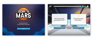
The above screens display my opening screen and home screen. The feedback on my opening screen was very positive and appeared to present an accurate representation of what to expect from my app. I have therefore made no changes to this screen.
The home screen, which previously only included two buttons raised some confusion in my user testing with one of the users stating “I really don’t know what to click first”. I have therefore added two additional white text boxes describing the different functions of the two buttons. This was intended to add more clarity and help the user to make an informed decision on which part of the app they want to visit first.
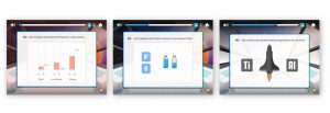
The “Play” button takes the user through a series of tasks, I have included screens from the spaceship tasks above. The first task is intended to teach children about the elements in the air. It requires the user to adjust the elements to the correct percentage to make the air breathable. The second task is designed to teach children about the elements in water. It requires the user to drag the elements onto a water bottle to fill it with water. The third task is designed to teach children about metal elements, specifically those used to make rockets. Tho fit with the narrative this is applied to a landing craft. A narrative is applied to each task to make them more engaging and link to the larger narrative of getting the user to Mars. The following issues arose in user testing:
- One user did not know that the bars in the air levels exercise had to be completed before they could move to the next bar.
- Most users struggled with identifying which element to drag onto the water bottle and landing craft first.
- One user wanted to move back to a previous screen but couldn’t
To help avoid these issues I have added a pulsing effect to the components that need to be selected first. I have also added a hint button. The hint button can be selected several times throughout a task and will provide instructions on the next action that should be taken. I have also added a back button that will take the user back to the previous screen and made the home button clickable. The home button takes the user back to the home screen that allows the user to view the elements they have discovered so far and to play the level they are currently on.
As included in the original design a bar has been included at the top of the screen so the user can see their progress. I had also included a setting button in my top menu however it was advised during the group critique it was advised that this be removed. As the only item I had imagined being in the setting menu that I wanted the user to have access to al all times was the volume control of background music I replaced this with a speaker. I have also included a speaker beside all text instructions throughout the app so that the user can select the speaker to have the text read to them.
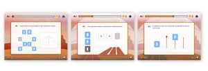
The app includes 3 additional levels when they reach Mars. At this stage, the UI colour scheme changes from blue to orange. The level bar goes back to the start and the elements included in the tasks become more complicated.
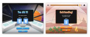
When a task is completed I wanted to provide the user with lots of positive feedback. A congratulatory exclamation is included at the end of each task and the user is rewarded with the new element/elements they have discovered. I had originally made these elements viewable only by clicking the element button however following feedback in my group critique I made the element symbols clickable as well. When the user selects an element they are brought to the elements Cool Facts page shown below.
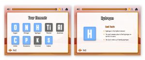
The above left screen shows the completed elements page. This is populated as the user makes their way through the game. I wanted to add some level of categorization to the elements so I have colour coded the metal elements grey and the non-metal elements blue. When an element is selected on the elements page the user is brought to the Cool Facts page on that specific element. This page includes three interesting facts that teach the user more about elements.
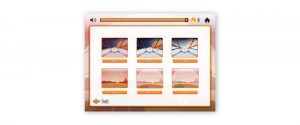
When the game has been completed the user is able to access all levels from the home page and play levels again from the screen shown above.
I am very pleased with the outcome of my app. I believe that the game I have created will engage children through the game’s narrative, the interactions in tasks and animated elements. I think the game would benefit from a broader range of tasks and difficulty levels. I would definitely work on improving this aspect of the app if I were to continue working on it. I would also add the music and multiplayer features presented in my music and multiplayer features blog.
However, overall, I am happy that I have been able to incorporate my desk and user research to create an educational app that is usable by children within my target age range (8 to 10-years-old). I believe that teaching children about elements in relation to what objects and substances they can be found in is a great way of introducing children to the topic. I am also pleased with the Escape to Mars Apps UI and narrative. While I was not able to produce the 3D UI I had originally hoped for I am still pleased with the illustrative elements in the game UI and Avatars I have created for the multiplayer feature. I am also happy that I have achieved a consistent visual style throughout my brand and UI that is indicative of an adventure game set in space.
You can view the Escape to Mars design and build here: https://www.figma.com/file/SAemdfroA4zdlH2alfHIQK/Escape-to-Mars–Elements-App?node-id=0%3A1
You can view the Escape to Mars prototype here: